Details from a One-of-a-Kind Kitchen
Custom cabinetry, a curvaceous island, and unique materials make a kitchen remodel special.

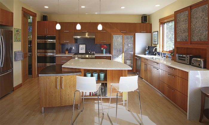
Synopsis: Architect Richard Shugar was hired to design a kitchen remodel to fix a major flaw with an otherwise decent room: its distance from the living and family rooms. His design began with a 10-ft. addition, creating a great room that includes the kitchen and a new family room. The addition also enabled the kitchen to expand, permitting the installation of an island and the creation of a pantry. Shugar highlights three features that make the new kitchen stand out: a two-tier island, a visually dramatic cooking area, and smart storage.
It’s fun to see dramatic before and after photos of old, derelict kitchens transformed into sleek, modern spaces. this kitchen, however, was still in pretty decent shape as we found it. Sure, it was a bit cramped and suffered from poor circulation, and the dark countertops and traditional upper cabinets weighed down the space a bit. But the real problem was that it was removed from the living and family rooms. That’s not what families want today.
The homeowners asked me to design a new kitchen that would connect better to their active lifestyle, which can include one person cooking while another is doing homework and a third is watching TV, all wanting to be close and feel connected. They were looking for spaces that would create intimacy without crowding. They wanted a great space that could serve as a multipurpose center for most daily family activities.
My instinct was not only to rearrange the spaces but to expand them so that the kitchen and family room could become the heart of the house. These spaces were situated on the middle of three floors, so pushing the exterior kitchen-and-family-room wall out 10 ft. would also expand one of the bedrooms on the level below and create the opportunity for a balcony off the master bedroom above. the homeowners were delighted with the plan.
The new kitchen is bright, welcoming, and playful. It is designed to be a place to hang out, a functional room that can simultaneously meet the needs of children, parents, and guests. It is a place where several people can cook, where kids can work on projects, and where interaction is encouraged. and it is unique in both design and materials.
10 More Feet to Work With
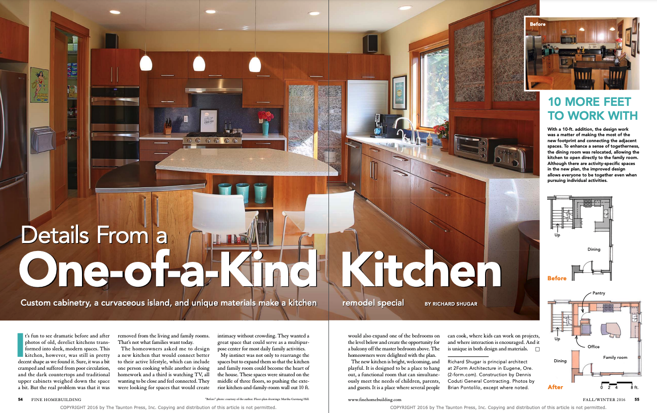
With a 10-ft. addition, the design work was a matter of making the most of the new footprint and connecting the adjacent spaces. To enhance a sense of togetherness, the dining room was relocated, allowing the kitchen to open directly to the family room. Although there are activity-specific spaces in the new plan, the improved design allows everyone to be together even when pursuing individual activities.
The nucleus of the kitchen
The island was designed to accommodate people working on different types of food preparation. The quartz counter is standard height for most tasks. The lowered area with its stainless-steel top is intended for baking; at 30 in., it’s a good height for kneading dough. Curves make the island comfortable to work around and provide an organic quality that contributes to the playful, welcoming character of the space. The island is a multifunctional place to cook, do homework, entertain, pay bills, or enjoy a casual meal. Cookbooks are tucked neatly into shelves carved into a niche on one side of the island, while the microwave is hidden in a slot on the opposite side.
To see photos of this custom kitchen, click the View PDF button below.


