Small Addition, Big Impact
A 2-ft. bump-out brings a midcentury home into the next century.
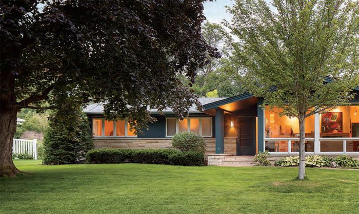
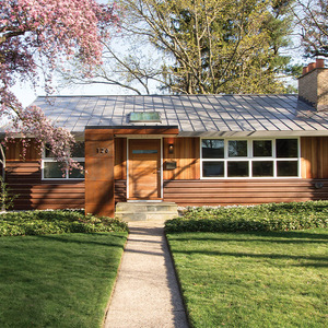
Synopsis: Paul Buum’s clients loved their new midcentury home’s 1950s character, as well as its yard and neighborhood. They were less than satisfied with the kitchen, however, so Buum designed a remodel centered on transforming the kitchen. He added a 2-ft. bump-out, which created enough space for an island, and used an exposed steel beam to carry the roof load and to define the new space. The bump-out, which also provided some extra space for the family room, leads to a new bluestone terrace with a dining area and hot tub.
I first worked with Stacy and Eileen to remodel their Wisconsin vacation cabin, and we were in the process of drawing plans for the remodel of their existing house in Edina, Minn., when a good-looking house in a neighborhood they admired suddenly came on the market. Built in 1958 on a tree-lined street, the house is in a neighborhood known for its midcentury homes. These homes have low rooflines, large windows, and bright and airy rooms. When Stacy and Eileen’s offer was accepted on the house, we quickly abandoned remodeling plans for their existing home and went to work on this new project. Our aim was to update the house without sacrificing its midcentury charm.
With any remodel, I first ask clients to list what they like and don’t like about the house. For starters, Stacy and Eileen loved their new home’s 1950s character, with its open plan, large windows, and light-filled living areas. They also liked the expansive yard, mature trees, and the neighborhood’s welcoming feel.
Kitchen and bath drove the remodel
Neither of them liked their new kitchen, however. They thought it was too dark and too small, and they wanted a center island. They also wanted to update the hall bath and add a separate shower. A larger garage with storage and a real mudroom connecting the garage and kitchen rounded out their wish list.
Making more room
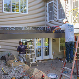
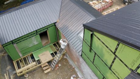
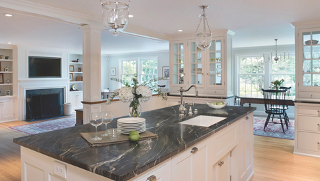
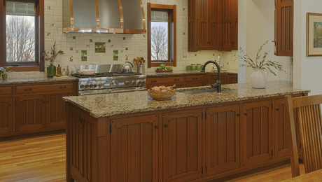
There wasn’t enough room in the kitchen’s existing floor plan for a center island, so we designed a 2-ft. addition. This small bump-out was all we needed to make room for an island. To support the roof above the addition, we used an exposed steel beam to carry the roof load and to define the new workspace. We also added a full-height pantry to make up for the cabinets lost to the new windows that frame the view onto the backyard.
With the addition, the family room also grew by 2 ft. We added a four-panel sliding French door that provides a view onto the stone terrace and backyard from the family room. We updated the hall bath with new finishes and fixtures, but we didn’t move any of the plumbing, which simplified construction and saved money. We found the space for adding the new freestanding tile shower by taking over a neighboring closet.
The garage addition, which made the space about 250 sq. ft. bigger than it was before, allowed us to carve a section from the original garage footprint for a 6-ft. by 12-ft. mudroom with a bench, a closet, and built-in cabinetry. The new mudroom and a larger garage reduce clutter and make this everyday entry more welcoming.
For more photos, drawings, and details, click the View PDF button below:
Fine Homebuilding Recommended Products
Fine Homebuilding receives a commission for items purchased through links on this site, including Amazon Associates and other affiliate advertising programs.

All New Kitchen Ideas that Work

Homebody: A Guide to Creating Spaces You Never Want to Leave

Code Check 10th Edition: An Illustrated Guide to Building a Safe House
