Raise an Eyebrow
Dramatic interventions include continuous radial ceiling coves, galvanized steel dormers, and a central bookshelf-stair.
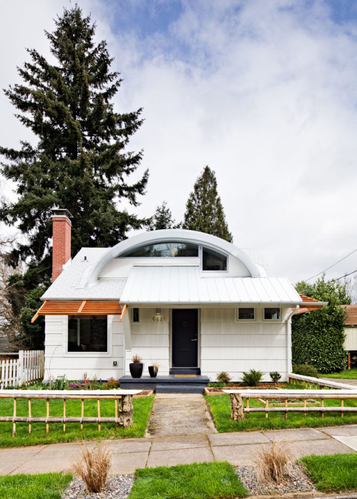
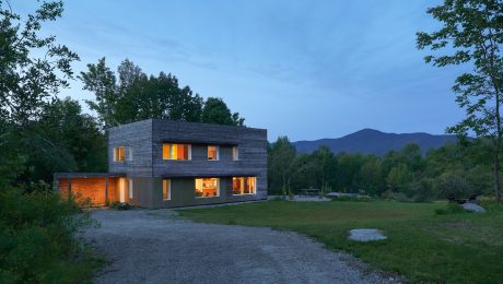
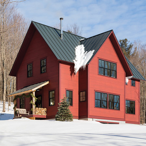
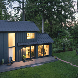
This completely modern and custom remodel and 1940s era Cape Cod style home is called Eyebrow House. It was designed by the David Papazian of Doon Architecture. It is such a unique home that I can’t really put it into words. I’ll let Edgar tell you about it:
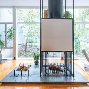
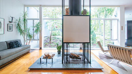
“The house was axially reoriented to better fit its site. It was also opened up inside to create a continuous circulation and surgically altered by a curvilinear series of interventions that accentuated these planning moves. These interventions included continuous radial ceiling coves, galvanized steel dormers, the central bookshelf-stair, mantelpiece, et cetera.”
So cool and such a fun project to shoot. More info here: http://cargocollective.com/doonarch/Eyebrow-House













View Comments
Some creative thought went into this but after reviewing the photo's at the link above, I am left wondering if I should feel sorry for the neighbors.
I really like they were able to take an ugly 1940s special and turn it into something interesting. But after living in cape style room for 7 years and looking through the pictures of the 2nd floor, I cant help but wonder how many times one bangs their head against the ceiling / wall... looks like if they could have raised the top by just another 1-2 ft, it would cause a lot less headaches (and wouldn't have added much to the cost of renovation)
Some interesting and innovative ideas but I think maybe too many in the same place, and some I just don't get -like recessed florescent light boxes and frosted glass doors in the kitchen. To me it seems like trying too hard just to be different. And as another reader commented, in the context of that neighborhood... a sore thumb.