Driving Your Construction Business With a Dashboard
Developing a dashboard for your construction business will help guide you along your entrepreneurial journey and enable you to reach your business goals.

You probably don’t even notice how many times you look at the dashboard in your vehicle during the course of a normal business day. You check your speed when entering that school zone. You glance at the fuel level to determine if you have enough gas to make it to the that client meeting across town. And if your truck is like mine, you regularly check the temperature gauge to make sure you’re not running too hot.
The dashboard provides a snapshot of the performance of your vehicle in real time.
Going too fast. Let off the gas pedal. Engine is running rough. Check the RPMs. The “Check Engine” light is on. Schedule a trip to the mechanic.
Your business is just as complicated as the combustion engine in your vehicle. You would feel uneasy if you got in a vehicle and there were no gauges, dials, or indicator lights on the dashboard to let you know what is going on with that vehicle.
But many construction business owners don’t have a dashboard for their businesses, or their dashboards might look like the one below.

They have no way of telling how fast they are going (growth), at what rate they are consuming fuel (cash), and what items need a little maintenance (production efficiency).
Developing a dashboard for your construction business will help guide you along your entrepreneurial journey and enable you to reach your business goals.
In my previous post, I shared with you three Key Performance Indicators (KPIs) that can help you gauge the health of your construction business. Tracking these KPIs, using your TOTAL REVENUE, can be a great place to start developing your dashboard.
But the TOTAL REVENUE is only one data point amongst a plethora of other data points that needs to be measured to help you determine the performance of your construction business.
For example, you can have a high TOTAL REVENUE but a low NET PROFIT. This can occur when the markup factor you apply to your Cost of Goods Sold (COGS) is too low to provide enough margin to pay for your expenses and leave you with a NET PROFIT.
You may have COGS that remain consistent when compared to TOTAL REVENUE, but because of operational inefficiencies or an increase in EXPENSES due to growth, your bottom line (NET PROFIT) suffers.
A well-designed dashboard will show you the adjustments you need to make to avoid these and many other situations that can be detrimental to the longevity and profitability of your construction business.
A business dashboard is an information management tool that provides at-a-glance views of KPIs, metrics, and other data points relevant to a particular objective or business process (e.g. sales, marketing, human resources, or production). In laymen’s terms, a business dashboard is simply a “progress report.”
DON’T MAKE IT COMPLICATED
When you have spent a majority of your life learning your trade and mastering your craft, then understanding the numbers side of your business can be overwhelming. This aspect of your business can leave you frustrated and unmotivated.
You may think that the dashboard for your construction business must look like the photo below.

Don’t make your dashboard this complicated.
I know almost nothing about cars. I didn’t spend much time growing up under the hood and never had an interest in learning much about cars. But I did learn the basics.
- Change the oil every 3,000 miles.
- Fill the tank with gas before it was empty.
- If I put the car in “drive” and it doesn’t go when I hit the gas, then call the tow truck.
- Obey the speed limit (I still struggle with this one).
Your business’ dashboard should be simple and straightforward at first. As you determine additional KPIs for your business, you can add them to your dashboard as needed. But if you are starting from scratch, then start by measuring the following metrics and KPIs.
Before we get into the details of developing this dashboard, let me define the difference between a metric and a KPI.
A metric is just a number or a data point.
A single metric does not indicate a trend, relationship, or an action that you need to take. It’s just one point. But a series of data points (metrics) may indicate a trend.
A KPI will indicate the relationship between two or more metrics or series of metrics.
For example:
TOTAL REVENUE is a metric. This shows you how much work your are selling.
COGS is a metric. This shows you the costs of what you are marking up and selling to your customers.
GROSS PROFIT is a KPI. It shows the the relationship between your TOTAL REVENUE and COGS.
GROSS PROFIT = TOTAL REVENUE – COGS
And if you know a metric like TOTAL EXPENSES, then you can calculate the KPI of NET INCOME.
NET INCOME is a KPI because it shows the relationship between TOTAL REVENUE, COGS and EXPENSES.
NET INCOME = TOTAL REVENUE – COGS – EXPENSES
KEEP IT SIMPLE
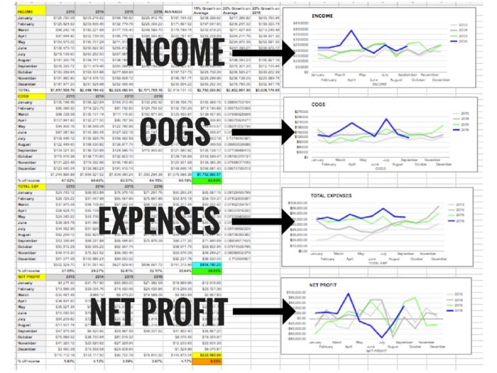
Here’s an example of a dashboard that you can create with the information directly from your Profit and Loss Statement (P&L).
(Download a PDF of this dashboard by clicking here.)
In this example, this business is tracking three metrics and one KPI:
- TOTAL REVENUE (Metric #1)
- COGS (Metric #2)
- TOTAL EXPENSES (Metric #3)
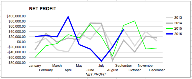
- NET PROFIT (KPI)
These numbers were taken directly from the P&L statement. The metrics were tracked for each month over the past 3 years and a line graph was produced showing the dollar amount versus the month.
Don’t let all these numbers distract you from how simple this really is.
This company is only tracking four numbers – TOTAL REVENUE, COGS, TOTAL EXPENSES, and NET PROFIT.
Each of the numbers is pulled from the P&L once per month and logged into this spreadsheet.
Tracking these numbers in this dashboard should not be time consuming. You will pull these four numbers from you P&L once per month and put them into your spreadsheet.
Your dashboard will eventually look like this over time as you acquire more data, and it only looks like the cockpit of a commercial aircraft because there are many data points.
But the dashboard above is quite simple to produce.
There are only 4 numbers at the heart of this dashboard.
Once you have enough data points in each of these four areas, then you can graph the dollar amounts versus the month of the year.
As your business continues, you can add a new data series (line) for each year and can compare that series to the previous year.
You will start to spot some trends. When you spots these trends, then you can start making projections and adjustments based on these metrics and KPIs.
For example:
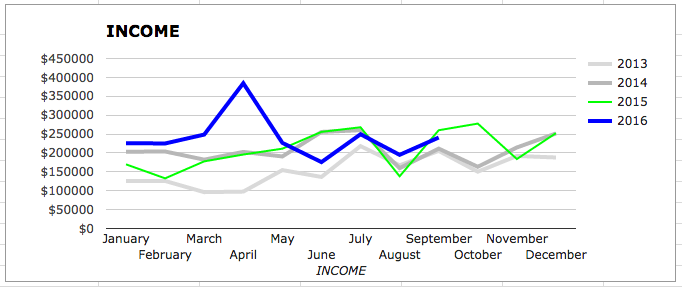
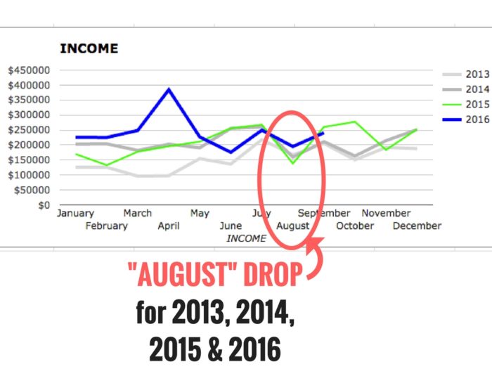
The income for 2013, 2014, and 2015 was somewhat consistent throughout the year except for August. In each year there was a drop in INCOME (TOTAL REVENUE).
And we see the same drop in INCOME happen again in 2016.
If you were planning the budget for this business in 2017, you may want to ask yourself, “What is happening in August every year that causes a drop in income?”
If you can determine the cause of this drop in INCOME, you might be able to avoid it by selling additional work. You could also make sure to collect any outstanding invoices that are due in that month.
Any additional income realized in August of 2016 to counteract this historical dip could end up going to the bottom line (NET PROFIT).
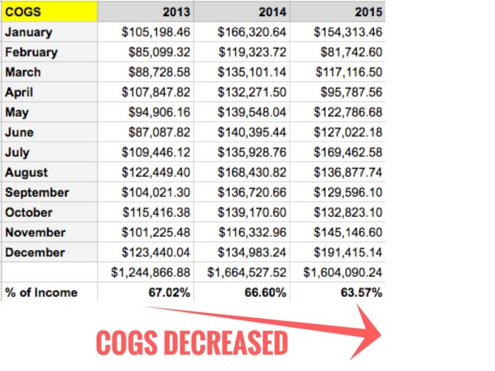
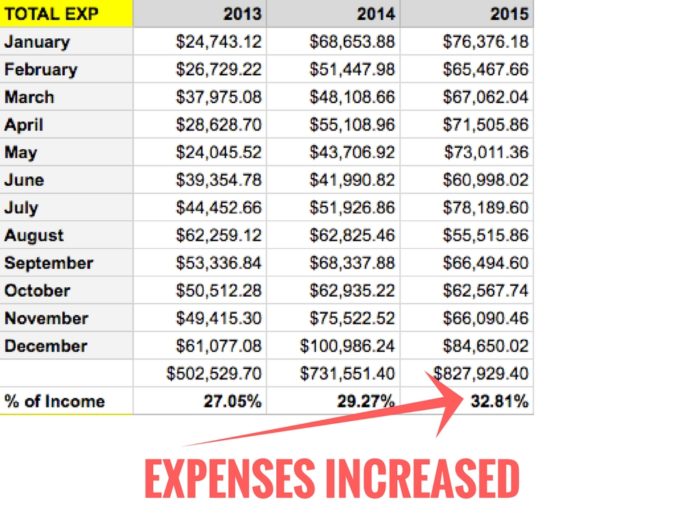
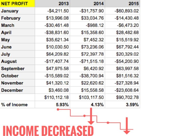
Two KPIs this dashboard shows are the percentages of the COGS and the EXPENSES to the TOTAL INCOME.
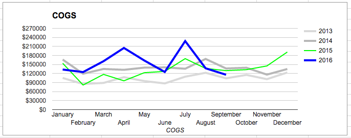
Although the COGS in dollars increased from 2013 to 2014 and remained about the same from 2014 to 2015, the percentage of the COGS when compared to the INCOME actually decreased.
Normally, a decrease of COGS sold when compared to TOTAL INCOME can be a good thing for your business.
If COGS decreases and INCOME increases, then that means your production is going up or the company is operating more efficiently (selling work at a higher price for the same amount of costs).
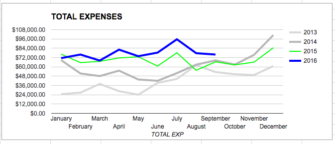
The problem is that during this same time period, the EXPENSES were increasing.
But in this example, you can see that the EXPENSES are increasing year-to-year by a faster rate than the COGS are decreasing (as compared to TOTAL INCOME).
This results in lower NET PROFITS.
This company’s dashboard shows that it is doing more work (increasing INCOME and decreasing COGS) for less money (higher EXPENSES, lowering NET PROFITS).
DON’T BE THIS COMPANY.
Develop and use a dashboard to measure simple metrics for your construction business. Study how those metrics lead to trends in your business. Once you spot trends, determine the KPIs that affect those trends.
Set goals based on your KPIs. Check your dashboard on a regular basis to determine the actions you need to take to reach your goals.
START WITH A SIMPLE BUT ELEGANT DASHBOARD.
The modern vehicle is more like a high-powered computer with wheels than a simple mode of transportation. Trying to get your construction business’ dashboard up to speed with all the analytics you need to perform during the course of the year can be a daunting task.
Determine a few metrics and KPIs that you will track, and start simple.
Just like the picture below, your initial business dashboard should be simple, elegant, and show you the most important information you need to operate your business in the most effective way.
Before you know it, you will be cruising down the highway toward your destination.
And checking your dashboard will become second-nature.
You started your business for many different reasons. You should enjoy the ride.
Follow me on Instagram @shawnvandyke, LinkedIn, Facebook, or shawnvandyke.com to learn more about how to streamline your construction business.








View Comments
Thanks for providing this wonderful and useful post!
Professional home improvement specialists required
at https://cooljonny.com/