Design is in the Details
Editor's Note: look for the designer’s restraint when it comes to colors, textures, and materials.
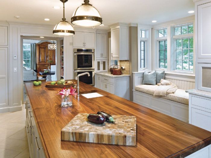
For years now, we’ve been publishing a similar story line. It goes something like this: “Todd and Sarah loved their home, but their kitchen was old, cramped, and disconnected from the rest of the house. There was too little storage and no place for family and friends to gather. When they called me to design their remodel, it was clear that they wanted a great room with a more social kitchen.” I made up this particular story for the sake of this note, but it’s not far from the introductions to countless articles on kitchen design.
In “Old School,” in this issue, however, you’ll meet Jean and Ellen, who tell a different tale. They had a “social kitchen,” carved out of a great room, with plenty of space for guests to gather and wide open to the dining room and main living area of their home. They found cooking with everyone in the kitchen frustrating and working in the kitchen with the TV or music playing and people socializing to be very loud. Jean and Ellen asked their architect to move the kitchen away from the living space and make it more private and functional. We’ve been hearing from other homeowners, too, who describe their great rooms as clunky, cavernous, cold, and uncomfortable, lacking intimacy and coziness.
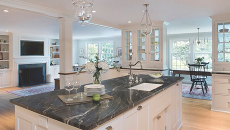
So, are social kitchens and great rooms actually a bad idea? No, they’re not. But design is in the details, and open space, big islands with lots of stools, or simply knocking down the walls between the kitchen, dining room, and living area does not make a great room—just a big one. The purpose and area of each space still needs to be well defined with architectural cues and the kitchen still needs to function first as a workshop for the cook or cooks.
Coincidentally, this is what Asa Christiana found when he interviewed designers and architects for his article “Timeless by Design” in this issue. Their responses were less about style and more about function and flow, the details found on the floor plans. And, in a similar way, this is what Paul DeGroot and I discuss in “The Best in Modern Bath Design.” With all of today’s beautiful tubs, tiles, vanities, sinks, and advanced building materials and the design options they make possible, it’s easy to let shiny objects get in the way of good bath design.
So as you read this issue and admire the pretty kitchens and baths, try not to be too dazzled by the great view through the kitchen or the fancy sink in the bathroom. Instead, notice how everything is arranged to be comfortable and convenient. Notice how much effort was put toward custom storage. And look for the designer’s restraint when it comes to colors, textures, and materials. Miles Davis said of jazz, “It’s not the notes you play, it’s the notes you don’t play.” That often seems to be true of kitchen and bath design, too.
Fine Homebuilding Recommended Products
Fine Homebuilding receives a commission for items purchased through links on this site, including Amazon Associates and other affiliate advertising programs.

Not So Big House

Homebody: A Guide to Creating Spaces You Never Want to Leave

All New Kitchen Ideas that Work
