A Home Kitchen Designed for Restaurant Owners
This kitchen has everything the owners need, all the style they could want, and nothing more.

Homeowners Eric Foster and Daniela Bell are also restaurant owners, which means they work hard. When they’re not working, they spend a lot of time at home with their daughter, Thalia, and a variety of animals. Eric enjoys baking, Daniela cooks the meals, and Thalia is a budding artist. The family regularly hosts fund-raisers in their 1870s Minnesota home, which is located in a historic district. Unfortunately, the house had, at various times, been divided into apartments. When Eric and Daniela bought the home, its overall condition was funky at best. The kitchen had been remodeled using cheap oak cabinetry and had absolutely no style. Worse, the layout didn’t take advantage of the three windows that offer both light and views.
Referred to me by Flannery Construction, with whom I’ve collaborated on numerous projects, Eric and Daniela turned out to be ideal clients, lending their trust to me as the designer and imposing very few restraints. Daniela’s only directions were that she didn’t want a white cookie-cutter kitchen, and she wanted to honor the age of the house.
Beyond the historic charm of the home, I saw a family with a lot of personality who would use the kitchen in very specific ways. My main goal with every kitchen design is to ensure that it functions exactly how the clients will use it. And I realized that for Eric and Daniela, I could redesign the kitchen within the existing footprint and be creative with the details while still honoring the home’s traditional style.
Making art in a bonus space
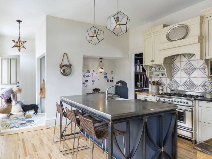
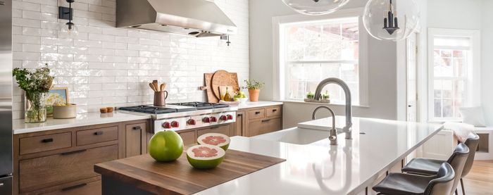
The new floor plan is designed to take advantage of the large windows on the west side of the kitchen. Previously, both the sink and stove faced the interior walls, leaving the cook’s back to the windows. In the new plan, the sink is in the island, so the majority of the time they spend in the kitchen, Eric and Daniela are able to look out the windows and take in the views of downtown St. Paul.
I relocated the stove so that it is now conveniently positioned across from the sink. To the right of the stove, the new kitchen has a baking area for Eric, including a soapstone countertop above large drawers for baking-pan storage. The cabinets above are designed to store flour, sugar, and other ingredients. On the other side of the oven is a butcher-block countertop for Daniela to prepare meals. With this arrangement, the couple can be in the kitchen side by side, both of them using the range and sink. Everything they might need is literally less than three steps away.
Once we had chosen to relocate the refrigerator, the existing kitchen offered us a bonus space: the alcove that previously housed the fridge. I presented Eric and Daniela with several options. It’s important to be realistic about how a kitchen will be used. Kids want to be in the kitchen while their parents are cooking, but parents don’t want to have to clean up their kids’ projects at mealtime. Since we’d already planned the island as the place where the family would eat most of their meals, we chose to make the alcove into an art nook for Thalia.
The art nook has drawers below the built-in benches for storing supplies, and the walls are finished with magnetic paint so that Thalia can keep a running display of her favorite projects. The table is made out of soapstone, making it virtually indestructible, and the built-in benches are painted dark blue in order to keep any messes a little
more hidden.
Open to the kitchen is the hallway that leads to the back door, which leads to the garage and is the family’s daily entrance into the house. When the remodel began, there was a bifold closet in the hallway that held the washer and dryer. I convinced the owners that it made more sense to put a functioning mudroom bench there, and moved the washer and dryer upstairs. Though it was an obvious location for a mudroom bench, when we had a neighborhood open house, the mudroom received even more comments than the kitchen.
Paying homage to the home
I try to design each kitchen that I work on to match the personality of its users. Well, Daniela has a huge personality, so this kitchen had a lot to live up to. The kitchen was originally intended to be more colorful than it turned out. But as we went through the design process, it became obvious that the kitchen had the potential to become quite sophisticated, so I toned down the color scheme. I then snuck in several details to reflect Daniela’s personality without letting the design become too kitschy. The “chicken coop” cupboard—with its chicken-wire panel—is an example of how we honored Daniela’s desire to have chickens in the city.
We also left an open wall space to put in an old hutch that introduces additional texture and color. With the inclusion of open shelves and a plate rack in the cabinet design, Daniela is able to add color to the room with the dishes she chooses to display. The open shelves provoke a certain nostalgia that transports anyone who looks at them back in time. I’ve included this detail in other designs, and it inevitably becomes one of the features that my clients like the most about their kitchens. I also designed the mudroom tile “rug” to include the jolt of color that Daniela craved.
The most unique material was used on the island, which we wanted to be the stellar feature of the kitchen. A pewter countertop from Francois & Co. adds a touch of luxury to the otherwise humble, earthy materials.
The kitchen cabinetry has a tight footprint, so storage solutions had to be worked out in the initial design stages. It helped that Eric and Daniela are tall, because their main storage cupboards are above the open dish and glass racks. If they were any shorter, this would not have been possible. There is no storage on the island. Instead, to the right of the sink are the garbage and recycling and to the left of the sink are two dishwashing drawers. The old hutch has to pick up a lot of the remaining storage duties and therefore had to be very functional. I replaced the hardware on the hutch to make it more usable, and gave it a major cleaning.
The kitchen has an adjoining parlor with a bar to store extra glassware and an unused closet that we opened up to store cookbooks, the microwave, and other less frequently used kitchen items. That borrowed space made it possible to keep the existing kitchen footprint without expanding the floor plan.
I find that wood island legs are usually too country for my taste. In this case, I used metal for both the art-nook table and the island legs. When the owners and I went to go see the metalwork in progress—before it was powder coated—we fell in love with the visible artist’s hand where the bars are welded. We opted not to paint it, keeping it natural with only beeswax and linseed oil to protect it from rust.
The kitchen cabinetry can all be seen in one eye shot and we crammed a lot of detail into it. So, to keep the kitchen from becoming too busy, we chose to put cabinet fronts on the dishwasher drawers and fridge and we painted the island and the cabinets to cut down the busy look of wood grain. However, I glazed over the paint finish to avoid the plastic look that new, painted cabinets can have. The glaze helps the cabinetry blend in with the dark countertop and the antique finish of the backsplash tiles.
Over the island, I went with clear globe pendants with a unique shape from Cyan Design. I had the pendants’ shiny chrome finish aged by my lighting guy, Brett Anderson, to fit with the rest of the kitchen’s matte finishes. I also incorporated under-cabinet lighting in the plate and glass racks to illuminate the work surfaces. This took great coordination between the cabinetmaker (Zroka Cabinet & Fixture Co.) and the electrician, but was well worth the effort.
There was not a lot of talk about the budget for this project. We simply focused on what we felt the space needed functionally and what the family wanted stylistically. I think every room needs at least one thing that makes it special. Here, the wow factor is provided by the pewter island counter. Otherwise, everything that we added or took away had a reason for us doing so. This makes for a thoughtful remodel that combines function with an interesting aesthetic.
Jacqueline Fortier owns Jacqueline Fortier Studio, a design firm specializing in remodeling older homes and building fine new homes. Photos by Andrea Rugg.
For extra photos beyond the print article, click here, and click the View PDF button below to see the article as appeared in the print magazine, with more photos and information.
To view the entire article, please click the View PDF button below.


