Combining Two Bland Bathrooms to Create One Grand Suite Bath
Adding a barely used guest bath to the suite gives a young family one bigger bath with classic charm.
When physicians Rebecca and David called me in to look at the suite bathroom in their 19th-century LaGrange, Illinois, home, I could immediately see the problem: bland beige tile, a cramped layout, and bad lighting. The 7-ft. by 8-ft. space had a small neo-angle shower without a tub. Rebecca and David were hoping to add a soaking tub and an oversize vanity, but this was no small feat given the tight space we had to work with. And that wasn’t the end of the challenges. To maintain the correct proportions on the exterior, we couldn’t move the windows, and the existing radiator had to stay where it was due to the budget. If that weren’t enough, there was a new baby on the way, so all construction had to be completed by the due date.
Making room for a bigger bath
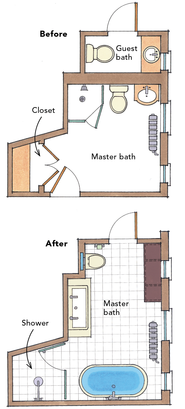
Rebecca and David’s upstairs floor plan was typical of older homes in the Chicago area, with quaint but small rooms. In a house like this, I often find that it’s helpful to combine the small, individual rooms into larger spaces. My plan included turning the second bedroom into the suite bedroom, so we could eliminate a door opening and carve some space from the existing small sitting room to create a suite-bedroom closet. I also planned to combine the former suite bathroom and the guest half-bath into one larger bathroom that would include a tub, walk-in shower, and oversize vanity.
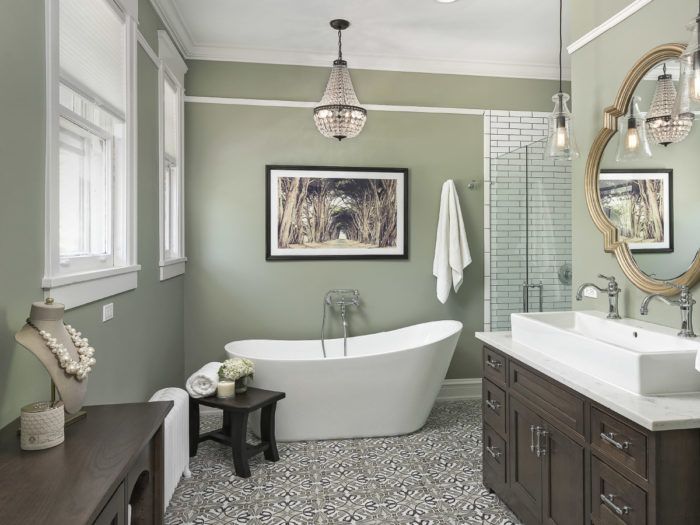
At first, Rebecca and David were hesitant to move their bedroom, but they were convinced once they reviewed the new floor plan that included everything on their wish list. We put the shower in what was originally a closet within the old suite bathroom and continued the Porcelanosa tile into the shower space without a threshold, making the space feel larger. A trench drain against the back wall adds to the seamless look. We placed the Barclay Lydia slipper tub next to the shower at the bathroom’s widest point. Aside from its sculptural, asymmetrical shape, we chose this model because, at 28-1⁄2 in. wide, it could fit through the existing door without removing
the jambs.
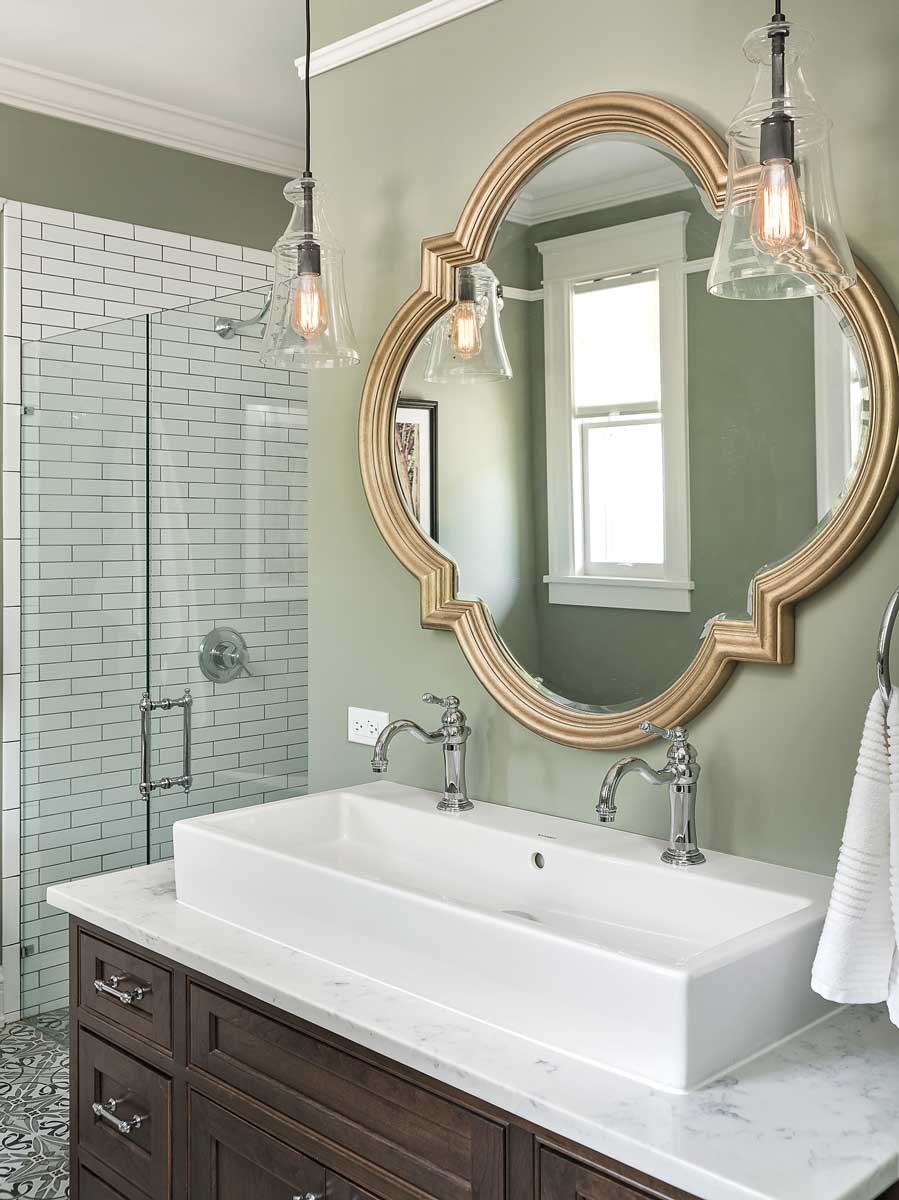
With the radiator staying where it was, the only remaining wall for the vanity wasn’t wide enough for two sinks. To make the most of the space, we used a 40-in. Duravit Vero vessel sink with two single-hole Brizo Tresa faucets. This arrangement saves at least 12 in. over a conventional double vanity. Over the sink is a mirror I found in a salvage shop.
Wall mounting saves space
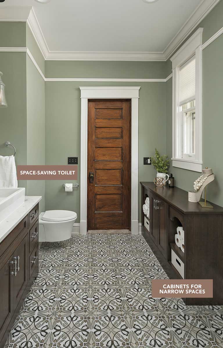
Another strategy for small baths is to use wall-hung toilets, like the Kohler Veil we used in this bath. Because the steel frame and tank (model K-18829-NA) are within the wall, we saved up to 12 in. of space in front of the toilet, allowing us to use an elongated bowl without blocking the walking path from the door. Wall-hung toilets have other benefits too: They’re easy to clean, and they allow for uninterrupted finished flooring. Opposite the toilet is a linen storage cabinet with open shelving. It matches the vanity and is made from three semicustom bookcase cabinets with a wood top. Bookcase cabinets are often 36 in., but we had this one made to match the 32-in.-high vanity.
|
Space-saving toilet. By tucking the tank inside the wall, a wall-hung toilet can save 2 sq. ft., a precious amount in a small bath. In this bath it also prevented the toilet from partially blocking the doorway, a problem in the original guest-bath layout. |
Cabinets for narrow spaces. Bookshelf cabinets, which are available in most cabinet lines, are 12 in. deep and an ideal solution for narrow spaces. This setup is made from two |
I like to have layered light in all bathrooms, both for interest and to make it easier to apply makeup and style hair. In addition to the natural light from the two windows, we installed 6-in. damp-location-rated LED can lights. The pendants on both sides of the mirror have vintage bulbs that look great in an old house, but their yellow glow gives people a sickly skin tone. With 3500K (cool white) can lights overhead, the color is more balanced. A GFCI-protected crystal chandelier over the tub creates an attractive focal point.
Dealing with the unexpected
This project went smoothly, and the contractor (Khurram Sayeed of VK Kontrakting) did a great job. The only hiccup was dealing with the old plumbing, particularly a waste line and vent stack. Remodeling around a 100-year-old cast-iron waste stack is always a concern, but we weren’t planning on complete replacement. Unfortunately, the old stack was leaking and had to go (fortunately, the rot from the leak was limited to a small area). With a bigger plumbing bill than expected, we saved money by omitting the subway tile behind the bath. With no other surprises, the project was completed on time and on budget, and two days after we finished, Rebecca and David had their baby.
One bath from twoTo create enough space for a double vanity and soaking tub, the guest bath and suite bath were combined into a single suite bath. The new space is accessed through the former guest bedroom, now the new suite bedroom. |
More details
Knobs/pulls/hinges Atlas Homewares
Counter MSI Q Premium Natural Quartz
Backsplash/surround Adex tile, TEC grout
Light Fixtures Pottery Barn Mia chandelier, Hortons Home Lighting mini pendant lights
Paint Benjamin Moore “Oil Cloth”
Danielle Burger, CKBD, owner of Kitchen Vitality Design, is an award-winning kitchen and bath designer in Charlotte, N.C. Photos by Marina Storm.
Floor-plan drawings: Martha Garstang Hill
Originally appeared in Fine Homebuilding issue #271 titled “Traditional Touch: Combining two barely
functional bathrooms gives a young family a bigger bath with classic charm.”
For extra photos beyond the print article, click here, plus click the View PDF button below to see the article as appeared in the print magazine, with more photos and information.
Fine Homebuilding Recommended Products
Fine Homebuilding receives a commission for items purchased through links on this site, including Amazon Associates and other affiliate advertising programs.

Not So Big House
Pretty Good House

Get Your House Right: Architectural Elements to Use & Avoid
