Best New Home 2018: Suburban Shift
Timeless styling with a modern twist makes this new home stand out in a post-war New England neighborhood.
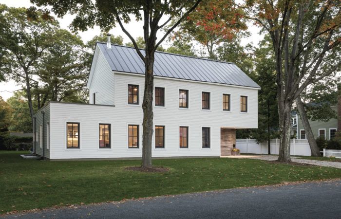
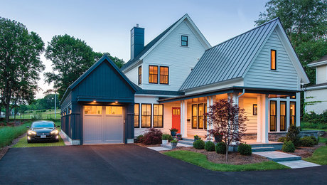
Synopsis: The 2018 Best New Home Award goes to architect Matthew O’Malia and the team at GO Logic for this traditional New England home with a modern aesthetic. The architects started with the form of a traditional cape and two-car garage, and turned the garage, added a second story, and shifted the second story over the garage to create a more modern and relevant design. The interior has a sort of hybrid floor plan—something between a traditional layout with separate rooms and a more contemporary open concept. Energy efficiency was incorporated throughout the design, with triple-pane windows, a minisplit heat pump, and an energy-recovery ventilator.
Tom Bures and Liesl Sitton realized that their South Boston apartment was getting to be too small for their growing family at the same time that a house around the block from Tom’s mother went on the market. The modest 1940s colonial wasn’t quite what they were looking for, but they couldn’t pass up the opportunity to be closer to family, so they bought it. At the time, the couple had only an inkling of the creative journey this purchase would take them on, but they knew they were determined to turn the place into a home they would love and live in for years to come.
Tom and Liesl’s initial plan was to remodel and expand the small house to give the family everything they wanted in a home. After careful consideration, though, it seemed to make more sense to raze the existing house and start from scratch with a new build. Their goal was to build something different from the surrounding colonials and Capes, but at the same time, something that would fit in with the traditional style of the neighborhood.
While searching for inspiration, Tom and Liesl stumbled upon the design/build firm GO Logic in the book Prefabulous + Almost Off the Grid. They were initially drawn to GO Logic’s minimalist take on New England architectural styles, but the firm’s experience building sustainable, high-performance homes is what won them over in the end. Once Tom and Liesl got a feel for the talent and dedication of the GO Logic architects, they knew that designing the house would present the team with a fun and creative challenge. Jokingly, Tom told them to “design a house that would win an award,” which is exactly what they did.
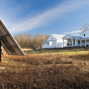
The design team’s first priority was to figure out how the house would best fit into the traditional neighborhood. They chose clapboard siding, a standing-seam gable roof, and a tidy grid of four-lite windows to give the house a decidedly New England feel. But fitting an attached garage on the narrow lot without dominating the facade would prove to be a challenge. They went through many iterations, shifting the spaces of the first and second floors until they found a streamlined solution: An unusual tandem garage flanking the right side of the house, with the L-shaped second floor shifting over the top of the garage to make it tuck neatly under a cantilevered corner. This would allow the second floor over the main house to become more slender, which would ultimately bring more light into the space and make room for more windows in the master suite above the garage.
The garage has a front and rear entrance for practicality, and repurposed barn siding that wraps across the front door makes the front opening all but disappear when it’s closed. Because the back door opens into the private backyard, it makes the rear half of the garage more flexible. In the warmer months, bikes and sports equipment take priority, but both of the family cars move inside for the winter.
Though one of the reasons for including the flat roof over the den and kitchen is to accommodate a green roof, the addition of vegetation and a rooftop deck was pushed off to a second phase of the project. The choice of a flat roof wasn’t a given from the start—gable and shed roofs were also considered—but the flat roof fit best with the modern sensibilities of the overall design, and it dovetailed nicely with the distinctive jog in the house’s facade.
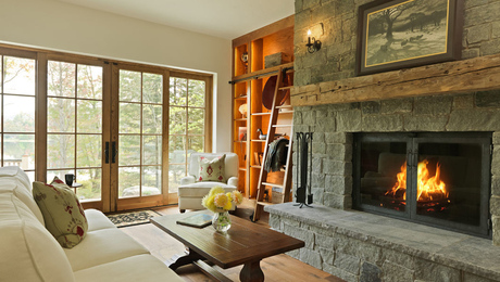
For the interior details, Tom and Liesl brought in designer and former neighbor Anthony Lee. The designer, architects, and homeowners shared the same goal of pairing natural, honest materials with a layout that complements a casual lifestyle. They settled on a sort of hybrid floor plan—something between a traditional layout with separate rooms and a more contemporary open concept. This is most evident in the living and dining areas, where the two spaces are defined by bold accent walls and changes in ceiling height, but are really extensions of one large room. The rooms feel brighter and more spacious because of this, and no square footage is wasted on separate hallways.
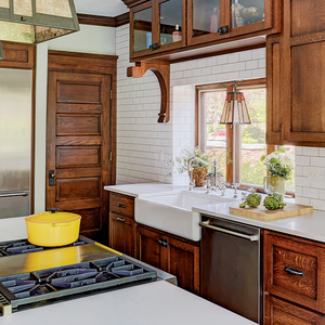
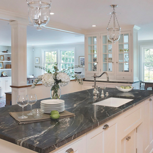
In talking with GO Logic principal architect Matthew O’Malia, Tom and Liesl embraced the idea that bedrooms don’t need to be big and complicated, and that they would get more bang for their buck investing time and money in multipurpose rooms like the kitchen and den. The couple was already on the right track with a purchase they made before the house was built: a salvaged set of cabinets that they were determined to work into the new kitchen.
Getting the most out of the den was merely a matter of designing it to meet several current and future needs. An adjacent bathroom allows it to double as a guest room. And because Tom and Liesl hope to be in the house for many years, they made sure it was private and accessible enough to possibly become the master bedroom someday.
The architects focused on integrating energy efficiency throughout the design process, basing their performance goals on the Passive House standard. Abundant triple-pane windows let in lots of light but keep precious heat from escaping. The superinsulated house gets heat and air conditioning from a Mitsubishi minisplit heat pump and fresh air from a Zehnder energy-recovery ventilator. All of these details paid off, judging from the annual heating costs of around $300.
The family says that the house is fabulous to live in. It’s always comfortable and bright, and it fits the way they live. The most unanticipated thing about it is the attention it gets. Every person that comes to the house comments on how unique it is, and people passing through the neighborhood often slow down to get a better look—some even come up and ring the bell to ask about it.
Click here for a gallery of photos of this project.
And for more photos, floor plans, and information, please click the View PDF button below.
Fine Homebuilding Recommended Products
Fine Homebuilding receives a commission for items purchased through links on this site, including Amazon Associates and other affiliate advertising programs.

Get Your House Right: Architectural Elements to Use & Avoid

Plate Level

A Field Guide to American Houses











View Comments
It looks as if the right end is going to fall off. I guess "unanticipated" attention was the idea.