Best Small Home 2018: Small House Has It All
A little house on an urban infill lot leaves room for gardens and play, and lives larger than its diminutive footprint.
Synopsis: The 2018 Best Small Home Award goes to Duncan McPherson and Margaret Chandler of Samsel Architects for designing a 816-sq.-ft. home that makes sensible use of a difficult lot. The 0.2-acre property slopes steeply away from the street, so the house was sited on the low portion of the lot to create intimate spaces for the screened porch and yard, with a simple shed roof that opens up toward the road. Because the lender was loathe to back a 500-sq.-ft. house, the homeowners upsized their plans and included a loft accessed by ladder. The article includes eight design lessons from a small house, including the use of storage solutions, durable materials, light, and bonus spaces.
When new clients Dave and Ali approached us to design a tiny house on an awkward, urban infill lot, we were excited by the challenge, but skeptical that the project would make it past the conceptual stage. They had a tight budget and a 0.2-acre parcel, which sloped steeply away from the street, and wanted to build a 500-sq.-ft. house, leaving some land for a miniature farm. After meeting Dave and Ali, we could tell they were serious and wanted professional help to create an efficient floor plan and make the most of their tricky lot.
They wanted the home to reflect their values of a simple life with less stuff, but realized the need to balance these things against the practicalities of modern living: laundry machines, computers, a TV, and amenities for entertaining friends. Their home life centered on cooking great meals, gardening, and raising chickens, and a fully functional kitchen was a must-have. Their larger design goals included lots of outdoor living space and daylight, as well as privacy.
Everything in 816 sq. ft.
The owners wanted a highly functional kitchen and a strong connection between indoor and outdoor spaces. The bathroom, laundry, and mudroom would often get their own dedicated spaces in a larger home, but were combined here to maximize the use of the available square footage.
 |
 |
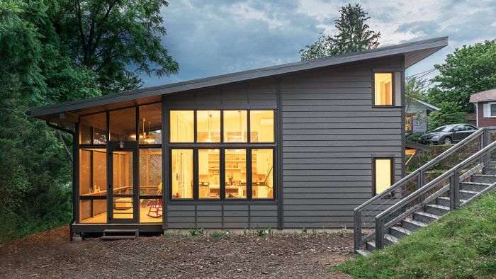
The house’s placement on the lot was critical to meeting these goals. The land is in an up-and-coming neighborhood, one block away from shops and restaurants, and came with its own set of challenges: car traffic, a steep dropoff from the road, a small buildable area, and a perennial creek at the rear. We quickly realized that the parking needed to stay tight to the street to minimize the cost of a driveway and to conserve land for other uses. Siting the house on the low portion of the lot partially screens it from the street, and creates intimate spaces for the screened porch and yard. A simple shed roof that opens up toward the road makes room for windows that bring in natural light from that side of the house. The living spaces and porch are oriented toward the private and wooded back portion of the land. With its ceiling following the plane of the roof, wall of windows, and white interior, the living space feels large and light. Terracing the gardens into the slope saved the remaining flat areas for outdoor living.
Creating functional back-of-house space was another design challenge. We settled on dedicating one room to multiple functions: laundry, bathroom, mudroom, storage, and back entry. Packing these together meant reconsidering the traditional compartments of a home. Maximizing wall space for storage and combining the floor area of spaces for circulation meant designing and considering every last inch of space. After careful assembly of this design puzzle, all of these separate functions interconnect in the space comfortably.
Eight design lessons from a small house on a sloped lot
1. Urban Privacy
Located about a block from a popular street packed with restaurants and shopping, the 0.2-acre lot has plenty of close neighbors and road traffic. Beginning on a small, flat spot next to the road, the property slopes steeply before flattening out again and backing into a treeline along a stream. The slope provided some challenges for construction, but locating the house at the bottom of the hill means the contours of the land provide a natural privacy buffer for the yard and home.
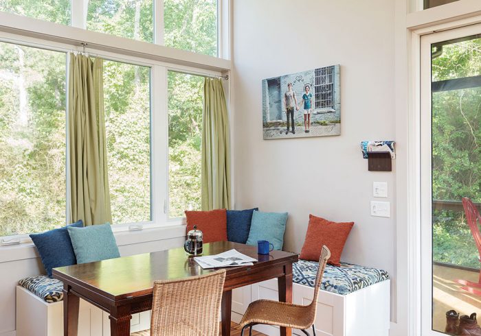
With the slope screening the house from the street, the wall of windows in the dining area flood the space with natural light without compromising privacy. Locating the living space and screen porch at the back of the home accentuates the sense of solitude.
2. Combined space
Designing areas to serve multiple functions helps maximize the space of a small home. The bathroom, laundry, and utilities, as well as a second entrance with a mudroom, are combined into a roughly 80-sq.-ft. space in the back of the house (technically the front), leaving more room for the living area where the occupants spend most of their time.
3. Light and size
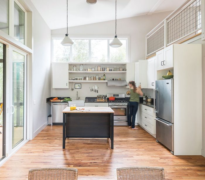
To get light into the home from the street side, a shed roof slopes up toward the street and extends vertically above it, and the space below the roof—on three sides of the loft—is filled with windows. The sloped ceiling, which follows the line of the shed roof down to the living area, combined with the white interior and natural light from all of the windows, makes the inside space feel larger. The sense of space is further extended by a window wall in the dining area that visually connects the space to the garden and yard, and a large sliding glass door that connects the living area to the 200-sq.-ft. screened porch allows the home to live a little bit larger for three seasons of the year.
4. Economy of scale
There’s often an advantage to buying in bulk; the unit cost tends to decrease as you buy more. The same is generally true of homes—as the square footage increases, the cost per square foot goes down. There’s no economy of scale when you
build small, but one way to pare the cost per square foot is to build up rather than out, since site work and foundations generally cost more per square foot than framing lumber and sheet goods. Bumping up the roof to make room for a habitable loft of more than 200 sq. ft. added little extra cost to this home.
5. Storage solutions
The bedroom has two closets for clothes, and a hatch to access the crawlspace, which holds seasonally used items. Ikea cabinetry wraps around two walls of the kitchen, which also has a small island with shelf space. Shelves and a closet in the multifunctional bathroom/laundry room/mudroom provide additional capacity. The owners also designed a dining bench that has storage inside.
6. Durable materials
Fiber-cement siding and a metal roof contribute to the home’s simple, modern aesthetic, as well as the overall durability of the exterior. Both can endure years of weather and sun with minimal maintenance.
7. Bonus spaces
The loft was not part of the owners’ original plan, and it was used very infrequently when they first moved in. They spent much of their time on the screened porch, a 200-sq.-ft. space that allows the home to live significantly larger for at least three seasons of the year. Once the owners had a baby, though, the loft became critical for the home to continue to work for the family. The baby took over the bedroom, and the owners moved their bed to the loft.
8. Slope solutions
Terracing gardens into the existing slope and locating parking above the house and adjacent to the street helps to maximize the usability and privacy of the lot’s rear flat area for play. A second entryway, facing the street, opens into a combined bathroom, laundry, and mudroom—a solution that left more space for the living area and bedroom.
There was one hiccup—and it’s a lesson for anyone who wants a tiny home: the lender was loath to back a 500-sq.-ft. house. To secure financing, Dave and Ali had to upsize their plans. We were able to adjust the roofline and massing of the house to add 300 sq. ft., including a habitable loft of more than 200 sq. ft., without adding much to the construction costs. The loft, accessed by a ladder, became critical for the house to meet Dave and Ali’s needs when their family suddenly grew by one. The baby took over the bedroom, and Dave and Ali moved their bed into the loft.
The construction budget was such that every stick of wood was considered. One problem inherent in small homes is the economy of scale; the cost per square foot for small homes is typically higher than for larger homes. We worked with the builder during the design phase to talk through the best assemblies and most cost-effective material options. We settled on a conventional framing system on a crawlspace foundation, which provided tight but much-needed storage space. We minimized constructed corners and maximized connectivity from inside spaces to the screened porch. This inside-outside connection allows the house to live larger for at least three seasons of the year.
Energy efficiency was also a priority, and spray-foam insulation was used to create a tight building envelope. The small-house design is perfect for a minisplit heating and cooling system with two wall units, one in the living area and one in the bedroom. A ceiling fan in the living area and an exhaust fan in the bathroom help circulate the conditioned air throughout the house. Simple interior finishes and Ikea cabinets helped keep costs down, while fiber-cement siding and a metal roof bring durability to the exterior.
Living larger
The screened porch connects to the living area, allowing the home to expand in the warmer seasons. The porch and views through it give the house a strong connection to the outside space, and the porch’s location at the back of the home provides privacy.
SPECS
Bedrooms: 1
Bathrooms: 1
Size: 816 sq. ft.
Cost: $204 per sq. ft.
Completed: 2015
Location: asheville, n.C.
Architect: Samsel architects, samselarchitects.com
Builder: Beach Hensley Homes
Borrowers beware
Wanting a simple life with less stuff, the owners had their hearts set on a 500-sq.-ft. home. This goal was upended by the realities of the lending industry, and provides a lesson for anyone who wants a tiny home. Lenders typically rely on the values of comparable homes nearby—known as “comparables” or “comps”—when making loan decisions, and there was nothing in the neighborhood that was similar to what the owners wanted. To secure financing, the owners had to upsize their plans.
Adjusting the footprint and bumping up the roof of the house allowed for the inclusion of a more than 200-sq.-ft. habitable loft and increased the overall size by about 300 sq. ft. without adding much to the construction costs. A ladder off the dining area accesses the loft, as a full stair would have taken up too much floor area.
—Duncan McPherson is a principal architect with Samsel Architects in Asheville, N.C.
Photos by Todd Crawford.
Drawings: Trevor Johnston.
Floor-plan drawings: Patrick Welsh.
For more photos, floor plans, and information, please click the View PDF button below — and also click here for a slideshow featuring this home.
From Fine Homebuilding #275


