Designing Double-Hung Windows
Follow these design guidelines to create a unified window composition.

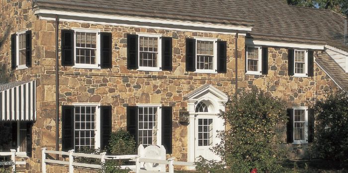
Designed well, windows balance the architecture of a house by maintaining a unified composition. Typically, there will be three layers in this composition: the primary windows in the main rooms of the first floor; the secondary windows, mostly in bedrooms on the second floor; and the tertiary windows in bathrooms and in the kitchen.
Primary windows on the first floor are typically 3 ft. or 2 ft. 8 in. wide, though height can vary. Secondary windows are based on a proportional relationship to the primary windows. If local code requirements for bedroom egress on the second floor limit your possibilities, keep the window widths aligned from floor to floor and increase the height as necessary to meet code. Here are some rules of thumb and design guidelines for creating a window package that works.
Primary and secondary windows
Traditional homes are designed within a proportional system. A typical point of departure is to set the primary windows at a 2:1 ratio of height to width. In a 6-over-6 window, for example, this will result in a golden rectangle (1:1.618) in the lite areas. For the secondary windows, maintain the width of the units, but reduce the height so that the overall dimension of the unit becomes a golden rectangle. This creates hierarchy through the height, but unity in the width.


Keep hierarchy intact
Avoid window combinations in which the lites in the primary floor are smaller than the lites in the secondary floor. While this creates differentiation, it works against the hierarchy of the home as well as the unity of the design. The smaller lites look cluttered while the larger lites, even in a smaller window, feel more important.
 |
 |
Use a cottage window
Another way to gain hierarchy while maintaining unity is to use a 6-over-6 window on the second floor and a cottage window on the first floor. This grows the height while keeping the lite size and proportion fixed. While this design looks great, in most cases it requires custom windows to execute.
 |
 |
Don’t forget the doors
Glazing proportioning does not end at the windows. The glazing proportions in front doors and garage doors should relate within your overall compositional system. While it can be difficult to match your proportioning system exactly between manufacturers and elements, making an effort to get as close as possible goes a long way toward unifying your overall composition.

Combining windows widths
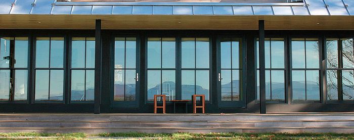
Your design may call for windows of different widths on the same floor, perhaps ganged together or combined in bays. In these cases, keep the width of the lites the same, while varying the overall opening size. Avoid stretching out or compressing the lites of windows that are ganged together.

Avoid transoms
Transoms are rarely available in sizes that are proportionally related to the overall design, and as a result they detract from the hierarchy of the composition. Instead, use a taller window in the same opening to get more light into the room. If you must have transoms, use them above doors.
For architectural drawings of these features, please click the View PDF button below.


