Updating Midcentury Modern
Three remodels evoke the spirit and staying power of modernist design.
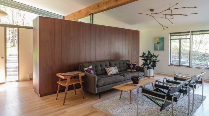
Synopsis: Architect Katie Flynn uses three case studies—the Mid Mod Eichler House in San Francisco, the William Landsberg House on Long Island, and the Peacock Farm House in Massachusetts—to outline the features of midcentury-modern design and describe the important considerations for maintaining the style when updating midcentury-modern structures. Midcentury-modern architecture features natural materials, low-slung roofs, modest scale, clean lines, open floor plans, and extensive glass, and the article gives examples of these features in the three case studies. It also features a section on energy performance and updating midcentury-modern houses with better building technology, including insulation details and new assemblies that meet current energy and structural codes.
From architecture to furniture to appliances, midcentury modernism is having a “moment” in the spotlight. At its inception during the first half of the 20th century, the modernist design movement saw architects re-evaluating stylistic expression, exploring concepts around society and community-building, and adopting new approaches to construction. They believed that architecture should be free from nostalgia and should reflect the spirit of the time in which it is built.
Midcentury-modern homes began appearing in the 1950s as the first broad-market realization of the modernist ethos in America—thanks, in part, to a group of expatriate European architects working primarily in New England, Chicago, and California following World War II. Among those pioneers were architects Walter Gropius, Marcel Breuer, and Ludwig Mies van der Rohe, whose work helped shape what have become telltale elements of the style: exposed structure, natural materials, low-slung roofs, modest scale, clean lines, open floor plans, extensive glass, and omission of fussy ornamentation. Those very features can present challenges when it comes to updating midcentury-modern homes to 21st-century standards of structural integrity and energy performance while also supporting contemporary lifestyles. But they are worth preserving and improving upon—not just because the style is trending, but also because these houses reflect the deeper spirit of modernism, which demonstrates a kind of freshness and optimism still relevant today.
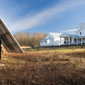
At Hisel Flynn Architects, we adhere to the fundamental tenets of the modernist movement. For more than 20 years, principal Dan Hisel has specialized in contemporary renovations of older homes. We find that successful updates to midcentury-modern homes are achieved by applying best practices, embracing new technologies, and employing careful design strategies—all of which was at play at the Peacock Farm House, where we reconfigured the entry, main living area, and office to enhance the home’s functionality while improving its energy performance. Similarly, Stephen Moser Architect’s renovation of the historic William Landsberg House included opening up the centermost space to improve flow, and expanding the master bath—here, too, window upgrades were integral to the design program. At the Mid Mod Eichler House, Klopf Architecture addressed the cramped family quarters by adding a guest room and an office, and reworking the bathrooms and storage spaces. All three remodels point to our belief as designers that the midcentury-modern style is worth preserving. Our shared goal is to respect the original house, improve its performance, and balance the budget.
Minimal ornamentation and modest materials
By the time modernism had flourished in suburban America, minimalism was well established as a native language. Theorists like Adolf Loos, who declared, “ornament is crime,” and practitioners such as Le Corbusier and Philip Johnson, rebuked traditional ornamentation in favor of a cleaner, “machined” aesthetic. White interiors, strategic pops of color, crisp detailing, glassy facades, bare materials, and an overall absence of decoration became the standard. In midcentury-modern homes, walls, floors, and ceilings meet head-on—without fussy trim or moldings to cover up imperfections. Windows and doors are detailed with plaster returns, or they run tight from floor to ceiling. Simple plywood paneling on ceilings and walls is common, and exposed roof decking is intended to be ornamental in and of itself. Exterior details are similarly understated, with a materials palette typically consisting of concrete, tongue-and-groove cedar, plywood, brick, and stone. The elemental components of the building’s structure are its visual allure. Building on rather than detracting from these qualities should be a primary goal of contemporary architects and builders.
Interior/exterior connections that don’t bleed energy
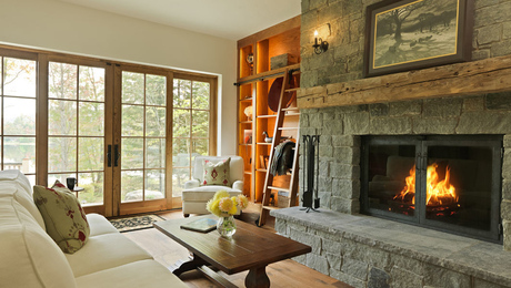
Early modernism came on the heels of the Industrial Revolution—a time when dark, polluted, and crowded conditions were ubiquitous. As modernism took root, its founders imagined a future full of light, fresh air, and open spaces. When the movement came to the United States, it merged with American ideas about the relationship between humans and nature set forth by thinkers like Muir and Thoreau. It also responded to post-war policies and economic trends, which led to the development of suburban communities as families migrated out of cities and into the environs beyond. These factors resulted in midcentury-modern homes that prioritized connections between inside and outside, such as living spaces oriented toward the surrounding landscape. This was achieved, in part, by using much more glass than had been the custom.
However, these original expanses of glass pose technical challenges today, when energy efficiency is often a high priority. Original midcentury window and glass-door assemblies are typically steel-framed units or field-glazed windows—all single-paned and without thermal breaks. These windows, while featuring sightlines that maximize views, perform poorly in terms of energy efficiency. Such units need reglazing or replacing—even in temperate climates—in order to achieve thermal comfort, much less meet current energy standards.
Today’s architects and builders have a number of options for upgrading windows and glass doors. At the highest end, specialty manufacturers make steel-framed windows and doors that feature midcentury-style sightlines with double- or even triple-paned insulated glass. Many manufacturers, such as Arcadia and LaCantina, also offer large-format door assemblies with a range of options and high-performance glass. Although such assemblies were not available half a century ago, their integration into midcentury homes complements the original objective of connecting interior spaces to the landscape.
Of course, midmarket solutions are more cost-effective. For direct-set units, custom insulated glass units (IGUs) can be field-glazed into modified wood frames. This strategy mimics midcentury detailing almost exactly, and IGUs can be sized to fit existing openings. For operable units, many popular window manufacturers offer aluminum-clad windows. Although their frames are typically chunkier than original midcentury steel windows, their clean detailing, minimal maintenance requirements, and reasonable price point make them attractive alternatives.
Minimal style without minimized comfort
By the middle of the 20th century, developments in building technology enabled structures to be taller and lighter. Residential architecture echoed this trend with simple framing and exposed structural members. The slender, lightweight assemblies common among midcentury homes often fail to meet today’s structural codes. They almost always pose challenges when it comes to insulation retrofits, as wall and roof cavities are too slim to achieve the R-values required by today’s energy codes, even with high-performance insulation materials.
A range of approaches can be taken. At a minimum, when opened up, existing assemblies must be filled with insulation, and new assemblies must meet current energy and structural codes. But in order to maintain the effect of exposed structure and slim assemblies, creativity is required. At the Peacock Farm House, the clients had added 3 in. of rigid-foam insulation (R-12) to the top of the original roof assembly, so we did the same to the addition. But to reach the required R-49, we also added closed-cell spray foam between the addition’s 2×8 rafters, which, in order to meet structural code, we installed at 12 in. on center rather than the standard 16. The combination of closed-cell spray foam and rigid-foam insulation reached R-57, exceeding the required R-value.
For details and floorplans on three case studies, please click the View PDF button below.
