Kreiger Residence Design-Build
Jon Ackley-Jelinek, founder of Third Coast Design Co. explains the rationale behind this Sears & Roebuck-inspired home.
Q. What is the backstory of this project?
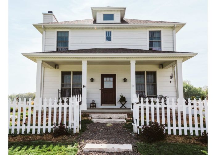
The clients wanted to build a new home on land that has been in the husband’s family for generations. It’s located in a largely agricultural area of Northwest Indiana, about 45 miles from Chicago. Though the property has been subdivided to meet zoning requirements, his parents and grandmother still live within a few hundred yards of where the new home would stand. The goal was to build a house that would fit in well with the bucolic surroundings. It also needed to be modest in scale yet roomy enough to host extended family members.
Q. What was it about the Sears & Roebuck home that the clients liked and wanted to emulate?
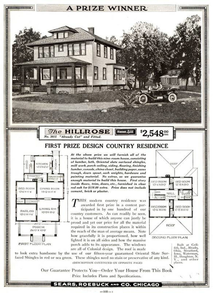
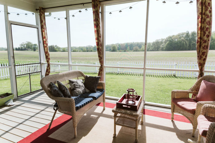
After visiting a replica of the Hillrose House at Prophetstown State Park, they fell in love with the style and basic layout. The simple exterior of the American Foursquare was in line with their tastes, and they were drawn to the traditional floor plan, which features first-floor rooms and spaces that are separated but linked by a central circulation path. That is actually something we accentuated by modifying the layout slightly to allow a sightline from the front door to the rear screened porch.
Q. How else did you alter the Hillrose design to fit the homeowners’ needs?
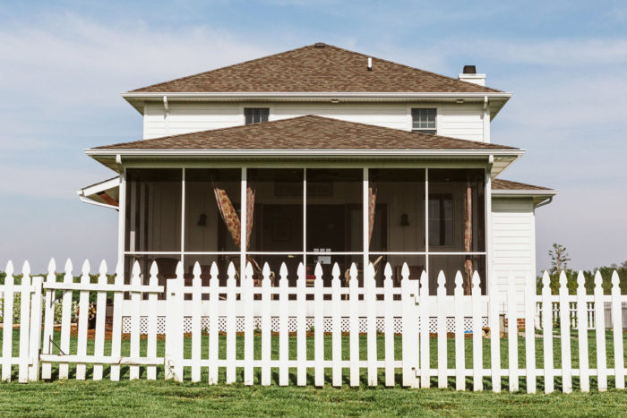
By tweaking the configuration of the main floor we were able to preserve the overall look and feel of the Hillrose, while also accommodating a guest suite with a bathroom that would serve as the primary first-floor bath. We also added a generous screened porch off the rear of the kitchen that would allow for modern-day outdoor living without compromising the traditional aesthetic. On the second floor we eliminated a bedroom to make room for a master bath and closet, and we saved a bit of space by omitting a closet in one of the bedrooms, which was going to be used as a home office.
Q. In what kinds of cases are closed rooms preferable to an open-concept floor plan?
I think the preference for open-concept plans over the past two decades—and their perceived desirability over the alternative—is due to the belief that more casual living means less defined spaces. The reality is the way in which we live in a space has more to do with who we are and how we like our built environment to feel and function. The open-concept arrangement is largely built on the idea of family units enjoying life in close proximity—preparing meals in the kitchen while the kids do homework at the island, for example. Yet I hear clients grow frustrated when the kitchen is a mess as a result of this one-room-for-everything idea. By adopting a more traditional approach to how rooms relate to one another, we allow families to have more control over their environment. In this home there are plenty of sightlines and framed vignettes to visually connect the different spaces without it feeling like one gymnasium-size room.
Q. What was the goal of the kitchen design?
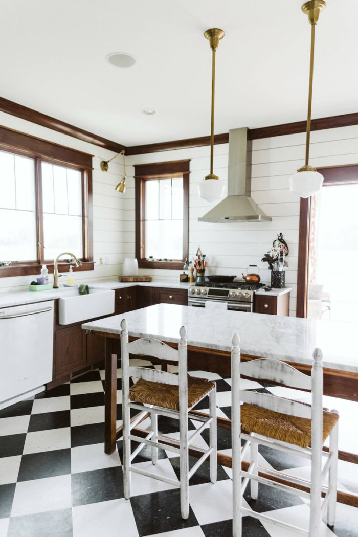
We wanted to employ constraint in the main space and allow for ample overflow into the adjoining pantry. By eliminating wall cabinets we were able to maximize the amount of natural light coming through the full-sized windows. The absence of wall cabinets also gives lighting fixtures, base cabinet hardware, and other decorative elements more play as points of visual interest. The walk-in pantry with its pass-through to the dining room is ultra-functional, as it provides easy access to the goods and cooking utensils on the open shelves. By including a small prep sink, coffee maker, and microwave it also expands the kitchen’s work space.
Q. Which of your design choices keep this home from feeling dated?
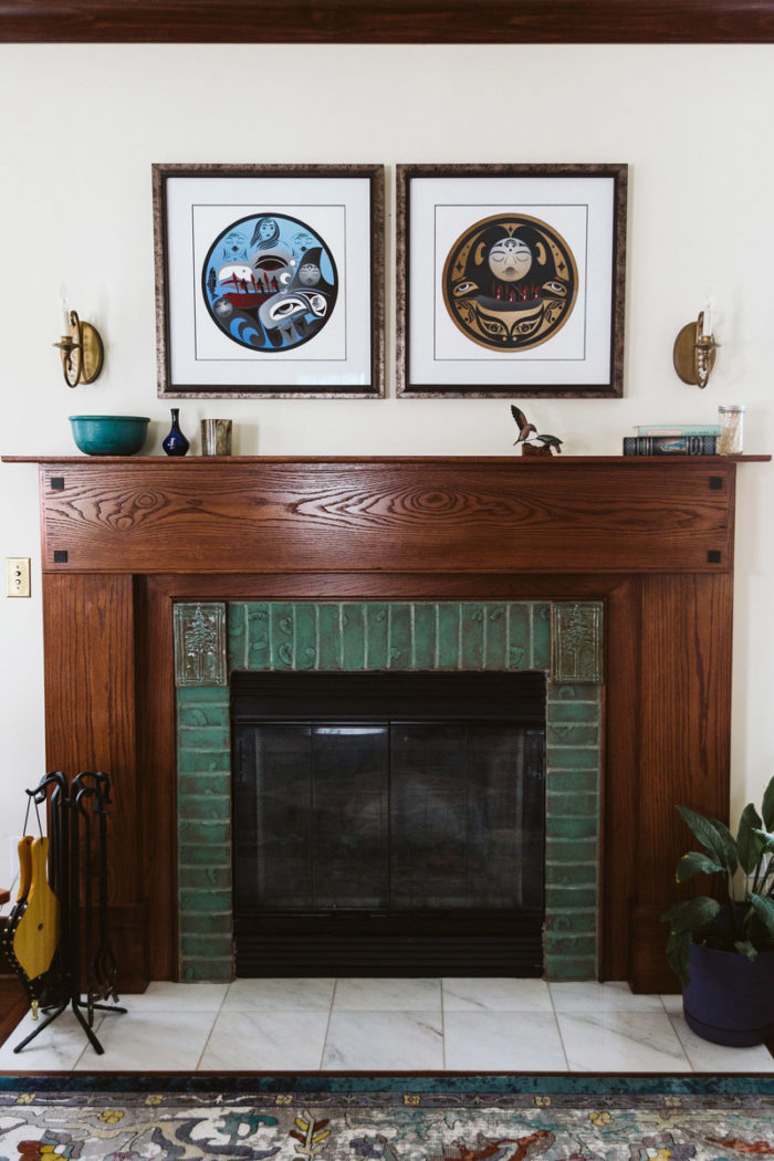
Because the design is based on the timeless American Foursquare we didn’t bind ourselves to something that would feel outdated in the next decade or two. By selecting interior finishes, such as dark-stained oak millwork, black-and-white floor tiles, woven rugs, and brass fixtures/hardware that speak to the early 20th century—when the Sears & Roebuck home was built—we expect the home to transcend trends.
Number of bedrooms and baths: 3 bd/3ba
Square footage: 2267
Project completion: 2016
Location: Valparaiso, Indiana
Photos courtesy of Jon Ackley-Jelinek/Third Coast Design Co.
Fine Homebuilding Recommended Products
Fine Homebuilding receives a commission for items purchased through links on this site, including Amazon Associates and other affiliate advertising programs.

A Field Guide to American Houses

Musings of an Energy Nerd: Toward an Energy-Efficient Home

Get Your House Right: Architectural Elements to Use & Avoid
