The Saari-Leonard Residence
Working with a capped budget, Duo Dickinson modernizes a midcentury ranch-style home.
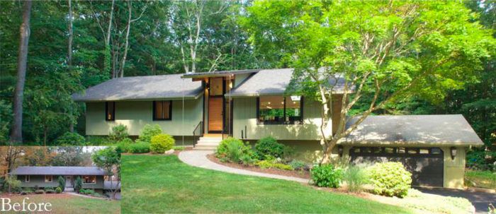
When Christine Saari and David Leonard contacted architect Duo Dickinson to remodel their classic 1950s raised ranch in Guilford, Conn., they had a few ideas of their own in mind. First, they wanted to brighten the house with natural light. While they appreciated the look of the exceptionally deep eaves that characterized the house, they recognized the major role the eaves were playing in blocking light from reaching the interiors. Additionally, the south-facing gable end of the home was entirely devoid of windows, which they viewed as a missed opportunity. Second on the list of priorities was creating an open floor plan and raising the living room level, which they described as “a deathtrap” for toddlers.
Collaborating with builder Keith Knickerbocker, the team came up with a plan that would maximize the fixed budget. Unfortunately, once demolition got underway, it was discovered that a new roof was imperative—a further strain on the already restricted budget. Areas of compromise were identified as the work unfolded.
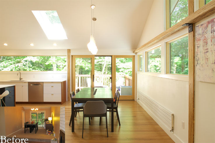
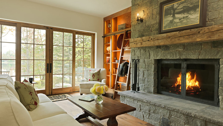
To start, they pulled back the eaves and removed all of the walls on the living-room side of the house, making way for a grid of beams and columns. In addition to shortening the eaves, an expanse of glass was added at the gable-end wall. Today, there is an abundance of natural light, particularly in the winter months, which has significantly elevated the mood of the main living space.
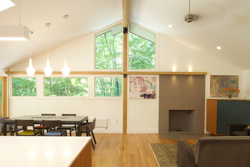
To raise the level of the living-room floor, they added solid 2x lumber blocking over the existing floor, followed by a plywood subfloor and clear white-oak flooring. This eliminated the issues associated with a dropped living/entry area, and it provided a completely open floor plan that improved circulation between the previously cramped and disconnected rooms.
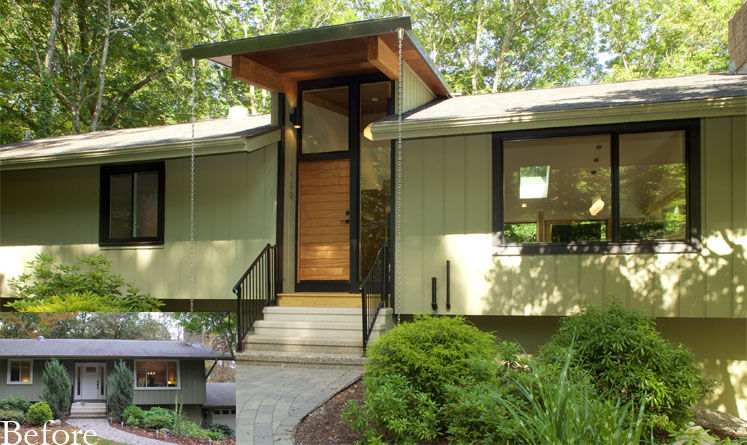
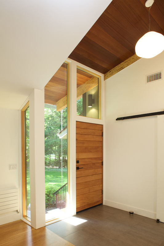
The entry was a key component. Using the same opening, they flipped the stair to more ideally connect the lower and upper floors. (The lower level was left largely untouched, with the exception of a new baluster for the stair.) Dimensional lumber was used to infill between the two new engineered lumber beams, which serve as expressive brackets supporting the infill roof framing. This treatment was chosen over the more conventional use of SIPs to make for a lighter angle. They also used PVC for durable fascias. The overhang with gutter and rain chains makes the new entry a dramatic focal point.
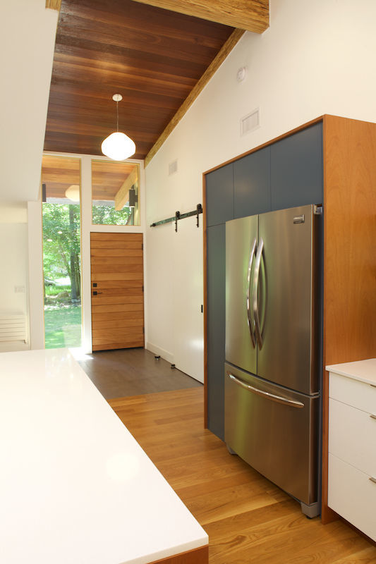
Originally, Duo envisioned the interior ceiling of the dormer entry in finished plywood. While Christine and David liked the idea in theory, in practice the use of another wood species ran the risk of busying the space. In the end, they went with solid mahogany to mirror the kitchen.
Though Christine and David were in favor of Duo’s design idea to address the entry stair, they viewed it as the logical feature to omit when the budget became too tight for comfort. They looked for less expensive options, but in the end decided to leave it for another day.
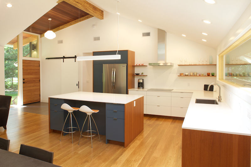
They saved in the kitchen, too. With the exception of the quartz composite counters, rough plumbing, and electric work, it was a DIY project. They opted for stock cabinetry and open, mahogany-veneer shelves, which are a great cost-efficient alternative to upper cabinets. Of note is the custom-painted island—its end panels are finished in the same mahogany-veneer plywood, pointing to the couple’s affinity for midcentury-modern design.
While solving the problems that Christine and David presented, the design also allows for the possibility of a finished basement to accommodate the family as the kids grow and their needs change.
For budget-savvy remodeling projects, check out
