An Elegant New Kitchen in a Narrow Old Space
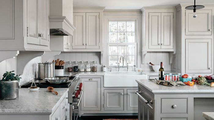
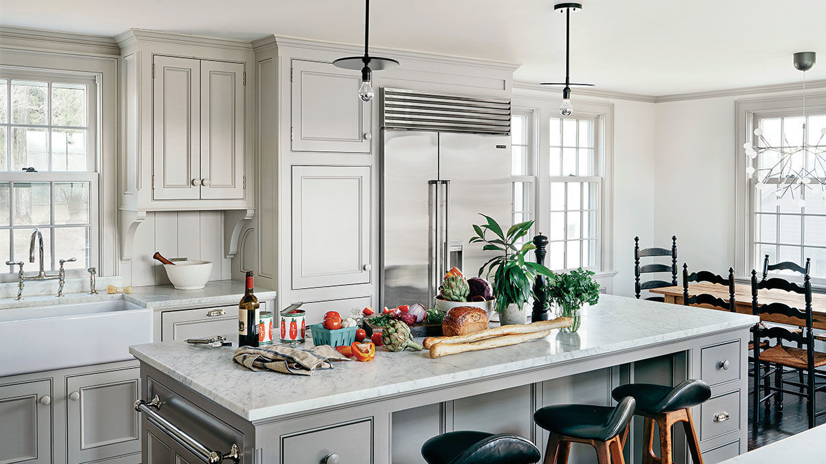
Designers Hendricks Churchill and builder Seth Churchill skillfully expanded an existing ell addition to make room for new cabinets, a kitchen island, and a casual dining space.

The goal of this remodel was to accommodate a full kitchen with 36-in. appliances, a coffee station, a three-seat island, and a generous breakfast table—all in a narrow 14-ft. by 23-ft. space, an existing low-ceiling ell addition to an 1820s house. Hendricks Churchill, LLC, raised the ceiling by 10 in. in order to increase headroom, add windows, and optimize views. To do this, they removed the existing second-floor framing, cross-braced the side walls for stability, and framed the new floor system, which was built using LVLs in place of conventional joists; the stronger LVLs allow for a more compact assembly. The joists were hung from an LVL ledger board that was through-bolted to the existing timber-frame structure.
To work within the room’s narrow rectangular shape, the kitchen and breakfast area were designed as separate spaces at opposite ends of the open floor plan. Because the breakfast table is the primary dining table, it needed to have plenty of room around it for everyday use. Therefore, the island was reduced in size, which also allowed for an additional lower cabinet behind the stools.
“ The finished kitchen relates nicely to the existing historic details of the house, while providing an efficient use of space for modern living.”—Rafe Churchill, Hendricks Churchill, LLC
- Designer: Hendricks Churchill, LLC, hendrickschurchill.com
- Builder: Seth Churchill, churchillbuildingcompany.com
- Project location: Sharon, Conn.
- Photos: Amanda Kirkpatrick, courtesy of Hendricks Churchill, LLC
Fine Homebuilding Recommended Products
Fine Homebuilding receives a commission for items purchased through links on this site, including Amazon Associates and other affiliate advertising programs.

Homebody: A Guide to Creating Spaces You Never Want to Leave

All New Kitchen Ideas that Work

A House Needs to Breathe...Or Does It?: An Introduction to Building Science


View Comments
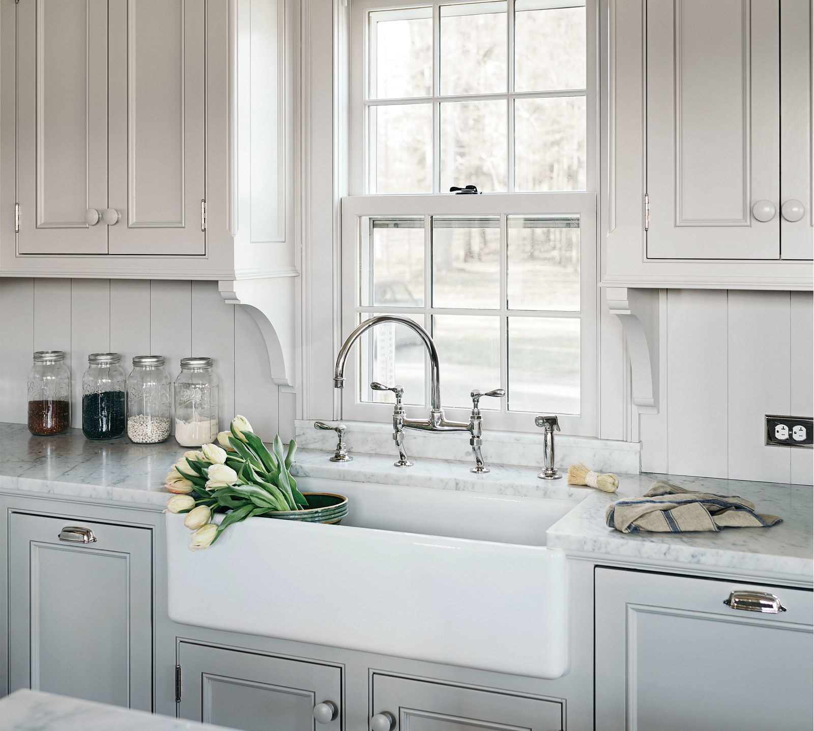
I will admit that this kitchen by Hendricks Churchill, LLC was beautiful. It was, therefore, all the more odd to see undersized brackets (or corbels) used to “support” the upper cabinets. These corbels have the appearance of an afterthought by a designer (or homeowner) that felt they could cram one more detail into an already detail-laden design.
The irony is that this kitchen article is immediately followed by an article by the always-excellent Marianne Cussato on good vs. bad design. Sadly, the Hendricks Churchill kitchen is a case study (in one regard) of exactly what to AVOID when designing a kitchen: the use of inappropriate, undersized corbels. I’m sure the designer was thrilled that their project was featured on the cover, but those “afterthought” corbels stand out like a sore thumb. Ouch!
Too bad Hendricks Churchill didn’t read Marianne Cussato‘s article before designing this project.
If these brackets are "undersized" I shudder to think what the commentator would consider to be appropriately sized.