Kitchen Design 101
Answering 7 questions helps this architect create a great kitchen floor plan and choose the right materials and fixtures.
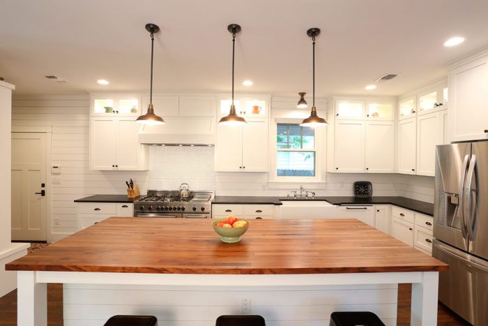
To design this kitchen to meet the family’s expectations, I asked a handful of questions right off the bat. The answers help me determine exactly how to design the floor plan, and what materials and fixtures to use.
Question 1: What will the pedestrian circulation need to be like?
Answer: Uncomplicated
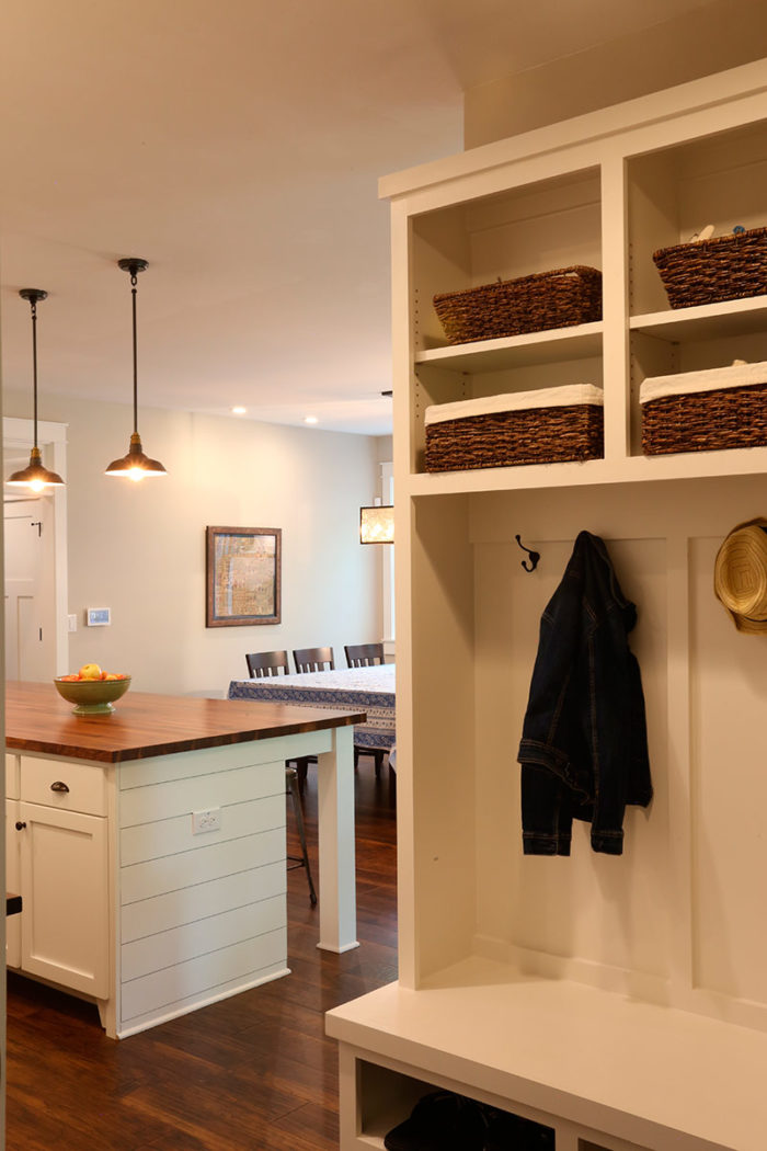
For a busy family of five, easy movement in and out of the kitchen is critical. A one-way-in, one-way-out arrangement was not an option here. The family moves through the kitchen in multiple ways. With every bedroom save the guest room located upstairs, the route between the kitchen and the stairs is well-traveled. So we knew early on that the kitchen shouldn’t be too far from the stairwell. And we planned it so the route between the garage and the kitchen would include a walk-in pantry and a drop zone/mudroom with built-in bench, storage cubbies, and hooks for coats and backpacks. Trips between the backyard and the kitchen are frequent, so it made sense to locate the kitchen close to the back porch. Lastly, flow from the living and dining areas was a top priority, so we went with an open-concept design.
Question 2: Just how open should it be?
Answer: As open as possible given the constraints
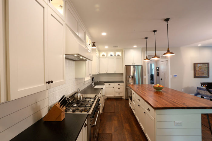
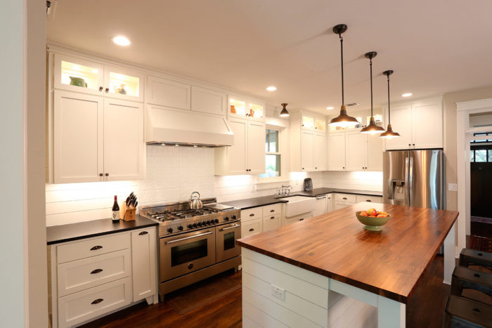
In the homeowners’ previous kitchen, there was only one way to enter—from the living/dining room. For their new home, they wanted more than one entry point. Given the shape of the lot, the kitchen needed to be a narrow rectangle. That meant there would be two main walls for the cabinets, sink, and appliances. On one of the long walls we were able to accommodate plenty of cabinetry and sizable work areas next to the sink and next to the range. On a short wall we added additional cabinets and tucked the refrigerator away at the end of a run. The layout is very open, yet the fridge, pantry, and mudroom were kept from plain sight.
Question 3: Does an island make sense?
Answer: Undoubtedly
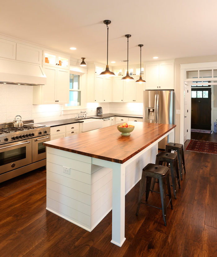
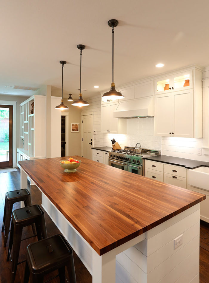
This one is used daily for coffee, snacks, and quick meals. It also serves as a desktop for things like homework. Having the countertop all on one level is key if you want a flexible, uninterrupted surface area. A 16-in.-deep recess for the bar stools means they tuck in nicely, and shoes are kept from scuffing the painted woodwork when they are in use. The work-zone side of the island affords extra cabinet storage that includes a sturdy pullout shelf. There is also a microwave drawer, which saves valuable upper cabinet space.
Question 4: Are there views to capture?
Answer: Nothing scenic, but there are daylighting opportunities
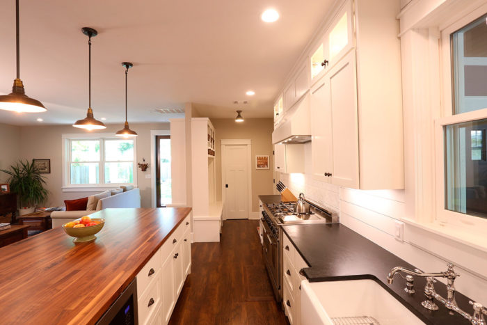
The house is located in a charming central Austin neighborhood developed in the 1930s. Neighboring residences flank the homeowners’ house, so a scenic view from the kitchen was not possible. The window at the sink lets in daylight and looks out toward the carport. From the kitchen, you can see out the large windows in the dining and living rooms. While they aren’t distant views, they do bring in additional daylight, and when standing at the island, both the side yard and the backyard are visible. Lastly, with the kitchen “on display,” as is common with open layouts, it was important that the view back into the kitchen from the living and dining rooms be pleasing.
Question 5: What appliances are needed?
Answer: Double oven, fridge, dishwasher, and microwave
The big splurge was the 48-in.-wide range with two ovens and multiple burners in a footprint just over a foot wider than a standard single-oven range. (Built-in wall ovens were not a good option for this kitchen since wall space was limited.) The homeowners saved money by forfeiting an expensive built-in refrigerator, and they saved storage space by nixing a counter-depth slide-in fridge, opting instead for a deeper slide-in model. We put the refrigerator in a spot where it’s easily accessed, but tucked away enough that people aren’t interfering with meal prep. A dishwasher and microwave were musts, but the family was not concerned with having a warming drawer, wine chiller, or built-in coffee maker, which they view as luxury items that would have occupied precious space.
Question 6: Where should the pantry go?
Answer: Preferably in the kitchen
Unfortunately, it didn’t work to put the pantry in the kitchen as was the original hope, but we got as close as we could. It is located mere steps from both the garage and the kitchen, yet it’s mostly out of sight. In a perfect world, we would have added some counter space right outside the pantry door to have a handy spot to set things down when coming in from the car. As it is, the island serves this purpose, along with the mudroom bench. A larger or less-open kitchen design might have afforded a pantry cabinet for everyday items in the kitchen proper; this is called a “ready pantry” because it supplements a walk-in pantry.
Question 7: What style are you after?
Answer: Craftsman with a twist
The house is Craftsman style, so the kitchen needed to be in that vein, with a touch of farmhouse-casual mixed in. White Shaker cabinets and shiplap siding help to accomplish that. An apron-front farmhouse sink and a pressed-tin backsplash further the feel. The homeowners weren’t after high-gloss polished counters; they went with soapstone for its durability and for the patina it acquires over time. The beautiful island top made from laminated strips of Texas black walnut is arguably the pièce de résistance, and upper glass-front cabinets showcase some of the items in the owners’ art collection.
For more on these seven questions and how their answers drive kitchen design, see my full article, “Kitchen Questions,” in this year’s issue of Kitchens & Baths.
More from FineHomebuilding.com:
- HOUSES by Design: Layout a Home for Family Living
- Creative Solution for a Corner Cabinet
- Getting the Most From a Kitchen Island
Fine Homebuilding Recommended Products
Fine Homebuilding receives a commission for items purchased through links on this site, including Amazon Associates and other affiliate advertising programs.

Not So Big House
Homebody: A Guide to Creating Spaces You Never Want to Leave

Musings of an Energy Nerd: Toward an Energy-Efficient Home







View Comments
Good job on Kitchens & Baths 2018, especially this article, "Kitchen Design 101".
Thanks for using a different kitchen for the "Kitchen Questions" version of this article in issue 279.
I also liked "Kitchen Islands - Practical Makes Perfect".
Why not say "open floor plan" instead of "open-concept design?" Some of the TV shows use the latter, too. It sounds awkward.
Very nice
Amazing larger or less-open kitchen design!