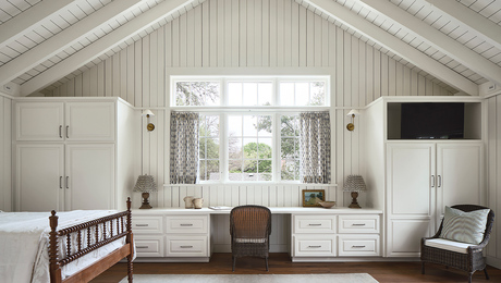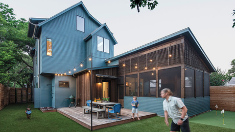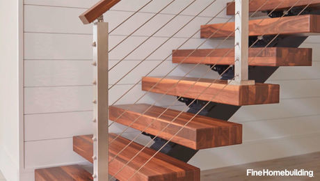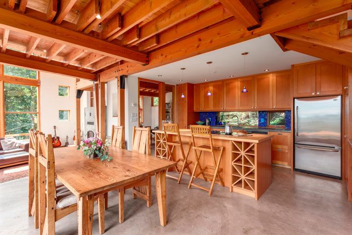
Ceilings can be a missed opportunity. In fact, they often are. Regularly referred to as “the fifth wall,” they are typically uninterrupted planes—a kind of blank canvas, so to speak. As such, they are rife with possibility. “There are so many ways to accentuate a room by using the ceiling as a focal point,” says architect James Tuer, who believes that ceilings require as much thought as floor plans. He uses them to articulate a room’s shape, scale, and proportions; to divide and define spaces; to enhance a design concept; and to overcome design challenges.
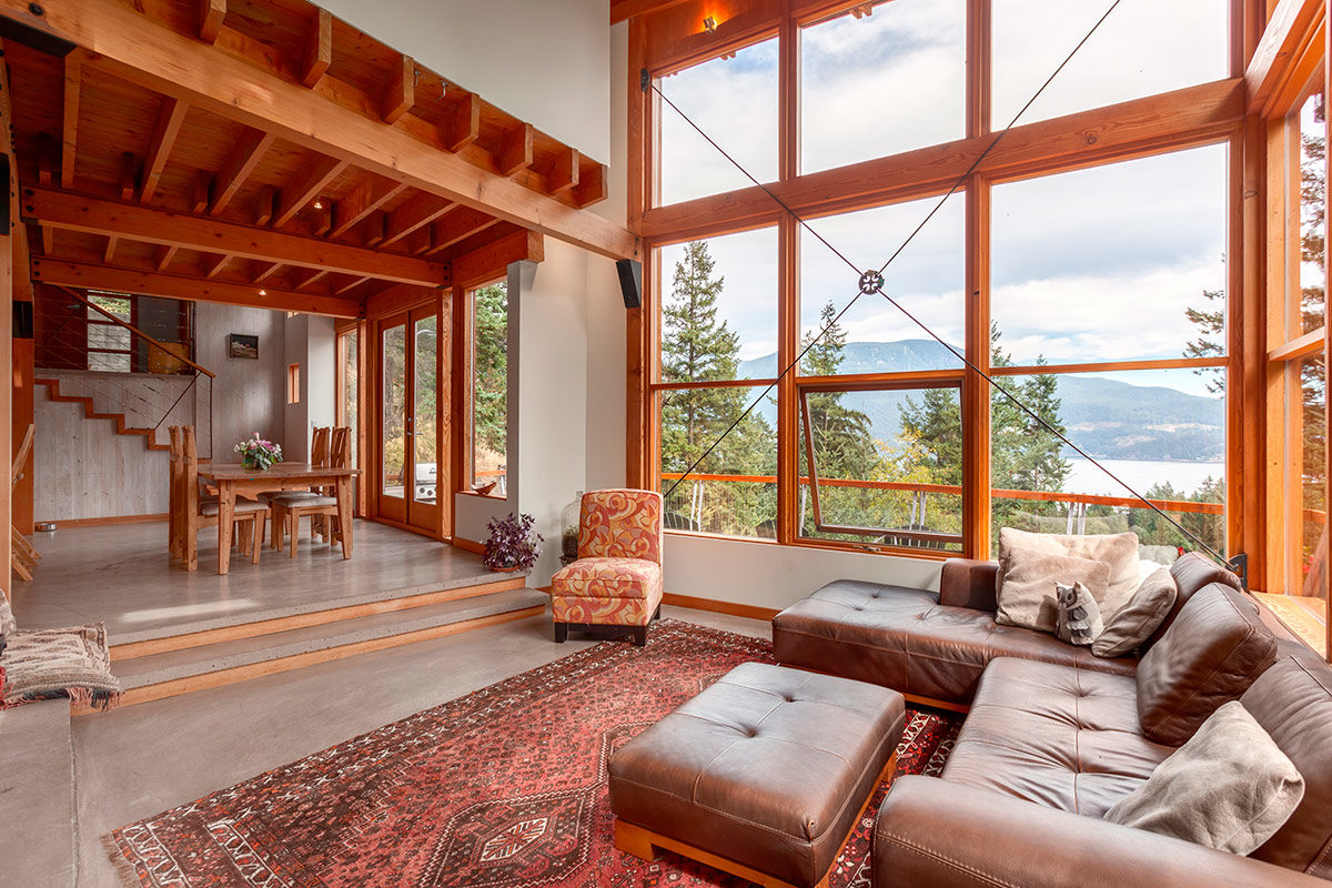
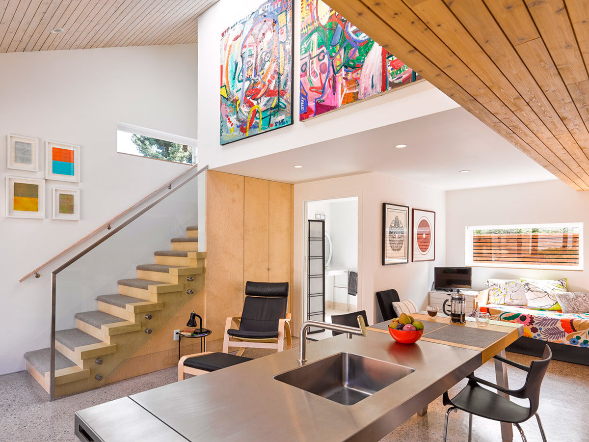
“Ceilings can be used to help establish the home’s flow and function,” notes Tuer, adding that ceiling heights can be delineated using “compression” and “expansion,” which are expressed by juxtaposing high and low ceilings in the same room.
Impactful ceilings add depth by opening, delineating, and breathing life into spaces. They can amplify acoustics or help with soundproofing. Ceilings can be used to frame views and capture natural light. It’s worth noting, too, that ceilings don’t need to be static. While horizontal planes suggest repose, and vertical planes lend stability, the introduction of curves and diagonals creates a sense of motion. Ceilings can be coffered, barrel-vaulted, domed, or coved. There are tray ceilings, panel-and-beam ceilings, and those that feature open plenums. All of this is to say that there is a lot to work with, designwise.
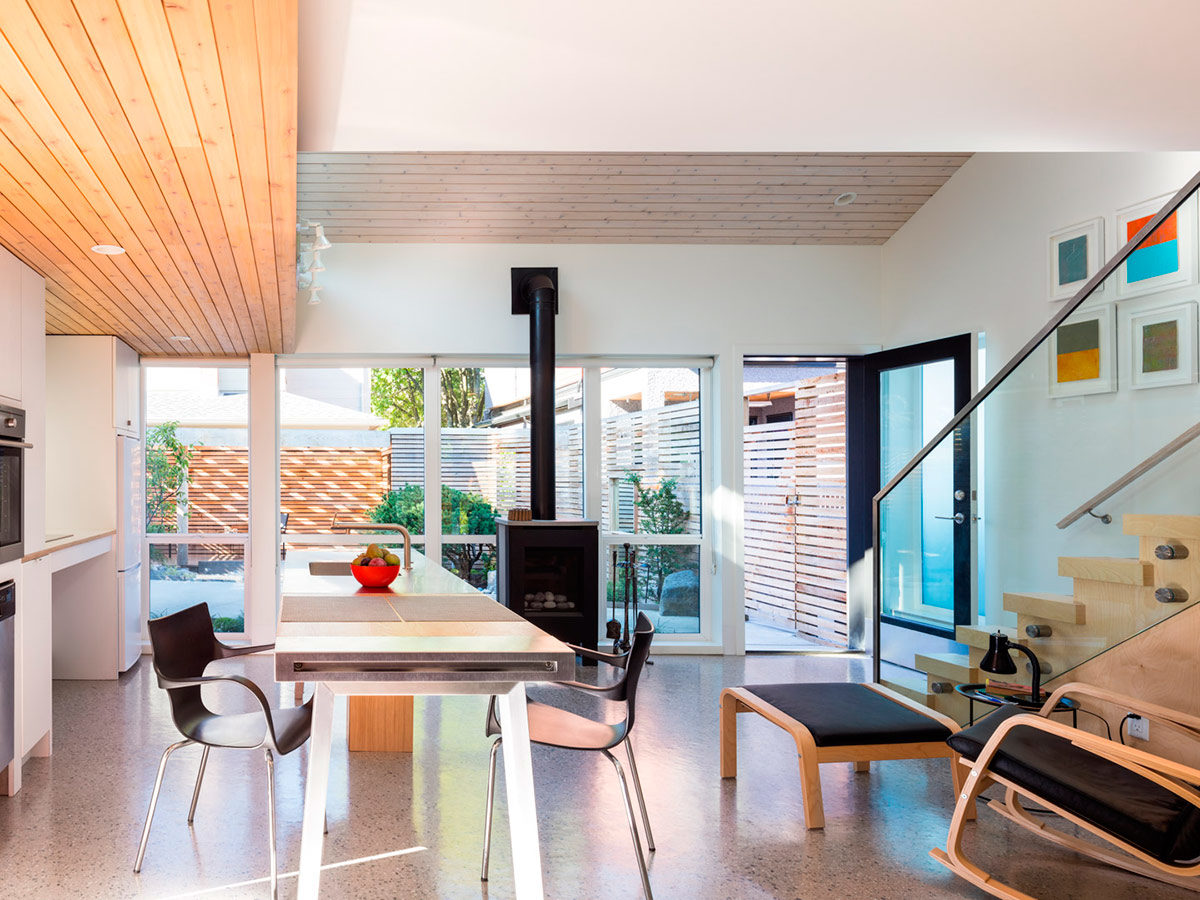
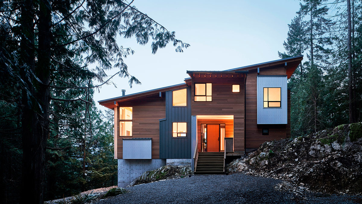
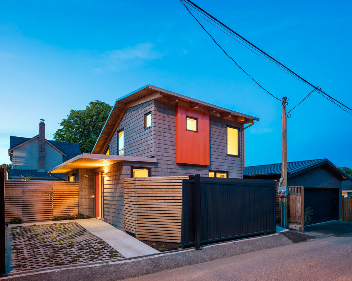
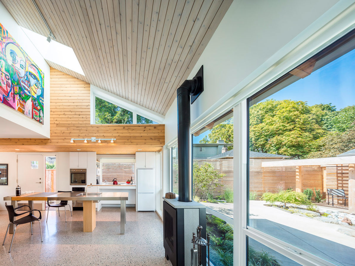
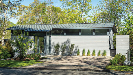
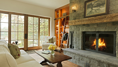
This project illustrates different approaches to ceiling heights and materials. The primary mass is a rectangle with a shed roof that follows the slope topography of the site. The ceiling heights were calculated and tested in section and with 3-D models to ensure clearance for the stair. It was also important not to get too tall with the ceilings or they would feel “cartoonish.”
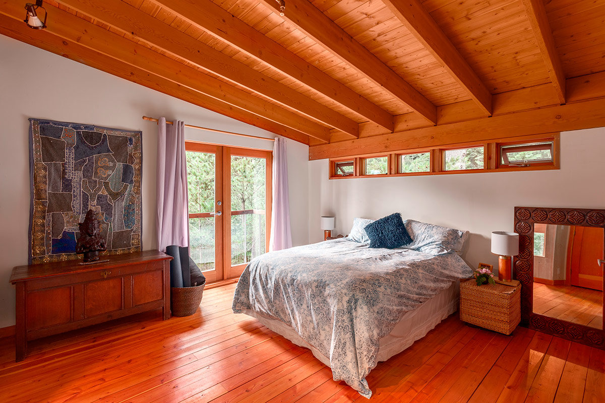
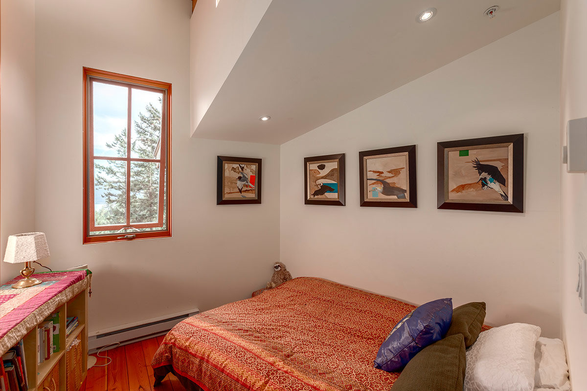
Double rafters over the living room were used to make the long spans and to create an interesting pattern. Tuer staggered the joists over the dining room and used 2×6 blocking so the light would bounce off the ceiling. In the smallest bedroom, he went with drywall to create a clean nook with a good task-lighting plane.
This Vancouver project meant working with particularly restrictive zoning regulations, which allowed for two stories but required that the highest point of the roof be no more than 20 ft. above the average grade around the house. Hence the low-pitch roof. Tuer used skylights upstairs in key places, such as the shower and the landing, to make the ceilings feel higher. Above the galley-style kitchen, which is the same height as the covered-entry soffits, he opted to drop the ceiling.
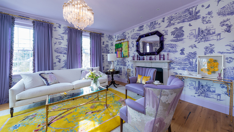
Among Tuer’s list of considerations when designing a ceiling are: (1) how to relate it to the house style, (2) existing elements/factors that will inform the height/s, (2) when to change materials within a ceiling plane, (3) whether vented or nonvented is the way to go, and (4) how to work with the rooflines. He also looks for opportunities to be creative. In some cases, he might extend the ceiling to meet exterior soffits for fluid visual connection. Uplighting from both the floor plane and other horizontal surfaces is yet another way to play up the ceiling, as is the use of color, which can work in harmony with molding to create the illusion of distinct spaces in a single room.
Tuer sees a more poetic side to ceilings, too. “When I approach the design of a house, I think like a storyteller. And ceilings are an essential tool for telling a story. I use them to create intrigue and surprise.”
Photos by Andrew Latreille, courtesy of JWT Architecture
For more on ceilings:
- Comfortable Cathedral Ceilings
- Ceiling Remodel: From Flat to Cathedral
- Add Character With a Box-Beam Ceiling
Fine Homebuilding Recommended Products
Fine Homebuilding receives a commission for items purchased through links on this site, including Amazon Associates and other affiliate advertising programs.

All New Kitchen Ideas that Work

Graphic Guide to Frame Construction

Not So Big House
