New Old Camp in the Adirondacks
A dated lake cottage inspires a hardworking house rich in sentimental charm.
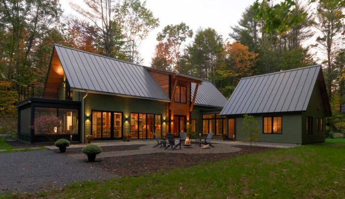
Completed in the spring of 2018, this 2775-sq.-ft. home is located in the town of Lake Luzerne in the Adirondack Park and is the result of a collaboration between homeowners Jeanine and Ron Pastore, architect Brett Balzer of Balzer & Tuck Architecture, and Jim Sasko, principal of Teakwood Builders.
For three generations, Jeanine’s family spent summers enjoying the lake “camp” that occupied the wooded lot. Her grandfather had built the place, so there were decades of memories associated with it. Letting it go wasn’t an easy decision.
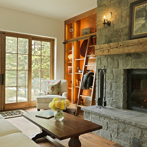
“The camp had reached the point of no return,” says Brett. “There were structural failures and moisture-related issues. Renovating it wasn’t an option, so they approached us with a request to demolish it and build new.” The goal was to design a highly functional camp that would house and entertain many generations to come. It needed to work on a number of levels, and it had to pay homage to its predecessor. Jeanine and Ron also wanted it to occupy a similar footprint. Other priorities included bigger rooms, higher ceilings, and an upgraded/retrofitted woodstove, which had been the centerpiece of the old camp and “an important relic.”
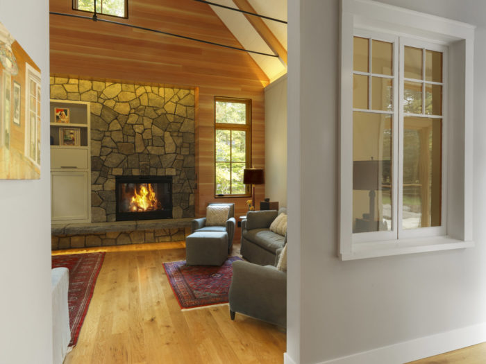
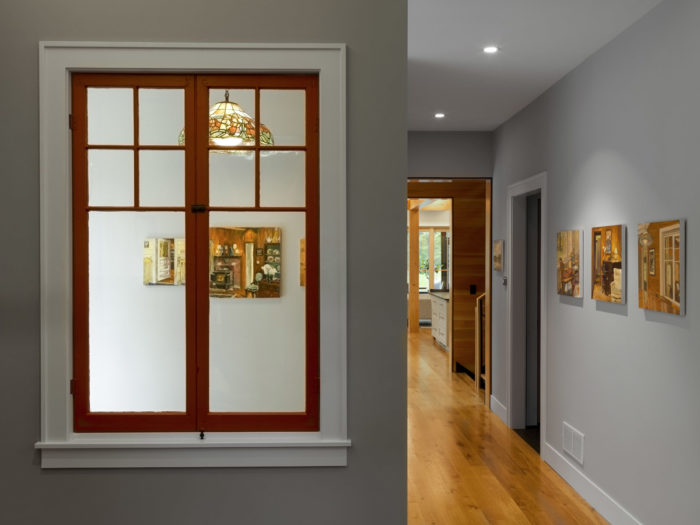
The team studied the existing house as they planned the new one. They wanted to re-create its “quintessential Adirondack lake cottage” charm. Jeanine, an artist, requested a mix of painted walls (for displaying artwork) and natural Douglas-fir walls, as well as fir beams and rafters, which were all treated in a clear stain to lend warmth to the rooms. The window frames were clear-coated rather than painted for the same reason. “Those were cues taken from the original camp,” notes Brett. “We wanted to have that warm feel of undressed timber.” They also left the floor-joist system exposed over the kitchen and dining area—a nod to the original camp’s rafters.
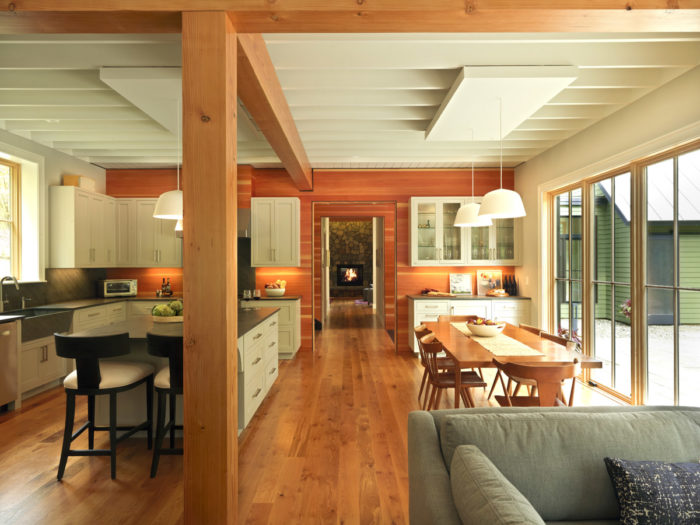
Jim describes that part of the program as something of a puzzle. Above the kitchen and dining area are two bedrooms, a closet, and a bathroom. “We thought the bathroom couldn’t be above open joists,” he says, explaining that the solution was to shift the bathroom fixtures around so they would all be up against the stairwell wall, where they could hide the shower and sink drain lines. All of the plumbing goes down a thickened 2×6 wall. For the shower drain, they put in a trap and designed the upper kitchen cabinets to mask it. “It was good to capture all of that on paper,” notes Jim. “We saw that the stove would be on the same wall as the trap, so we needed to ensure that the stove wouldn’t move. It’s ducted up and out and is hidden behind those same upper cabinets.”
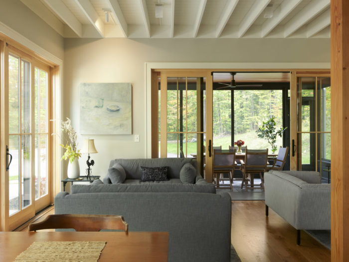
Jim also notes their handling of the floor system. Originally, the design called for a thin layer of edge-and-center bead for the upper decking of the exposed ceiling. Instead, they increased it to 3/4 in. and laid a built-up floor on top of that, resulting in an extra-thick floor across the exposed structure. That helped when putting in hardwood flooring nails—they had plenty of stable material to nail through.
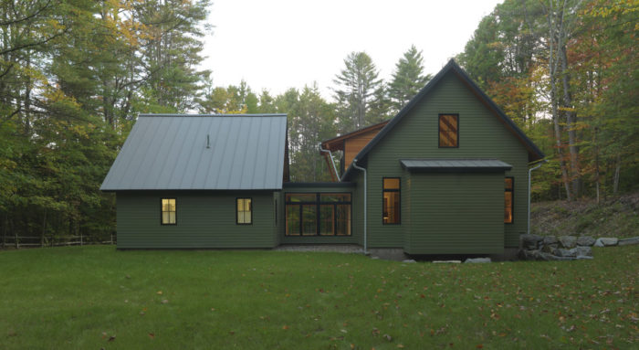
Other puzzle pieces included the site itself. The original house was tucked up close to the edge of the woods at the base of a hill, which meant runoff ran straight to the foundation. When rebuilding, Jeanine and Ron were desperate to get away from that hill. “But as we worked through the design,” Brett recalls, “we kept pushing the new house back toward the hill. It became a mental hurdle that everyone needed to get over. We knew that we could build next to or into the hill and keep water out. Putting the house back there would allow us to open up the site for a courtyard.” The solution included a foundation-wall waterproofing system with a fluid-applied membrane to protect the concrete. A drainage mat was installed over the surface to relieve any hydrostatic pressure while allowing water to move along the wall to a new foundation drain, which then directs the water to a remote drywell. They also put in a stone drainage swell along the entire length of the house. Plus, half-round Galvalume gutters capture and redirect all of the roof runoff before it reaches the rear of the house.
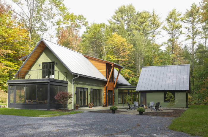
Given the ways in which the property is used, the courtyard was key. Ron describes the town as something of a “hippie commune.” Multiple generations of families have grown up in the area, and everybody walks into everyone else’s homes. “It’s the kind of place where doors are never locked and where afternoon gatherings turn into evening meals turn into wine by the fire,” notes Brett. That communal lifestyle figured heavily into the design of the indoor-outdoor connection. The doors to the kitchen and dining area all open to the courtyard to accommodate space for large-group gatherings.
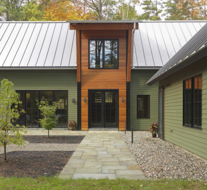
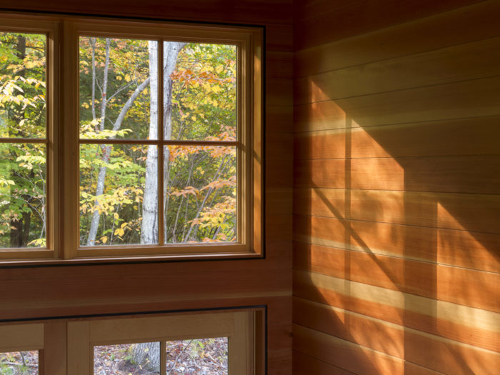
Another important element was the entry; the challenge was to indicate it without overdoing it. They wanted a bit of protection and to introduce the timber that would feature throughout the house. “The big move there was to get the height for the stair once you get inside,” explains Brett, adding that the stair hall receives nice warm light that plays along the walls—something the homeowners have come to love. “The irony is that they didn’t want a staircase on display,” says Brett. “But it became the element that stitched everything together between the public and private spaces.”
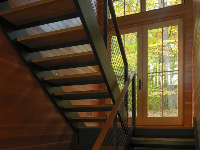
The stair is poised to be inviting for another reason, too. Off the midlevel landing, a set of doors will eventually open onto a bridge leading to Jeanine’s Japanese tea house–inspired art studio, which will be tucked into the hillside.
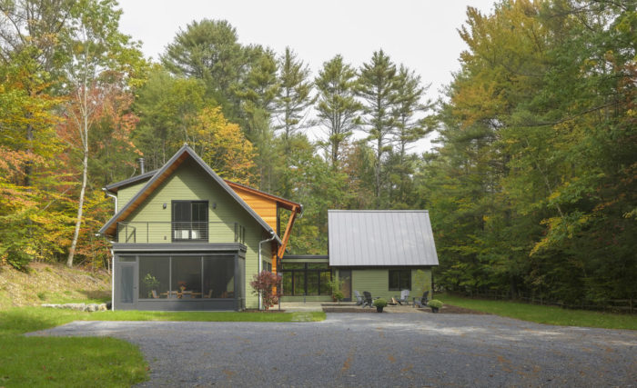
Improved functionality makes this new camp a well-used, well-loved place. In fact, family members find themselves spending more time there than they had at the previous house. But it’s the fact that the old camp’s spirit persists that makes it really special. “Visitors often say that it feels like the old camp,” Brett muses. “That’s the nicest compliment we could get.”
Photos by Susan Teare
For more cabin retreats:
Fine Homebuilding Recommended Products
Fine Homebuilding receives a commission for items purchased through links on this site, including Amazon Associates and other affiliate advertising programs.

Affordable IR Camera

Reliable Crimp Connectors

Handy Heat Gun










View Comments
This new 'camp' may be judged on it's merits, but there seems to be little reason to believe it somehow evokes an undoubtedly more modest bit of vernacular architecture.
Must visit! It seems very quiet and calm place.
Thank you for featuring Teakwood Builders in this post. We would be thrilled if you would feature another one of our projects on your upcoming blog posts. Below is the link to our online portfolio of projects. If you are interested in any photos, we can send you a high resolution version for you to feature on your website.
https://www.teakwoodbuilders.com/portfolio-and-showcase-of-homes/