Arts and Crafts Meets Modernism
This high-performance house embraces local materials, modern lines, and the craftsman’s hand.
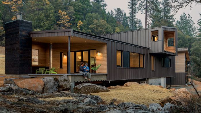
Synopsis: In the third and final article surrounding the Fine Homebuilding House: California 2018 build, designer Mela Breen describes the finished floor plan and interior design. The house is oriented to connect the indoors to the outdoors, and includes a covered breezeway with outdoor shower and a porch with a fireplace. The kitchen has a mix of cabinetry types and styles and includes an island with a raised bar, while the bathrooms are designed to be low maintenance. The article includes a detailed floor plan and a list of products used in the home’s assembly and interior design.
The DNA of the Fine Homebuilding House (or “Good Haus” as we’re calling it) is established by the steep and rocky hillside that spills down onto a small neighboring foothill meadow. The site’s limited buildable footprint, seasonal drainage concerns, and an inviting flat outcrop of granite drove the initial design. My own DNA, though, informs the aesthetic.
I am the child of craftspeople, and my rural upbringing is embedded in me like the red dirt of the Sierra Foothills. I like handmade things and local materials. I believe buildings need to connect and respond to the landscapes we build in. Yet I am drawn to the clean lines of modernism and the illusion of simplicity that relies on rigorous craft and thoughtful detailing. Designing and building our own house was an opportunity to explore finding the balance and harmony between the three intersecting areas of our work: the handmade (and maybe somewhat “imperfect”) house, modern architectural forms, and a commitment to high-performance building standards.
Balancing performance and appearance
I start designing around an intellectual idea so that there is a thread of a story that I can come back to throughout the process. In our case, the idea was the notion of design and high performance being inextricably tied together and overlapping each other—hence the two rectangles intersecting over the main mechanical core and balancing on each other.
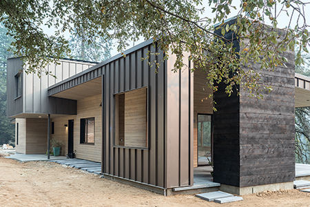
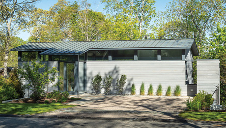
The primary rectangle is the long, south-facing first floor. At the west end, a deep porch protects the house from overheating, bridges the seasonal drainage, and links the open floor plan to the landscape with a large outdoor living space. The second-floor rectangle runs perpendicular to the main living space and cantilevers to create a covered north entry, while a balcony on the south side cantilevers toward the nearby treetops.
To underscore the architectural volumes, I chose standing-seam metal roofing by Bridger Steel that turns down onto the walls as cladding. Because the same material is used on both roof and walls, the eye doesn’t separate the two planes; the intersecting rectangles are therefore reinforced. I used the metal on the sides that are most exposed to the weather. In places that are more protected, however, I used cedar siding that my father had milled for us from his property. The wood beneath the deep north overhangs provides a “softness” in those locations where we will be moving around the outside of the building.
From Fine Homebuilding #281
To view the entire article, please click the View PDF button below.
Plus, read about the energy-efficiency details used in the design of this house:
On the Way to Net Zero
Fine Homebuilding Recommended Products
Fine Homebuilding receives a commission for items purchased through links on this site, including Amazon Associates and other affiliate advertising programs.

Graphic Guide to Frame Construction

All New Bathroom Ideas that Work
The New Carbon Architecture: Building to Cool the Climate




View Comments
Well done!! great work
I really like it!!
Love it!!
Good job!
Too good!