Kitchen Renovation—From Concept to Completion
Designer John Kelsey explains his firm’s approach to renovating this dated and awkward kitchen.
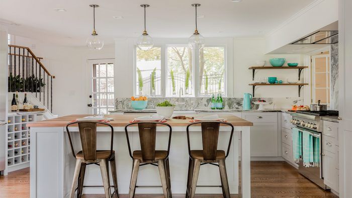
During a recent scroll through LinkedIn, I came across a bathroom-remodel project by Wilson Kelsey Design. The way John Kelsey and Sally Wilson detailed the design process and illustrated it with sketches and renderings put me in mind to invite John to contribute a guest blog post, which is what follows.
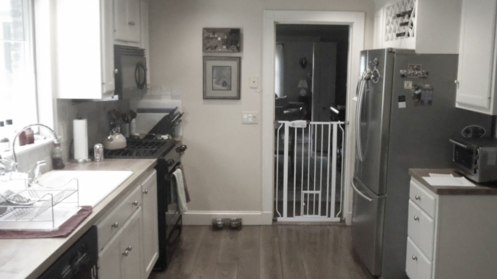
As is typical of most older New England homes, the existing kitchen of this 1920s Colonial, located on Boston’s South Shore, was small and tucked away in a back corner. With an awkward mid-1970s addition on one side of the kitchen and load-bearing or exterior walls around the rest of the room, we had limited options for expansion. Yet, that was exactly what the client wanted.
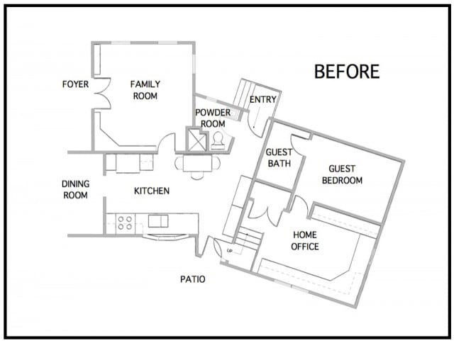
Let’s take a look at the design challenges we faced:
We always start a project by asking, “Where’s the pain? Where does it hurt the most? What are your biggest problems and fears?” Some of our clients’ issues and concerns may be familiar to you:
- The kitchen is too small and the kids play in the basement. How do we get them upstairs?
- The kitchen is too dark. Can we have more daylight?
- The kitchen is isolated. How can it be connected to the rest of the house?
- There’s nowhere to entertain. Can we create a kitchen where friends and family are entertained comfortably?
- The ceilings are low. Can anything be done about that?
- The circulation is lousy. Can we get major circulation paths out of the kitchen?
- There’s not enough storage.
- There’s no coat closet by the kitchen door.
- An existing chimney seems to limit design options and possibilities. Is there anything we can do to make it work?
With our preliminary plans we try to solve functionality problems first. This establishes the basic design intent. For this project, we brought a contractor on board early in the design process to help evaluate the costs of various design concepts. After budget reviews, we agreed to do three things:
- Take out the wall between the kitchen and the den.
- Eliminate the powder room. (It was redundant given there was a rarely used guest bathroom nearby.)
- Open up the wall between the kitchen and the underutilized home office, converting it into the kids’ playroom.
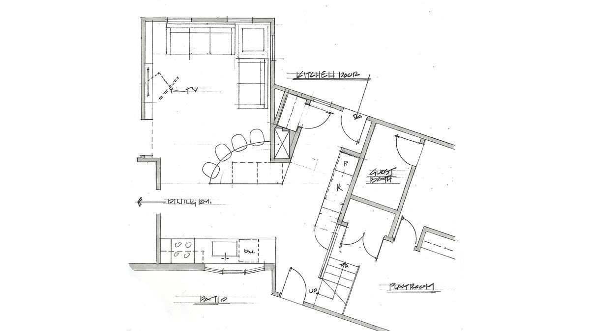
We went through multiple iterations of plans to reach the final solution. In our initial schemes, we tried to work around the chimney and the door between the kitchen and underused formal dining room. In this early scheme, we added a closet/storage by the kitchen door and created a funky island that engaged the old chimney. But the lousy circulation remained unresolved and the kitchen was too spread out.
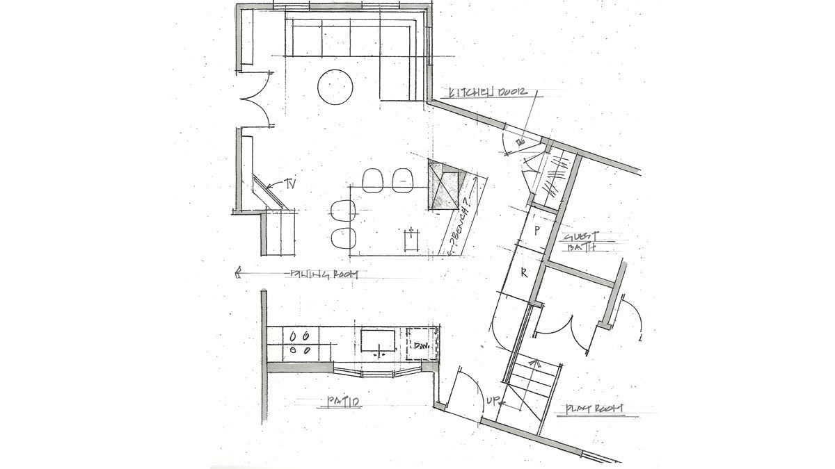
Here you can see how we “cheated” the island a little closer to the rest of the kitchen, and brought the kitchen to the island with a prep sink. By reworking the kitchen door, we were able to move the closet and create circulation around the entire island. It was better, but not good enough. We still had circulation coming through the work triangle in the kitchen, and the island still felt like it was in no man’s land, plus the chimney just looked weird in the middle of all that open space.
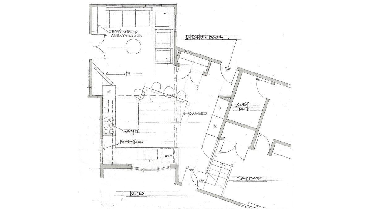
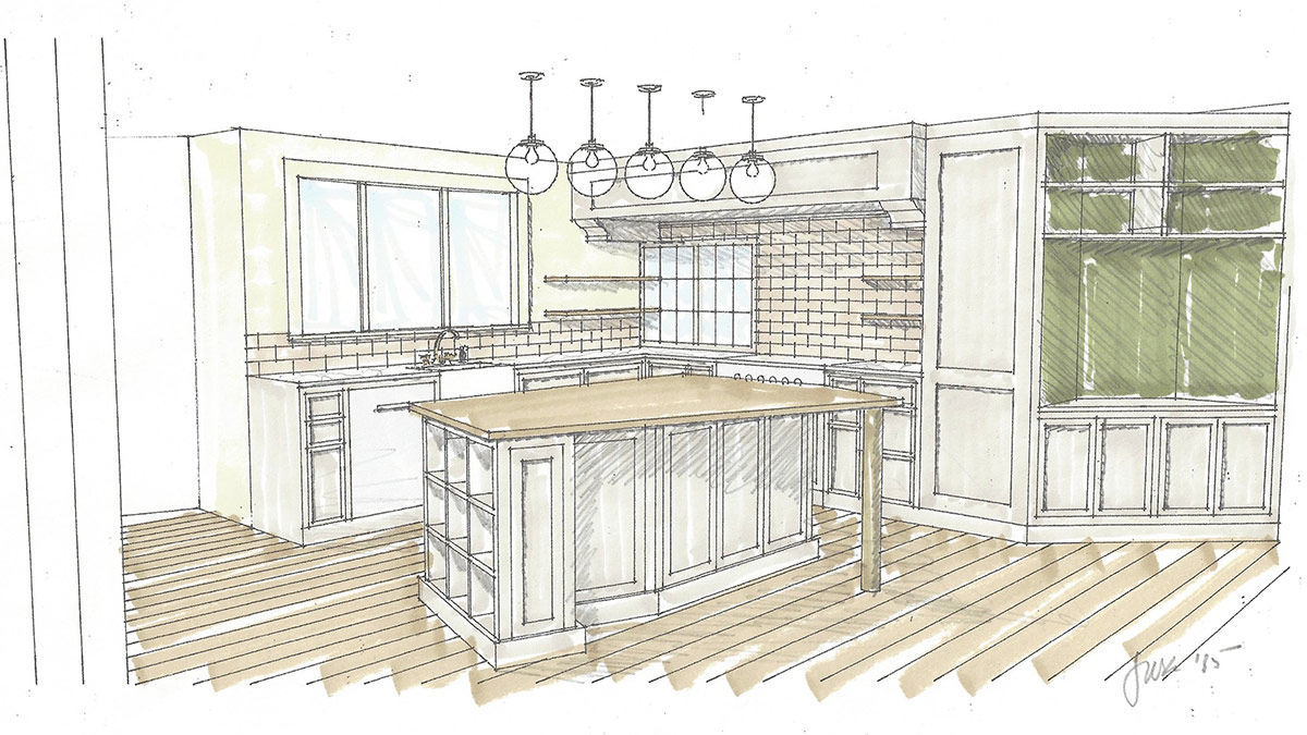
At this point, we knew we had to close the opening between the kitchen and the dining room. We asked the contractor for an estimate to remove the entire chimney—roof to basement. While we were waiting for his quote, the client asked us to do a scheme without the chimney so she could visualize the difference. You can see that the door between the kitchen and dining room has been eliminated. I added a pass-through between the two rooms. (At some point, you have to trust when the client repeatedly insists, “I only serve dinner there four times a year on holidays.”) She took one look at the drawing and said, “I’ll find the money to eliminate the chimney!” With some minor tweaks, this became the final plan. Fortunately, the chimney removal didn’t break the bank.
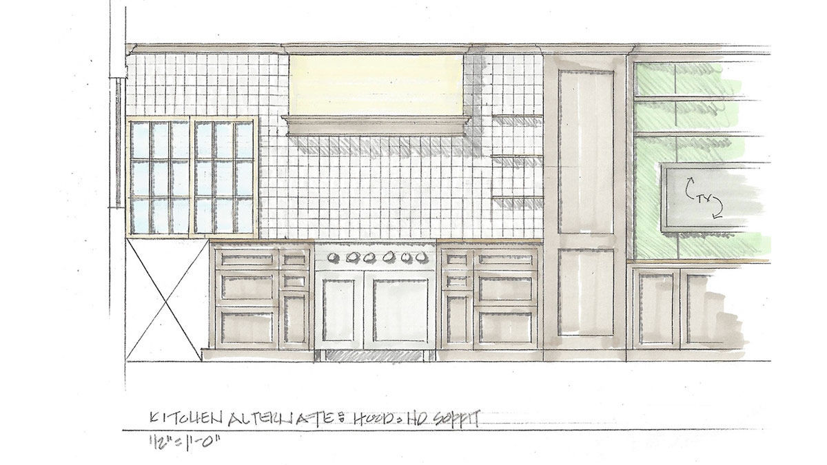
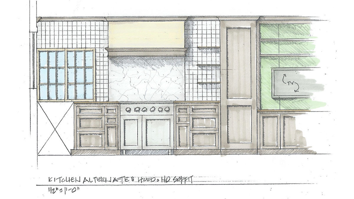
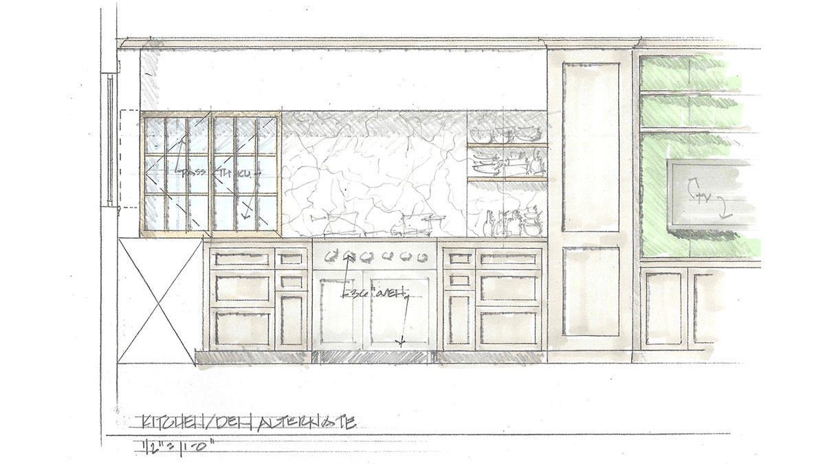
Now it was time for the oven wall. In our first two schemes, we used a conventional exhaust vent over the range. And we played with the idea of tile versus stone backsplashes. Because of the low ceiling height, we kept bumping into issues routing the vent stack through the house to the exterior. It got complicated and expensive.
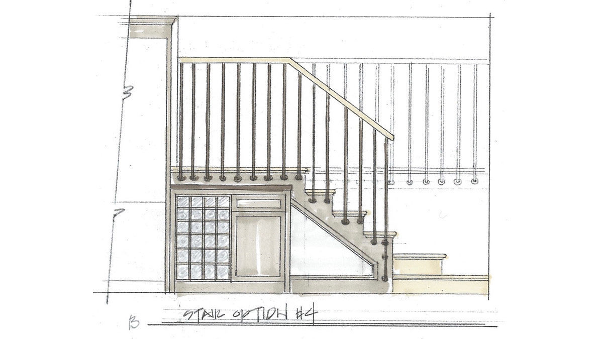
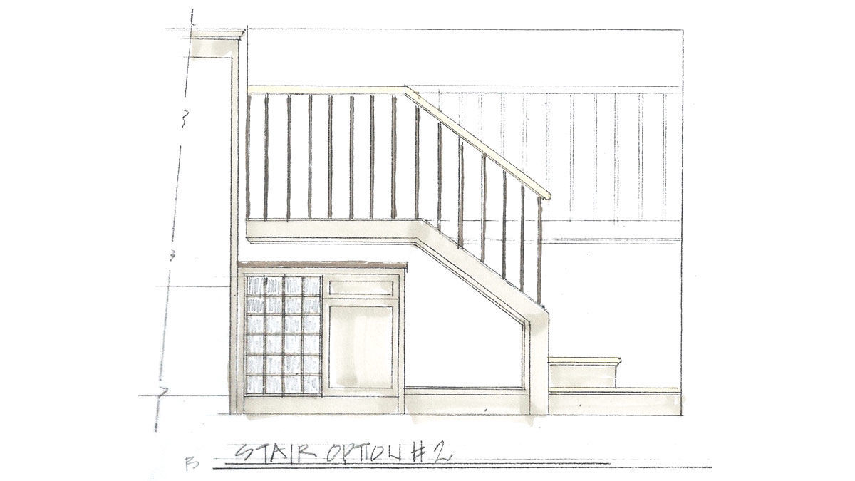
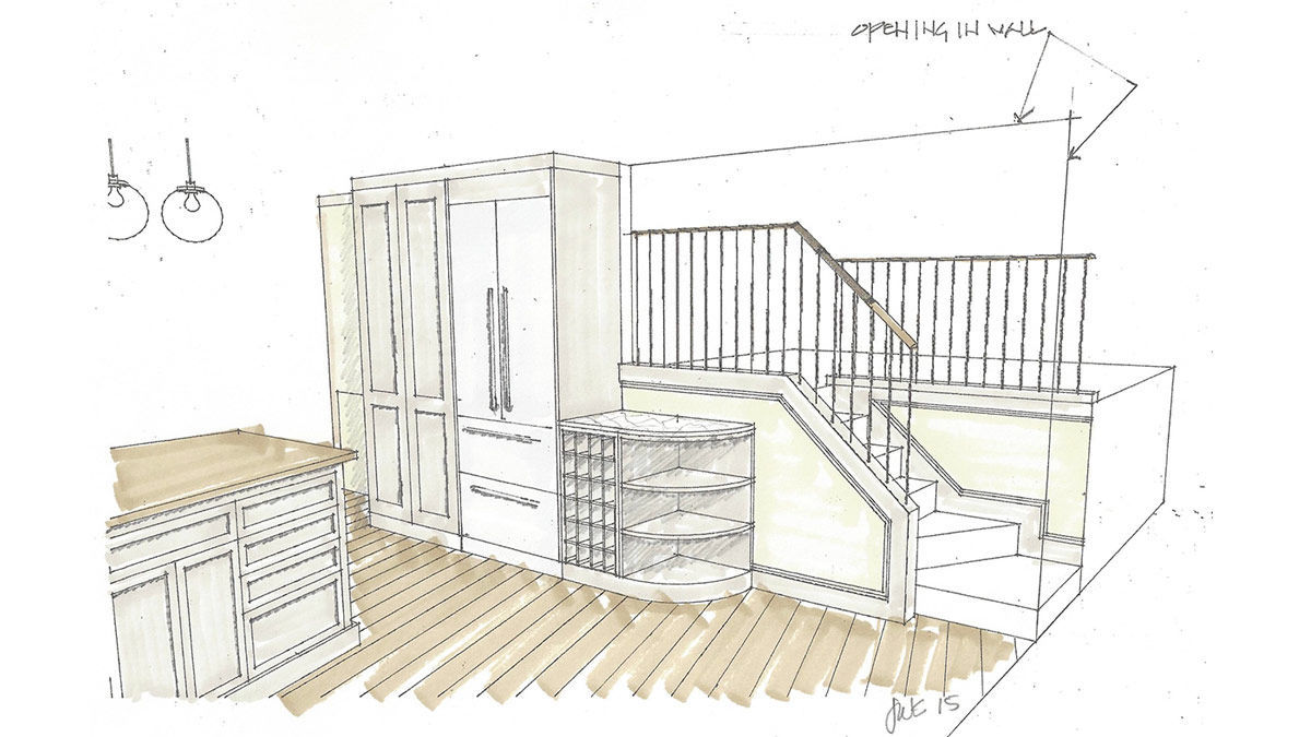
The final solution enabled us to keep the existing steps and risers—we designed a simple curb to which the balusters were attached.
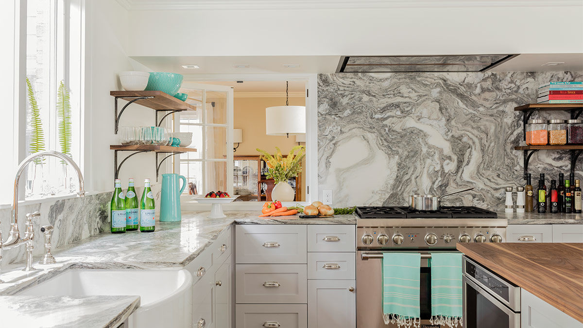
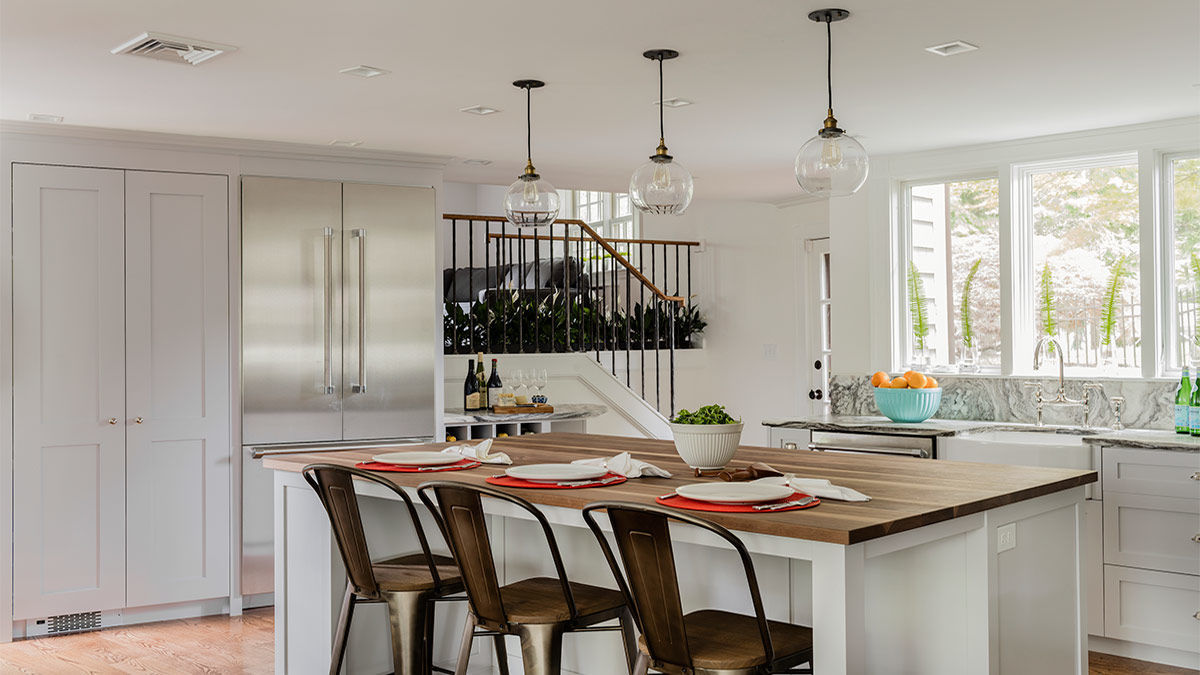
With those two key decisions made, the rest of the design fell into place. Shaker-style cabinet doors, simple pulls, dark-stained oak floors, and cool accent lighting over the walnut-topped island were among the finishing touches.
Quick and dirty project tip list:
- Identify the pain—where are the challenges? Make a list. It will help you stay on task.
- Start with a floor plan that addresses circulation, flow, and organizational needs. These things should be solved before moving on to the fun stuff.
- Have a vision that provides an organizational structure to test ideas against.
- Be patient—your first idea may not be the best solution.
- Be open to what your eyes and instincts are telling you as you test your ideas.
- A tweak here may affect a decision there. Revisit, review, reconfirm.
- Don’t be afraid to change midstream.
- If budget is a concern, be prepared to compromise and let go.
- SMILE! This is supposed to be fun! You are making your home a more enjoyable place to be.
For more kitchen renovations:
Fine Homebuilding Recommended Products
Fine Homebuilding receives a commission for items purchased through links on this site, including Amazon Associates and other affiliate advertising programs.

Not So Big House

A Field Guide to American Houses

All New Kitchen Ideas that Work
