21st-Century Modern Farmhouse Gets the Big Things Right
This compact, innovative home manages design and construction best practices on a budget.
“I could tell by their style – tasteful, simple, minimalistic, everything thought out but not overdone – that [the new house] was going to be a cool project.” —Dan Porzel
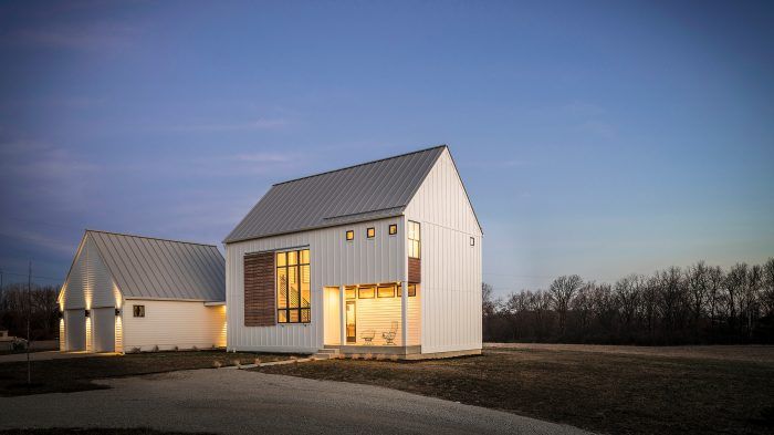
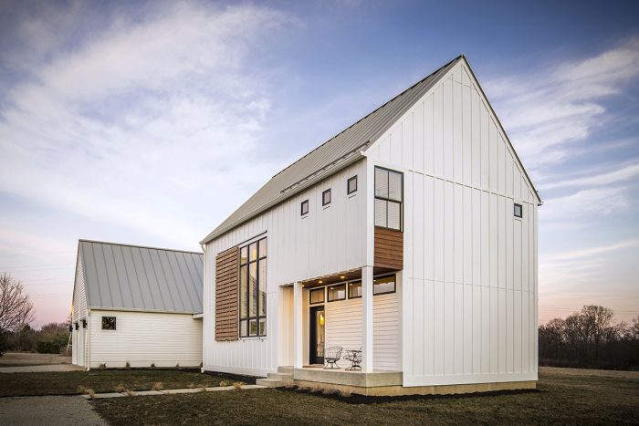
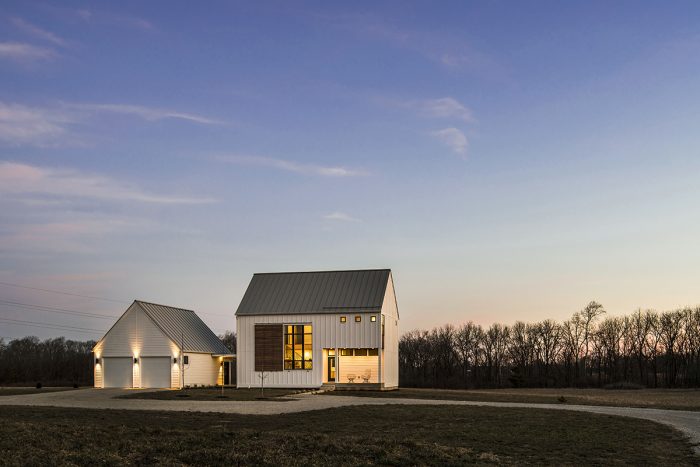
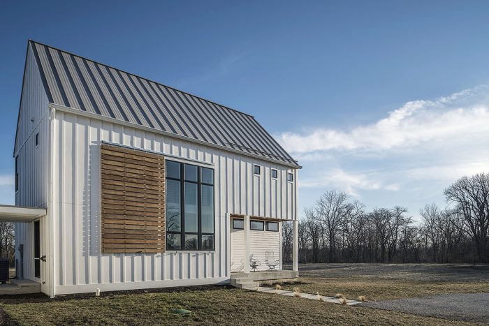
FINE HOMEBUILDING’S BEST NEW HOME: It’s hard enough to build a house that delivers style, function, and energy-efficiency. To do so on a limited budget is laudable. This year’s Best New House—a collaboration between Dan Porzel of Cedar Street Builders, architect David Rausch, and homeowners Kelsey and Tyler Johnston—is a perfect example. Well-insulated, airtight, and all-electric without pushing for Passive; box-shaped with-out looking boxy; compact yet open and light-filled; and designed for both today and tomorrow. This custom starter home on a beautiful tract of Indiana farmland is a roadmap for earth-conscious, value-minded buyers at all stages of life.
Homebuilding has changed a lot in the past decade or two, and the Johnstons’ 1800-sq.-ft. house reflects best practices in almost every area. Happy in their jobs, the young couple plans to put down roots, but whether they stay or go, their tasteful, durable, energy-smart house will only appreciate in value.
The Johnstons’ first move was hiring Dan Porzel, a high-performance builder with one Passive house and a number of LEED-certified projects under his belt. They met for the first time in the young couple’s first house, an old Indianapolis bungalow they had rehabbed and remodeled themselves. “I could tell by their style—tasteful, simple, minimalistic, everything thought out but not overdone—that [the new house] was going to be a cool project,” Dan says.
 The Johnstons felt good about Dan too, who was more responsive than the design-build firm they had spoken with earlier. Their big pile of inspiration photos for interior and exterior design made Dan think of David Rausch, an accomplished Indiana architect whose work balances modern lines and clever features with traditional touches that recall the past.
David welcomed the chance to adapt his style to a small, energy-efficient house on a budget—the Johnstons had found the last piece of their puzzle. The three parties met once a week throughout the design stages, and connected just as frequently during construction.
“David took all of our ideas and ran with them, adding thoughts that never would have occurred to us,” Kelsey says. “[Dan] was realistic about what each thing would cost and how we might do something alternative for less.”
The first big hurdle was energy-efficiency. The Johnstons are numbers people—she is an engineer; he’s an accountant—and they were hoping to build a Passive House. At the same time, they had their eye on an 8-1/2-acre tract of unimproved farmland, which would soak up a lot of their budget with basic infrastructure.
With costs mounting for well, septic, and electric utilities, not to mention unforeseen truckfulls of stone and gravel for grading and creating a 350-ft. driveway, the Johnstons gave up on the super-insulated SIPs and super-thick European windows of the Passive House approach, opting for a value-packed version of Dan’s basic build.
The builder sketched out three scenarios for energy efficiency, including initial costs and long-term savings. One was full Passive, one a small step down from that, and the baseline was the thoughtful way Dan usually builds. With a variety of smart, low-cost techniques, the builder and architect delivered a structure that requires 47% less energy than the baseline energy-use intensity (EUI) for a house of its size.
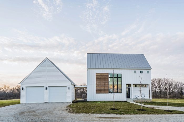
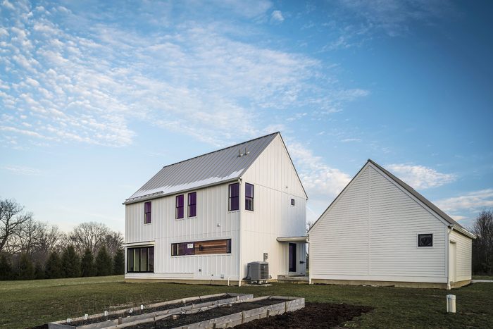
The team made a wide range of practical construction choices for a high-performance home. The most important decision was the simple, compact box shape, which makes any structure more affordable to build, insulate, air-seal, heat, and cool. The uninsulated garage, on the other hand, could be roomier than normal—to allow for two cars plus the equipment needed to maintain 8-1/2 acres.
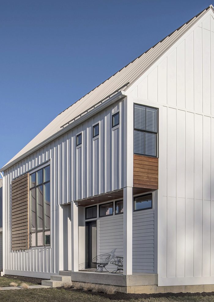
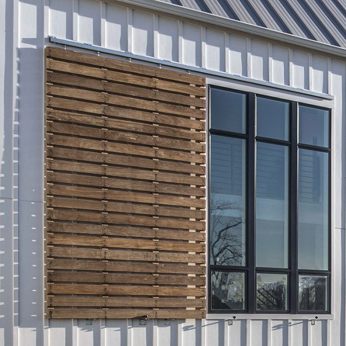
The efficient shape meant the Johnstons could afford better materials and mechanicals, with their own long-term payoff in durability, beauty, and energy use. Examples include cement-board siding, a stable, durable material that holds paint well and promises a lifetime of service; Ipé wood details that will last just as long; and a standing-seam metal roof, which will last three or four times longer than asphalt shingles with a fraction of the solar heat gain.
Instead of pricey SIPs, they went with 2×6 walls, blowing in fiberglass to bring them to R-21 (thicker floors and ceilings are twice that). Air-sealing strategies are equally sensible, starting with Zip System sheathing and taped seams, as well as premium aluminum-clad-wood Pella windows with well-sealed and taped openings. (A rubber sill gasket costs just $100 more than the “roll of foam the lumberyard sends out,” Dan notes, but it seals and insulates far better.)
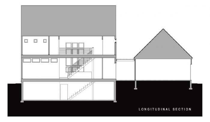
To get the ductwork out of the cold, ventilated attic, the team added a long, insulated doghouse of sorts to the attic floor, which brings the ducts into the heated envelope.
A non-venting dryer, a heat pump for HVAC, and an energy-recovery ventilation (ERV) system complete the near-Passive package. The Johnstons also chose an induction range and LED lights, which use less energy and produce less ambient heat than conventional options. Making the house all-electric means that renewable energy sources, when added, will be able to power everything.
The second critical move was how the team oriented the house and its windows, a decision that costs very little compared to its impact on energy use, natural light, and views. The house is oriented to gather southern sun in winter but limit direct sunlight on the west side, which is often intense during summer afternoons. To prevent summer heat gain through the story-and-a-half south-facing windows, David proposed a giant exterior shade that could be rolled across them as needed. The rolling Ipé wood shutter echoes the barn doors of local farmsteads. “The big shutter works like a charm,” Kelsey reports. “When it blocks sunlight, it keeps the house remarkably cool.”
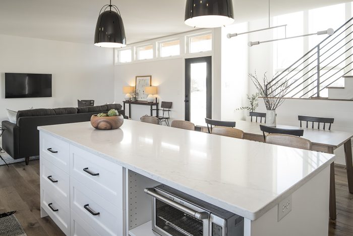
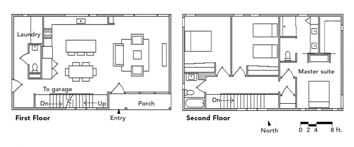
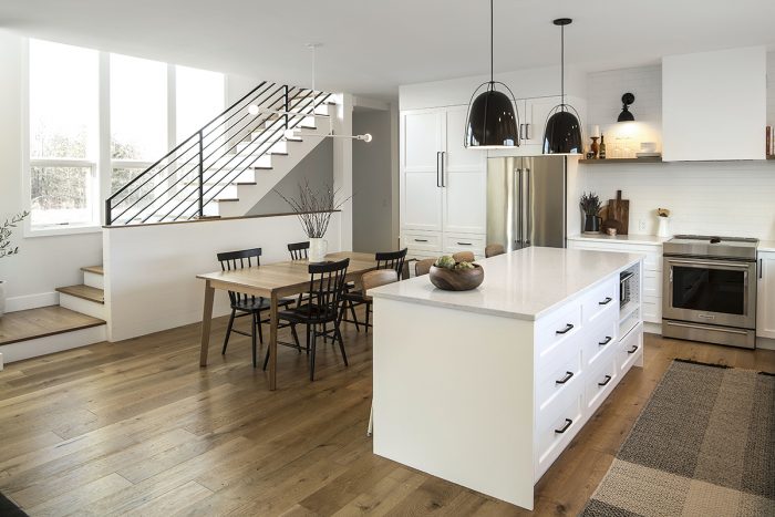
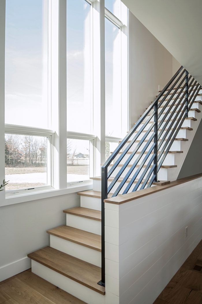
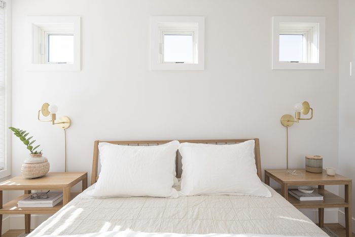
Inside, David worked hard to organize the floor plans and balance the natural light. The big window draws a flood of light past the open stairs into the entire home, and clerestory windows in the recessed porch bounce light off the ceiling in the main living area, making it feel more open at the same time. Even walk-in closets and service areas receive natural light.
The team worked hard to get the stairs as close to the windows as possible, knowing they would have to be both self-supporting and code-compliant. The siting of the stairs also keeps open a beautiful view to the south.
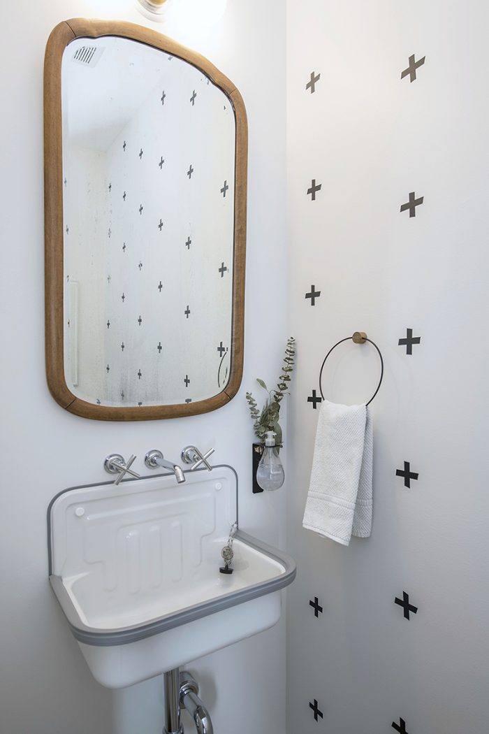
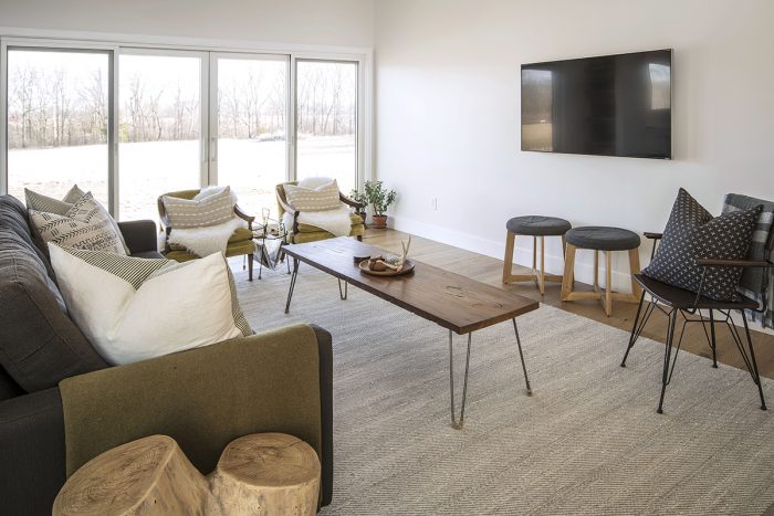
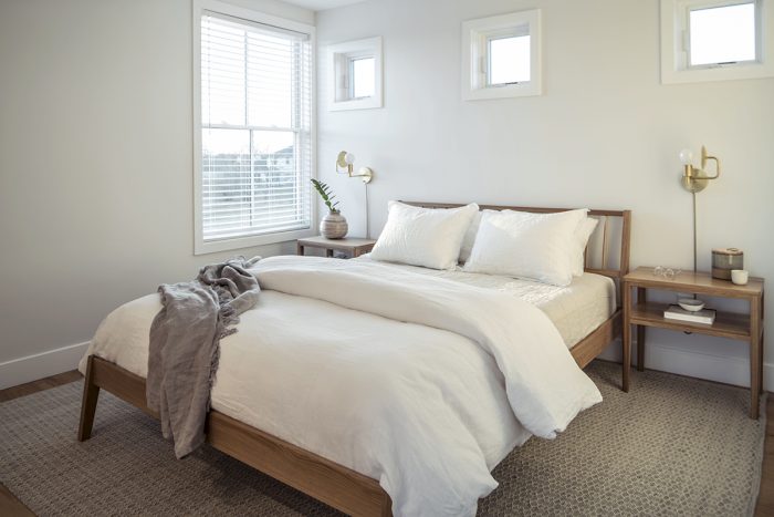
The interior of the house is designed with a neutral palette of calm white surfaces and black accents, with blonde wood surfaces adding warmth.
The Johnstons were determined to get the most permanent parts of their new home right, and they were willing to donate DIY time to make that happen. It’s a good recipe for handy home buyers on a limited budget. “We sold or donated almost everything we owned and moved in with a mattress and a couple of chairs,” Kelsey recalls.
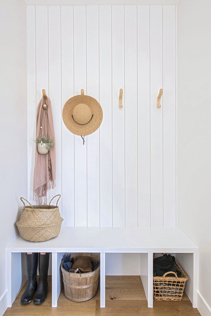
They have since purchased furniture, installed custom closet systems (affordable from IKEA), finished out the mudroom and laundry room, added a garden, and started work on an Ipé deck at the back of the house. “We could have put ‘something’ in but it would have been replaced,” Kelsey says. “We said, ‘Let’s put nothing in and do it it right later.”
 |
 |
“You watch ‘Fixer Upper’ on HGTV and every last pillow and candle is in place,” she says. “You need to fill the house with your own stuff and your own memories as they happen, so it doesn’t look like every other house on Pinterest. It’s the same with sweat equity. If you take your time and watch some YouTube videos, read blogs and books, you can can perfect your skills over time and take on a lot of projects. There’s something so rewarding about walking into a space and saying, ‘I did that.’” (Check out Kelsey’s design blog at mysimplysimple.com for more of her tips, experiences, and discoveries.)
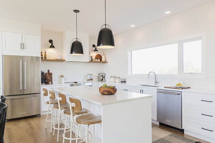
The Johnstons also ordered and assembled all of the cabinets. They designed them at IKEA—bought sinks and countertops there, too—and assembled everything at home. They found custom fronts for the kitchen cabinets at semihandmadedoors.com and attached those, too.
The Johnstons then handed their work off to Dan and his lead carpenter, Lee McBride, who attached boxes to walls and floors, installed countertops and sinks, and connected plumbing. There were hiccups, but Dan and Lee were talented and patient enough to handle them.
The Johnstons wanted clean transitions at the walls and floors, without extra moldings to hide gaps, so Lee made custom trim pieces, redid drywall corners to fit, and made a drywall soffit in the kitchen so the IKEA cabinets would fit under it seamlessly.
In the end, the couple saved tens of thousands of dollars over fully custom cabinetry, and got the style and function they wanted.
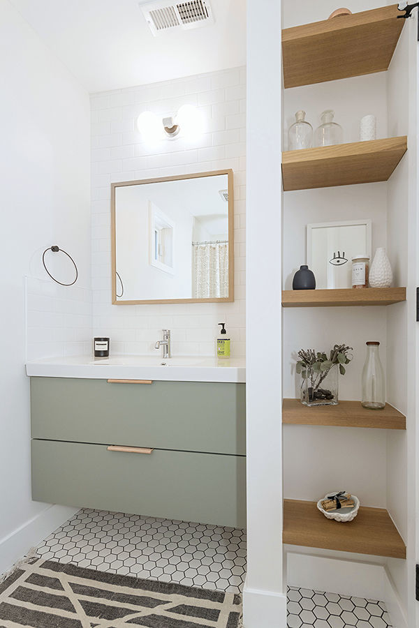
One of Tyler’s clients cut the quarter-sawn white oak that Lee used to makes floating shelving in the kitchen, living room, and guest bath.
In the end, all three parties were overjoyed with the result of their year-long collaboration. “David knocked it out of the park,” Dan says. “You see a lot of good architecture that must have cost a ton; I can’t imagine what the people spent and paid their architects. This was a really worthy challenge.”
SPECS
|
 |
Photos by Chris Bucher.
Floor plans by Patrick Welsh.
For more photos, floor plans, and information, please click the View PDF button below.
From Fine Homebuilding #283
Fine Homebuilding Recommended Products
Fine Homebuilding receives a commission for items purchased through links on this site, including Amazon Associates and other affiliate advertising programs.

A Field Guide to American Houses

Graphic Guide to Frame Construction

All New Kitchen Ideas that Work


View Comments
Awesome!
Excellent!
Awesome!
Great one share
Awesome interior design
Does anyone know the paint color they used for the green bathroom vanity?
Thanks for sharing. Are the plans for the home for sell by the architect? I'll love to purchase a set