Best Small Home 2019: Small and Skinny Spec Home
This 1650-sq.-ft. urban home challenges market norms with a thoughtful modern design.
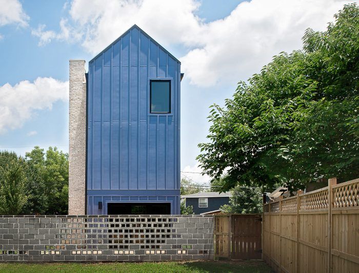
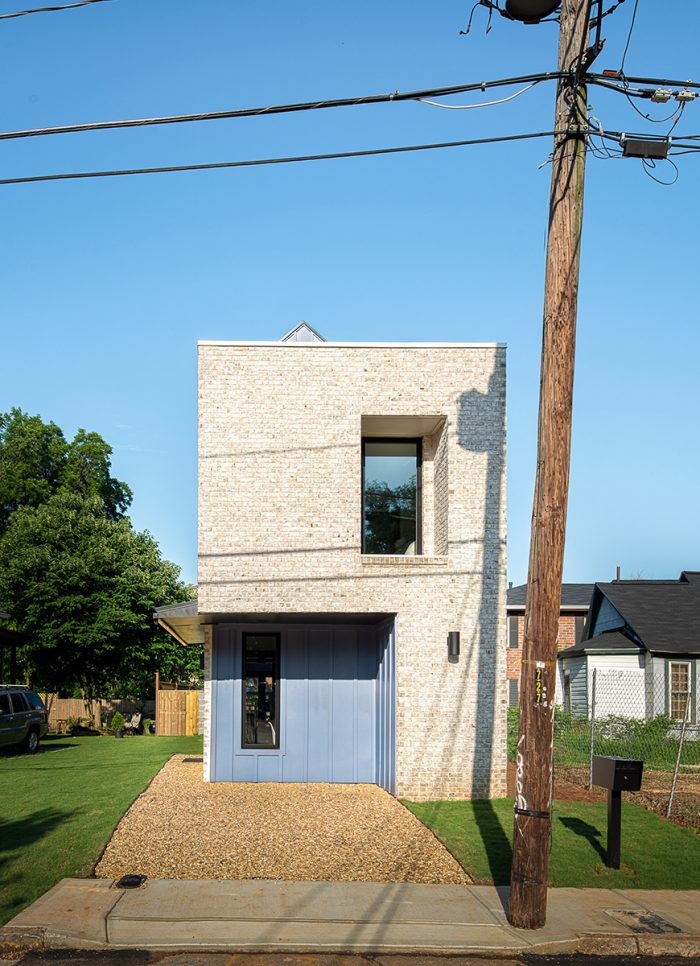
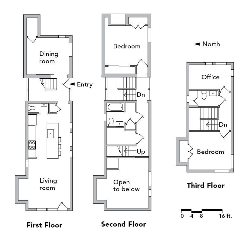
BEST SMALL HOME: At about 1000 sq. ft. smaller than the average home built in 2018, our Best Small Home Award goes to Atlanta architect Alex Wu for his infill spec home. But it’s not the size of the home as much as the size of the lot that made this project challenging. Built on a 20-ft.-wide lot, the project’s success hinged on Alex winning a significant variance from the zoning board and still designing a comfortable home within a mere 14-ft. by 56- ft. footprint.
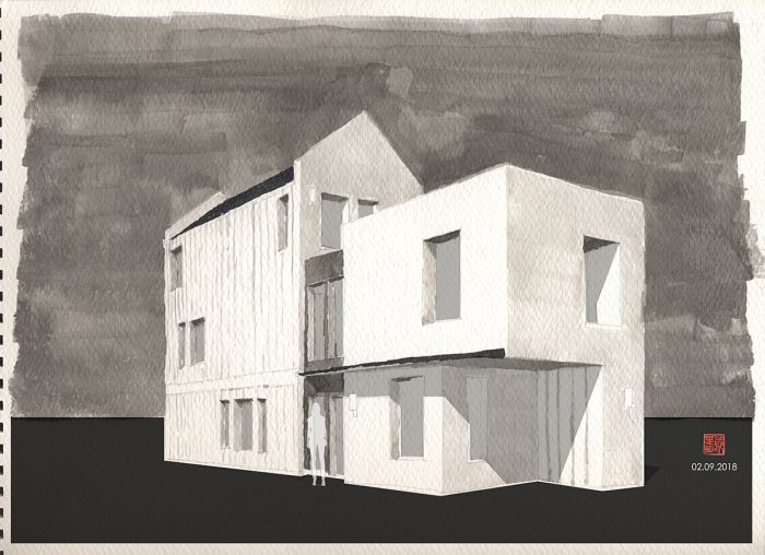
In 2016, Alex Wu decided to leave the large architecture firm—focused mostly on university buildings—where he had been working for over a decade. Competing with established developers and builders for a decent lot in the Atlanta area proved to be a challenge. But the reality was that many of the more ideal building lots wouldn’t be right for what Alex had in mind. He was planning to build a well-designed home that was both smart and small, and that had style but was still affordable. Alex’s project would be an outlier in a market where the norm for spec homes is to put as many square feet of home as possible on each lot, by building a big box of a house, with all the latest popular finishes, sold for a premium—an approach that is driving inflated property values in many urban centers.
The lot Alex ended up building on is a mere 20 ft. wide with an unmovable utility pole planted at the narrow street front. The local zoning setbacks would have allowed only a 6-ft.-wide home to be built on the property, so Alex’s first order of business was to apply for a variance. He got it, but the approved plan only allowed him to build a 14-ft.-wide house, which is still an awfully skinny structure. Alex was not discouraged. He was energized and was on a mission to prove that good design can overcome the many challenges facing today’s architects and builders who are working in urban areas where many of the available lots are infill and nonconforming with current zoning laws.
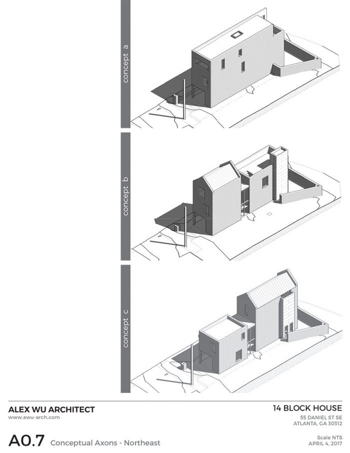
To get the variance he needed, Alex presented three design ideas to the board. The first was exactly what he didn’t want to build—a giant box as big as the lot would allow. But the design provided con-text for the other two options, which were variations on the same theme. Alex always offers more than two options for a design review. In his experience, two options present a choice of one or the other; more than two sparks a dialogue, which is exactly what happened.
 |
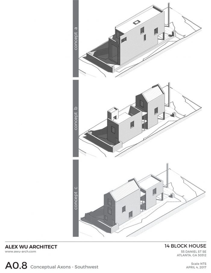 |
As he had hoped, the big-box option was largely ruled out and a discussion of the merits of each of the other designs allowed Alex to show that he was being thoughtful about how to best use the lot, which at the end of the day, got him the variance he needed.
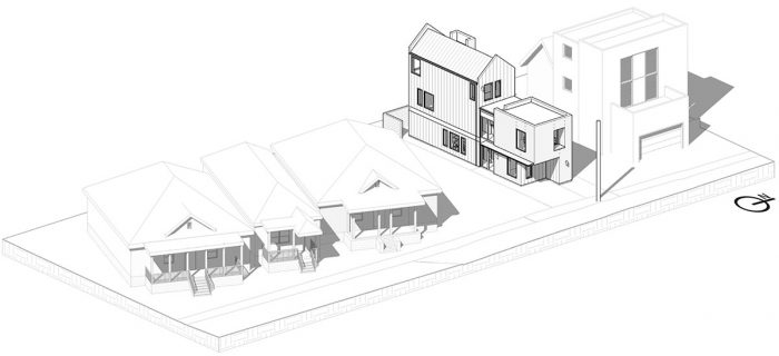
Alex got a variance to reduce the side-yard setback from 7 ft. to 3 ft., and the zoning board also agreed to reduce the front-yard setback from 30 ft. to 10 ft. Many houses built in the neighborhood before the current zoning laws were adopted have 10-ft. setbacks. In this way, Alex’s house actually fits well into the neighborhood. He didn’t ask for a variance for the back of the property, which would be the only place left for an outdoor space. Despite the variance, Alex had to build a three-story house to get the minimal space he needed to make the spec home marketable to buyers.
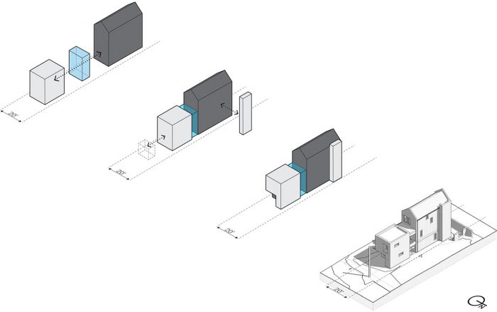
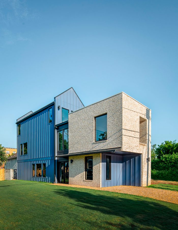
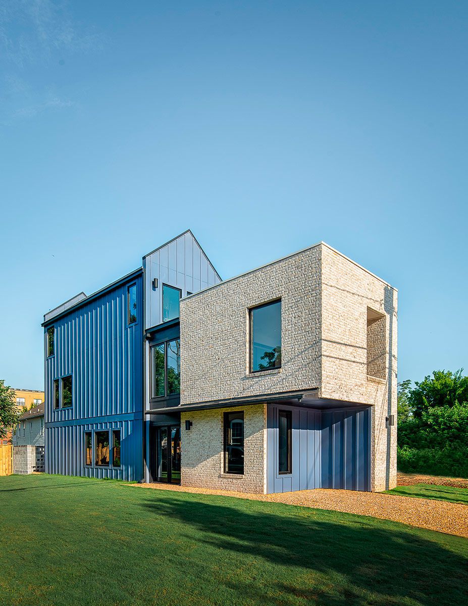
The plan he settled on has a two-story modern wing at the front of the house inspired by a remodeled carriage house in London designed by architect Russel Jones. The back portion of the house is more traditional. The three-story gable form was informed by a home by Austrian architect Bernardo Ba-der. Though the modern brick cube was put at the front of the house to make a design statement and keep the home in scale with others nearby, both forms fit into the architecturally diverse Atlanta neighborhood.
ENTRYWAY
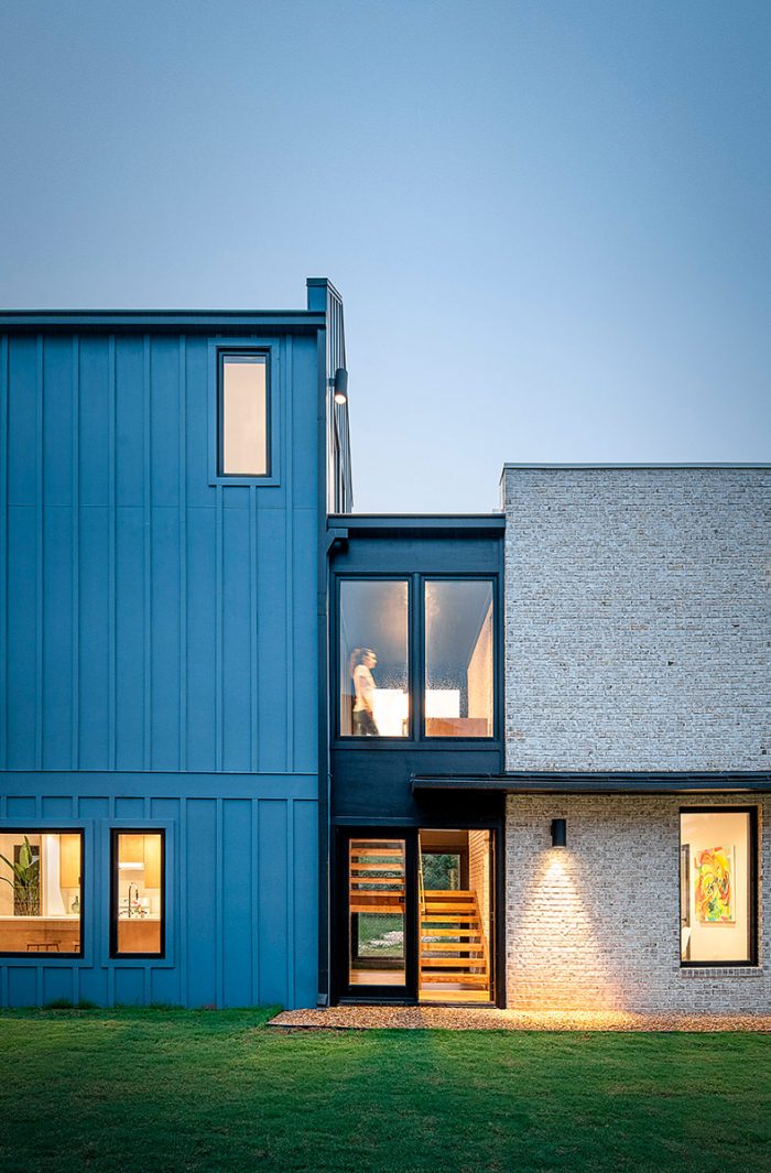
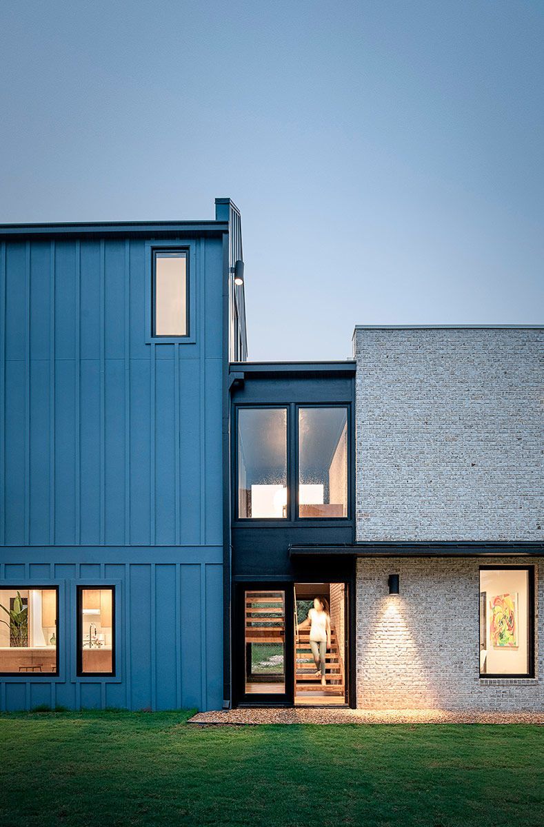
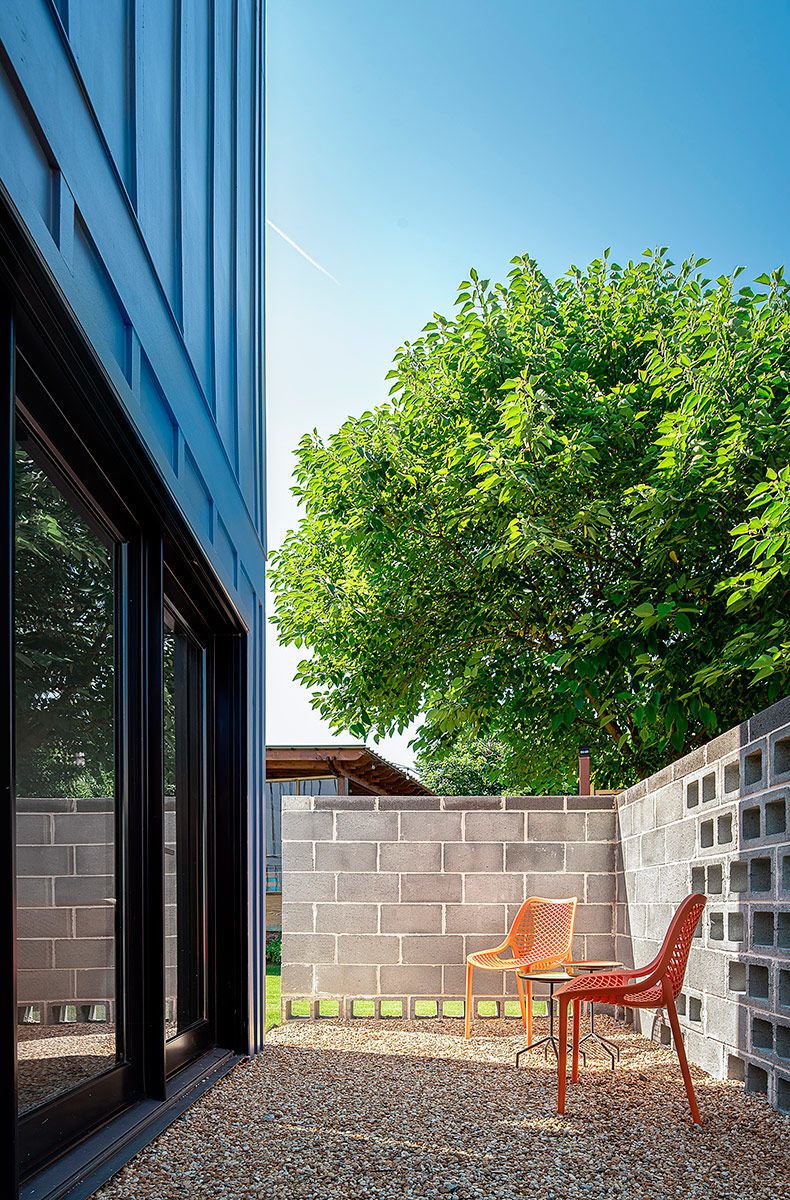
Alex was determined to keep the two styles distinctly separate, which he did by designing an entry to sit between the two. He would have liked the entry to be a glass atrium, but that would have blown the budget and made it difficult for him to meet the 1-hour fire rating for exterior walls built within 5 ft. of the property line. This code limits glass to 25% of the overall wall area. Instead, he painted the entry black and included some big windows to help it largely disappear in the overall context of the home.
The painted-black panel siding and trim on the entry’s exterior are fiber cement, as is the gray-painted board-and-batten siding and trim on the back of the house. Alex’s first choice for siding was shou sugi ban, but it proved to be too expensive. Because painting brick changes its permeability and hinders performance, he chose Boral Brick’s Magnolia Bay brick for the modern cube at the front of the house, which gave him the light color he was looking for without paint.
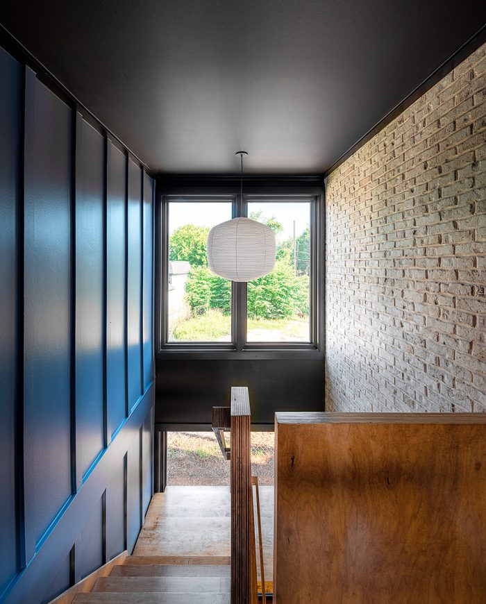
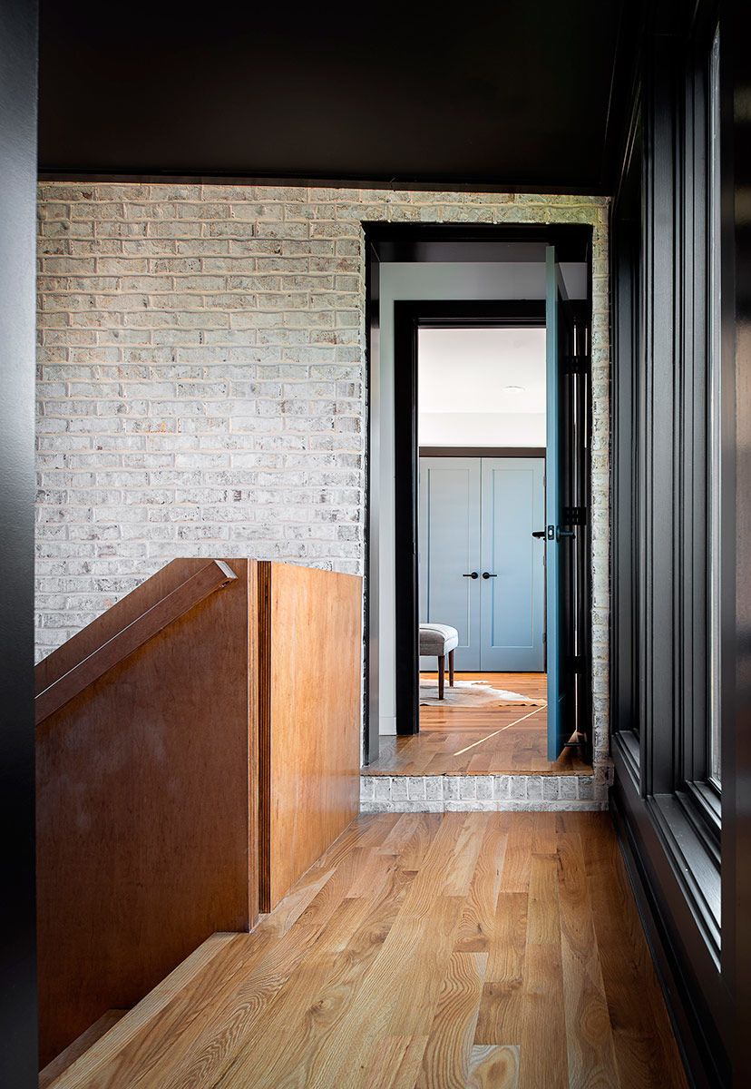
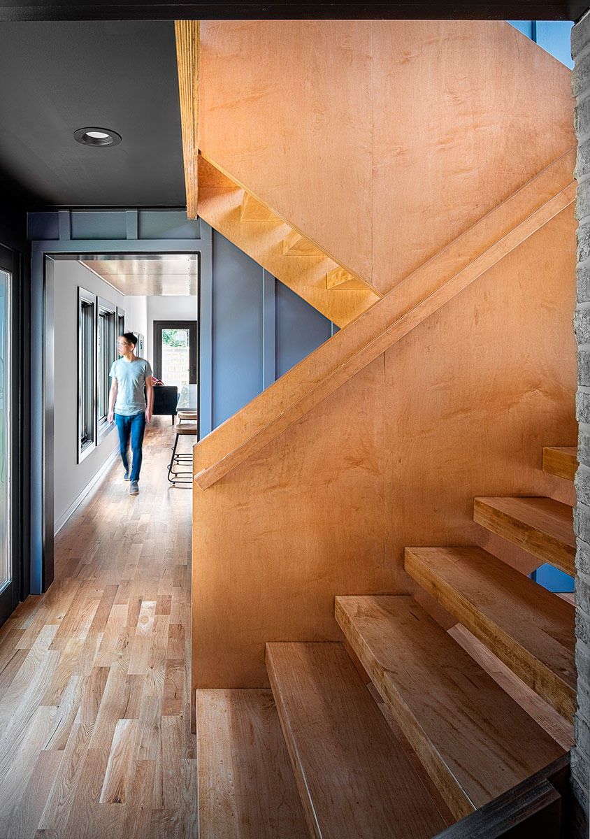
For continuity, Alex turned the exterior material into the house inside the entry, where the brick from the front of the house and the board-and-batten siding from the back of the house are used for the interior walls.
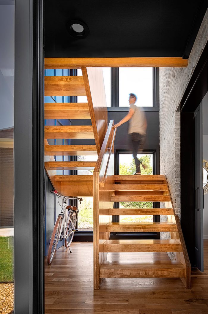
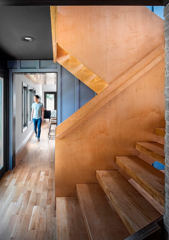
Inside, the effect is of two buildings being joined by the entry, which is also the stairwell from the first floor to the second floor and one of the areas where Alex chose to make a design statement. With large windows on both floors and on both sides of the house, the entry is light-filled and airy and the stair is the focal point.
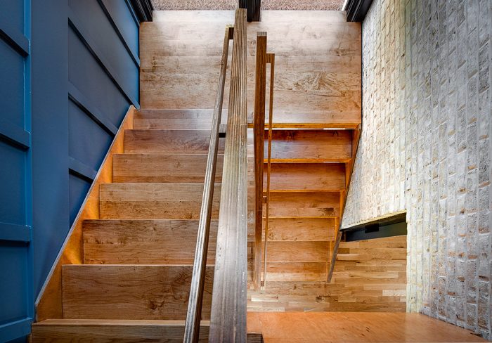
Alex is a fan of using common materials and good craftsmanship to execute elegant design. The modern open-riser stair is a good example of this approach. The entire stair is made of maple ply-wood, including the treads, the solid guardrail walls, and the handrails.
CUSTOM ELEMENTS
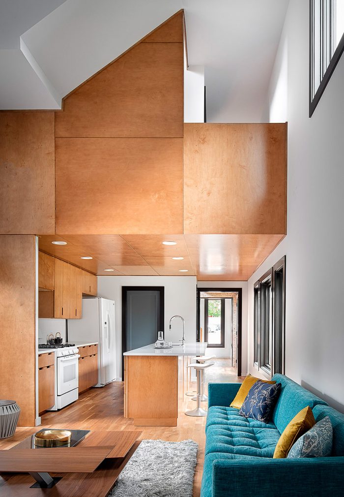
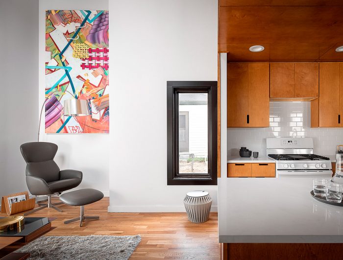
Throughout the interior, Alex chose materials and colors for a combination of style and affordability. In the kitchen, for example, he decided it was worth the cost to bring in the maple plywood from the stairs and use it for paneling and cabinetry. Though there are many finish materials and paneling options that are far more expensive than maple plywood, most spec builders would prefer inexpensive drywall to any other wall or ceiling covering. This decision reflects Alex’s mission to show that spec houses and investment properties can still be designed and built with custom details. In contrast to the paneling, he used a simple suite of white appliances, which were affordable and work well color-wise in this design.
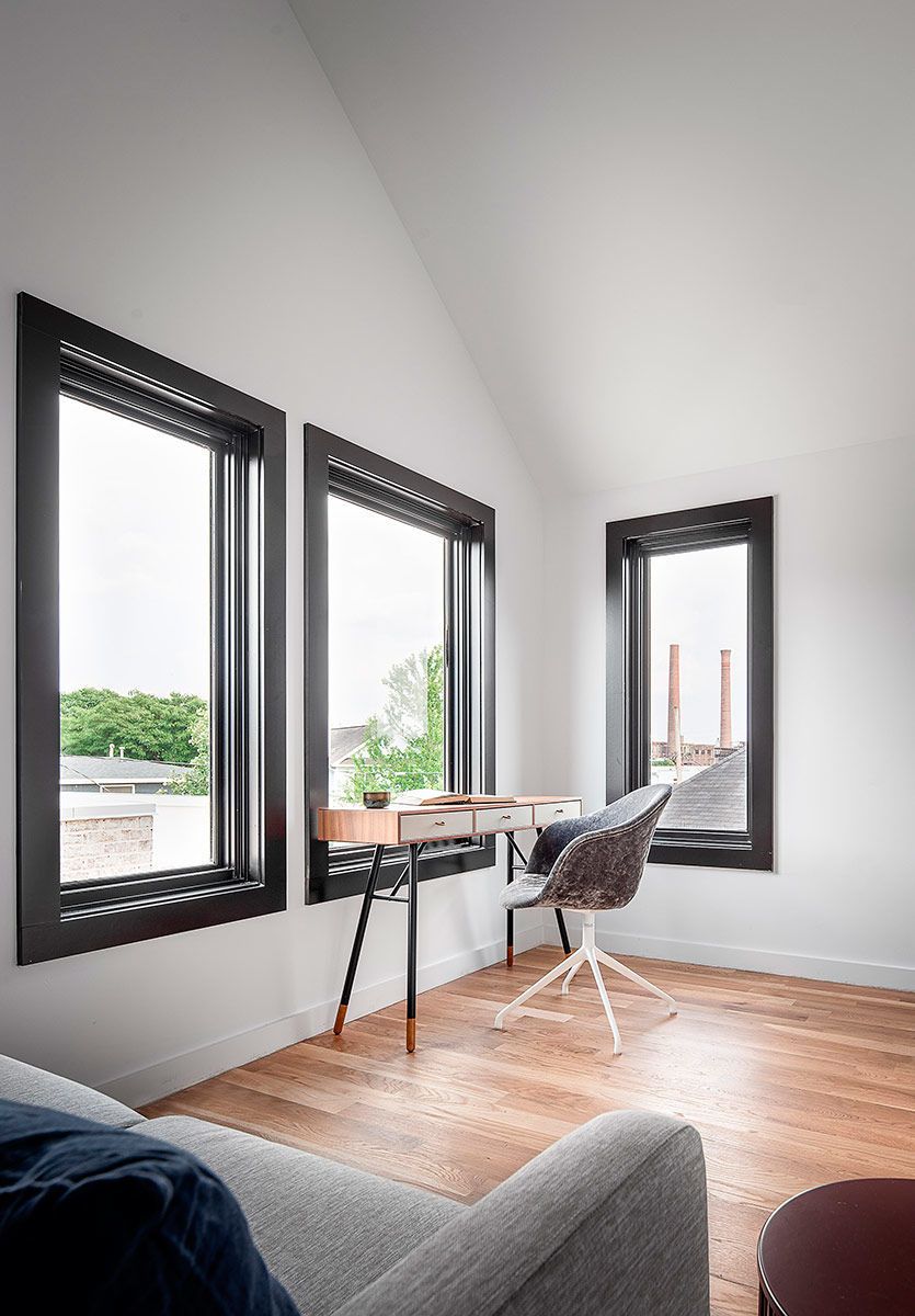
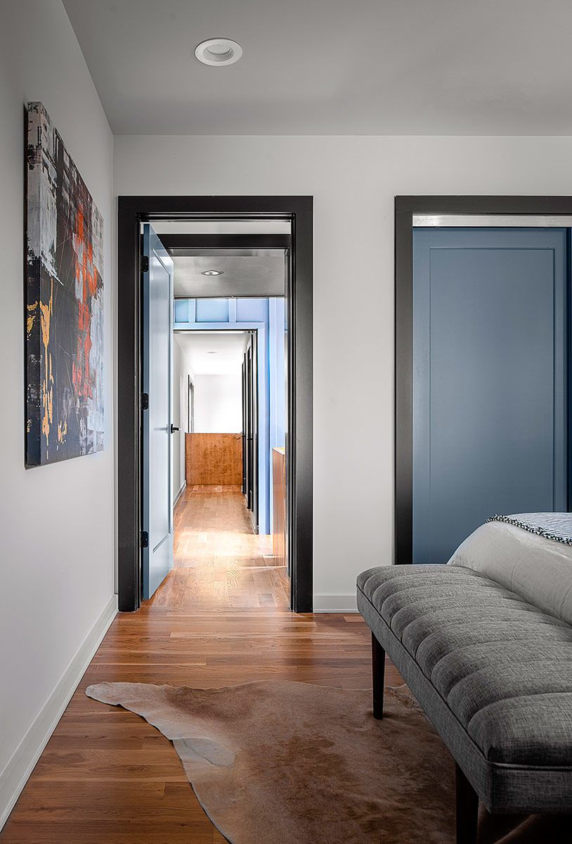
Though the rest of the walls in the house are white, the window and door casing is black and the interior doors are the same gray as the board-and-batten siding, tying more of the interior design to the exterior finishes. Alex doesn’t believe all interior trim must be one color. He also bucks the trend when it comes to doors; often they are made to disappear by painting them white or leaving them a natural wood tone. They can also be highlighted with color, which he chose to do here.
The one rule he did follow is to not use color to separate the floors from the walls. So, all of the baseboards are painted white. Except in the bathrooms, the floors throughout the house are white oak.
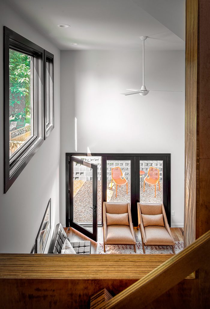
Perhaps the most interesting decision Alex made was to make the living room a two-story space. For most spec builders looking to maximize square footage and profit, it would have been a no-brainer to make the space above the living room into an additional bedroom. But according to Alex, small and more affordable homes and their owners deserve good design too. Including big-home details in small houses is a great way to make them feel spacious and special. The vaulted family room is a surprising and delightful detail in these tight quarters and one of many great tricks Alex used to make this home work.
Photos by Garey Gomez, except where noted. Floor plans by Patrick Welsh.
SPECS
|
 |
Fine Homebuilding Recommended Products
Fine Homebuilding receives a commission for items purchased through links on this site, including Amazon Associates and other affiliate advertising programs.
Not So Big House

The New Carbon Architecture: Building to Cool the Climate
Graphic Guide to Frame Construction







View Comments
I suppose the phrase 'small house' is relative, but come on, 1650 square feet on three floors no less? Also, from what you can see of the surrounding neighboring homes, this house doesn't make any kind of effort to fit in.
It's Beautiful!
It's fantastic!
Great!
Clever and beautiful.
But why is there no range hood?