Focused Remodel
A 1950s ranch house benefits from a strategic redesign by the team at SHED Architecture & Design.
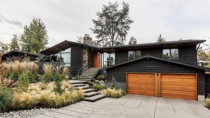
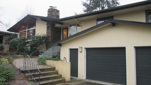
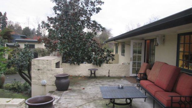
When Thomas Schaer, principal of SHED Architecture & Design, and architect Alex Hale stepped onto this property in Seattle’s Madison Park neighborhood, they took stock of what the 1959 ranch house did and did not have going for it. It had style, though it was badly compromised. The previous owners had infused it with a Mediterranean sensibility, the result being a series of disjointed spaces, a hulking mass of concrete in back, and an exterior clad in Dryvit, a synthetic stucco famous for failing. “It wasn’t a blank-slate situation,” Thomas recalls, referring to the whole ensemble as a mess.
 |
 |
Before |
After |
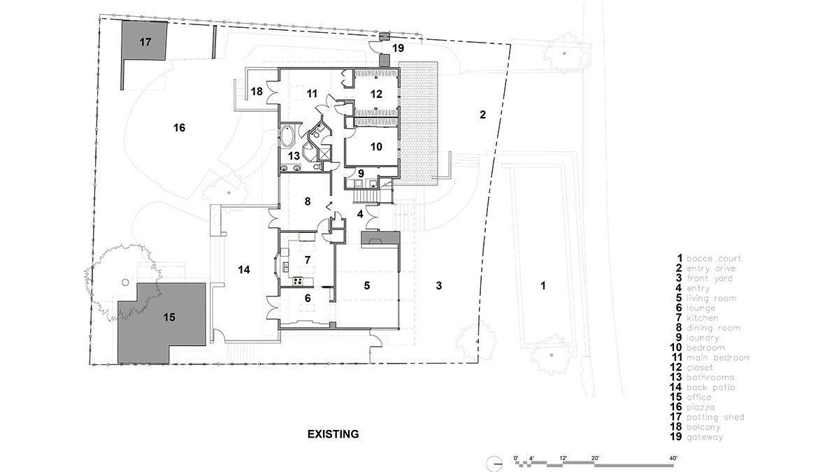
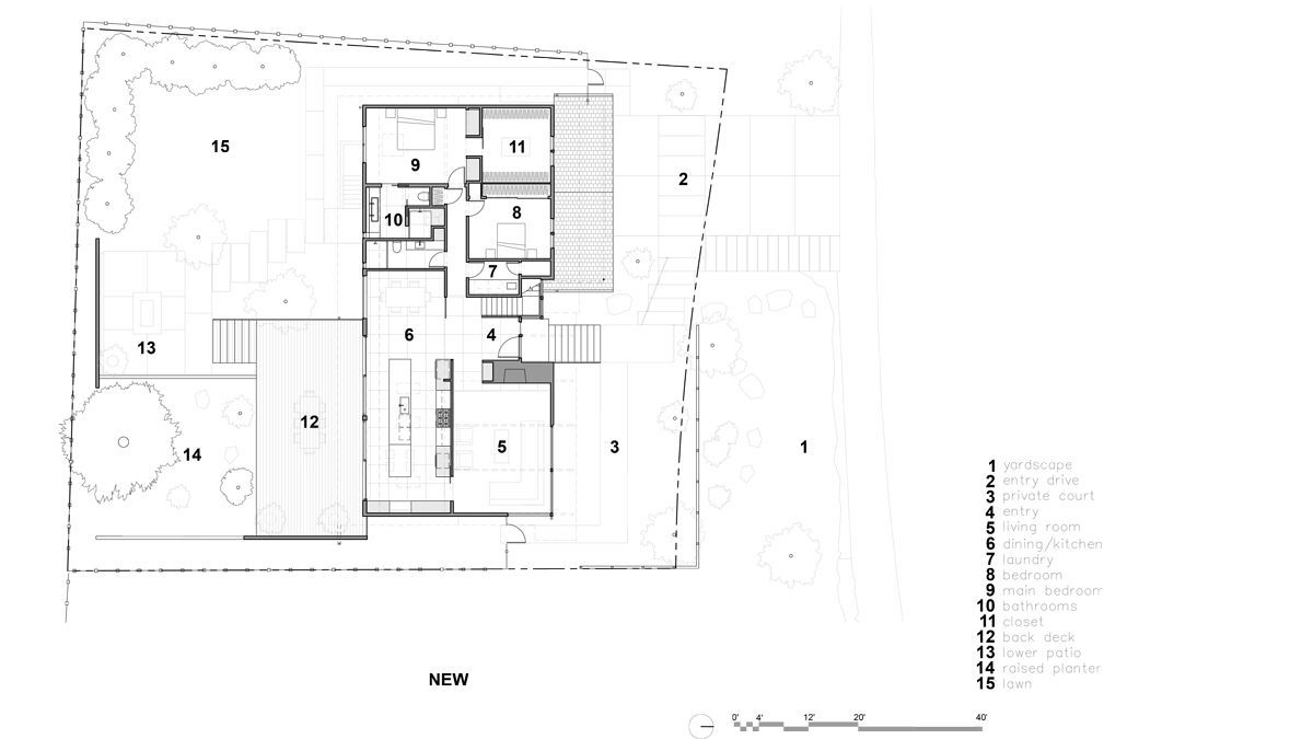
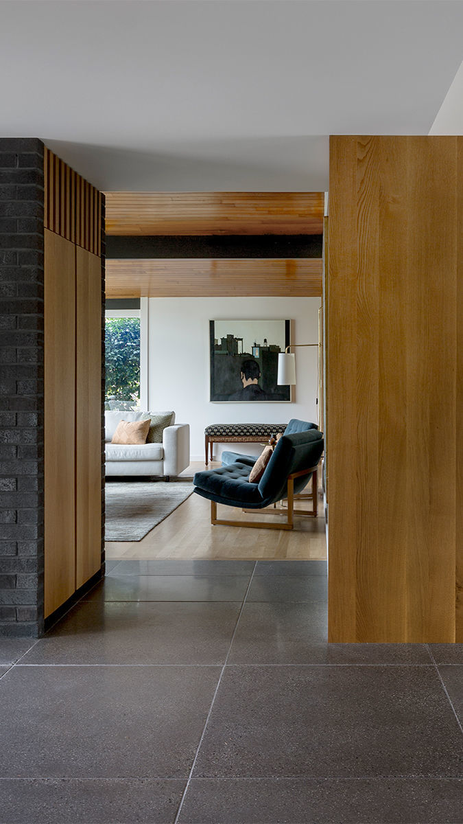
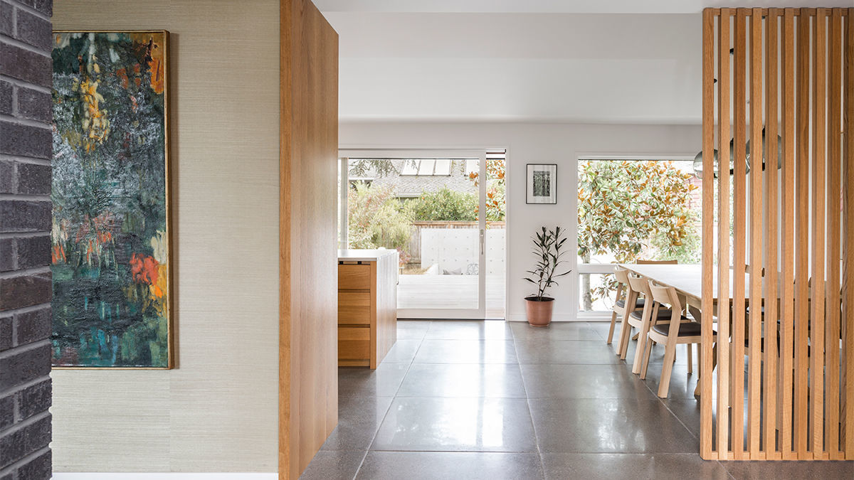
Though not a low-budget project, it was budget-driven. “There was a specific budget that had to be stretched,” Thomas notes. To that end, they didn’t extend beyond the existing footprint, and the work was hyper-focused on the kitchen/dining zone. They also made targeted improvements in the living room, where black brick was used to re-clad the existing fireplace and new cabinetry was tucked into its end side. “Those were very specific interventions that dramatically changed the look and feel of the living room, but essentially it’s the same space,” says Thomas. Despite the limitations on what could be done, the project comes across as a whole-house remodel.
The biggest head-scratcher was working around existing skylights in the master bedroom and kitchen, which had been put in recently when the roof was replaced. “It’s always a challenge to make skylights feel native to a new design,” says Thomas. The master shower treatment is an example of success. The tiled seating area/built-in shelf funnels upward toward a skylight, enlivening the space with natural light.
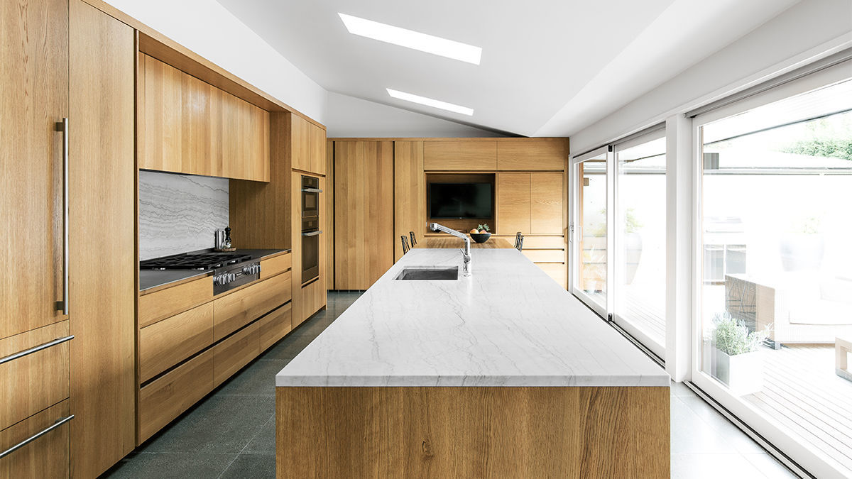
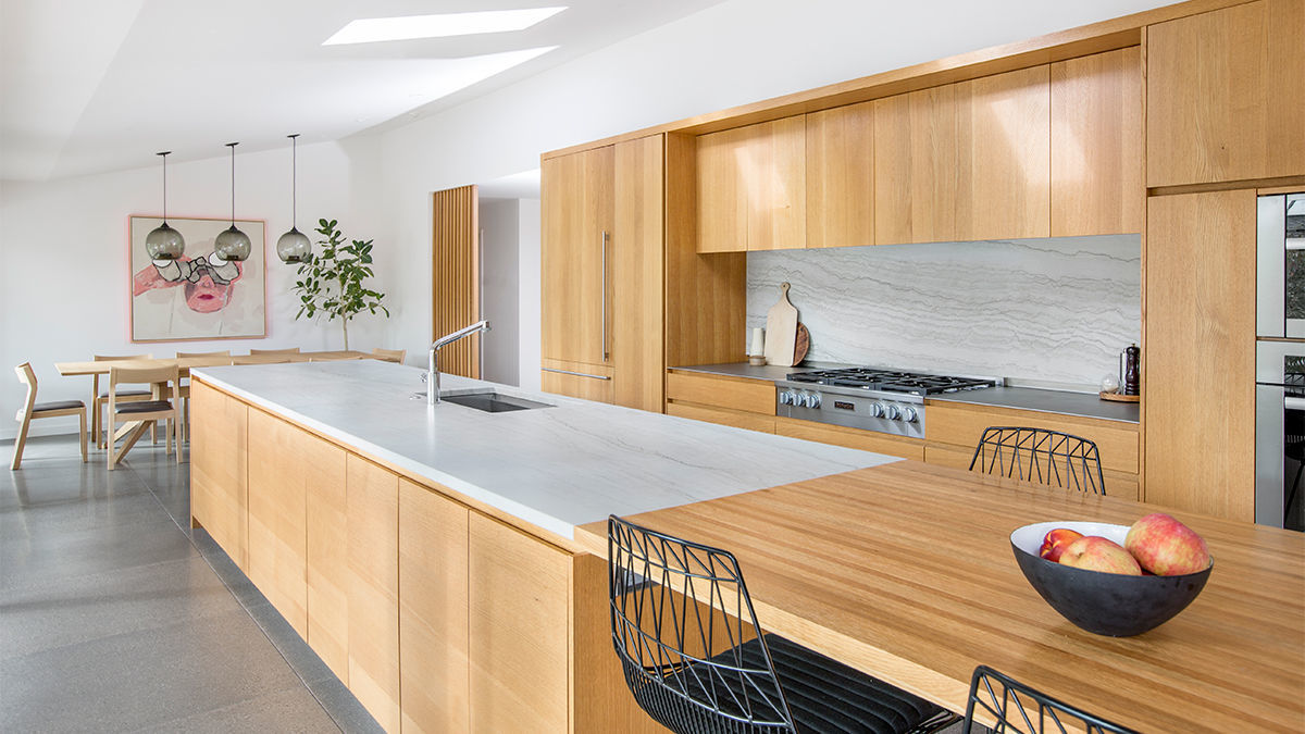
A similar approach was taken in the kitchen over the island, although those skylights were a bit easier to integrate. Of the end result, Thomas says, “They feel like they were put in as part of this remodel, but they were actually what we centered the work around.”
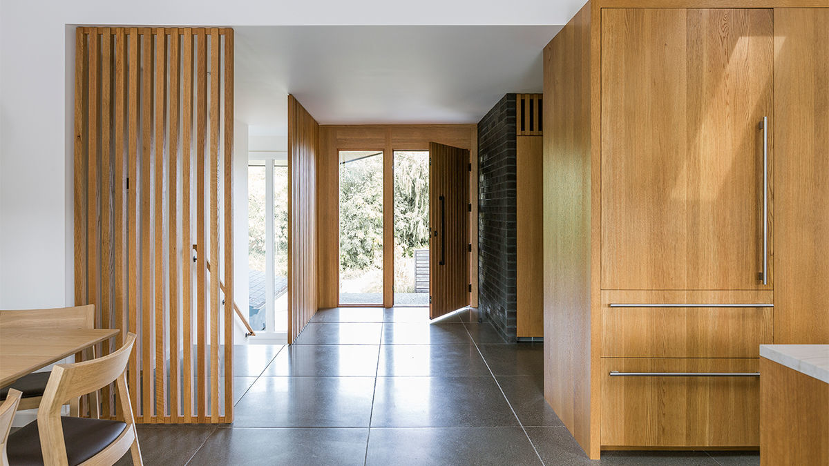
The client wanted the house to feel textual. To aid in that, the team spec’d 3×3 concrete floor tiles with exposed aggregate. Though not easy to install because of their weight, the tiles are thought to create warmth in the rooms due to their rough finish. Also intended to add texture are the wire-brushed solid-oak cabinet fronts. Scraping out some of the softer summer wood makes the grain pattern more visible. “They have a rich, tactile quality that is quite nice,” notes Thomas.
Oak was also used for the wood screens that define the spaces and take advantage of light coming from another portion of the house. Thomas refers to the screens as “a common midcentury move,” noting their popularity in the Pacific Northwest.
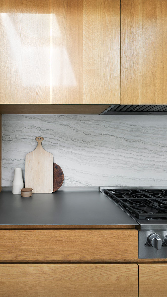
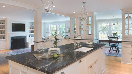
Without a doubt the pièce de résistance is the nearly 16-ft. island with quartzite slab—that material was also used behind the cooktop and for the master-bath vanity. Of note, too, is the 1/4-in. stainless-steel plate with bead-blasted finish used for the counter surface on either side of the cooktop—a detail the firm incorporates often for its fingerprint-proof quality and durability. “It’s a supertough surface where you can set the hottest pot and not worry about it,” Thomas says. “It’s not the cheapest thing, but it’s not crazy expensive either. As long as your measurements are good—just order it, pick it up from a sheet-metal shop, and glue it down.”
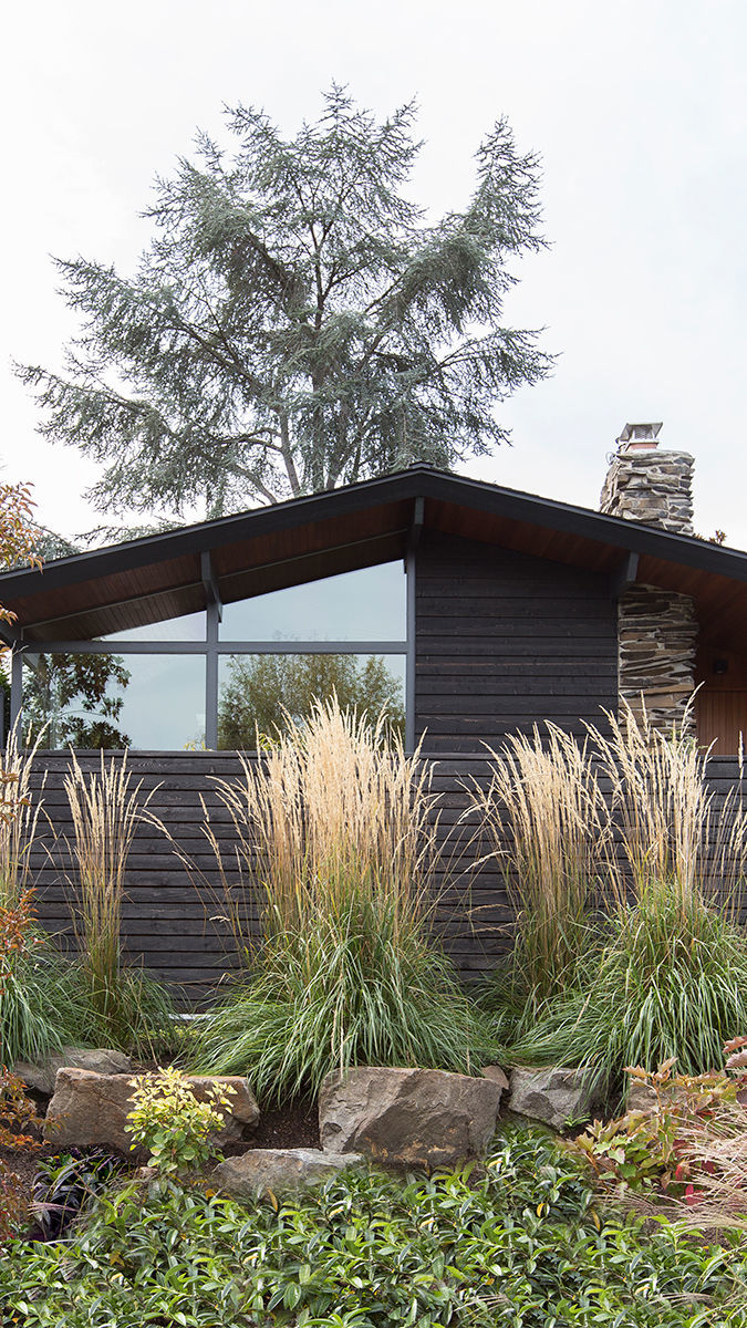
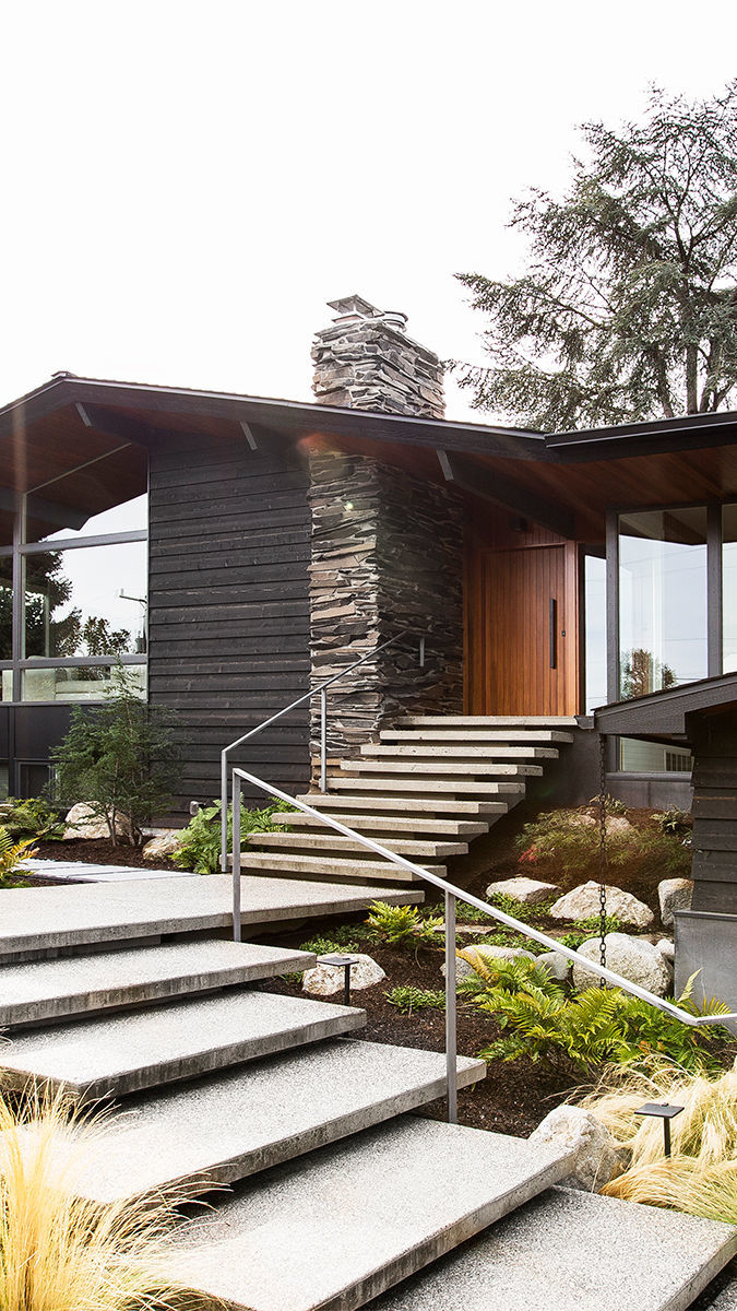
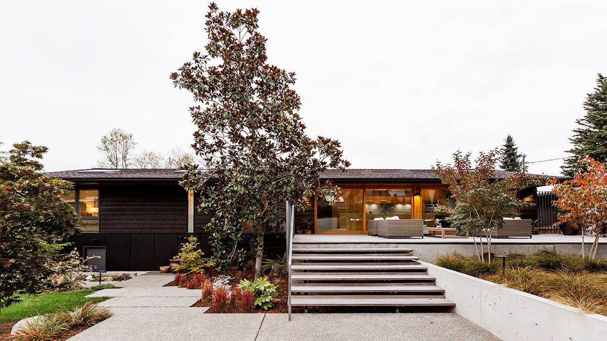
On the exterior, the idea was to strip away all of what wasn’t in keeping with the ranch style. “Our clients wanted to reinforce the horizontality of the original design and give it a Northwest materiality with wood cladding and natural characteristics,” Thomas explains. “The flagstone fireplace and the stained clear cedar used on the exterior soffits—and interior ceilings—set the tone for that.”
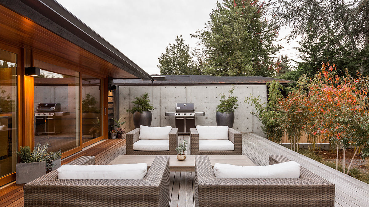
In back, a new unfinished Ipé deck overlaps and covers up the concrete patio eyesore. Thomas and his team regularly leave Ipé to weather because they like the grayed out, natural look. “Finish doesn’t prolong its life in any measurable way, and you have to sand and re-stain it every year to maintain the rich cherry color,” he says.
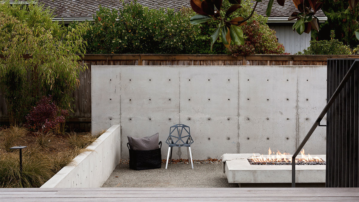
Other new landscape elements include a privacy wall and fire pit. Because the site is “a bit of a fishbowl”—with neighboring houses that have upper story windows looking down into the homeowners’ yard—careful thought was given to partitioning the outdoor zones. Simultaneously, the landscape needed to feel open and spacious. “We wanted the clients to be able to stand on the deck and see everything,” Thomas explains. It was a balancing act to achieve that, while also nestling into the site for privacy’s sake.
Exposed-aggregate concrete steps were used at the entry—even though they are often associated with a 1970s style and not always considered desirable, they add a layer of depth, which was what the client wanted.
For all SHED projects, the way in which interior spaces move outward is integral to the design, so as part of the basic construction budget they include the primary hardscape routes. In this case, that included the steps and retaining walls. “It’s far more affordable and efficient schedule-wise to have the builders include that in their scope, as opposed to having a landscape designer and crew come in after the project is complete,” Thomas explains. “Our clients are usually comfortable with us designing the hardscape as though it is part of the rest of the house, and then bringing in someone who really knows plants to further define the spaces with plant selections.”
Asked if any of the demoed construction materials were salvageable, Thomas responds: “The design sensibility and era in which the house was built were what we salvaged. The strategy was not so much re-use as it was rip out only the stuff that will get a transformative result.”
Photos by Rafael Soldi, courtesy of SHED Architecture & Design
If you have a project that might be of interest to our readers, please send a short description and images to kjacques@taunton.com.
For more ranch-style house remodels:
Fine Homebuilding Recommended Products
Fine Homebuilding receives a commission for items purchased through links on this site, including Amazon Associates and other affiliate advertising programs.
The New Carbon Architecture: Building to Cool the Climate

Not So Big House

All New Bathroom Ideas that Work











View Comments
Who was the builder on this project?