Fresh Urban Abode
NYC-based architect Denise Lee strikes a perfect balance in an imperfect old building.
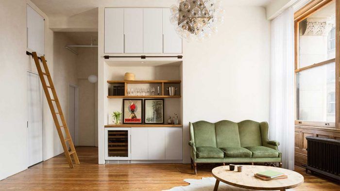
“The overall idea was to find the right balance between celebrating the old details and making things feel fresh without those elements working against each other.” —Denise Lee, architect
It’s rare that Fine Homebuilding covers an urban apartment but when I stumbled across this project by Denise Lee Architect, I had to make an exception. It’s a stunner—the very pinnacle of sharp, sensitive design.
Housed inside a former bank at 18th Street and Broadway in Manhattan, the two-bedroom abode was once part of a larger apartment, now divided in two. Lee worked on both. For the project pictured here, the primary objective was to make sense of the space. Because Broadway cuts through the city at an angle, the 1800s building is also angled. As a result, the apartments it houses have unusually shaped rooms. In this case, Lee was working with a trapezoid. “That wasn’t immediately apparent to me when I first visited,” she recalls. “In its original condition, the entire space was broken up in such an odd way that you couldn’t get a good sense of the overall shape of the apartment. It wasn’t until I had surveyed everything and was drawing it up that I realized it was a kind of trapezoid.”
Making significant structural changes in an old building—particularly when there are apartments above and below—is not a reasonable course of action. Plus, the windows are exceptionally large and take up nearly an entire wall, so there were not a lot of choices in terms of reworking the layout. “There were only so many options for where to locate walls without making weird conditions,” Lee explains, noting that the original architectural details became the organizing elements.
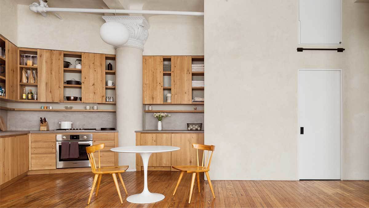
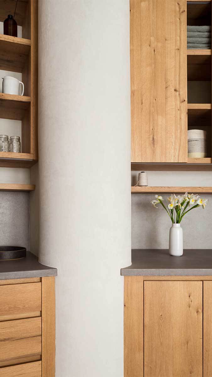
Among them is the kitchen column—arguably the space’s finest feature. It is also where all of the room’s funny angles come together. Initially there were two columns—the other was in the bathroom but its plaster detailing was in bad shape, and the client decided against having it restored. Luckily, the capital on the kitchen column was mostly intact. Lee says scribing the concrete countertops to the column was straightforward but getting the cabinets to fit snug against it was tricky—taking the measurements at the narrowest point proved especially challenging.
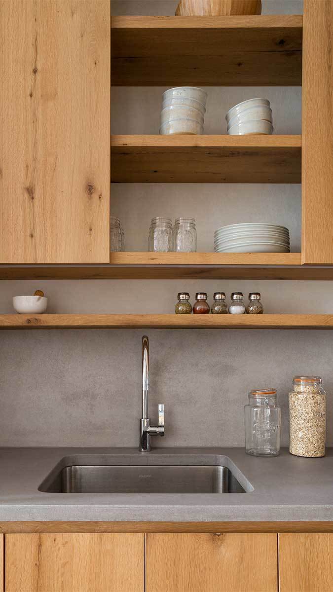
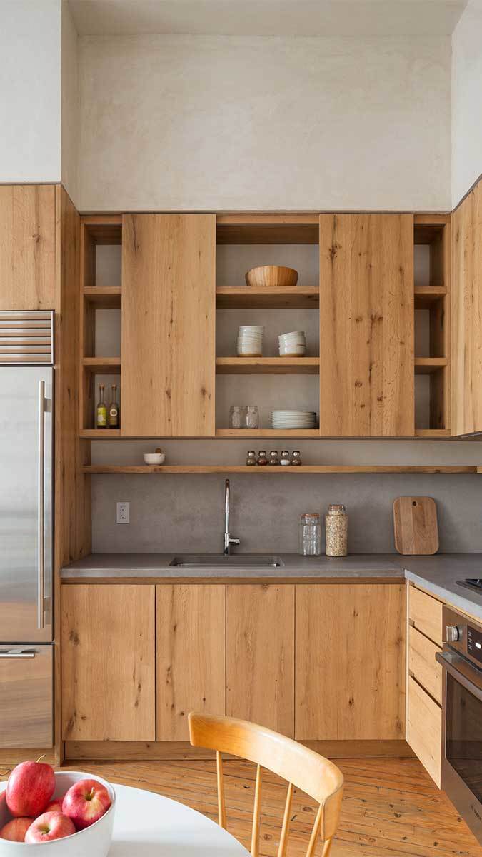
The cabinets themselves are Lee’s design. Made of reclaimed white oak, they are her response to the client’s taste, which walks the line between minimal/modern and warm/rustic. “To keep things lighter and not too rustic, we liked the idea of open shelving but we thought to add sliding doors to be able to hide items, too,” Lee says, explaining that the units were built as standard cabinets but because she wanted plaster to show from behind the shelves, the cabinetmaker built the boxes off-site, and once they arrived, the contractors removed the backs, plastered the face of the rear panels, and reassembled them before installation.
 |
 |
The kitchen cabinetry was given special treatment because it’s an important room to the client. Elsewhere, Lee went with simple white-painted cabinets to give a little relief to the warmth of the wood and plaster color—again, to strike that balance between earthy and modern. “Certain things needed to be a little cleaner, like the closets, doors, and all of the storage that’s not part of the kitchen,” says the designer.
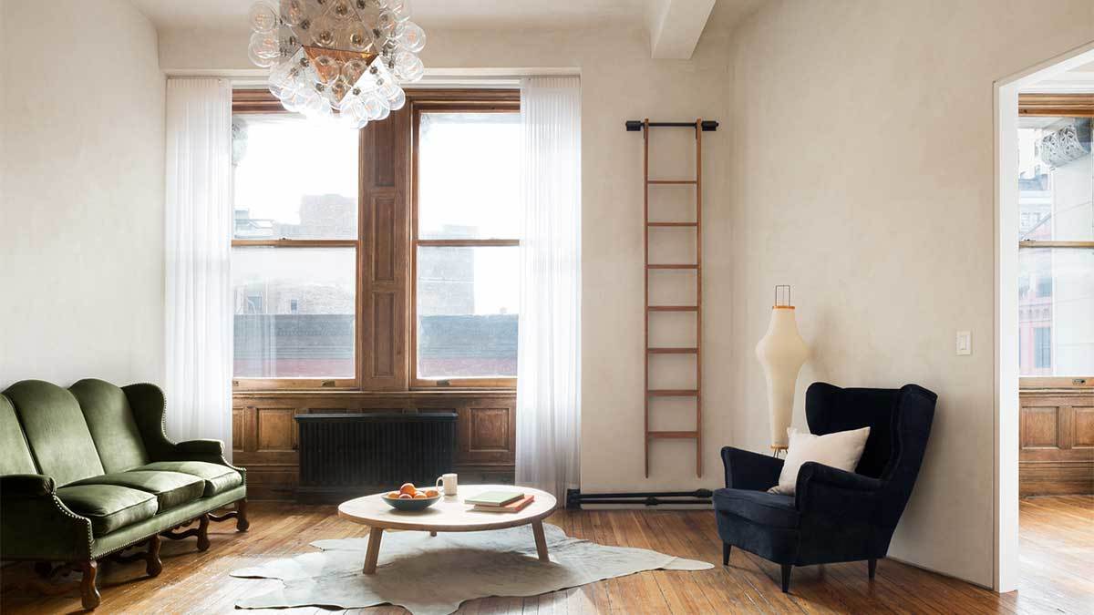
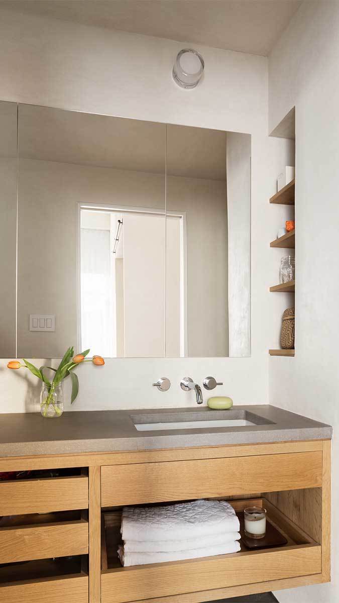
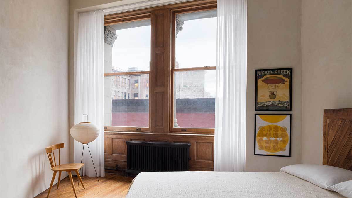
For the walls, Lee spec’d natural, hand-troweled lime plaster—something a previous firm she worked with used in special circumstances. “It seemed like the right thing to do here because it gives the space a softness that a painted Sheetrock wall just can’t do,” she explains, adding that she chose the color carefully, going with the lightest plaster mix possible—a warm white. Regarding the concrete used for the countertops and backsplash, she says: “We tried a lot mixtures, this one seemed to have the right level of texture without being too polished looking.”
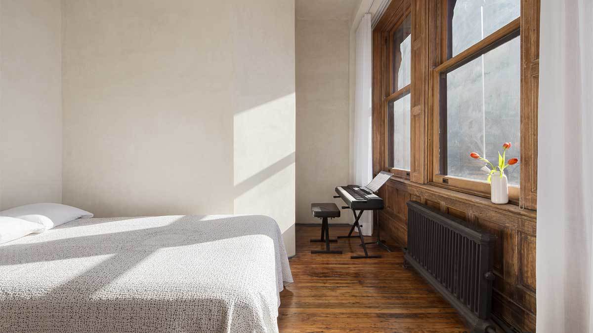
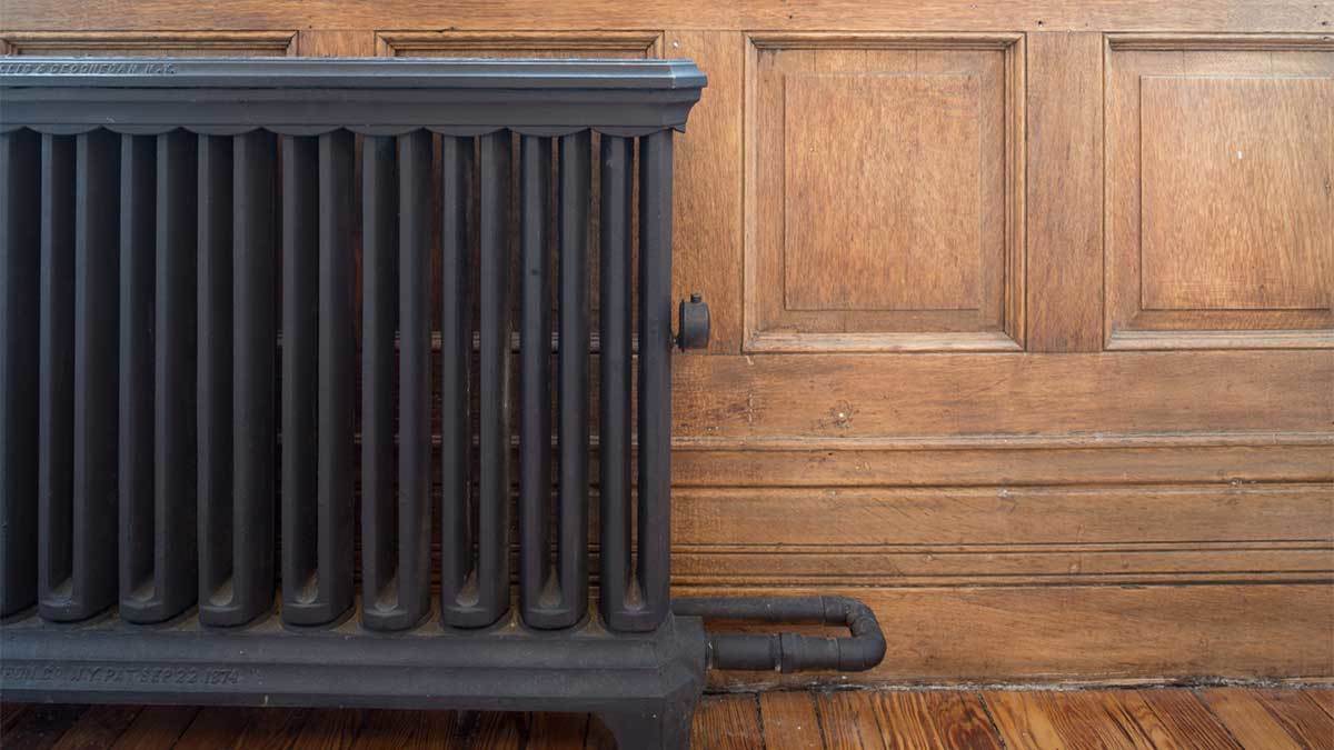
In addition to the column, the original wood paneling and floor boards were also restored—the floors being the more difficult of the two. It was a surgical procedure to pull up the cheap wood flooring that had covered the original pine boards, while being careful not to damage what lay beneath. To patch areas where boards couldn’t be salvaged, the contractors used an old beam of the same pine.
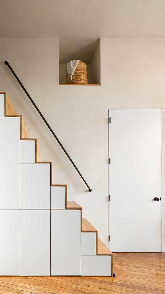
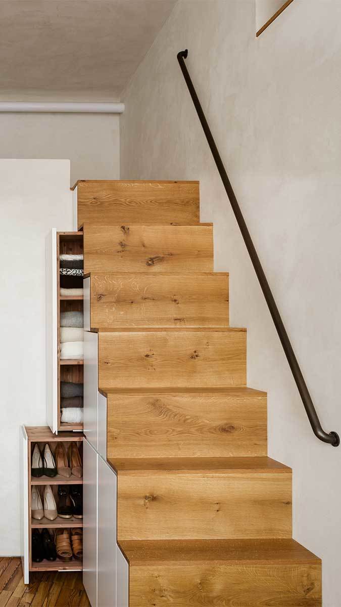
Part of the apartment’s appeal is owed to its heady volume. At a height of 12 ft., the ceilings presented a few creative opportunities. For instance, Lee added a lofted area, accessed via a built-in storage unit that itself creates dramatic effect with its steep pitch. There’s also upper storage above the bar area and in the second bedroom. Pipe handrails and a custom-built library ladder are simultaneously utilitarian and handsome design elements (as is the lofty Flos chandelier).
As the city rewrites its building codes, and they become more stringent, these old buildings have spaces that are no longer legal. Such was the case with the full bath. According to Lee, the general rule is: If you don’t move or enlarge anything, you can keep it as is. So, Lee updated the bathroom with a full gut job and redesign but left all the plumbing in place and didn’t touch the footprint. Instead of enlarging that tight but functional bath, she tucked a new half bath behind the stair to the loft.
Taken as a whole, this apartment’s composition is fresh, balanced, peaceful, and wonderfully inspired—all hallmarks of superb design. No wonder it caught my eye.
Photos by Devon Banks, courtesy of Denise Lee Architect
If you have a project that might be of interest to our readers, please send a short description and images to [email protected].
For more urban homes:
Fine Homebuilding Recommended Products
Fine Homebuilding receives a commission for items purchased through links on this site, including Amazon Associates and other affiliate advertising programs.

Code Check 10th Edition: An Illustrated Guide to Building a Safe House

A House Needs to Breathe...Or Does It?: An Introduction to Building Science

Not So Big House







View Comments
It's beautiful!
Good Job!
Great work! I like it!
I love this. Great JOB! well done!