A Midcentury-Modern Makeover
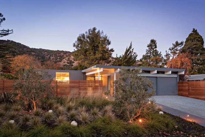
This Post-War Eichler got a major facelift to make it more aesthetically appealing and energy efficient.

The house, designed by visionary builder Joseph Eichler, had clean modern lines, single-level living, an easy rapport with the landscape, and an indoor-outdoor flow that made it feel much larger than it actually was. So Taya and Stephen Shoup fell in love with it.

Stephen, a green designer-builder, particularly appreciated the house’s simplicity: “Things were booming after the war, so architects looked for methods and materials that enabled them to build houses quickly and more affordably. Eichlers are all post-and-beam construction. You put a slab down, reinforcing it where you will put your posts. Simple beams. Simple flat roofs. Apart from window-stops to secure large pieces of plate glass, virtually no trim. For its day, the design was pretty avant-garde and, by historical standards, relatively fast to build.”
After 50 or 60 years, though, even the best-built houses get a little tired. Yet when the family decided to update their 1957 Eichler, they encountered a design shortfall that their far-seeing builder possibly never considered.
“The downside of the design,” Stephen explained, “is that because it’s a slab on grade, there’s no crawlspace. And because the underside of the roof sheathing (2×6 tongue-and-groove) is also the finished ceiling, there is no attic. So if you want to move things—say, a kitchen or bathroom—you must either bust into concrete or pierce the roof membrane to run pipes and wires.”

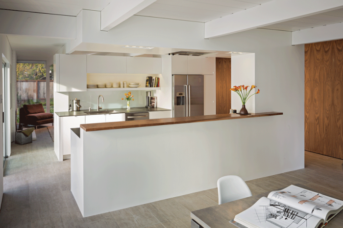
Neither is a great option. By developing a master plan, however, one can avoid the disruption and expense of breaking through a stubborn slab or a vulnerable roof more than once. This, the Shoups achieved. Their major kitchen remodel required only slight changes to the original floor plan, and replacing a structural post with a compact beam to redistribute loads. The concrete slab stayed intact.
Small changes yielded dramatic results. Adding a window lit up the dining room. Removing a small wall section on the west end of the house improved traffic flow from the kitchen and introduced more light into the living room. Another small but significant innovation was adding an opaque glass backsplash behind the sink to allow light from the kitchen to illuminate part of the living room. Lastly, they added a small bump-out for an audio-visual cabinet next to the fireplace—easily accomplished thanks to the deep overhangs along the west wall.
Two big-ticket items completed the master plan: Replacing the Eichler’s original single-pane windows with insulated, tempered, double-pane glass; and spraying the roof with polyurethane foam insulation once the kitchen remodel was finished. With its energy usage well in hand, the Eichler was ready for the next century.

Project size: 1500 sq. ft. (whole-house renovation)
Design and construction: Stephen Shoup, building Lab, Oakland, Calif.,
Landscape design: Taya Shoup
This blog was adapted from Renovation 5th Edition (Taunton, 2019). A hefty 656 pages, R5 is a trove of pro tips and techniques that builders shared with me over four decades, plus roughly 1000 photos taken on job sites across North America. I hope you find it useful. – Mike


View Comments
Wow! so beautiful. Thanks for sharing the information!
Lovely! Great job!
I like the modern design...
Very creative design! great look.
nice
Thanks for sharing this information!
nice
Wonderful Work!
I like this post!
Thanks for sharing this post!