Row House Remodel
Reconfiguring an oddball bathroom vastly improves the functionality of a hardworking kitchen
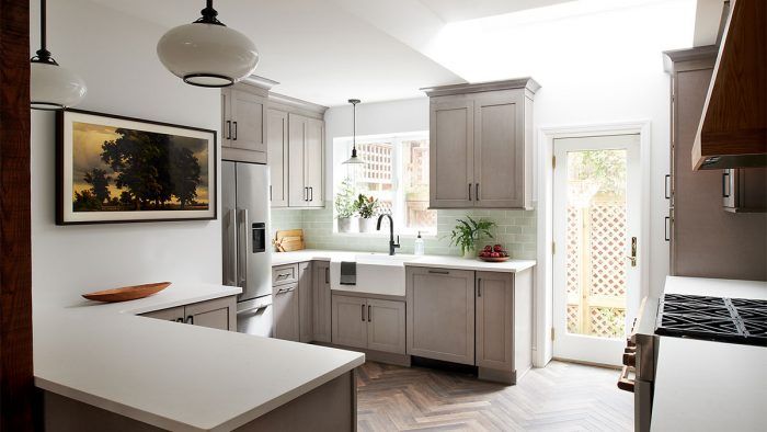
Designer Nicole Cole, principal of vestige HOME, is accustomed to working in Philadelphia’s old row houses. She treasures their historic details and time-worn feel. “Being in this city, with all its Colonial-style homes—we try to consider that,” she says. “Even when it’s a new space, we want it to feel like there’s a bit of story to it. It should be contextually appropriate.” That mindset informed the remodeling of this late 1800s row house kitchen. The homeowners wanted the new kitchen to be optimized for frequent family meals; and materials had to be tough enough to handle two young boys.
 |
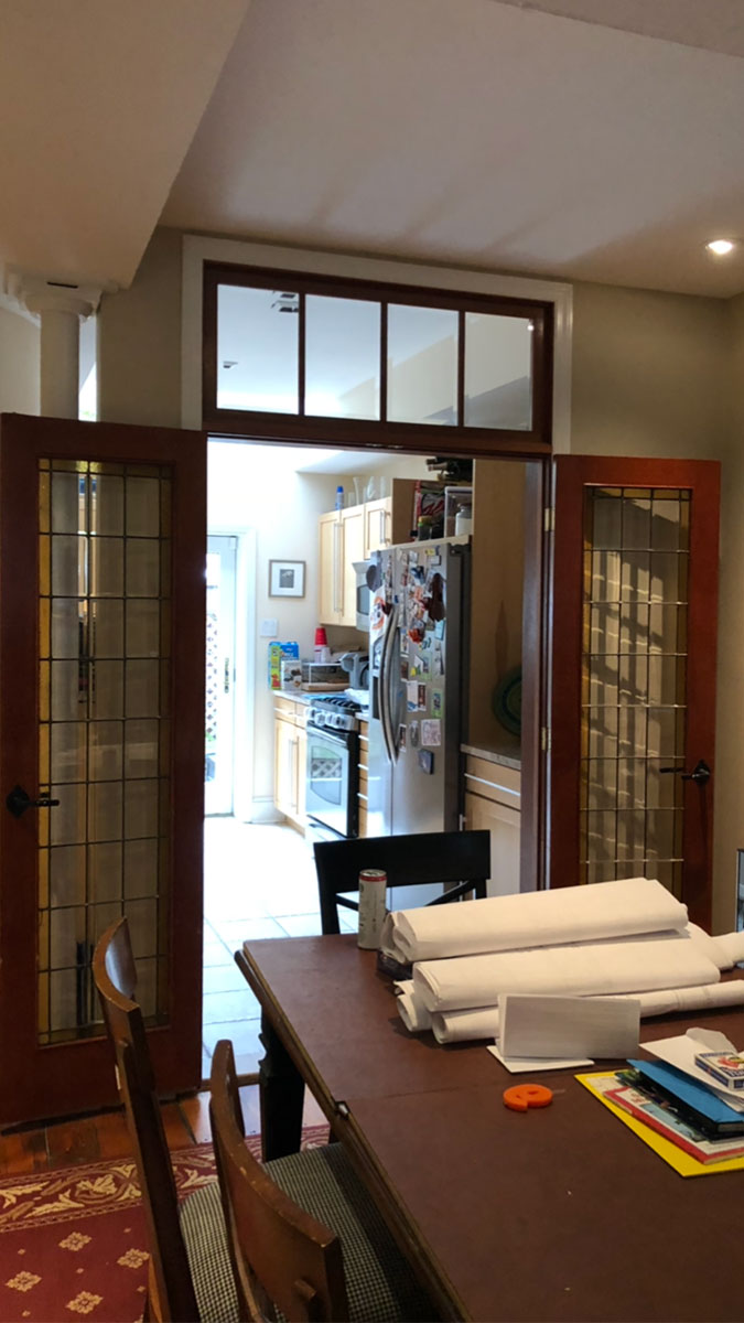 |
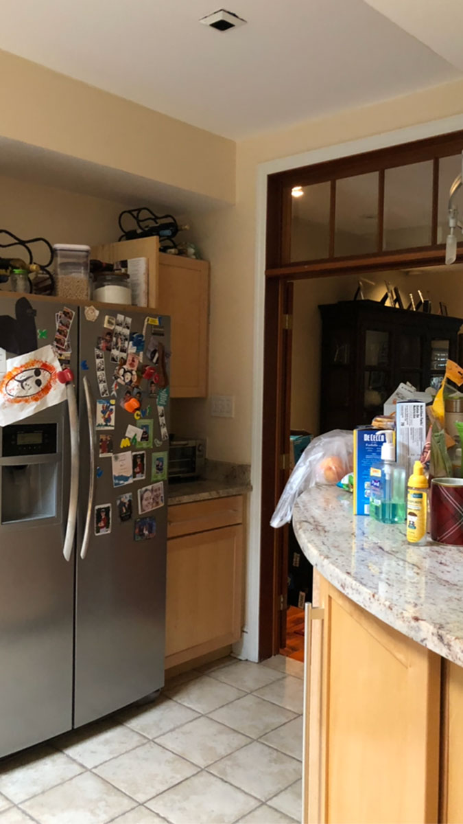
Existing conditions included an oddly shaped and poorly placed powder room. Its curved wall pressed into the kitchen, eating up valuable square footage. Awkwardly located French doors, an exposed support column, unfinished cabinetry, and an obtrusive refrigerator also factored into the design plan. “There was a lot of unusable space that made the whole area feel unconsidered,” Cole notes, adding that without adequate storage space, items ended up crowding the countertops, which were few.
Builder Kenny Grono of Buckminster Green notes that, originally, between the dining room and kitchen, there were five different ceiling planes created by two soffits and a skylight well. One soffit continued out of the kitchen on one side, and then turned 90° in the dining room. Another, on the opposite side of the kitchen, ended at the now-removed dining room wall. The soffits were off from one another by 1-1/2 in., and the main ceiling plane in the kitchen and dining room was 3 in. different from the soffits. To smooth out the planes Grono extended the soffit on the range side of the kitchen to create a tray ceiling in the dining room. “That soffit isn’t functional,” he notes, “but it made things seem more intentional. We also evened out the dimensional differences between things.”
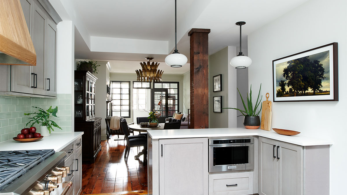
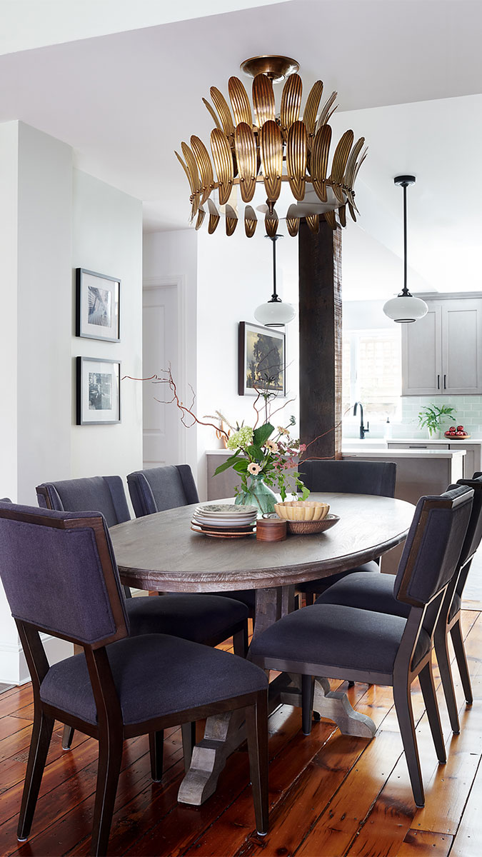
The plan included establishing a few more right angles. The French doors and partition wall between the dining room and kitchen were removed, and the powder room was reconfigured to have a smaller, rectangular footprint. That freed up room for a peninsula, which addressed the limited countertops problem and provided additional cabinetry. It also houses an under-counter microwave and an integrated beverage center for beer and wine. A narrow bank of cabinets beneath the TV/“painting” provides a bit more storage space. The kitchen is now open to, yet distinct from the dining area, and the peninsula is a multifunctional station that the kids make good use of.
The painted-steel column had to stay for structural support, but Cole made it a textural design detail by wrapping it in reclaimed timber from a local architectural salvage yard. “It lends some history to the house,” she notes.
The Shaker cabinets were treated to have a barn-board look—they are not meant to be precious but rather comfortable and durable. “We wanted to bring some farmhouse elements into the kitchen without making it over-the-top,” says Cole. “I like to do that with materials and colors because I think they elicit an emotion.” Here, she used soft grays, blue-greens, and white oak contrasted with touches of black for a fresh, contemporary take on farmhouse style.
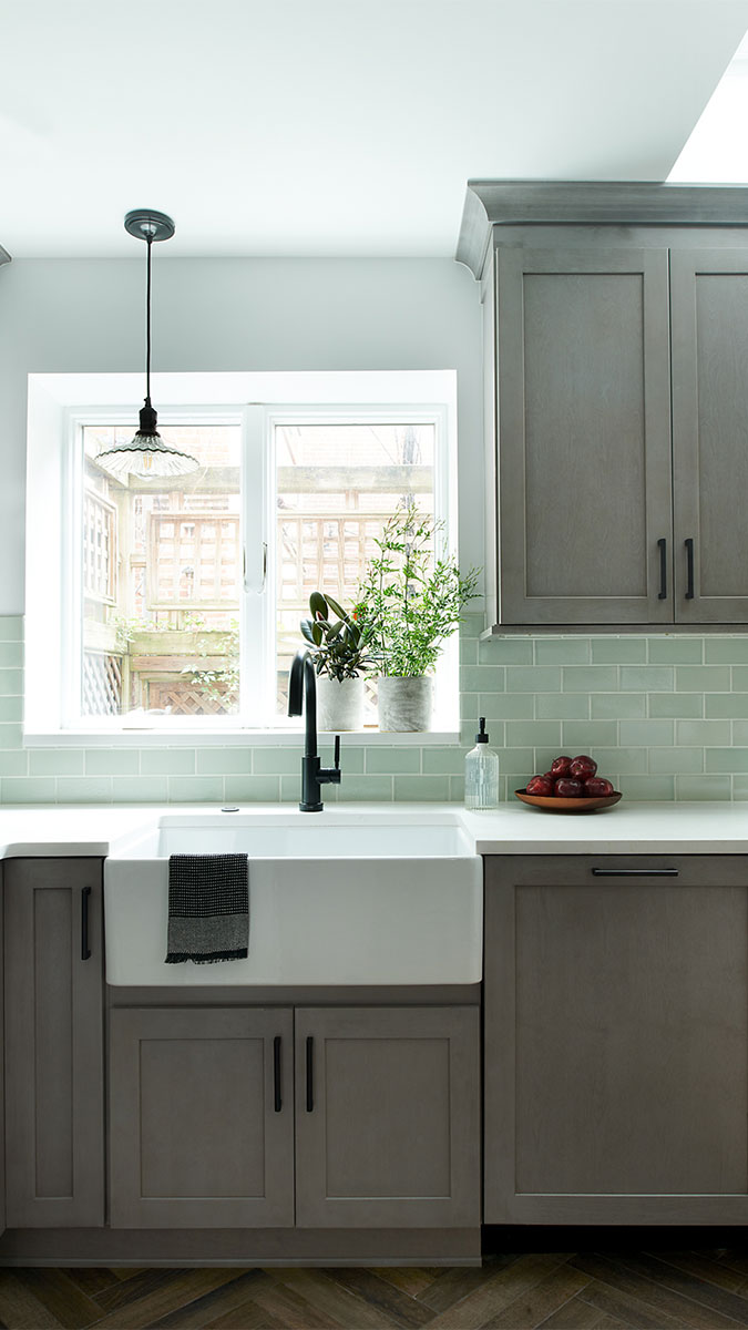
On the floor, she went with wood-look porcelain tile in a herringbone pattern to replace trodden heart-pine floor boards, which run throughout the house. Asked about her choice, Cole replies: “If we are going to go with wood on wood, I like them to be different with a distinct style while still working well with the rest of the house.” The wood-look tile adds another dimension to the kitchen, and provides some warmth amongst all of the cool tones.
In an atypical move, Cole hung a mercury-glass pendant—something more likely to be be seen in a dining room—left of the sink. “To counterbalance the visual of the off-centered faucet, we hung the pendant offset on the other side so, overall, it feels balanced,” she explains, adding that she always enjoys opportunities to do something a little unconventional.
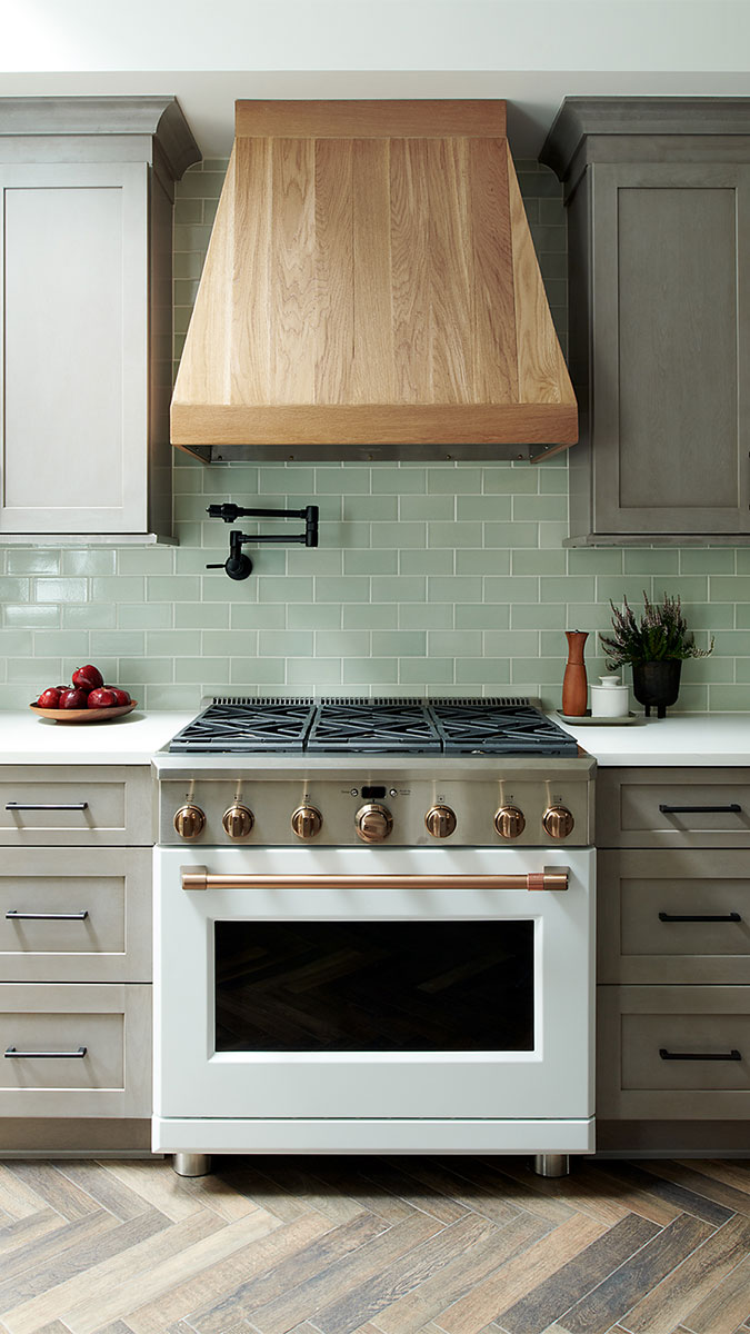
Interestingly, Cole was a woodworker in a previous life. Her penchant for the material is on display in the range insert hood with softly tapered sides—another warm touch. “The nice thing about being someone who has done a lot of work with wood and who understands wood species is that I can be very specific about what I want.” Here, she wanted white oak in a matte finish in a transitional style, which is a hallmark of her work. “What’s really important to us as a firm is to create spaces that clients won’t tire of in a few years. I think one of the pillars of doing that is to use a blend of styles. Even though we live in this city full of Colonial architecture, it’s not uncommon for us to use a mid-century piece or a modern fabric or light fixture. It might look to some like it’s out place, but I think it adds interest, depth, and longevity to the design.”
Photos by Rebecca McAlpin Photography, courtesy of vestige HOME
If you have a kitchen project that might be of interest to our readers, please send a short description and images to [email protected].
For more row house remodels:
RESOURCES
Cabinets: Galaxy/Horizon Colorway, Fabuwood Allure
Counters: Honed Frosty Carrina Caesarstone
Cabinet hardware: modern pull, Restoration Hardware
Backsplash: 3-in. by 6-in. Silver Haze subway, Fireclay Tile
Range: 36-in., matte white, Cafe Appliances
Hood: White oak with matte finish, custom
Pot filler: matte black, Brizo European
Lighting over peninsula: Caton pendants in old bronze, Hudson Valley Lighting
Faucet: Single handle with SmartTouch, Brizo Solna






View Comments
The teaser line "Reconfiguring an oddball bathroom vastly improves the functionality of a hardworking kitchen" suggests that the reader is going to learn how this row house was reconfigured. The reader is, however, in for a disappointment. The article is chock full of product pushes, clever details and finishes but nearly devoid of anything that has to do with the reconfiguration.
I really don't understand how anyone can write or publish a remodel article without before and after floor plans.