What Makes for Good Design?
A look at the qualities that separate masterfully designed homes from those that are mediocre.
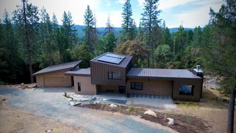
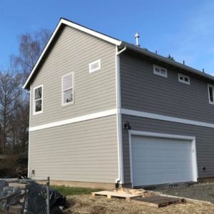
Recently, one of our podcast listeners, “Troy from Portland, Oregon,” contacted us with a design-related question (always appreciated). He sent four photos of a newly built house in his neighborhood—one of each elevation—and commented on its severe lack of appeal. I couldn’t have agreed more. There are a number of reasons for calling it an example of bad design, including:
- No clear style
- Confusing facade and circulation path
- Cheap building materials
- The only entry is into the garage
- Nonsensical window placement
- Poor proportions on pediment
- No architectural interest
- No marks of craftsmanship
 |
 |
 |
 |
Photos courtesy of Troy
Troy followed with a question that boils down to: What makes for good design? It got me thinking about the things I look for when considering houses we might feature in the magazine. As I was making my list, it occurred to me that it might be fun to share it. In my opinion, the hallmarks of good design include:
- Clear style or reference to style
- Uncomplicated rooflines
- Right scale for the lot and neighborhood
- Regional appropriateness
- Distinct hierarchy of forms
- Clear entry and circulation pattern
- Appropriate window sizes and placement
- “Architectural rhythm”
- Restrained ornament
- Details with impact
- Points of focus for the eye to pause
- Quality building materials
- Marks of craftsmanship
- Functionality
- Elements that tie the whole house together
- Connections to the surroundings
- Broad appeal
Troy’s question also spurred me to revisit Kate Wagner’s McMansion Hell, which is an entertaining way to learn about good vs. bad residential architecture; and I found an excellent Fine Homebuilding story titled “How Great Houses Take Shape” by Jeremiah Eck. One of the things I appreciate about this piece is the fact that it was written in 2008, yet is still spot-on today. The six design principles that the author outlines are just as relevant a decade later, proving yet again that “good design is timeless”—a cliché, but true. Below is a selection of houses from past articles and/or blog posts. Each has something to offer in the way of understanding what makes for a well-designed house.
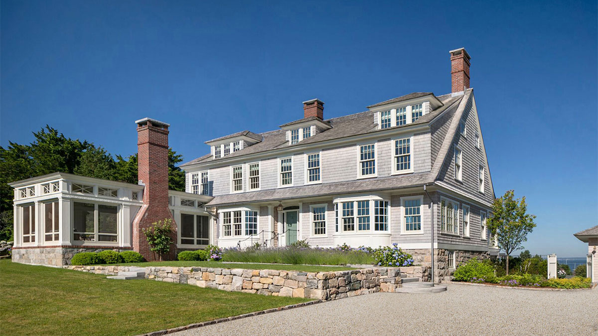
Though a newer build, this house is obviously influenced by the Shingle style (1880-1900) with its naturally weathered cedar siding, rustic stone foundation, double-hung sash windows, prominent porch, multiple dormers, and asymmetrical patterns.
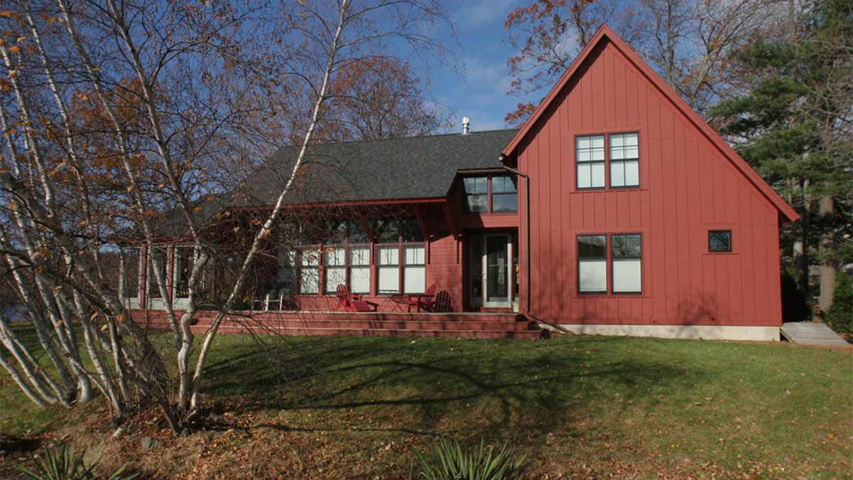
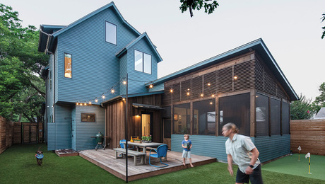
Simple forms in a distinct hierarchy are pleasing to the eye. Here the house is organized into three volumes—the gable end, the center section, and the screened porch. There is a clear and concise relationship between them—primary, secondary, and tertiary.
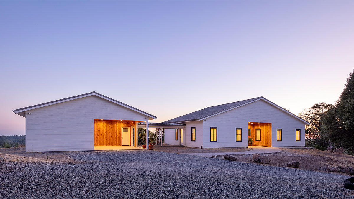
This is a good example of how a simple roofline can be impactful. Its broad gesture mimics the expansive landscape.
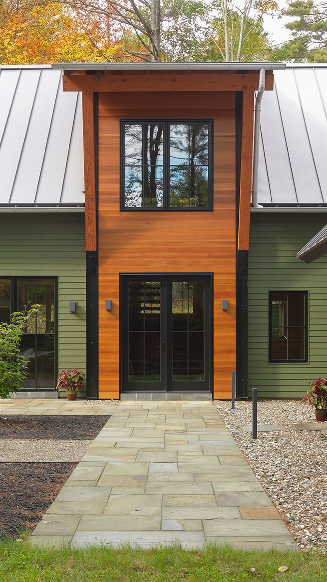
A clear and inviting entry makes a house sing. The one shown here is particularly celebratory. It’s possible to achieve the same result with more modest materials and scale. The point is to draw people into the house.
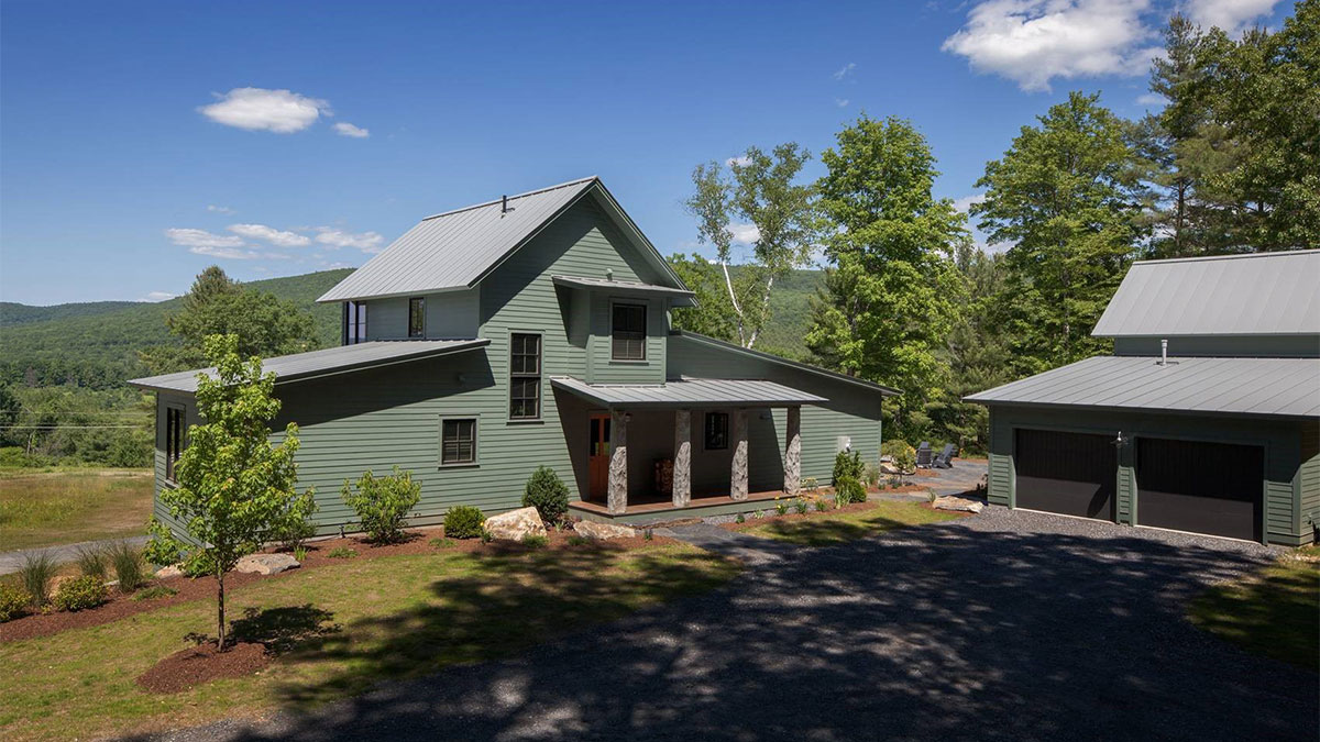
Located in Great Barrington, Mass., this farmhouse-inspired build is a direct response to its place in The Berkshires. Its form, materials, and even the color harmonize beautifully with the natural surroundings.
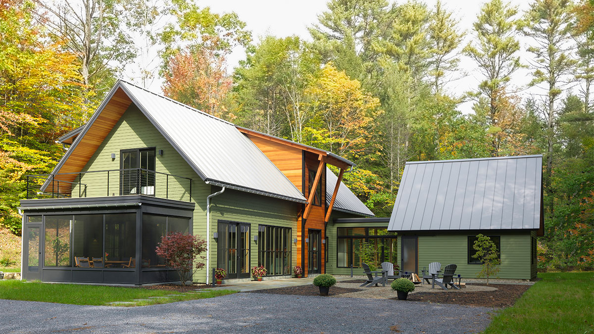
A mix of high-quality building materials and window units distinguish this home, as do the clear marks of craftsmanship—the most obvious of which are the entry and eave treatment.
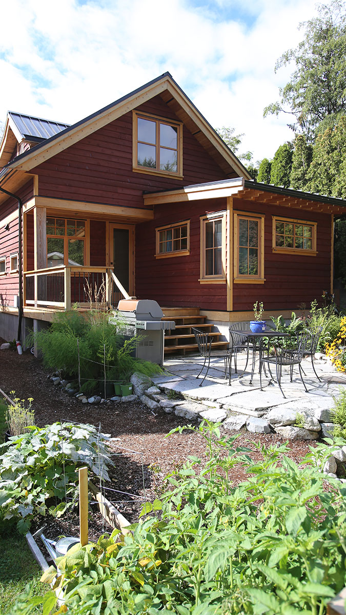
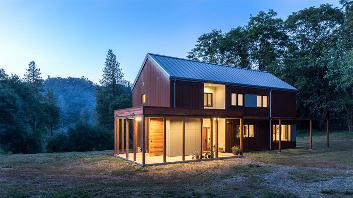
This LEED Platinum–certified house sits on an infill lot in Squamish, B.C. It is a model of sustainable, ecologically responsible design and construction. Using the smallest possible footprint and nontoxic building materials, it was designed for minimal disturbance to the natural environment. Not only were LEED points earned for being on an existing infill lot near public transport, but it also scored points for not being in a flood plain, wetland, or environmentally sensitive area, and for being close to community resources.
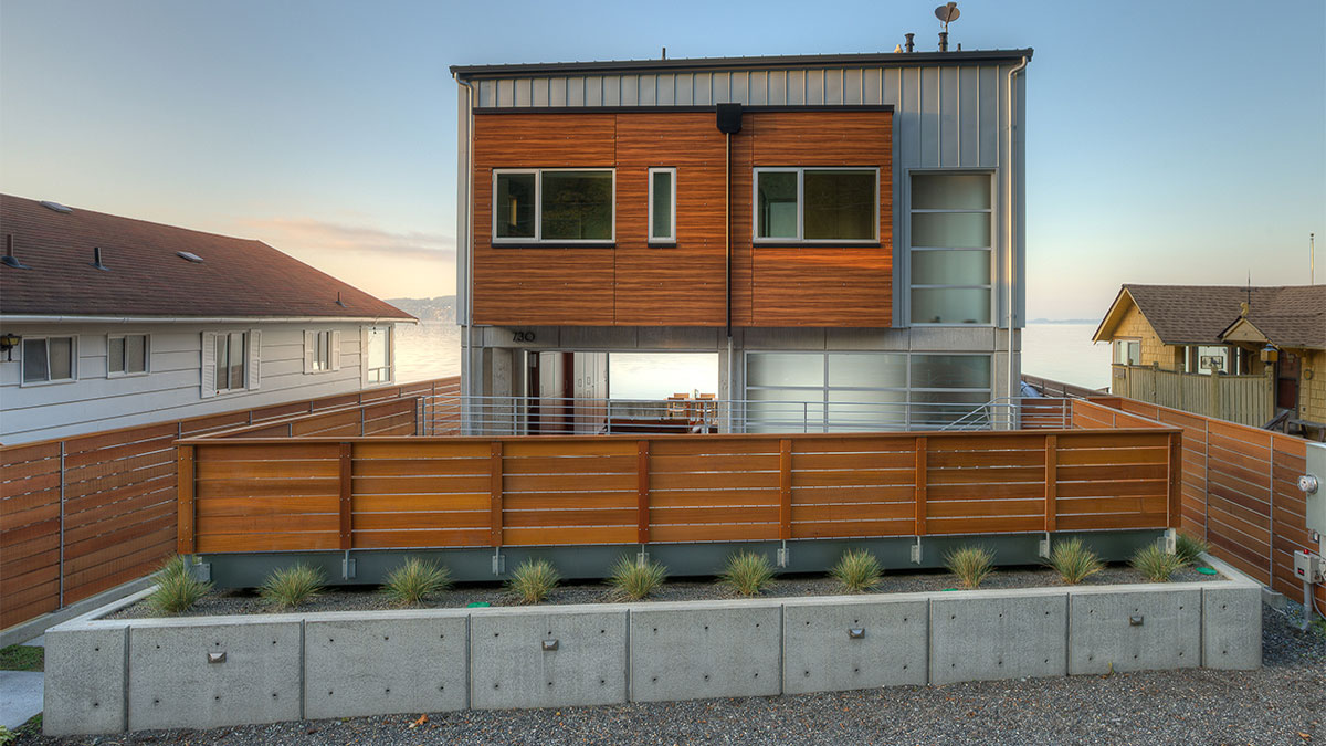
Built to withstand tsunami conditions, this house on Camano Island in Washington State sits on 9-ft. concrete columns, which are tied into a concrete floating slab. The connections for the panel wall system—located below flood elevation—were designed to resist waterfront wind loads, but they are meant to be weak enough to fail during a high water event, enabling water to flow through the lower level. A steel moment frame is tied into the concrete frame, creating a hybrid structural system for lateral seismic design. In the event of an earthquake, the entire structure will move as one unit. It is the ultimate example of a house built to hold up to its environment.
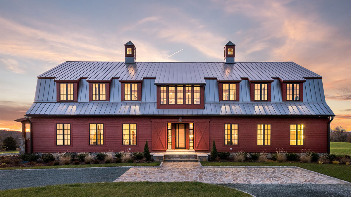
This renovated barn in Richmond, Va., is a study in architectural rhythm. The symmetry and repetition of the windows balance the whole composition. Any element, such as brackets or columns, can be used to create patterns to visually tie a house together.
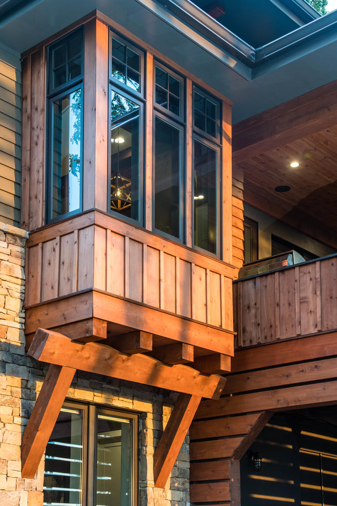
The craftsmanship of this bay window treatment is on full display in a prominent location. Good design often includes decorative features that are strategically placed to have the most impact.
If you have a project that might be of interest to our readers, please send a short description and images to [email protected].
For more on design:
Fine Homebuilding Recommended Products
Fine Homebuilding receives a commission for items purchased through links on this site, including Amazon Associates and other affiliate advertising programs.
Pretty Good House

All New Kitchen Ideas that Work

A Field Guide to American Houses
