Addition by Subtraction
Whitten Architects turns a centuries-old waterfront chandlery into a quintessential New England respite.

“Nothing was square or true about the existing building, and it’s still not square or true, but it is much more stable and will last at least another 50 years.” —Will Fellis, architect
 |
 |
 |
 |
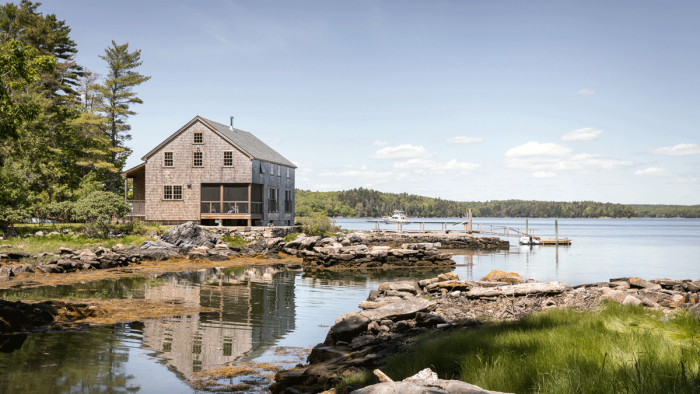
Estimated to have been built around 1800, this former chandlery in Sheepscot River, ME, is remarkable for having stood for over two centuries on a tidal river bank, close to the open ocean, despite being under-framed and set atop a rubble foundation. The roughly 2,000-sq.-ft. cottage had been in the same family for nearly 70 years before being purchased by the current owner, by which time the structure was so compromised that it would actually sway when pounded by storm waves.
“The first question the client put to us was whether or not we knew what a chandlery is,” recalls Will Fellis of Whitten Architects, the firm responsible for the renovation. A chandlery, he explains, is a place where candles, lamp oil, rope, and the like are sold to boaters. Historically, such a building would be sited at the water’s edge, as is the case here. “It’s basically the Quickie Mart of the boating era,” he adds, “and it is an important structure.”

Originally, the high-tide line ran under the building. Prior to renovation, the finished floor was below the 100-year-flood mark, so the structure needed to be raised by 3 ft., as well as moved for a mandated 25-ft. setback. (Because the cottage is so close to the water, the design team was required to work with the Department of Environmental Protection to ensure ecologically responsible construction work.) The exterior stone wall indicates where the building used to sit; it was moved back about 7 ft. and over another 8 ft.
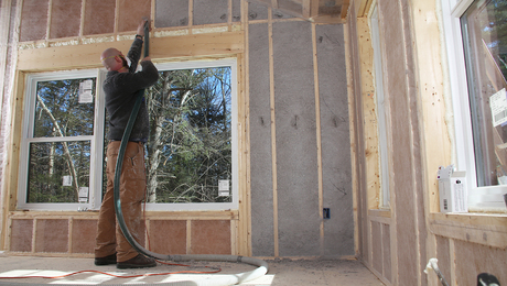
The design plan had to accommodate an addition, which needed to be sited outside of the setback. “There was a lot of reconstruction that had to happen before we could even start designing new,” Fellis says. “We had to pick up the building, then pour the foundation and piers beneath it, then add new floor framing and insulation before setting it back down.” To reinforce the wall framing, the team essentially built a post-and-beam frame from the inside, feathering plywood to transition from the new structure to the out-of-plumb old framing. And, in order to keep as much of the original interior detailing as possible, they insulated on the exterior.
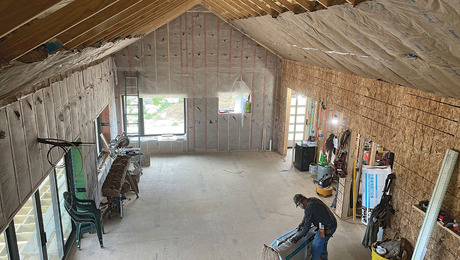
Despite efforts to retain the entire shell, there were portions of the building that needed to be replaced, particularly where new openings would be added. Additionally, an 8-ft. by 20-ft. section running nearly the length of the cottage was built to house a mudroom, a bathroom, laundry units, and mechanicals. This move enabled them to get a stair to the second floor, which they opened up by cutting out over the living room. Now the upstairs and downstairs are one large open volume, giving occupants a sense of the entire space. Previously, the second floor was used for storage and included two small “quasi” bedrooms.
The clients really wanted an outdoor space, and the southwest corner was the ideal place to site a new screened porch. Unfortunately, because of the setback restraints, they couldn’t simply add onto the existing building. Instead, they carved out a corner of the interior space for the porch. “That gave them cover and a water view without having to add on,” Fellis explains, noting that this solution also brings light deeper into the house. “A lot of this project was subtractive—we removed more conditioned living space than we added, and we used the structure to open the space to make better use of the square footage. The porch is a pretty modern move in an 1800s box.”
Because they couldn’t add structure to the water-facing side but connection to the river view was important, Fellis devised a solution using glass doors and a cable rail. From inside, the three structural posts of the railing line up with the door and window mullions such that the posts visually disappear. The treatment provides protection and safety without obstructing the views.
In terms of finishes, Fellis points out the bold use of blue. “All of the blue accents are original pieces from the old building including the bunk beds, the shelving unit in the kitchen, and the kitchen peninsula, which is the old chandlery cash counter.”
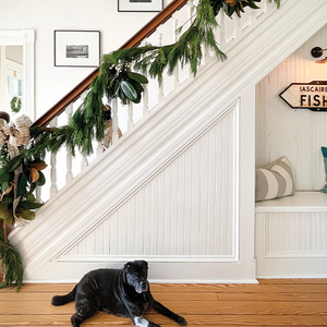
Years of dirt, oil, and various finishes were removed from the floors, though not to the point of making them pristine. “They were cleaned just enough that they will be set for years but not so much that they were stripped of character,” Fellis notes. In fact, the entire project is an ode to the architect’s ability to keep a structure’s integrity intact.
Builder: Pearson Construction, pearsonconstructionmaine.com
Photos by Trent Bell
If you have a project that might be of interest to our readers, please send a short description and images to [email protected].
For more on renovation of historic structures:
- Revolutionary Remodel
- Architectural Archeology Informs the Restoration of a Centuries-Old Farmhouse
- Preserving Colonial American Houses
Fine Homebuilding Recommended Products
Fine Homebuilding receives a commission for items purchased through links on this site, including Amazon Associates and other affiliate advertising programs.

All New Bathroom Ideas that Work

The New Carbon Architecture: Building to Cool the Climate

Graphic Guide to Frame Construction


View Comments
It’s really very nice and I will only say thanks for sharing this great information with us. Today Iftar Time in Dhaka.