2020 Editor’s Choice: Island Inspiration
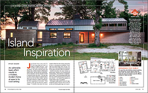
An admirable team effort results in a modest, modern home at ease in its rural setting.
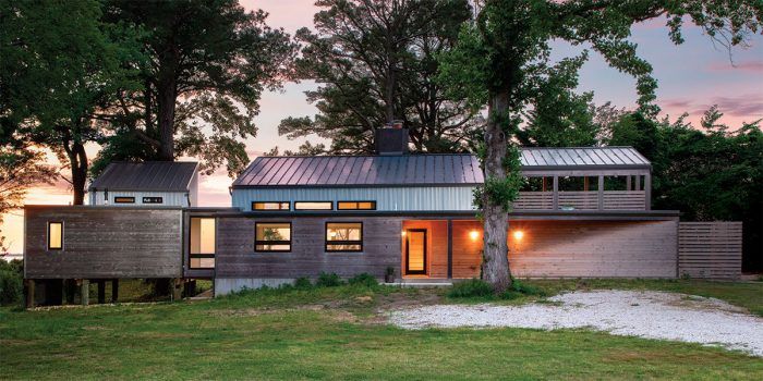
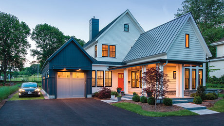
EDITOR’S CHOICE: When selecting a project for the 2020 Editor’s Choice Award, we look for a house that can be studied for months without tiring of it. The moment we saw this design by David D. Quillin Architecture, we knew we’d found the 2020 winner. Its measured proportions, gentle aesthetic, and clean detailing make it a stunner, but it’s the affection with which the team describes their time together that makes it a house with heart.
Arranged for family
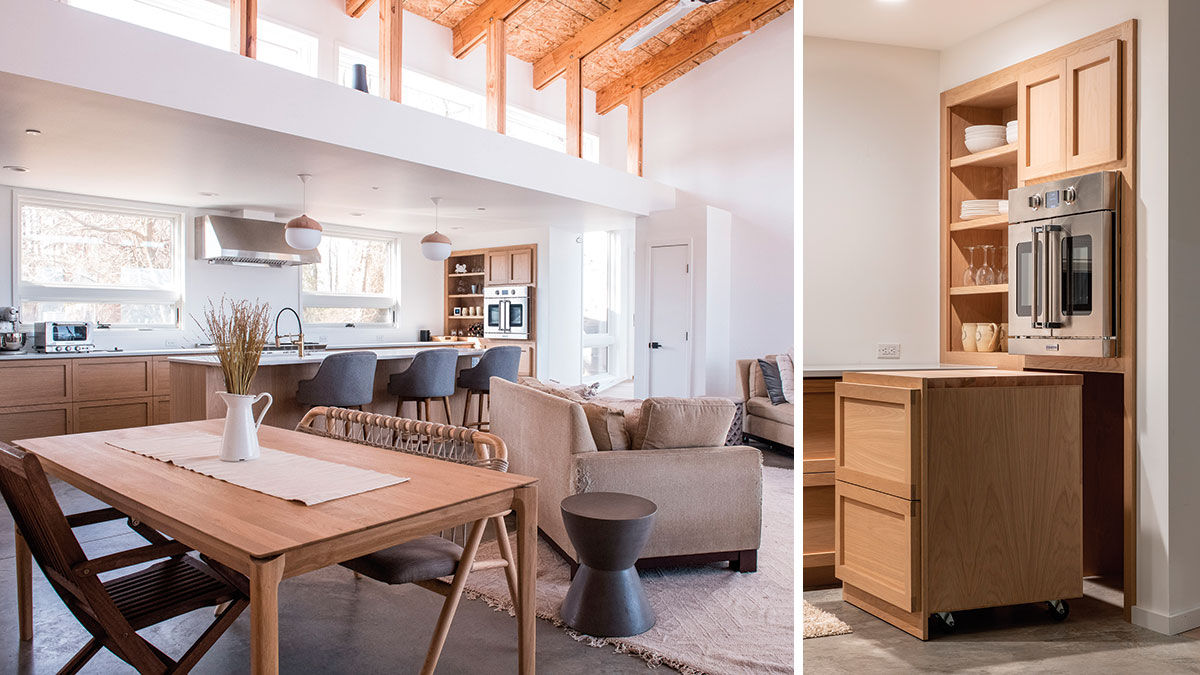
The open floor plan facilitates relaxed socializing by orienting the common spaces toward the water views. The kitchen island and stair cabinet break the volume into distinct zones for different activities for adults and kids.
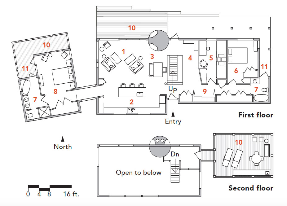 |
1. Living 2. Kitchen 3. Dining 4. Kids’ playspace 5. Kids’ bedroom 6. Guest bedroom 7. Bathroom 8. Master bedroom 9. Laundry 10. Deck 11. Outdoor shower |
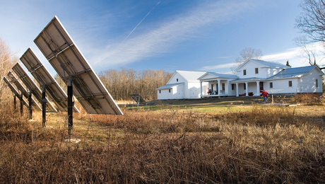
Jerry Keith lives at the end of a 25-mile-long dead-end road in a village of roughly 50 houses—most of which can be described as fishing shacks. The retiree enjoys the peace and beauty that is Elliott Island on Maryland’s eastern shore. His son and son’s young family live elsewhere, but they decided to build a weekend house next door. “The idea was to create a kind of camp for seasonal trips to spend time with the client’s father,” says the principal of David D. Quillin Architecture, the firm responsible for the build. “They wanted a rustic feel, but they love modern design.” To Quillin, that meant the house needed to blend into the remote community, yet have a contemporary sensibility. “It was right up my alley design-wise,” he says. “I’ve spent a lot of time studying the architecture of this region and what makes it wonderful.”
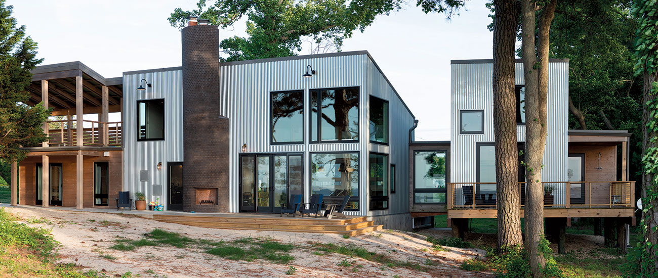
Quillin describes the area’s homes as pared-down, without a lot of architectural ornamentation. They also have a weightlessness to them. “The surrounding houses look like they could be picked up by the wind at any moment—we wanted that quality in a casual-modern style,” he explains.
Striking the right aesthetic tone and organizing the house to function well in terms of privacy and family gatherings were top priorities but not unusual design goals. What was a bit unconventional was the team that pulled it off. The clients hired Andy Bukovsky, a local master cabinetmaker but first-time home builder, to serve as the general contractor. And Jerry Keith, the homeowners’ father, acted as construction manager. Because Keith uses a wheelchair, the first move was to make the job site fully accessible, which means accessibility was built into the plan from the start. It is one of several ways the team demonstrated a shared sensitivity to what this home was to be all about—unity.
Built for respite
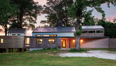
To give the homeowners some privacy, Quillin set the master suite off from the main house, connecting it with a glass bridge. Spatially removed and built on wood pilings, the bedroom has a treehouse feel and is something of a retreat space. Its separation from the main house is also meant to be suggestive of the way island properties tend to evolve over time as a series of separate dwellings. Though the majority of the foundation is slab-on-grade, pilings made sense here because the topography slopes away on that side of the property, and there are a number of nearby pine trees whose roots needed protecting. Additionally, runoff water is naturally directed beneath that portion of the house, creating a pleasant stream that is visible from the bedroom.
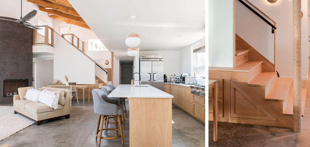
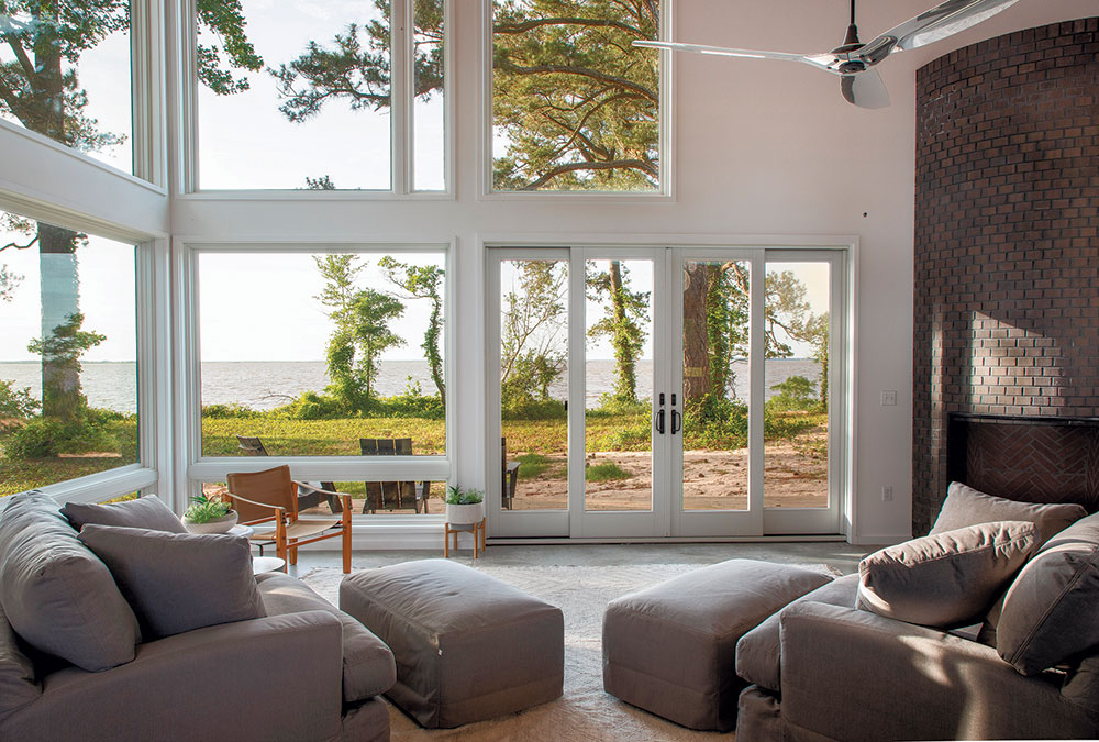
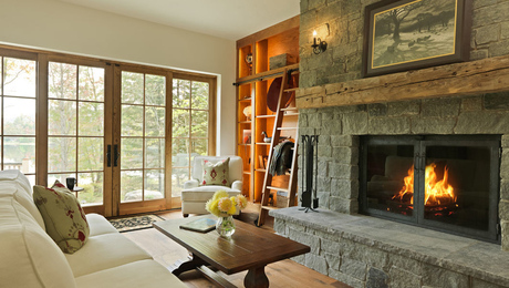
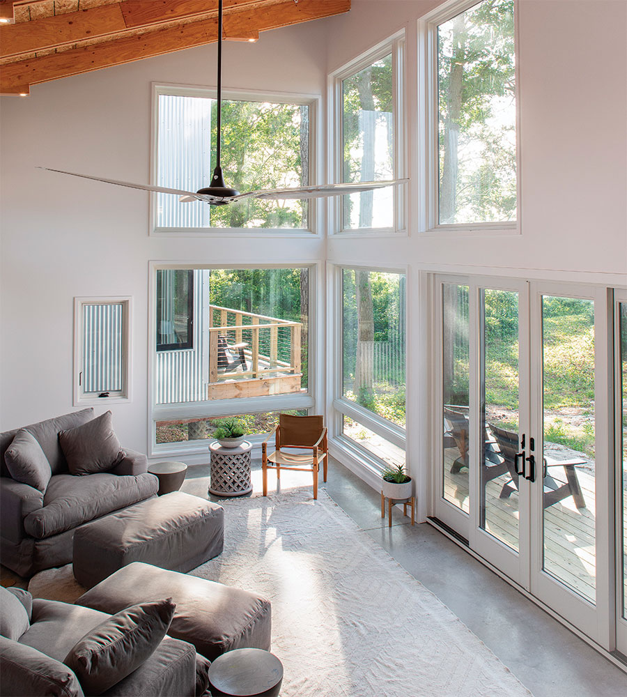
While the bedroom is loftlike, the main house is solidly rooted to the site. That connected feeling is heightened in the central space, where glazing is concentrated on the north side to dramatize water views. Quillin describes the room, which includes a creative play area for the kids, as “loose and organic.” His idea was to encourage family time. “It facilitates roughhousing rather than ceremony,” he says. “The concrete, brick, wood, and metal materials contribute to the rustic camp feeling we were going for.”
A chimney takes shape
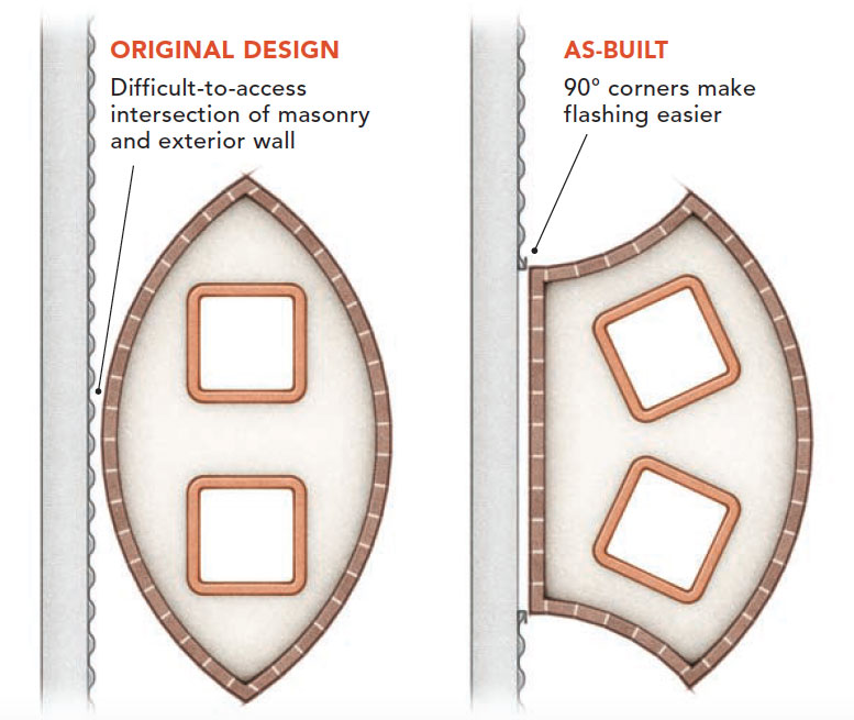
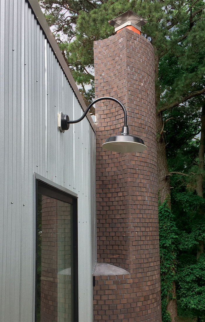
The original design called for two separate fireplaces—one in the great room and the other on the rear deck. it was decided they would share a chimney. A new concept was developed for a 7-ft.-diameter drum that reduces to a smaller tower. The chimney’s initial shape was football-like, but the mason, Joe Pete, said flashing that curve would be difficult. instead, he suggested having the brick meet the siding with 90° corners, which not only made flashing easier, it also reduced the amount of brick-cutting he needed to do.
 |
 |
Island character
Asked about a favorite feature of the house, Quillin points to an aesthetic detail. “The cedar siding grayed out wherever the sun hits it, but at the recessed entry it hasn’t weathered. It has an orange-gold color; it’s like a beacon that guides visitors to the front door.” It also works to further break up the different volumes by adding contrast to the color palette. “The wood treatment helped the house settle into the surroundings,” he adds. Arguably, the house harmonizes so well with its setting because of a hundred decisions made during the build. Like most designs of distinction, it is the result of creativity, flexibility, inspired craftsmanship, and straight-up heart.
See more photos of this home on the architect’s website: Elliott Island Residence
SPECS
Bedrooms: 3
Bathrooms: 2
Size: 2176 sq. ft.
Location: Elliott Island, Md.
Architect: David D. Quillin Architecture, daviddquillinarchitecture.com
Builder: Andy Bukovsky
Construction manager: Jerry Keith
 David Quillin is founder and principal of David D. Quillin Architecture, a small firm that focuses on sustainable design and working with nonprofits, when possible. The company does both residential and commercial work, and has done projects as diverse as a national monument and the first Energy Star–certified Habitat for Humanity home in the mid-Atlantic area. |
 Andrew Bukovsky started a carpentry crew at his high school in 1976, and has been a carpenter and cabinetmaker ever since. He came to this project with little home-building experience, and working for the first time as a general contractor has given him a new appreciation for home builders. He’s now involved in a few restoration projects on the island. |
Photos by Danny Bostwick. Drawings: Christopher Mills.
From Fine Homebuilding #291
Fine Homebuilding Recommended Products
Fine Homebuilding receives a commission for items purchased through links on this site, including Amazon Associates and other affiliate advertising programs.

Stabila Classic Level Set

Short Blade Chisel

Tajima Chalk Rite Chalk Line
