2020 Best Remodel: Two Structures, Two Treatments
A restored Massachusetts farmhouse receives a modern addition inspired by traditional New England barns.
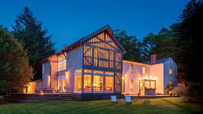
BEST REMODEL: The commitment of architect Nicole Migeon and builder Chris Seaver to honorably restore a late 18th-century house and add to it in the form of a barn-inspired gathering space made it a pleasure to give them the 2020 Best Remodel Award. The poor condition of the original house and the complexity of the new build made the three-year-long project a demanding effort and hard-earned triumph.
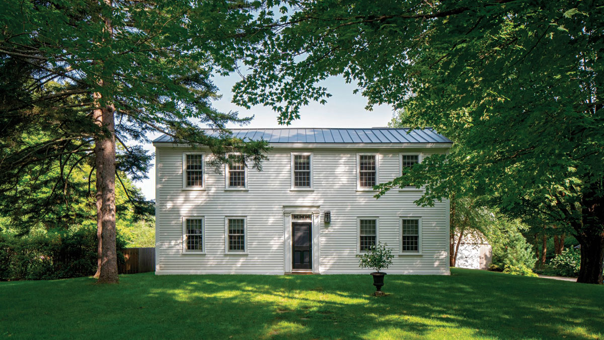
Located on a river in western Massachusetts, this 1785 Federal- style home has been in my firm’s charge for more than three years. The clients bought the property with the intention of restoring the original portion of the house and replacing a decrepit exist- ing addition. This was accomplished in two phases, beginning with the historic structure. Given the old home’s small rooms and low ceilings, we agreed it would be used for more private activities like sleeping and reading, whereas the addition would house an open- concept space for socializing and allow for easy access to the outdoors. Our plan was to restore or replicate the details and materials in the farmhouse where we could, and build an addition with natural, durable, and sustainable materials.
I think designing and engineering the trusses in the new guesthouse, as well as the screening assembly and slot stair, were the most gratifying aspects of the build. And, of course, anytime you are restoring or renovating a period home, there are unanticipated hurdles and creative opportunities that require a good team. The builder, Chris Seaver, and I worked with several local craftspeople and artisans. I attribute the high level of design and construction details on this project to their care and expertise.
Unified for FlowThe floor plan did not change in the original house, and the new addition was designed for easy access to the stone terrace and private entry to the studio. While a previous addition required occupants to take a steep, awkward step up or down, excavating the slope at the rear enabled its replacement to be positioned 3 ft. above grade, putting it on the same level as the original structure. |
Back from the brink
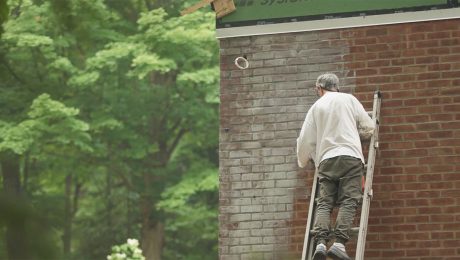
In the existing house, we restored where we could and renovated where we had to. The entire framing structure and the floors were in exceptionally bad shape—everything needed reinforcing, and the roof was a complete redo. Plus, the siding was full of rot. In short, it was a near-total gut job.
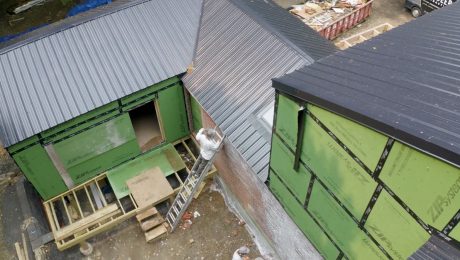
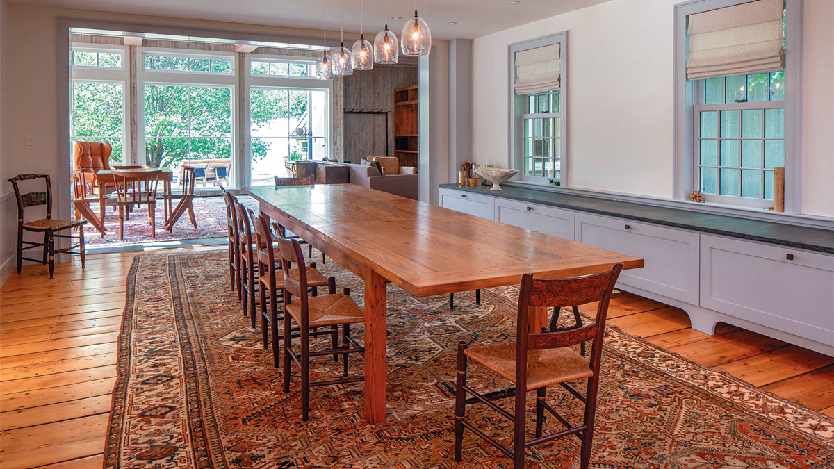
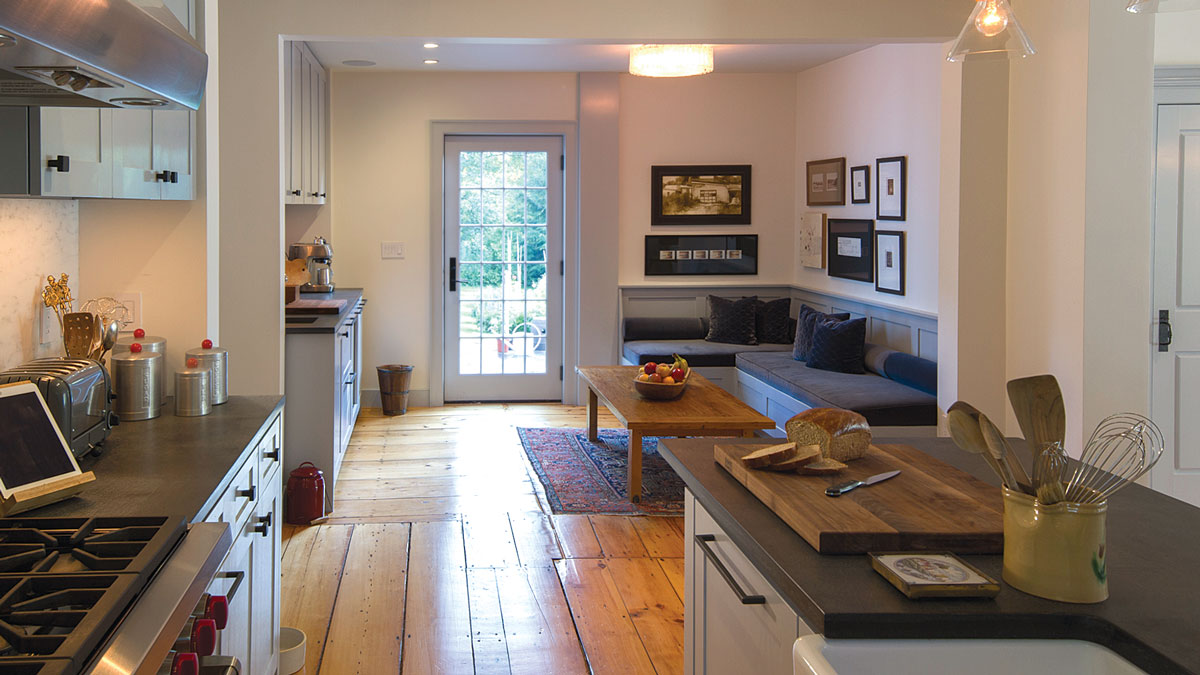
We decided not to change the floor plan, and started by removing all of the features that were not part of the original house. We salvaged materials when possible, including the wood-plank floors, the plaster walls and ceilings, some moldings, and the stone fireplace mantels and hearths. The original roof was slate, but we wanted the house and addition to relate, so we went with standing-seam zinc on both. All of the windows were damaged and replaced with historical replicas by Marvin— the new wood-divided lites match the size and scale of the originals. We also restored the glass transom above the entry door. Custom casings, moldings, and baseboards were milled locally—again to replicate what was endemic to the house. Additionally, the walls were covered in historical-style wallpaper and the ceilings were tea-stained, as they might have been during the late 1700s and early 1800s.
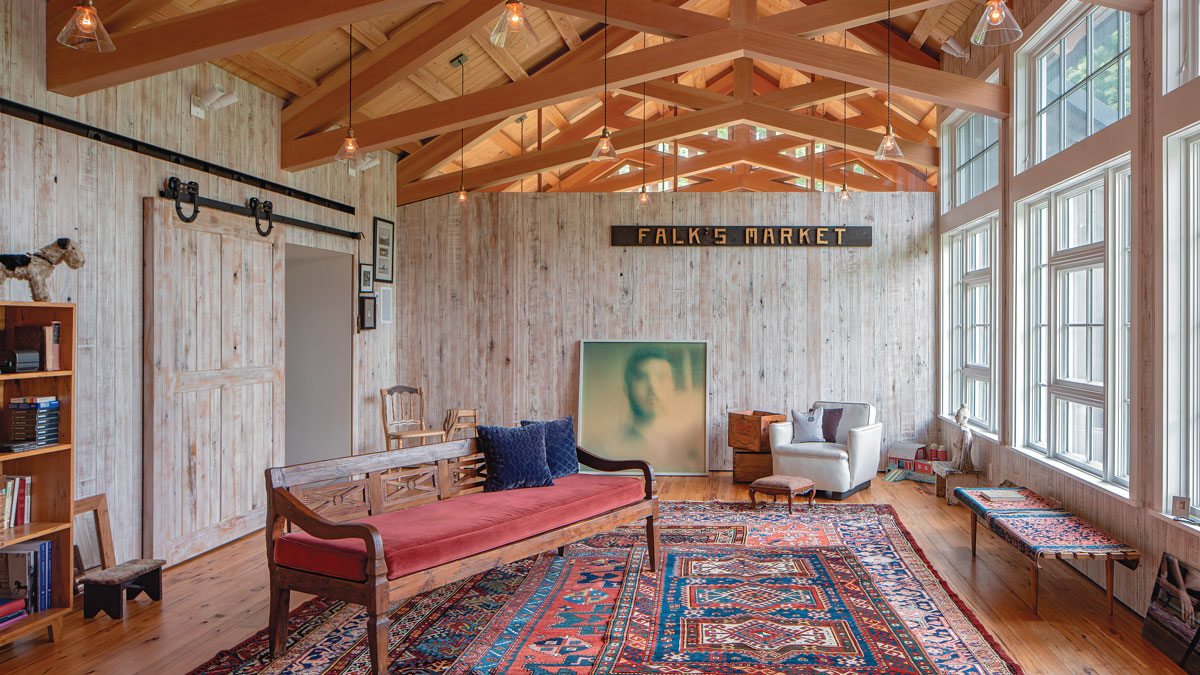
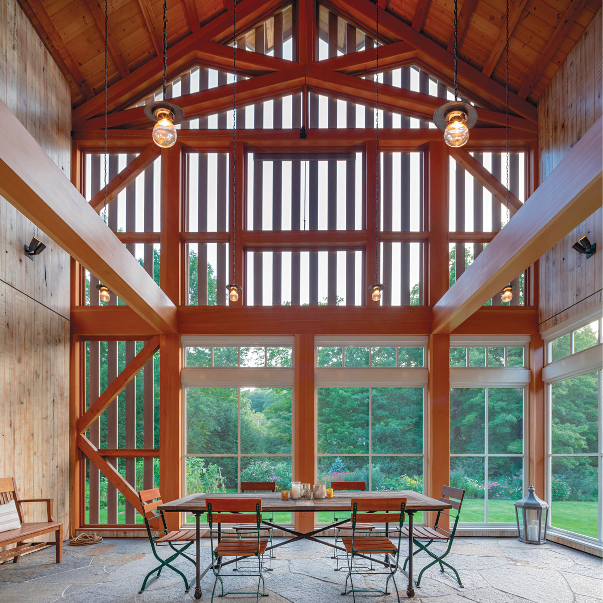
Customizing TrussesAfter the rough truss framing went up, the builder wrapped every surface with the highest-grade quartersawn clear Douglas fir, chosen for its consistent grain. He used 3⁄4-in.-thick 1x12s for the finish wood—ripping miters at every corner—to create the look of solid timber and left an 1⁄8-in. gap on each side of the trusses for expansion/ contraction to protect the mitered corners from popping apart with humidity. The trusswork includes two webs infilled with glass to separate the conditioned space from the unconditioned screened porch. The glass was cut to be sandwiched between the finished trusses. The same approach was used on the opposite end of the room, with the added complication of a chimney running through the assembly. |
Inspired addition
A previous addition had been tacked onto the rear of the original building—it was dark, dank, and full of mold. It was an easy decision to demolish it to make way for a guesthouse and an artist’s studio. The clients love old New England barns, which inspired the new building’s form. To come up with a design, we studied hay and tobacco barns, which are common in the area.
The placement of the 1500-sq.-ft. slab-on-grade structure was something of a head-scratcher out of the gate. Originally we thought to position the addition on the other side of the house so as not to repeat what had been done previously. We did ultimately add to the rear of the house, which is more in line with what would have been done traditionally, but in a different orientation than that of the previous addition.
Addressing natural elements
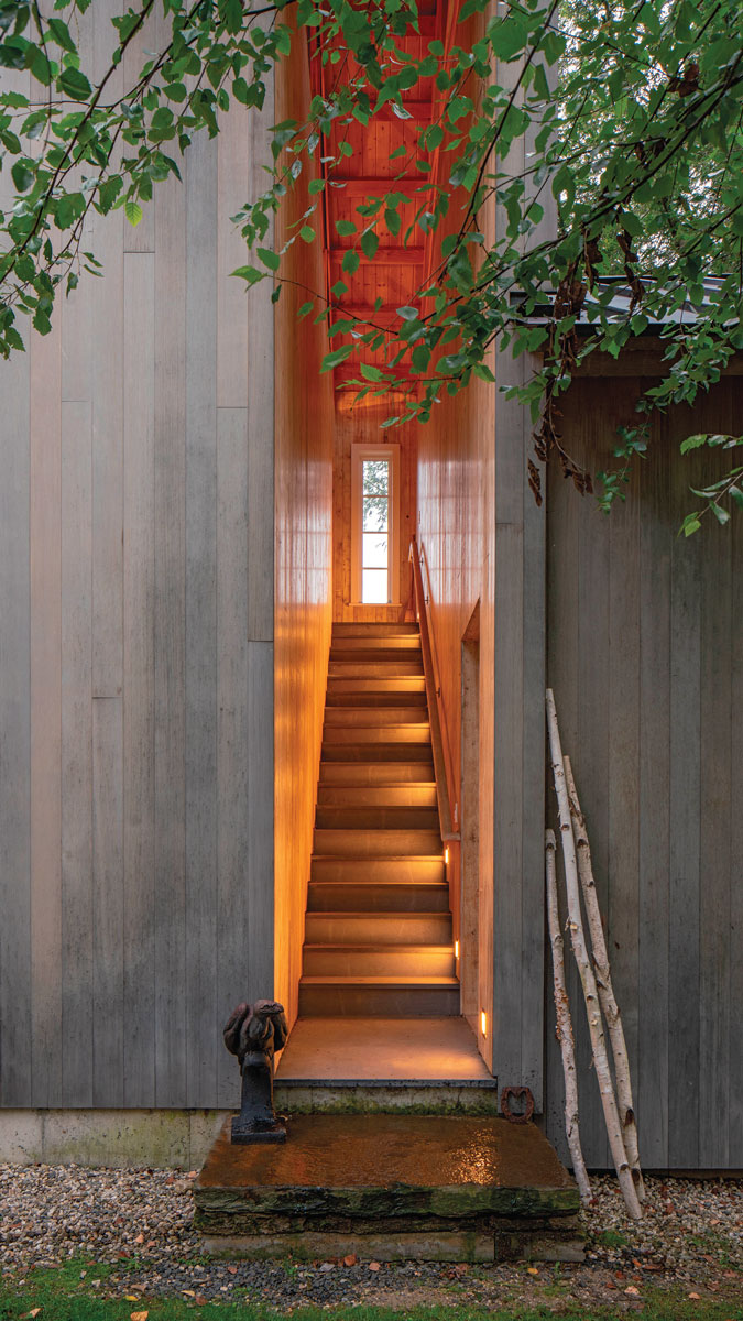
The site’s topography influenced the design too. Runoff water and heavy snow loads were major considerations, complicated by a steep slope at the rear of the house. We chose to excavate to create a more gradual slope, and then raise the building roughly 3 ft. above grade. This was done for two reasons: to protect the structure from moisture and to make the transition from the addition to the existing house an even plane. Excavating also gave us the opportunity to add an elevated stone terrace.
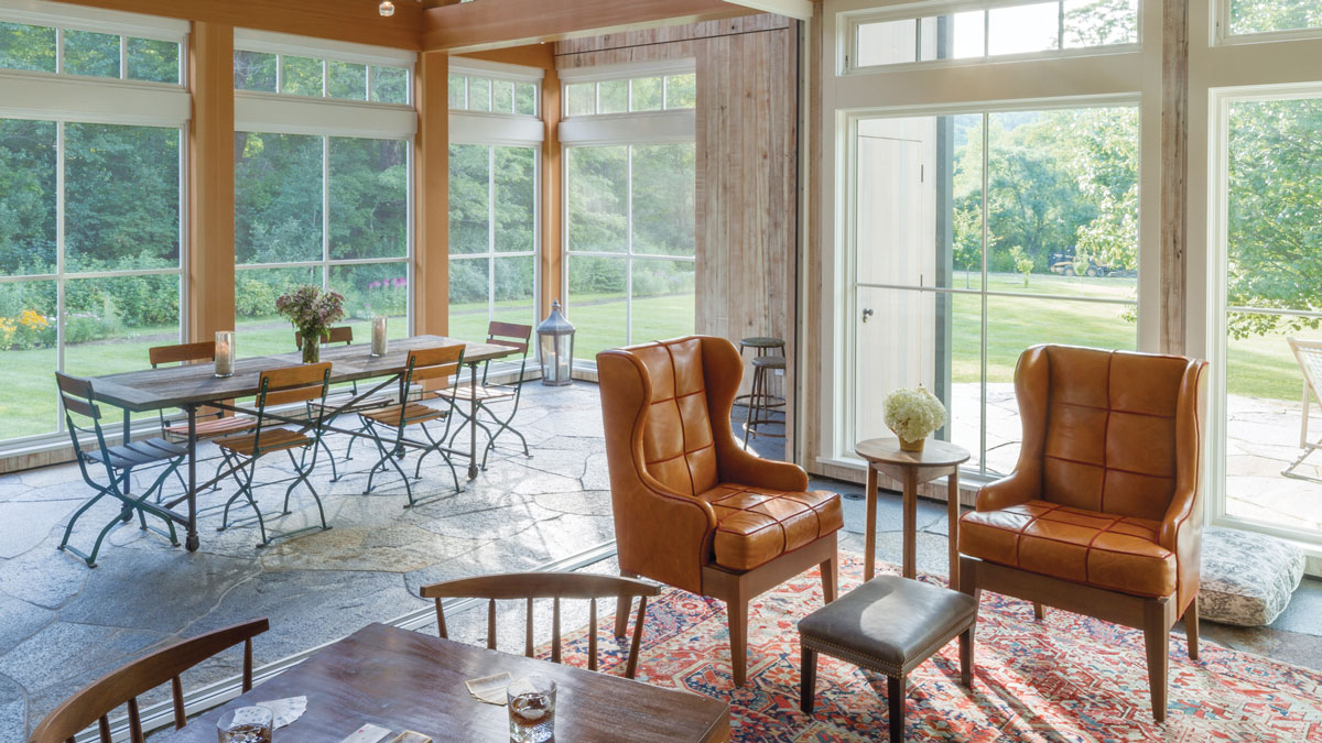
For passive solar control, we designed a three- layer shading system to cover the west-facing gable end. It allows natural light into the screened porch while deflecting heat and glare. Douglas-fir-clad timbers make up the framing structure, insect screening allows for comfortable outdoor living, and vertical slats of reclaimed clear cedar create deep shadowlines, adding texture and depth to the exterior. This wall also features a pulley and rope attached to an upper-level swinging window—a nod to the traditional hay barn.
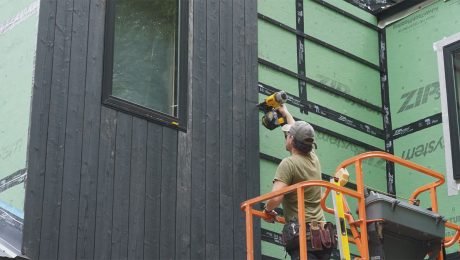
The eave-side cladding is quartersawn red cedar coated with Cabot bleaching oil, a semitransparent stain with an additive that accelerates the graying process and produces mottled tones. The slats were given the same treatment for contrast with the fir timbers. Multisash Marvin windows with large four-over-four divided-lite transoms were installed on the second floor, while the lower level has 5-ft.- wide by 7-ft.-tall fixed windows with four-lite operable transoms. A lot of thought went into the screening panels and trimwork to make the screens blend well with the windows. In fact, from a distance, the screens look like windows.
Social space rich in detail
Inside, a large entertainment space is divided into separate areas for socializing, watching TV, playing games, and reading. Everything is centered around a custom gas fireplace. A NanaWall makes it possible to open the interior conditioned space to the screened dining porch. Seaver says detailing the ceiling above the main living area was tricky, and required wrapping the partially exposed LVL joists in reclaimed chestnut. When installing the finish wood, he scribed and coped every board abutting the stone chimney and wall. It took two weeks to finish just one section of the ceiling. To give the room the feel of an old milking barn as the clients requested, the reclaimed chestnut that covers the joists and walls was whitewashed, making for a lighter atmosphere.
All told, the addition warmly supports all of what was outlined in the design program. Architecturally, it is a masterpiece of craftsmanship.
SPECS
Bedrooms: 4
Bathrooms: 4-1/2
Size: Main house, 3500 sq. ft.; addition, 1500 sq. ft.
Location: Western Mass.
Architect: Nicole Migeon Architect, migeonarchitect.com
Builder: Seaver & Sons, seaverandsons.com
|
|
|
Floor-plan drawings: Patrick Welsh. Photos: Paul Teeling Photography, Drawing: Christopher Mills
From Fine Homebuilding #291

 Nicole Migeon
 Chris Seaver