Four-Part Farmhouse
Uncommon design goals inform the organization of this multivolume home.
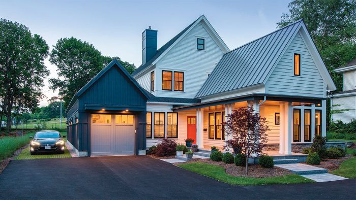
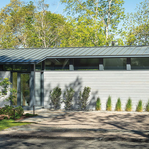
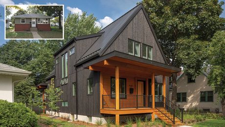
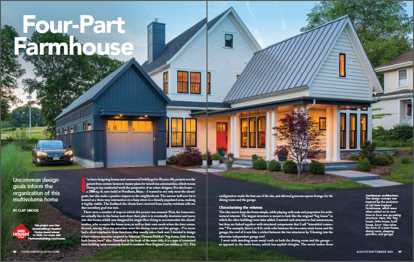
Synopsis: This winner of the 2020 Readers’ Choice Award is a custom modern-farmhouse-style home that sits on a narrow site. Special consideration was given to the dining room and the garage, which led to a unique design that focuses on these two rooms, as well as the master suite, as additions to the central structure. A number of design decisions emphasize and delineate the four forms, including differences in roofing material and trim packages. Floor plans and drawings of the home and its “additions” showcase the layout of the structures and the interior.
I’ve been designing houses and commercial buildings for 38 years. My projects run the gamut from custom homes to master plans for mixed-use communities, which means I bring to my residential work the perspective of an urban designer. For this house— a 2800-sq.-ft. new build in Needham, Mass.—I wanted to not only meet the clients’ goals, but also make a positive impact on the neighborhood. The narrow half-acre lot is located at a three-way intersection on a busy street in a densely populated area, making it highly visible. The feedback the clients have received from nearby residents tells me that secondary goal was met.
There were a number of ways in which this project was unusual. First, the homeowners actually live in the house next door; their plan is to eventually downsize and move into this house, which was designed for single-floor living to accommodate the clients’ mother, who occupies the house now, as well as their own needs when the time comes. Second, among their top priorities were the dining room and the garage—I’ve never had a client emphasize those functions; they usually take a back seat. I decided to design a four-volume structure inspired by historian Thomas Hubka’s “big house, little house, back house, barn” idea. Described in his book of the same title, it is a type of connected farm building most commonly found in northern New England. This configuration made the best use of the site, and allowed generous square footage for the dining room and the garage.
Characterizing the volumes
The idea was to keep the forms simple, while playing with scale and proportion for architectural interest. The largest structure is meant to look like the original “big house” to which the other buildings were later added. I wanted each structure to feel autonomous, but they are linked together with structural components that I call “interstitial connectors.” For example, there’s an 8-ft.-wide cube between the two-story main house and the garage; the roof of it acts like a cricket between the two structures by T-boning into the otherwise independent garage roof.
I went with standing-seam metal roofs on both the dining room and the garage— as opposed to the main house, which has asphalt shingles. The metal makes those structures more striking and also supports the idea of buildings added on to the original house.
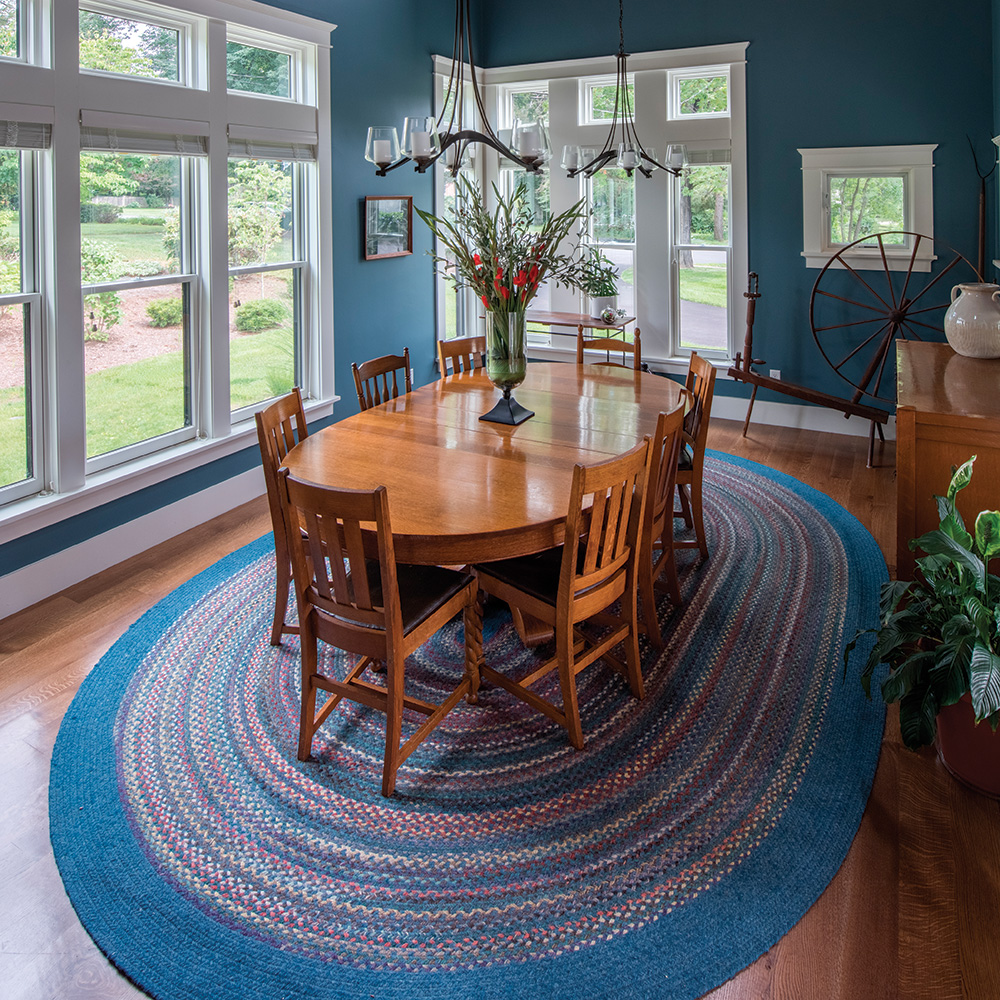
The back of the house is meant to be just as architecturally engaging as the front—in my mind, there is no front and back. Because I am fond of courtyards, I created one by extending one of the master-bedroom walls and developing the rear elevation around it. Connecting the interiors to the outdoors is about more than putting a large sheet of glass between them. I wanted true transitional spaces, and for the clients to enjoy the feeling of being outside yet bounded by the house. When inside, they are able to look out toward views that include parts of the house, which helps to frame the landscape.
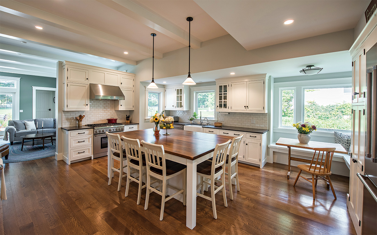
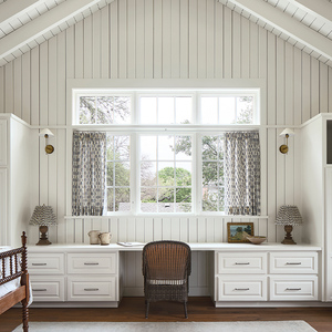
With the windows, I tried to walk the line between traditional and contemporary. Some are much larger than windows typically seen on a house of the period that inspired this one, but I prefer to use windows that are appropriate for what’s happening inside. For example, in the kitchen I spec’d a sizable picture window above the built-in seating for the breakfast nook to allow natural light to fill that corner and brighten the work zone. The double-hungs tie the house to the established neighborhood, while the more modern styles give the exteriors some flair.
More about farmhouse design:
From FineHomebuilding #293
To view the entire article, please click the View PDF button below.
Fine Homebuilding Recommended Products
Fine Homebuilding receives a commission for items purchased through links on this site, including Amazon Associates and other affiliate advertising programs.
Original Speed Square

100-ft. Tape Measure

Anchor Bolt Marker
