Stretching a Limited Supply of Brick
Removing a poorly designed addition for this home renovation meant reusing the color-matched brick in the most highly visible areas.
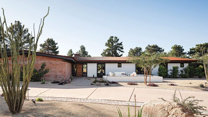
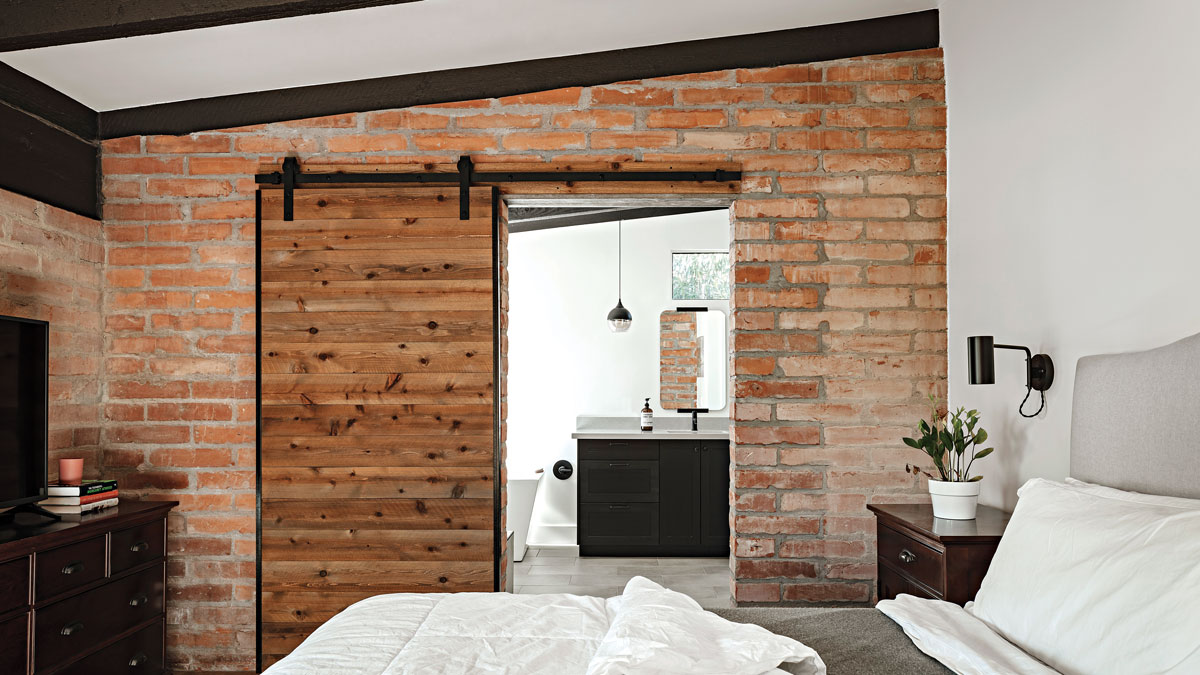
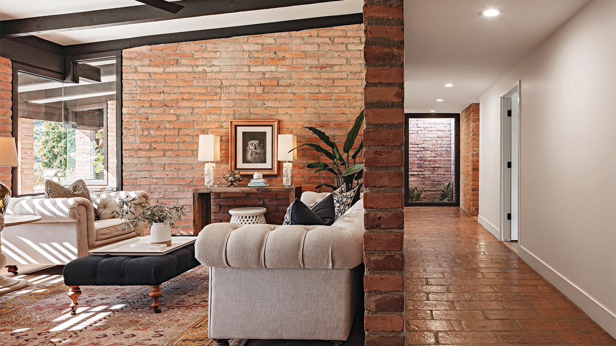
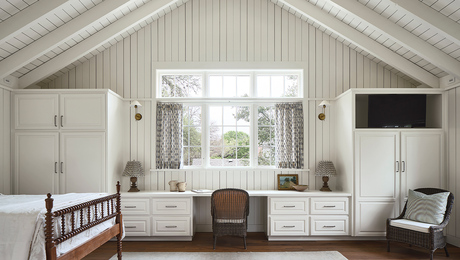
The original portion of this burnt adobe–brick house was built in 1967. By the time architect Cavin Costello was called in for renovations, it had acquired a poorly designed addition. That turned out to be a good thing. Removing the old addition meant there would be bricks to use elsewhere in the project, avoiding the need for too many new bricks, which would not match in color. “We did the math on how much we were taking down and how much we needed to fill in,” Costello says. “So we knew how much wood framing we would need to do on the new addition in order to save bricks.” The salvaged adobe bricks were used to patch highly visible areas that had been altered to accommodate a modernized floor plan. The previous addition had blocked light, which meant all of that brick made for heavy, dark interiors. The new addition is oriented to allow plenty of natural light into all rooms—this move was key to showcasing the masonry. Today, the light and layout bring out the brick’s natural warmth.
Designer/builder The Ranch Mine, theranchmine.com
Location Litchfield Park, Ariz.
Photos Roehner + Ryan
From Fine Homebuilding #293
