A Fresh Take on Tradition
A renovation with a focus on increased space and sustainable systems transforms a historical home.
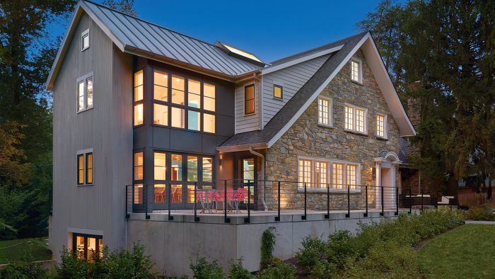
Synopsis: Located in the Washington, D.C., suburb of Chevy Chase, Md., this home, originally built in 1919 as a log cabin guest house, was ready for a remodel. The current owner’s renovation goals involved making the house livable for her family while also creating a flexible entertaining space for fundraising events she hosts. The design team was tasked with turning a plethora of tiny, dark rooms into open, flowing spaces that are conducive to modern living, while also re-working a 1980s addition that was not ideal for the space.
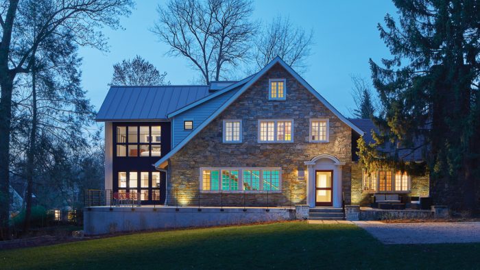
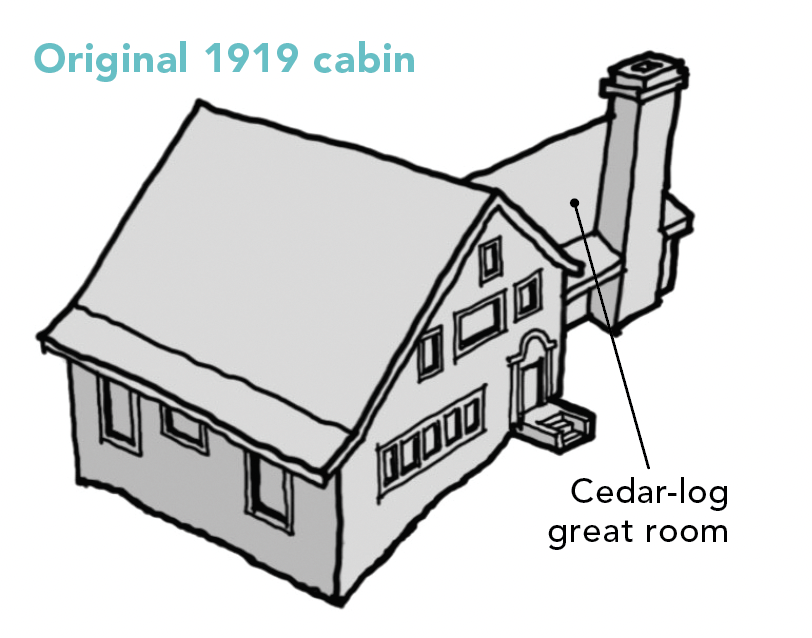
Situated on a large, grassy lot in the well-established Washington, D.C., suburb of Chevy Chase, Md., this home was originally built in 1919 as a log cabin guesthouse handcrafted from Canadian cedar. While my design work is largely focused on mixed-use and multifamily infill buildings, I took on this whole-house renovation because of the home’s unique history and the owner’s passion for honoring it.
The client contacted me after seeing an article on the Hazel River Cabin project (see “Two Cabins Into One”), which also respectfully transformed an old log cabin—plus two other historic structures—into a modern livable house. I relished an opportunity to work on a challenging, noteworthy residential project again, in a neighborhood I can most accurately describe as an incredible collection of eclectic houses.
The current owner, who grew up in the house, is only the third full-time resident. Her renovation goals involved making the house livable for just her family, while simultaneously creating a flexible entertaining space for the numerous fundraising events she hosts. She also asked us to prioritize sustainable features and energy-efficient systems. To accomplish these goals, the design team was tasked with turning a tangle of tiny, dark rooms into open, flowing spaces conducive to modern living that still preserve the structure’s historical character. The desire to save existing old-growth trees on the property and the need to work within a tight budget also meant reusing an earlier addition commissioned by the client’s mother.
Space innovation
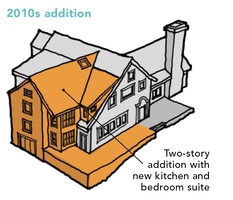
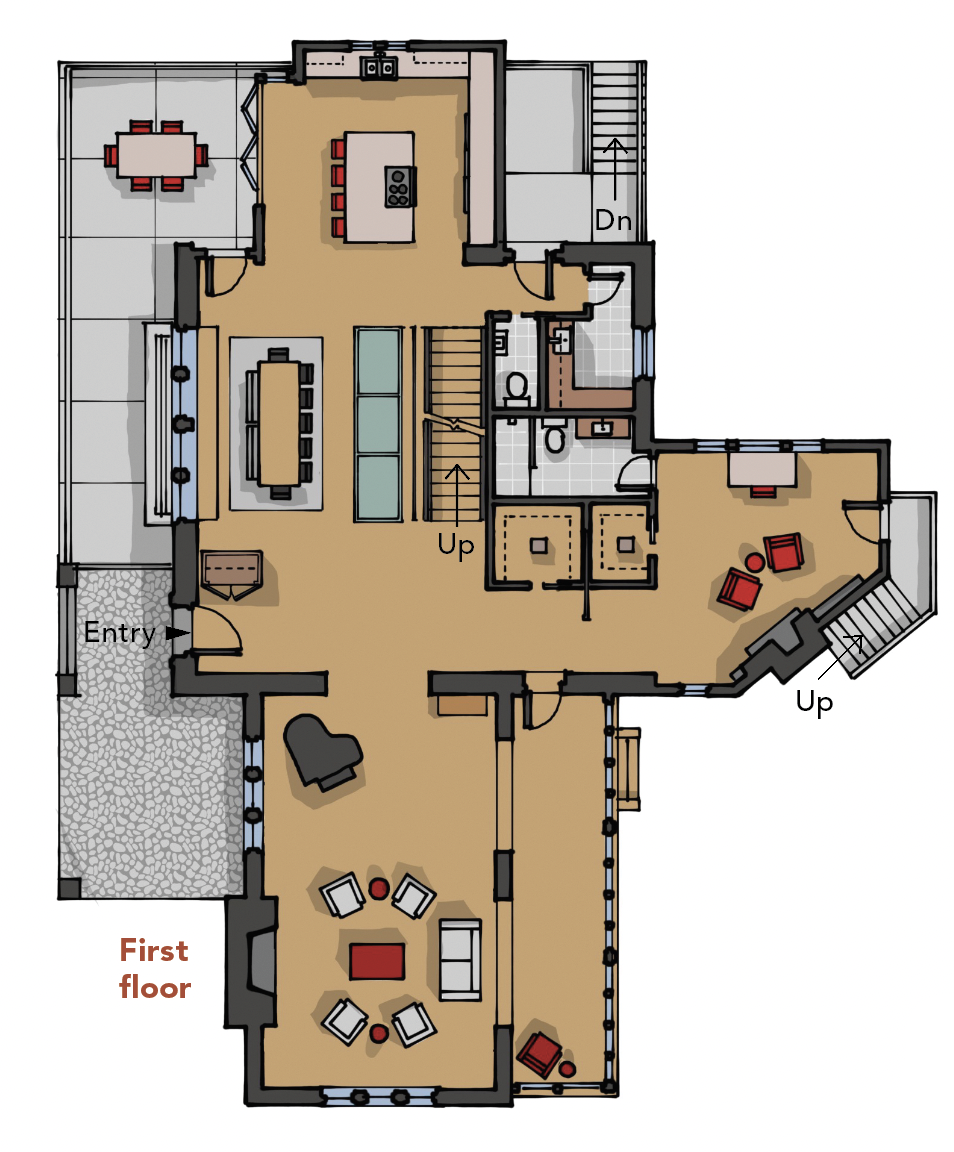
The existing floor plan’s central cube was divided into a warren of rooms resulting in awkward circulation and obstructed sightlines. Accessing the addition meant climbing up and over the stair landing, for example. To balance the floor plan and create a strong central axis, we planned a two-story addition similar in form and placed directly opposite the original log great room. Our strategy was to improve the floor plan by transforming the central cube from a jumble of rooms into a single cohesive space serving as a physical and visual transition from the restored log great room to the new contemporary kitchen.
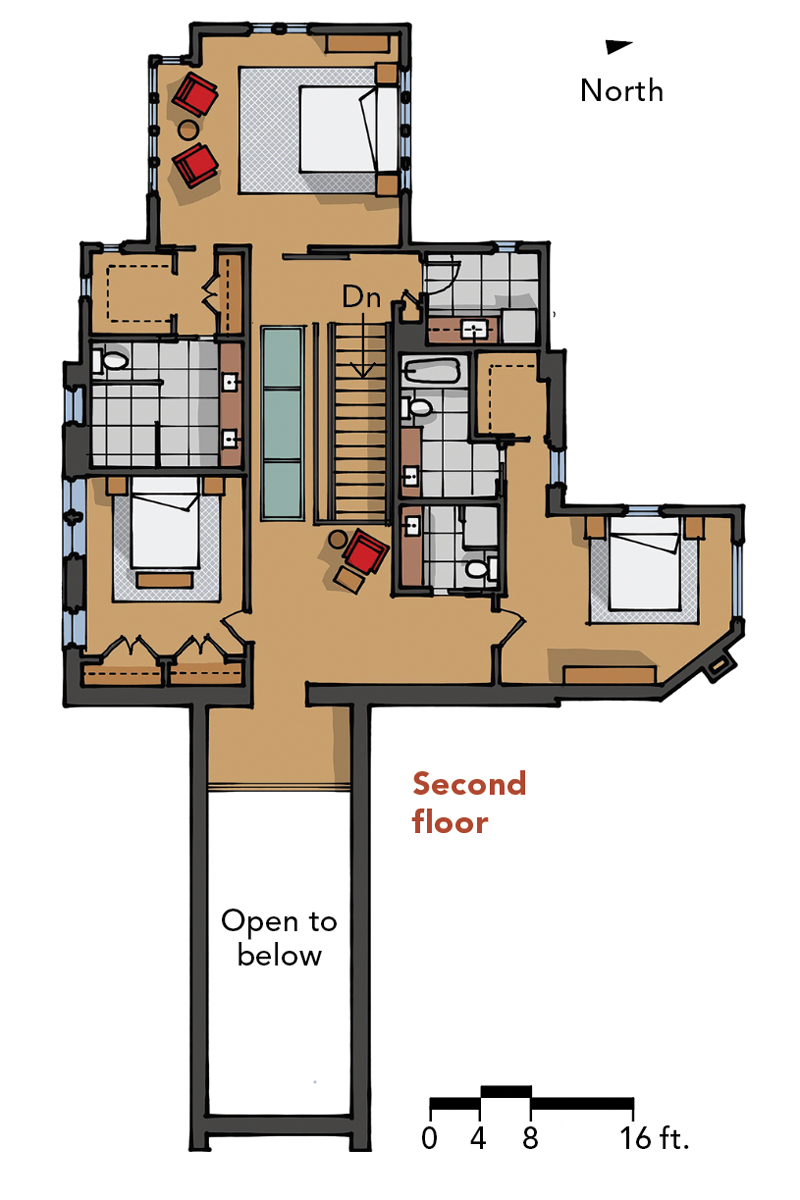
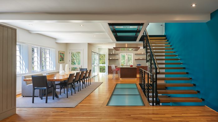
Removing walls leading to the older addition revealed an unpleasant surprise during construction: Work on this addition had compromised the structural integrity of the floor system. The addition involved cutting away big portions of the original exterior walls, and because the logs in log houses are used in tension, the second floor was about to fall into the first. This instability necessitated the demolition and rebuilding of the entire second floor. However, that created an opportunity to raise the height of the first-floor ceilings. Glass flooring adjacent to the stairwell brings natural light from a ridge skylight down into the basement. Directly across from those stairs sits a 10-ft.-long dining table repurposed from century-old logs.
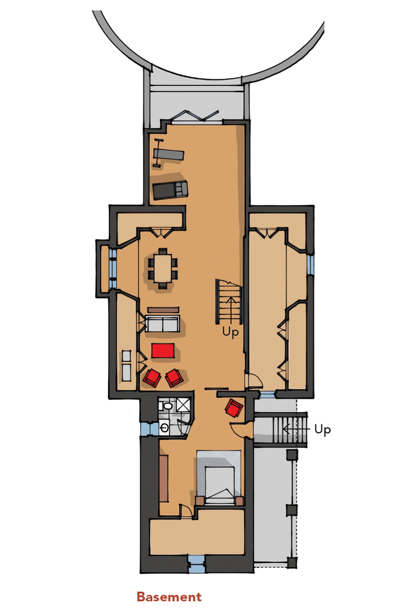
Outside circulation also received a makeover. Exterior spaces were reorganized around the new footprint, strengthening ties to the generous yard on multiple levels. In the basement, dropping the floor and expanding it out beneath the new addition made space for an exercise room and guest suite. A wall of glass offers walk-out access to native landscaping on the west side. Above, a two-story box-bay window tower connects the open kitchen to an alfresco dining deck and floods the primary bedroom with southern light. Offset from the front door, a parking court overlaps with a proportionally square walkway leading to the entry steps and up to the full-width front patio.
Rebuild and restore
Walls made from hand-split logs tend to be imprecise, so the entire house was out of square. Framing new walls within the log structure allowed for a tighter building envelope and rectilinear spaces. Our contractor’s highly skilled framer—and a structural engineer specializing in historical buildings—deserves a ton of credit for restoring the structure of the house.
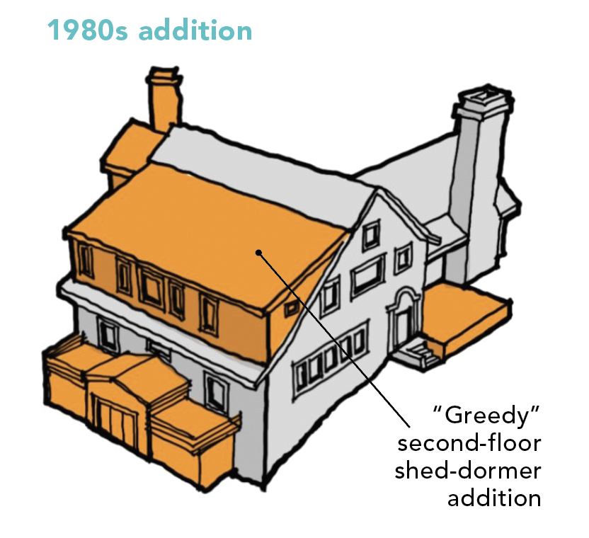
Despite the iconic look of an authentically constructed log cabin (the original owner brought Canadian lumberjacks down to assemble the giant cedars), the neighborhood elders instructed the current owner’s mother to cover the exterior with stone for a more “luxury” facade when the addition was built in the 1980s.
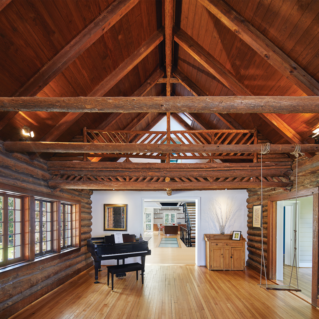
Removing plaster and lath from interior walls revealed that most of the logs were damaged beyond restoration, and exposing them would also preclude making rooms more comfortable by insulating them, so the design team made the decision to insulate and cover them with drywall. The logs in the vaulted great room, however, remained nearly pristine. Our strategy here was to celebrate the history of the house by preserving the logs and original character of the great room. Logs were cleaned and new chinking inserted. Century-old casement windows were taken apart and then carefully restored or rebuilt as needed. A massive stone fireplace maintains the room’s rustic atmosphere and provides visual and literal warmth for the voluminous space. Covering most other walls in crisp, white drywall, in contrast to the walls in the historical great room, generates a clear distinction between old and new.
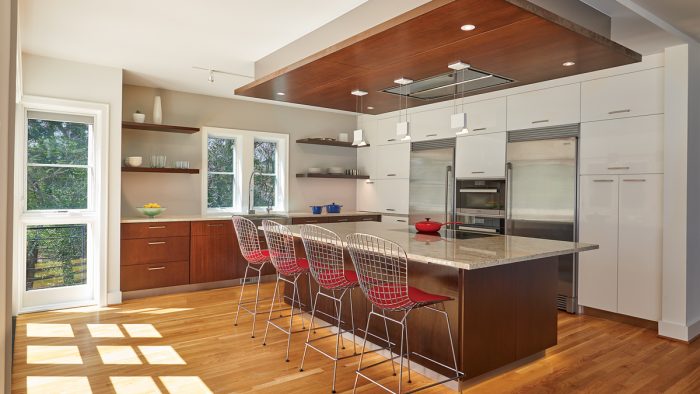
Materials used in the new addition and renovated core relate to the log cabin while remaining decidedly modern. Natural wood base cabinets, floating shelves, and the cooktop vent surround pay homage to the aged cedar finish in the great room. Historical casements were also restored in this space for continuity, while new oversize windows create a modern look. These old and new spaces are located on opposite ends of the house, with clear sightlines between them.
Making an addition look right
The three phases of this home’s transformation are best understood using massing models, where the newest addition can be seen as the scaled reflection of an original east wing. The size of the addition not only accommodates the spatial demands of the homeowner, but it also helps provide visual balance to the entire structure and remedy problematic additions on the west-facing elevation. The addition in both size and detail is distinctly modern, as was the intention.
 |
 |
 |
Historical inefficiencies
Not surprisingly, the old house was drafty in winter and hot in summer. Even with the added square footage of a new bedroom suite and kitchen, the owner uses a fraction of the power she did before—most of it renewable. New systems include electrical, plumbing,
and high-efficiency, geothermal HVAC.
Superinsulation in the walls and ceilings—except in the great room—along with low-flow fixtures and energy-efficient appliances, helped meet her environmental goals. A geothermal system keeps the open public areas comfortable year-round with little drain on the city grid. Original casement windows were painstakingly rebuilt with insulated floating glass, and exposed log walls in the story-and-a-half great room were repointed for a tighter building envelope. Outside, a permeable parking court prevents stormwater runoff, and native landscaping reduces water use for irrigation.
The client arranged donations of all existing fixtures, appliances, and cabinets in good enough condition for reuse to a reclamation organization. Skylights and abundant glazing negate the need for artificial lights throughout the day. Durability of the materials and systems incorporated into the renovation also boosts sustainability by increasing the home’s longevity. One of the most important aspects of sustainability is retaining and reimagining an existing house and extending its use for several generations.
Centered on stairs
The compartmentalized interior of the original plan was extensively reorganized to provide the open concept the homeowners requested. Now, rooms laid out on a strong east-west axis seamlessly connect with each other and are anchored by a feature staircase flooded with light from a skylight above. Each floor feels connected via this shaft of space and light.
 |
 |
 |
Specs
Bedrooms: 4
Bathrooms: 6
Size: 3950 sq. ft.
Location: Somerset, Md.
Architect: Bonstra Haresign Architects, bonstra.com
Builder: Thorsen Construction, thorsenconstruction.us
Sensitive additions
Adding on to any structure—especially one with previous alterations—requires thoughtful planning around how the massing will change. Chaotic rooflines can distract from even the best architecture—not to mention the ensuing difficulties during construction.
To create a sense of balance, we essentially matched the original log great room wing and repeated it on the other side of the primary cube, coordinating the length of the pitched roofs (see “Making an addition look right,” above). Shortening the existing dormer away from the edges of the front-facing gable allowed the dramatic, asymmetrical roofline to read more clearly. On the gable end of the new addition, the end of the south-facing wall pulls back slightly under the eaves. This move allows the kitchen and bedroom suite to benefit from western light while generating a distinctively modern detail.
Buildings tell you what additions want to be. It’s incumbent on the architect to discover and understand those cues. We separated our intervention from the original by selecting sympathetic materials and assemblies to contrast and slightly balance against the historical fabric. For example, cedar planks clad its exterior in homage to the cedar logs, but their vertical placement reads modern. Oversize window walls respect the scale and detail of historical divided-lite casement windows while remaining contemporary.
Renovating an older house with more than one incongruous alteration over the years presented the design team with challenges—as well as highlights. One benefit involved giving a new architect on staff experience in all parts of the process, from permitting to design review presentations to project management throughout construction. Working with a client as enthusiastic and open as this one also provided opportunities to solve functional hurdles through inventive ideas.
Meeting this client’s initial goals was a great thing, but I also think we changed the way the family lives in a positive way. The renovated house serves their extensive entertaining needs, but it also feels comfortable when the family is alone. Our client lives in the house where she grew up and loves the transformation. It has become a generational family treasure.
David T. Haresign, FAIA, is a founding partner of Bonstra Haresign Architects in Washington, D.C. 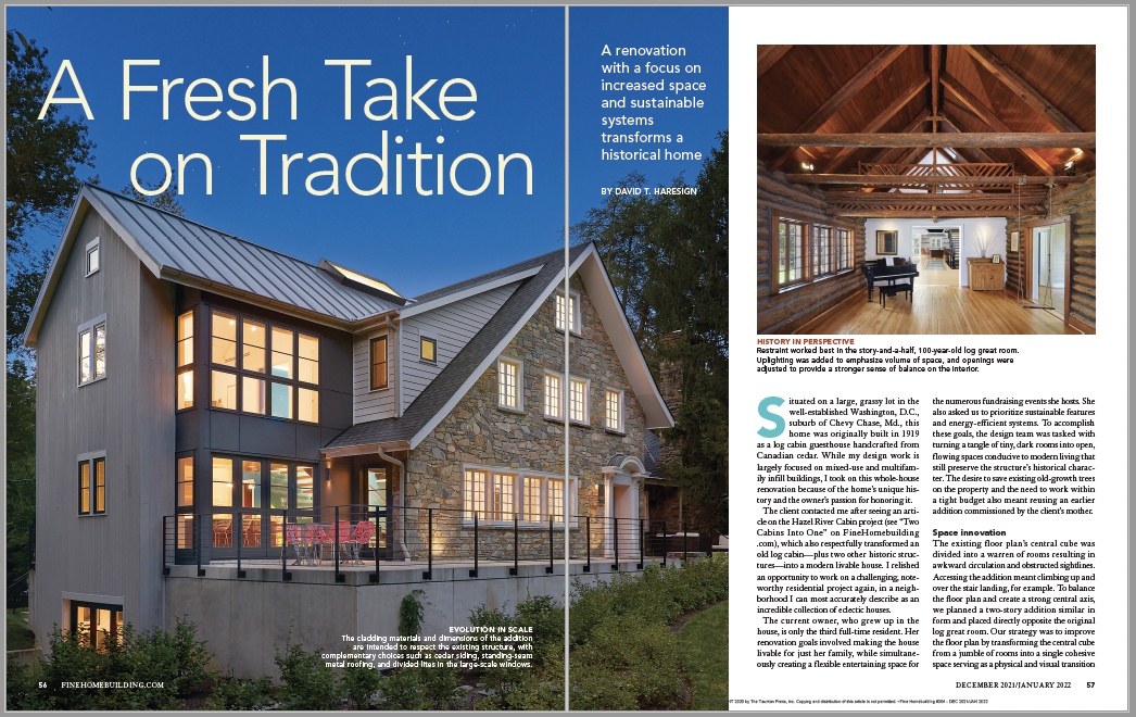
Photos by Anice Hoachlander.
From Fine Homebuilding #304
To read the entire article, please click the View PDF button below.
RELATED LINKS
