A Flat Roof in a Cold Climate
A three-bedroom house in a cold climate challenges conventions with SIP wall construction, a unique floor plan, and a flat roof.
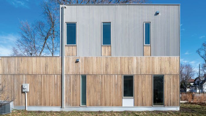
Synopsis: With a flat-roof and clad in corrugated metal and vertical bands of cypress, this 1726-sq.-ft. house is an anomaly in its established neighborhood in North Minneapolis. In addition to features such as two individual garage bays, the walls were built with SIPs, and there is no basement. Despite its modern design, however, its modest scale makes it fit right in.
The neighborhood of Camden in North Minneapolis is typical of residential developments that arose in the early to mid 20th century. It’s platted on a standard grid with sidewalks and comfortable setbacks, lots measure approximately 45 ft. across, and hundreds of shingled two- and three-bedroom houses feature little more than 1200 sq. ft. of living space. It’s quaint, close-knit, and affordable.
Another defining characteristic of the area is curb appeal. Along the tree-lined N. James Avenue, a modern but decidedly modest home, clad in corrugated metal and vertical bands of cypress, now occupies Lot 2 of the street’s southernmost block. Its form is spare and simple, like a primed canvas. The hard lines, flat roof, and geometric configuration of windows and exterior cladding fit the minimal to nonexistent topography of this part of town. Its facade is indeed striking, leaving no speculation as to what century it belongs to, but the house’s material palette, height, and siting don’t stray far from the neighborhood’s overall look and feel. Even so, passersby will quickly discern that this design was an unconventional choice.
According to the home’s owner, Kim Wieting, there were no “negative vibes” among her neighbors when the house was going up. “The vast majority of responses were positive,” she says. “Everybody was happy that something was getting built.”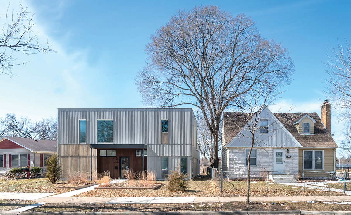
Prior to 2018, the lot had been sitting empty for several years in this racially and ethnically diverse part of the city. Wieting, a long-time resident of South Minneapolis (a much trendier part of town where the cost of land can be as much as one’s mortgage), was on the hunt for a developable lot that was close to her place of work just across the Mississippi River and wouldn’t break the bank. There was something “fortuitous” about this lot, notes Christian Dean, founder of Christian Dean Architecture, the home’s designer. For starters, the property’s rear view looks directly out onto an expansive retention pond, trails, and prairie grasses that hum with activity in the warmer months and provide a nice bit of privacy. The lot itself, which came flat as a pancake, also presented both owner and designer with the opportunity to try out some progressive approaches to construction and home efficiency—including a slab-on-grade foundation and the use of structural insulated panels (SIPs)—while keeping to a modest budget. “The opportunity to build arose, and my father was looking for his next project,” says Wieting.
Wieting’s father, Mel, had previously lived in (and helped build) a nearly 3000-sq.-ft. sustainable infill home for him and his wife, also designed by Christian Dean, on a hillside in the city’s Linden Hills section. It features a Thermomass concrete foundation, SIPs, solar panels, and responsibly sourced finishes. Father and daughter set out to accomplish something similar in North Minneapolis, only pared down.
Mel served as general contractor for the project through his company Metro Contractors. Having established interdependent goals of affordability and energy efficiency, he refers to this house as a “roll up your sleeves, figure it out, and do it” kind of effort. Indeed, achieving high performance on a budget—the home was built for less than $200 per sq. ft.— remains largely a contradiction in terms in most contexts. Mel cites the difficulty in obtaining competitive and affordable quotes from electricians, plumbers, and HVAC contractors due to their unfamiliarity in navigating homes framed with SIPs. Those who are unversed might, for instance, improperly route wiring or pipes that results in foam getting removed, compromising the energy efficiency of the panels. The choice to partially clad the house in corrugated metal also raised a red flag with local zoning inspectors.
Alternative ways to meet code
Despite its durability, longevity, and low cost, corrugated metal is not an approved exterior building material in the city’s design section of its code for residential infill. (Masonry, brick, stone, stucco, wood, cement-based siding, and glass are all approved.) It takes a little education for contractors to realize that this raw and inexpensive material is easy to work with and can be installed quickly, Dean says. Design elements in the code are based on an accrued point system for different components, so the presence of an unapproved cladding system meant that points would have to be earned elsewhere to comply with the city’s zoning ordinance. The answer was literally at their feet.
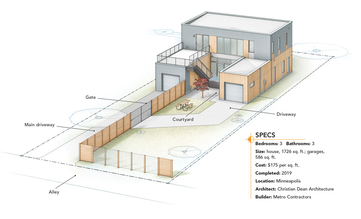
Not constructing a basement (basements are common in tornado-prone Minnesota) and siting the house at grade level on a 4-in. concrete slab meant that construction costs were lessened. This allowed the home to meet accessibility requirements as well, including a ground-level entrance and bathroom, and accessible interior doorways. The points earned through these means brought the house up to the required points needed overall and freed up Metro Contractors to clad the structure to their liking. The resulting composition is textural and warm without being overbearing. Roughly three-quarters of the home’s street-facing facade is composed of 7⁄8-in. corrugated metal panels, supplied by Minneapolis-based McElroy Metal. This abruptly transitions to alternating blocks of metal and 1×6 vertical shiplap cypress siding, provided by Austin, Texas-based Jimmy’s Cypress, that’s been coated with a cool-gray pine tar.
The home is an intricate mix of choices that consider design and efficiency at once. But what is hidden beneath the surface?
Navigating SIPs and a flat roof
SIPs were of interest because “there’s a lot of control and predictability” to them, says Dean. Usually composed of a layer of EPS (expanded polystyrene), XPS (extruded polystyrene), or polyurethane foam sandwiched between oriented strand board (OSB) panels, SIPs are preferred by many builders and homeowners because they provide higher R-values for walls, floors, and roofs. They are also manufactured to spec under factory-controlled conditions, which results in a streamlined installation process that also saves on waste and labor costs. But a common complaint about SIPs is that they deteriorate due to moisture retention.
“We addressed some of the horror stories people associate with structural insulated panels,” Mel says. In an effort to prevent moist interior air from migrating through the SIP seams, Mel and the build team air-sealed all interior seams with tape. Mel also knew how to pre-plan the home’s electrical wiring to ensure the panels were well-protected and air-sealed. Typical wood-framed houses with standard-grade foam or fiberglass insulation are easier for electricians and plumbers to navigate. Without proper planning to ensure tight sealing, contractors may need to remove foam from the SIPs to course correct. This not only compromises the panels’ airtightness but their structural integrity as well. HVAC poses another potential problem spot—because SIPs are hyper-efficient and allow for lower levels of air infiltration, it was important to right-size the project’s HVAC system to ensure compatibility.
On this project, Mel used 6-1⁄2-in. prefabricated SIP walls, supplied by Iowa-based Energy Panel Structures. When the house was being framed, Mel recalls, the standard polyethylene housewrap most contractors use was discarded in place of VaproShield’s WrapShield SA, a self-adhering membrane that offers better protection and vapor permeability to allow any moisture that does find its way into the SIPs a better chance to dry.
Up top, the flat roof that extends over the house’s main living areas (the garage bays are supported with SIP roof panels) comprises a system of trusses reinforced with spray-foam insulation, plywood sheathing, and a thin finish of EPDM (ethylene propylene diene monomer), a durable and self-adhered synthetic rubber membrane—from Oregon-based Ames Research Laboratories—typically used on large warehouses that Mel personally applied with paint rollers. Still, even with its commercial-grade membrane, the presence of a flat roof in Minnesota’s harsh winter climate may raise a few eyebrows. (The Twin Cities received 89.7 in. of snowfall for the 2022 to 2023 winter season, the third snowiest on record.) But such numbers didn’t deter the home’s designer.
Perhaps surprising to some, flat roofs can perform really well in cold climates. Because flat roofs don’t have additional attic space, the insulation sits right at the sheathing and creates a “hot roof” that keeps the home warm and the snow cold. “The snow just sits up there very happily and doesn’t interface with the interior environment at all,” Dean says.
Accommodating a car, differently
A big part of the appeal of neighborhoods like Camden and other inner-ring suburbs that were built out in the post-World War II boom years is their walkability. Ample sidewalks line both sides of each tree-lined street and meet private walkways that lead to each home’s front door. This kind of intimate and scalable urban planning has gained renewed interest in recent years, owing to concerns about consumption and associated environmental impacts. People also just want to know their neighbors and be able to walk down the street without peering over their shoulder for oncoming traffic. Cars, however, remain part of the equation.
Garages don’t front homes in this section of town. Instead, cars are relegated to on-street parking, or, for some lucky homeowners, they access rear-facing garages via alleyways that cut between residential blocks. The Wieting house benefits from one such alley. But designing the home with a standard two-car garage would have consumed an oversized portion of the 2312 sq. ft. of gross house area. (The living area is 1726 sq. ft.) It also would have compromised the home’s rear-facing vantage toward the pond and prairied landscape that lie just beyond the alley. It was the alley, however, that allowed Dean to get creative with how to access the house in a car without undermining the home’s aesthetic charm.
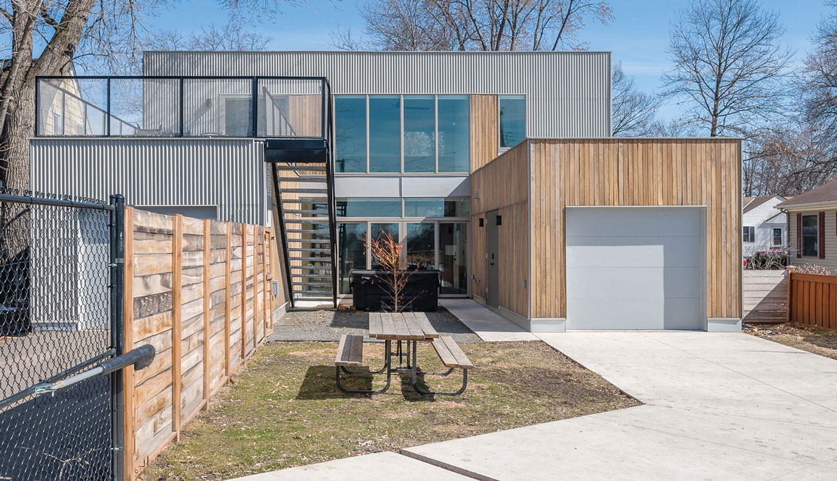
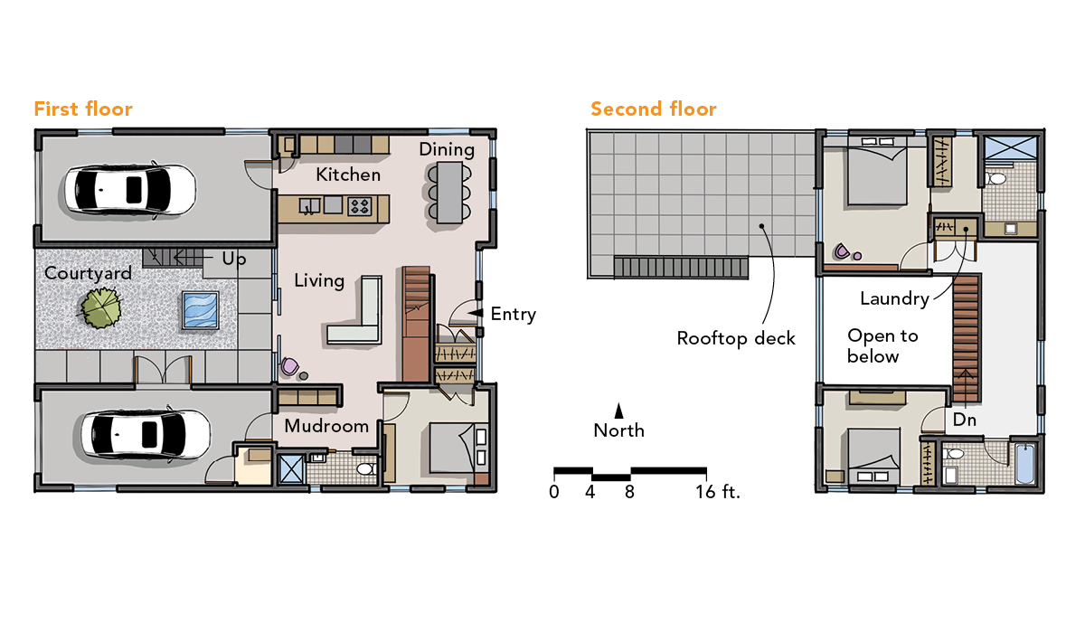
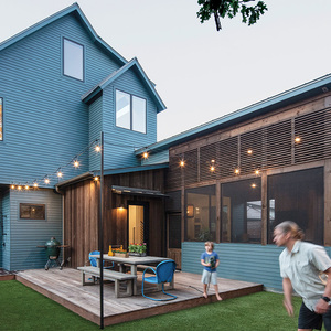
“We split them,” Dean says. Two individual garage bays—one clad in corrugated metal and the other in cypress—adorn either side of the home’s rear face, lending the building its distinct “U” shape and effectively creating a compact courtyard house with a long view of the pond. The bay on the property’s south end, accessible via a driveway that diverges from the main one and cuts diagonally through the courtyard, acts as a flex space that Wieting can use for storage or convert into a studio.
Interior organization
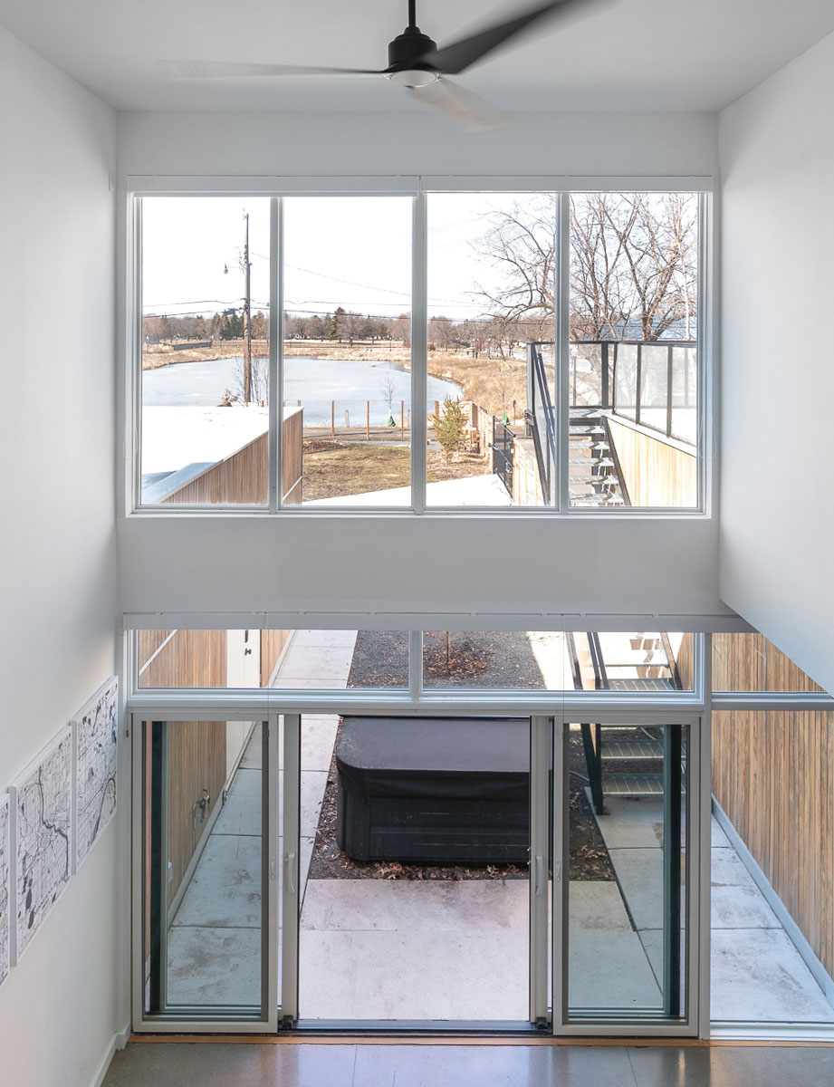
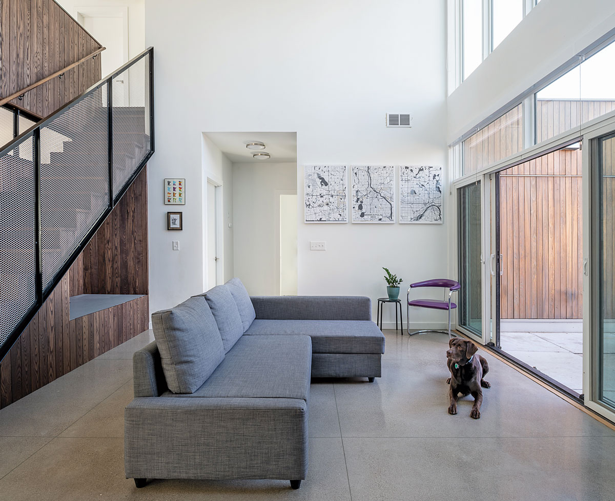
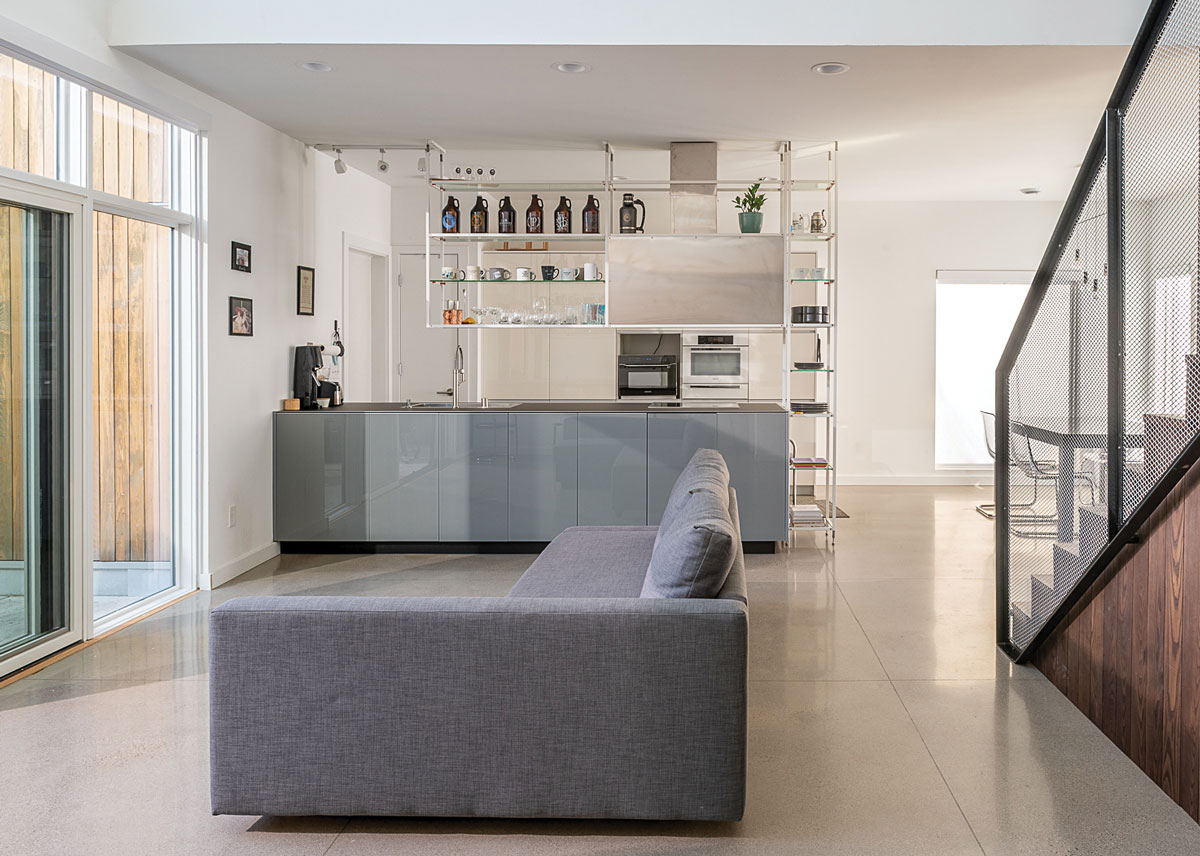
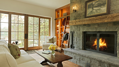
This “U” configuration also allowed for a more balanced interior organization. In fact, for a relatively modest amount of living space, the home’s interior feels voluminous. Once past the foyer, the ground floor’s open concept features a lower-level bedroom and bath that meet accessibility requirements, a small dining area, and an adjoining kitchen designed by DOM Interiors, which Wieting purchased as a display model at Minneapolis’s famed International Market Square. The centralized living space, which empties into the courtyard, is double height at 18 ft. 9 in., with west-facing windows extending the full vertical bandwidth of the interior and flooding the home with natural light. Overlooking the atrium is an interior balcony that connects the second floor’s two bedrooms on either side; Wieting’s primary bedroom on the north end also boasts a walkout that extends over the garage bay and an exterior staircase that connects to the courtyard.
Every square foot of space is maximized to its fullest potential in the Wieting house, and this extends to the home’s energy needs as well. The utility room, tucked away in the bonus garage, is tiny, with a Bosch-brand electric tankless water heater. When the home’s design was coming together, Mel admits that he was keen on installing a ductless minisplit system; all electric, no natural gas. Installing a furnace and a standard forced-air system, however, became necessary and, in retrospect, the result of bad timing. Since Wieting moved in, in the fall of 2019, Minnesota (as well as select HVAC contractors) has made headway in making it easier for homeowners to weatherize their homes and electrify their heating and cooling sources. A system conversion is certainly possible and would prove an
easy feat.
In the meantime, Wieting can take comfort in the fact that her home is as airtight and efficient as they come. The use of properly installed SIPs prevents air leakage, and the rear-facing windows enable passive heating. Even in the dregs of Minnesota’s winters, the furnace isn’t working too hard.
Dean refers to this house as “the least expensive modern home” he’s ever designed. Of course, choosing to build a million-plus-dollar house in North Minneapolis—on average a lower-income part of the city not nearly as sought after by developers as other pockets—would have been rife with controversy, and rightfully so. Keeping the house at comfortably affordable levels was extremely important. So was keeping a relatively light footprint and designing for flexibility. The home currently works well for Wieting, but it could do likewise for a family of five.
“We wanted the house to have resell value,” she says. “It wasn’t just built for me.”
Justin R. Wolf is a Minnesota-based writer who covers energy and climate policy, green building trends, and regenerative design. He is a regular contributor to Green Building Advisor.
Photos by Chad Holder.
From Fine Homebuilding #317 as “Modern and Efficient on a Budget.”
RELATED STORIES
- Replacing PVC With an EPDM Membrane on a Flat Roof
- Air-Sealing SIP Seams
- Modern Remodel in a Traditional Neighborhood
Fine Homebuilding Recommended Products
Fine Homebuilding receives a commission for items purchased through links on this site, including Amazon Associates and other affiliate advertising programs.

Peel & Stick Underlayment

Flashing Boot

Ladder Stand Off









View Comments
"Despite its modern design, however, its modest scale makes it fit right in."
The photograph showing the neighboring houses clearly shows that the Wieting House does not fit the neighborhood. The form of the house could have echoed the neighborhood using a pitched roof parallel to the street with flat roofs over the garages.
An insulated attic roof would have created space for mechanical equipment and storage and the house would have had more consideration for its neighbors.
Use the same exterior materials, same floor plan and the same site plan. Concentrate the wood siding on the front exterior and the house would have acknowledged the neighborhood and still embraced the desires of the owner.
("The resulting composition is textural and warm without being overbearing."
Most neighbors and I would not share your opinion.)
Most of the glass faces west with no visible sun control. Challenging during the summer and early fall.
Separate Units ! How is that accomplished with a concrete slab, a two story living room and very little room upstairs for a kitchen, living area, a dining area and No direct access to one of the garages. Once again, just because you say it is so does not make it true.
Unfortunately, architects continue to ignore context and location to produce Their extraordinary design visions. That has led unfortunately to the profession having little involvement or influence in residential architecture.