Design Lessons Through Photos
Favorite images teach about color, holistic design, period context, small baths, style inspirations, and honoring the past.
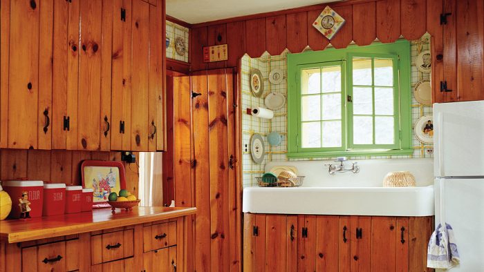
Our archive is evergreen—by which I mean that rooms depicted in OHJ don’t date themselves quite like those in most shelter magazines. Others chronicle trends (if you’ve picked up a 1950s magazine in a secondhand shop and giggled at the décor, you know what I mean).
 |
 |
Most of the houses in OHJ feel timeless: because they are old to begin with and because their interiors are designed to complement the house. Less is torn out to be replaced by the new. Tradition and character play a bigger role. Also significant is that many of the houses we feature belong to OHJ readers, self-educated and creative, who act as their own decorators. Their houses are unique and far more personal than those professionally choreographed.
Holistic DesignWith a mix of antique and new, restored architecture and renovated spaces, most of what we feature are not purist “period rooms.” How to account for the sense of inevitable composure in them? Again, it’s because owners and designers respond to the age, style, and unique aspects of the house. Design is a process of elimination. What’s left is appropriate. Even when contemporary finishes and furnishings are introduced in an old house, rhyme and reason dictate scale, shapes, and colors.  |
The houses we’ve showcased date from three centuries plus; some have been period pieces, others interpretive, still others a study in bringing minimalism to an interior filled with antiquity. Some have been over-the-top mansions but others were restored on tight budgets.
 |
 |
A common theme has been preservation of original elements, even if they are worn. Another is the creation of a “scenario”—an imagined timeline or back-story that suggests a continuum between what was part of the original building and the often-necessary changes that came later.
Lessons Learned – The BathIf any cohort still appreciates the easy-to-clean privacy of a three-fixture bathroom designed to accommodate a single occupant, it’s old-house people. A good light fixture or bit of wallpaper can elevate the simplest cottage bath—or a pink-and-grey room ca. 1952. That said, we’ve published newly designed bathrooms that reflect Victorian built-ins, the “sanitary” white craze of the early 20th century, and jazzy Art Deco style. The best of the past is revived: think console sinks and tile, not carpeted steps leading to a sunken tub.
|
One could “date” an addition not to last year but to a much earlier change of ownership. The imagined scenario might inform today’s design of, say, a new bathroom in an outhouse-era Colonial, or a Depression kitchen in a Victorian row house. If there is a single thread that connects all, however, it’s this: The owners bought an old house on purpose. They wanted the ghosts.
Style InspirationsOHJ’s sister publication Old-House Interiors ran a column called “Inspired By,” which showed a renovated space accompanied by the historic house, room, or object that had inspired the new work. A staircase based on one in England, a kitchen island cued by a vintage worktable, a painted ceiling dreamt up after a trip to Morocco—we didn’t run out of material.  Inspiration comes not only from the house itself but perhaps from an unrestored gem in the neighborhood, from a visit to a museum house of similar age and style, from out-of-print books, from the carvings on an antique. Very often, new design reflects an undertanding of period conventions or of the vernacular. Learning that shellacked beadboard was typical in seacoast cottages ca. 1880s–1910 might jump-start the direction of a restoration. |
Design “Rules”
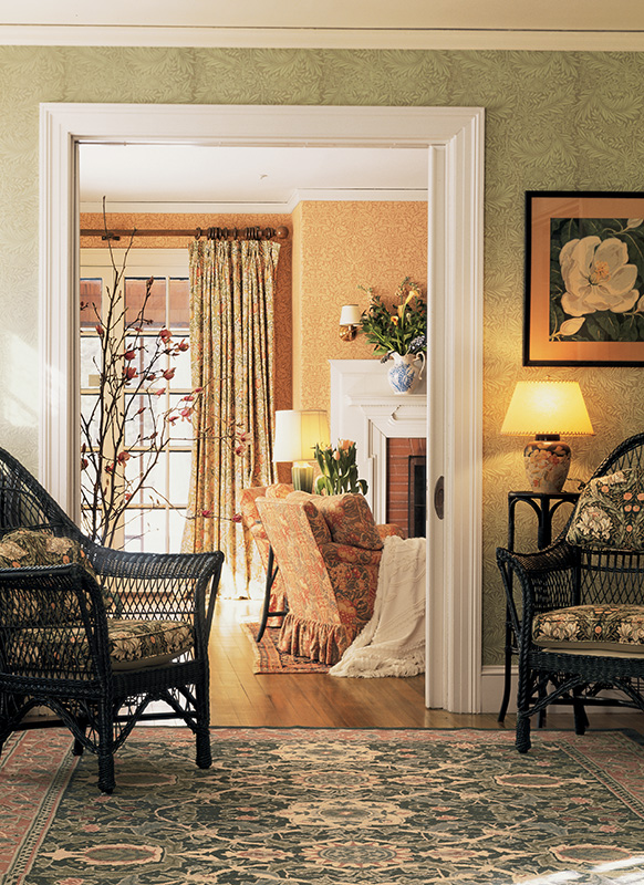
So, OHJ’s coverage has been on one hand historical, on the other quirky; we have published both unretouched survivors and replica houses. This club is diverse and unafraid. Still, people ask if any “rules” of renovation and interior design might save us from obvious traps and expensive mistakes.
Rules? Maybe not. As in most creative endeavors, the best work is by people who learned the rules and thus when to break them. Some guidelines, however, may help.
1.) Knowledge is Power
Understanding the period and style of a house mercifully narrows choices, allowing a head start. More importantly, that knowledge teaches us to differentiate between what is original and what was remodeled, and how the windows should look. You get what you pay for. This is almost always true. Do without, wait and save up, rather than subbing in short-lived materials or settling for poor craftsmanship.
2.) Respect the Architecture
Future owners will curse big changes that obscure the original design and period integrity in favor of individual taste and passing trends. You saw that when you were house-hunting. Paint plaster walls chartreuse or fuchsia… but don’t be the first one to paint 140-year-old figured mahogany intrinsic to the 1880s opulence of the dining room.
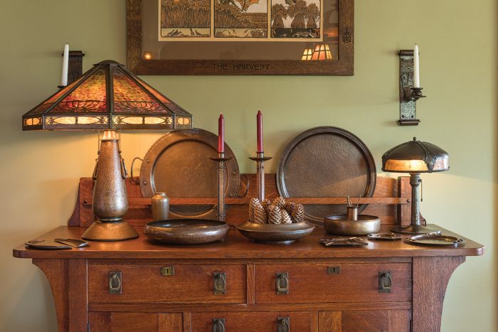
3.) Scale is Everything — Regardless of Style or Personal Taste
Better to use a contemporary adaptation in an appropriate scale (for the mantel, in a wallpaper pattern or the size of the breakfront) rather than a period element that isn’t a fit.
4.) Don’t Be Afraid of Color
Our ancestors clearly were not. All-white rooms are a recent affliction. Be personal. It isn’t just a house, it’s your home. Ignore the TV pundits du jour. That said, express your quirkier taste in a way that doesn’t permanently damage the house.
RELATED STORIES


