An American Foursquare in St. Paul
A couple finish restoring their home fillled with beautiful millwork and trim.
Pam and Kevin Johnson had always wanted an old house but, while raising their two daughters, settled for a practical suburban Colonial. When in 2001 they became empty nesters, they decided it was time to follow their passion.
These long-time OHJ subscribers began searching for a historic property; they were intrigued by a transitional house with late Victorian and Arts & Crafts elements. Built in 1901, it offered a large, welcoming foyer; a parlor on the second floor would accommodate their grand piano.
Love at First Walk-Through
The kitchen had a screened back porch. Quarter-sawn oak woodwork and paneling and a wide staircase gave an ambiance warm and inviting to the foursquare interior. Pausing to sit on the landing after the first walk-through, Kevin and Pam knew this was the house.
 |
 |
Substantial restoration, however, was in store. This had been a boardinghouse for nurses during WWII so every bedroom door had a deadbolt and padlock. The house had been divided into separate living areas with kitchens added in both the foyer and upstairs.
 |
 |
Bats nesting in the attic regularly visited downstairs (Pam remembers taking a shower with a baby bat), squirrels ran races in the eaves, and mice scampered inside kitchen walls. Woodwork was gouged and disfigured, the fireplace mantel was pulling away from the wall and tile was missing, kitchen floor joists had been cut at one end and dangled precariously.
 |
 |
Outside, crumbling aluminum storms covered the windows, gutters were broken or missing, the chimney was in danger of collapse, and the small backyard was a patch of dirt covered in buckthorn.
Demolition Required
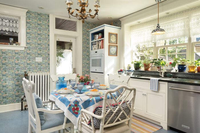
Pam refused to cook in the kitchen so that’s where they started, tearing the mice-infested room down to the studs. In homage to the original Swedish owners and inspired by the artist Carl Larsson, the couple created a bright and sunny aerie—adding a broad expanse of windows above the sink with a shelf for plants.
 |
 |
Marmoleum flooring in Serene Blue and a Wedgewood-blue Aga cooker went in. Trustworth Studio’s wallpaper ‘Woodland Carpet Minor’, based on an 1897 C.F.A. Voysey design, is further brightened by simple white cabinets.
They didn’t plan to refinish the first-floor oak floors. Once the soiled wall-to-wall carpeting was removed, however, they decided to have the old flooring professionally refinished, even though it was covered in decayed padding and riddled with nails.
 |
 |
Charming Updates
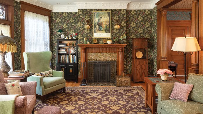
The parlor fireplace was an eyesore as the original mantel had been removed and “updated” with an out-of-scale replacement. Original surround tiles had been removed and the sides plastered over, then crudely painted in imitation of bricks. The damper was broken, vents were missing, and the fireplace was pulling from the wall.
They began by squaring up the chimney, adding alcoves for bookcases on either side. A new mantel was commissioned from Gallenberg Studios, with detailing similar to the original built-in hutch in the dining room; matching, fluted oak columns were carved to replace those missing from the archway between living and dining rooms.
North Prairie Tileworks replicated tile based on the few tiles, gold and green and brown-speckled, that remained on the hearth, making the fireplace once again the focus of the room.
The parlor was properly done up in a warm Arts & Crafts aesthetic with ‘Golden Lily’ wallpaper by Morris & Co., anchored by an earth-tone ‘Sphinx’ carpet of New Zealand wool, from Old World Weavers.
The dining room retained its built-in china hutch and wainscoting, though the woodwork was buried under coats of caked white enamel. The quarter-sawn oak woodwork was taken off the walls to be stripped off site, cleaned, and finally reinstalled. (The tedious process took more than a year.)
The hutch got new drawers and cabinet fronts as well as beveled-glass mirrors. Bradbury & Bradbury’s ‘Passion Flower’ wallpaper in Aesthetic Blue adds an elegant note.
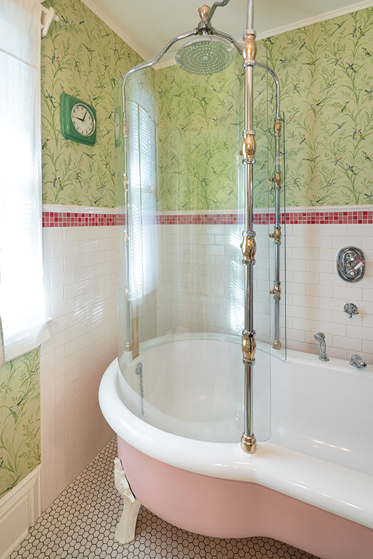
The second-floor bath (originally the only one in the house—besides a toilet tucked under the basement stairs) was awkward. An exposed PVC pipe doubled as the towel rack; mildew was spreading upward on walls, vinyl flooring had buckled, and those bats were still visiting.
The owners brought plumbing up to code and added a period-appropriate clawfoot tub and glass surround, a wainscot of white subway tile, and Thibaut’s ‘Augustine’-pattern wallpaper.
The upstairs corridor had been a narrow, dark passage. Stained-glass transoms replace plain glass originals, adding color and interest while still allowing light transfer and ventilation.
Japanned copper hardware was added. Furthering the horizontal aspect of the long hall is Trustworth’s lively ‘Huntsman’ wallpaper, a storybook pattern in broad bands, which expands the space.
 |
 |
A Good House is Never Finished
Outside, rotted cedar siding had to be replaced. New siding has been painted in pleasant Middlebury Brown, with trim in Welcome White and accents in Marblehead Gold. The missing balustrades on the porch have been replaced. Storm windows by Marvin now protect original stained glass.
Of course, a good house is never finished, and Pam and Kevin Johnson have a list of future projects, from reroofing to replacing windows on the back porch.
— By Brian D. Coleman. Photographs by William Wright.
RELATED STORIES


