Drawn to Detail
Designed on the fly, a master collaboration between architect and builder produces a one-of-a-kind remodel.
Synopsis: When Gregory Masefield Jr.’s clients approached him about renovating their home, he could tell that it needed to open up, connect to the landscape, and take advantage of the views. To reduce the home’s compartmentalized feeling, walls were removed to make large, inviting open spaces. The project got its focus from Masefield’s use of freehand sketches and photos, which allowed the clients to envision and react to what their house might look like without having the sense of finality that computer-generated drawings sometimes create. To keep the free-flowing project moving smoothly, Masefield worked closely with builder Sean Flynn.
Initially, renovations to the four-bedroom house perched over Lake Champlain were supposed to be confined to the kitchen. But architect Gregory “Gregor” Masefield Jr. could see early on that this house needed more. It needed to open up, connect to the landscape, and take advantage of its lake views—none of which its built-on-spec floor plan allowed. What’s more, with three sons grown or in college, the couple who lived there no longer needed lots of separate spaces. “It was way too compartmentalized, and it just didn’t work for the way they lived anymore,” Masefield said.
“We started out with some concepts—A, B, and C—and each one was progressively more encompassing of the larger issue at hand, taking more walls down and opening up more space,” he said. After opening up the living room, the project expanded to encompass the foyer and entry, and the master suite upstairs.
It became, in fact, a remodel on a roll. “There were times we were framing walls when the plans were arriving,” said contractor Sean Flynn. But, he added, “Gregor did a great job keeping up with the pace.”
If Masefield was the visionary on this project, Flynn, of Silver Maple Construction of Bristol, Vt., was the one who tempered Masefield’s ideas into reality. After a general discussion with the homeowners, Masefield would sketch out his ideas—what Flynn refers to as Masefield’s “pretty-picture phase.” With the owners on board, the two would hash over the plans. “Sean might say, ‘I don’t want to see a fastener. Can we do it with a spline?’ ” Masefield said. “We’d go back and forth with that process, and usually we’d find ourselves at an interesting detail that fortified the concept with more life than what we started with.”
Cues from the kitchen
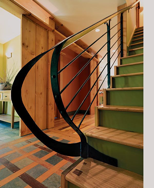
The transformation began in the kitchen both literally and conceptually. Before the remodel, the owners had purchased some rustic kitchen stools with backs made from old pitchforks. Their composition set Masefield on the path of combining metal and wood elements that figure in the kitchen island supports as well as the stair railing in the entryway. While the new floor plan left the stairs and the entry in their original location, their character would change dramatically with a sweeping iron railing and a “woven” wood floor with slate inlays.
Another fundamental design element that got its start in the kitchen is the built-up window casing, which, paired with a unique ceiling valance, carries throughout the main floor. The layered frames serve to draw added attention to outdoor views that were previously ignored. “The main idea was to really connect to the exterior,” Masefield explained. “The house is in a pretty dramatic setting, and these ended up being deep, coffered portals to the outside.”
Drawing visitors in is a redesigned entry porch executed in golden Douglas fir and sheltered by a cantilevered roof. “It’s warm and inviting,” Masefield said. “And I do think it says, ‘This is your entry; this is where you want to be.’ ”
For before and after photos, click the View PDF button below.
