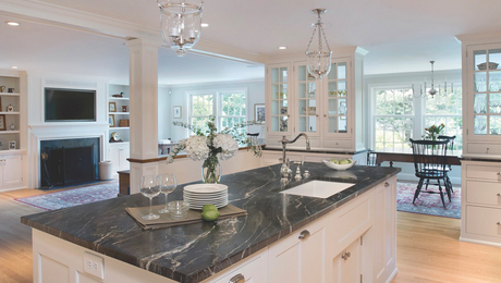
A Kitchen Fit for a Family
With a new layout and smarter storage, this kitchen works for everyone.
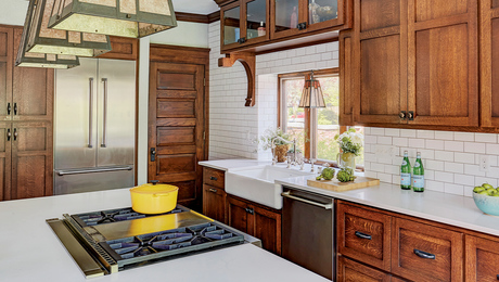
Synopsis: A Massachusetts architect uses his powers of observation and a bag of clever design tricks to turn a dysfunctional kitchen into a family-friendly space with something for everyone — even the family dog. With better traffic flow, more light and much more storage, this remodel proves that small moves done well add up to big changes in the way a room functions, even without adding any floor space.
In 2006, my wife and I purchased a 1500-sq.-ft. cottage-style house in Amherst, Mass. Although the house was from the 1920s, its kitchen had been remodeled in the 1970s and was downright dysfunctional. We determined that the kitchen — along with every other room in the house — would have to be completely overhauled.
The original kitchen measured 11 ft. by 17 ft., with two short counters on opposing walls. With foot traffic running diagonally through the space, the kitchen was not conducive either to gathering or to cooking. There was no dedicated storage space, and the limited countertop area was taken up by a microwave, utensils, a toaster, a mixer, and a bread box. The cabinetry was old and broken down, there was no dishwasher, and — even though the daylight hardly penetrated it — it had only a single overhead light.
We had several goals for our kitchen remodel: to improve the traffic pattern, to increase daylight, and to make the space feel more welcoming. Given our budget, we chose not to enlarge the kitchen. We did, however, decide to expand the opening to an adjacent pantry and laundry room that, because of its narrow door, felt hidden away.
Focused on the family
To be sure I got the functionality right in the remodel, I asked my wife and daughters about how they used the kitchen, and then I observed them doing just that. I noticed that when my wife was cooking, she would have to walk over to the opposite counter whenever she needed a utensil. Spices and pot holders also required trips back and forth. With no garbage disposal and the trash can located in the back pantry, there were frequent trips to discard food waste and packaging. It became clear that the redesign should bring these areas within closer reach.
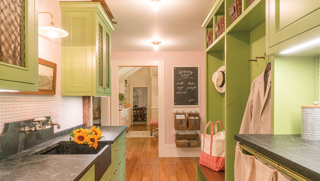
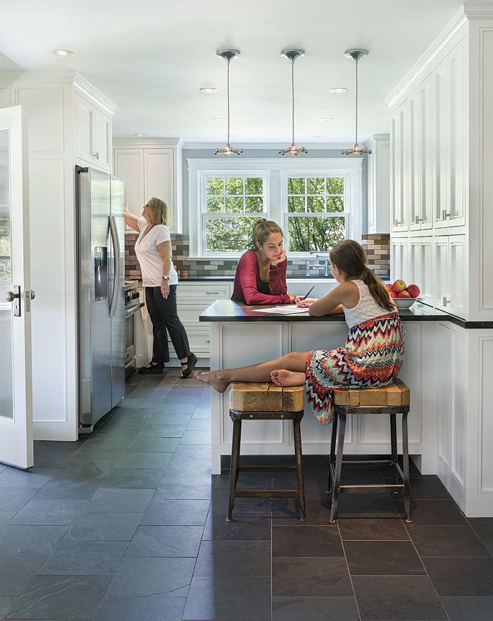
I also noticed that while my wife and I prepared dinner, our daughters often would trek downstairs from their rooms to ask for homework help. I decided to design a peninsula where they could do their homework. Along with moving the entry door, this peninsula would create a separation between the new kitchen work area and traffic coming through the back door to the rest of the house. At the same time, however, it would require a creative approach to ensuring access to the cabinets above it.
Lightening it up
To remedy the lack of natural light, I added a window to the adjacent south-facing entry hall. I also decided to add more glass by asking local cabinetmaker Jim Picardi to build a custom door to the kitchen from the entry so that southern light could enter the kitchen for most of the day. This also solved a problem we had with our dog leaping up on the door.
For more photos and details, click the View PDF button below:
