Wake Up to a Hot Shower
It's the inventive use of materials, space, and style that make these bath designs worth getting out of bed for
Most of us need a good jolt in the morning. The question is, does your shower deliver? If your daily vertical immersion is a yawner, consider the lessons to be learned from the following bathroom designs. In each, the inventive use of materials, space, and style provides an eye-opening start to the day.
Stage a drama and light it up
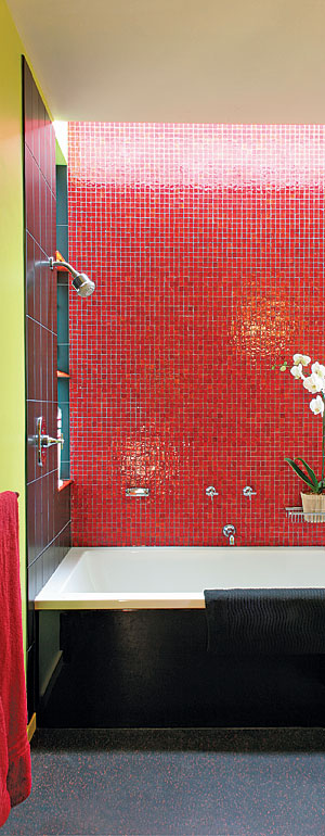
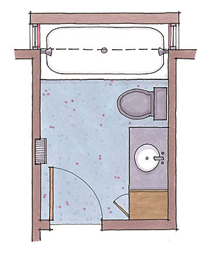
The play of light and color in this bathroom isn’t an accident. It’s what happens when an architect—in this case Jay Lazerwitz of Seattle— plans a bathroom remodel with an artist—in this case his wife, Dionne Haroutunian. “Her thing was drama,” Lazerwitz says. “Mine was natural light and recycled materials.” Privacy was a shared concern, and a challenge because the original bathroom window faced a neighboring house. Lazerwitz closed up the window and pushed out the wall 20 in., allowing for a skylight above and side windows that invite light but not curious glances. By day, liquid sunshine spills through the ceiling and trickles down the luminescent tiles; at night, a light strip on the near wall provides the sparkle. The tiles are recycled glass, as are the vanity knobs and custom shelves set in the side windows. The vanity itself is reclaimed fir, its top salvaged chalkboard, and the floor cushy-soft Expanko, made from castoff tires (read “Recycled Rubber Flooring” for Jay’s review).
Architect: Jay Lazerwitz, Seattle
Builder: Kohl Construction, Seattle
Photo: Charles Miller
Sources: Black wall tiles, Modern Dimensions by Daltile; dual-flush toilet, Aquia by Toto; recycled-glass shelves, Bedrock Industries, Seattle; red tiles, Tessera by Oceanside Glass Tile
Take an inside shower outdoors
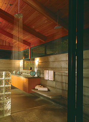
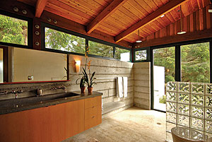
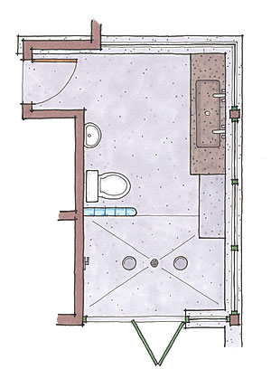
A desire for a modern, agricultural aesthetic drove the material choices for this home nestled in the woodlands in Occidental, Calif., says Laurie Erickson, a partner with Chet Zebroski in the San Francisco architectural firm EZDG. Those choices extend to the bathroom, where 6-ft. board-formed concrete walls topped by a roof structure of Douglas fir recall a wilderness outpost. Windows filling the space between walls and roof add to the pavilion-in-the-woods atmosphere. Served by two rainheads, the 5-ft. by 9-ft. curbless double shower is flanked by a bifold glass wall that opens to the outdoors. In a modest nod to privacy, along with the just-high-enough concrete walls, a glass-block partition separates the shower from the toilet and urinal. Both fixtures, as well as a concrete-topped vanity, are wall-mounted, making the room easy to clean. Floors and a concrete seat are warmed by radiant heat. With the visual weight of all that concrete, “you get such a strong sense of your surroundings when you’re in that bathroom,” Erickson says. The home’s owners have discovered an additional by-product: great acoustics. “They find themselves going into the bathroom and dancing,” she says.
Architects: Laurie Erickson and Chet Zebroski, Erickson Zebroski Design Group, San Francisco;
Builder: Larry Horne Builders, Cazadero, Calif.
Photos: Dennis Anderson, Brian McCloud
Sources: Glass door, NanaWall; vanity top, Bohemian Stoneworks; windows, Blomberg Window Systems, Sacramento
Don’t stop at a period
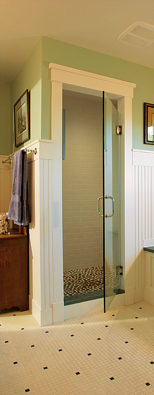
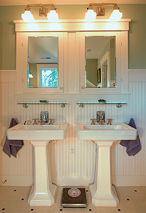
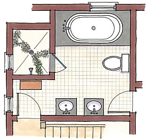
When David and Kathy Griffin decided to transform their brick-and-block rambler into a cozy bungalow, they wanted hallmarks of early-20th-century style carried throughout the house, including the new second-floor master bath. Project architect Sarah Farrell obliged, emphasizing crisp trim elements and outfitting the space with pedestal sinks and a pair of custom medicine cabinets. But she broke out of the period mold in the enclosed shower room. With two entrances to the bathroom, the homeowners decided a separate compartment for showering would offer more privacy. For Farrell, it offered an opportunity to relax the rules, so she covered the shower floor with river stones rather than the 1-in. by 1-in. keystone tile that covers the bathroom floor. “It was nice to be able to bring in a modern element,” Farrell says, “and it gave us an opportunity to have some fun.” The tub also strikes a balance between period and practical. Although the Griffins selected a traditional footed tub for its depth, they chose to surround it with a more modern-looking deck of Brazilian blue slate outfitted with simple fixtures. The modern moves are subtle, Farrell points out, but “it’s nice that there are moments when the modern touch comes through.”
Architect: Moore Architects, Alexandria, Va.; Sarah Farrell, project architect
Builder: Gabe Nassar, GN Contracting Inc., Arlington, Va.
Photos: Daniel S. Morrison
Sources: Faucets, Newport Brass; floor tiles, Keystone by Daltile; hardware, Ginger; shower’s island stones, Architectural Ceramics; vanity light, Bonneville by Rejuvenation
Give good bones a face-lift
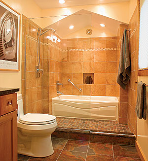
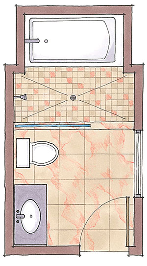
The wet zone in this remodeled bath delivers a quick shower for the bather-on-the-go or a relaxing place to soak in the tub. Clad in earth-tone ceramic tile, it’s a stylish replacement for the original tub/shower combo with its cheap molded surround. When a custom glass door proved too expensive, the homeowners opted for a single 3-ft.-wide by 6-ft.-high glass panel atop a granite-capped curb. The doorless opening makes entering and exiting the shower effortless and hands-free, and a thin chrome strip prevents water from spilling over the curb. With no frame or moving parts, the glass panel “provides for a much cleaner look, a more modern look,” designer Sonya Jacobs-Burkin says. On the floor, a switch from 13-in. by 13-in. to 2-in. by 2-in. ceramic tile distinguishes the shower from the dry part of the room, and on the walls, a mosaic strip adds zip.
Designer: Sonya Jacobs-Burkin, SJB Designs, San Francisco
Photo: Debra Silber
Sources: Floor tiles, Stone Age by Cerim Ceramiche; toilet, Cimarron, bath fixtures, Symbol by Kohler; tub, Maui Maax; tub-surround tiles, Evolutions beige by Marca Corona; mosaic trim by Cerámica Tres Estilos
Where you can’t create space, create interest
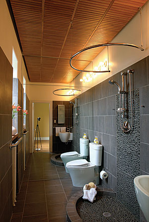
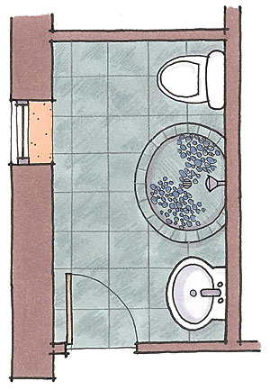
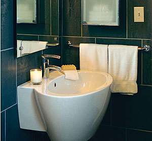
Washington, D.C.-area architect Cheryl Mohr’s response to the challenge of remodeling a 51/2-ft.-wide, 9-ft.-long box of a bathroom was as deceptively simple as the mirrored wall that instantly doubled its square footage. Faced with an unalterable floor plan (co-op rules and plumbing issues in the vintage building ruled out moving walls), Mohr relied on visual and textural enhancements to grow the room’s appeal. She started by warming up the 10-ft.-high ceiling, cladding it with walnut-slat shelves from several of Ikea’s Molger benches. “We just tossed out the legs and used the seat and shelves,” she explains. The pieces are screwed to furring strips affixed to the ceiling. To create more floor space, Mohr removed the existing tub and built a shower around the old drain, with a low curb to trap water and a tubular stainless-steel curtain rod suspended above. The shower’s pebbled surface was chosen to suggest the look of a natural waterfall. A wall-mounted sink (“probably the biggest splurge in the room,”Mohr says) is stationed where the foot of the tub used to be. Above the sink and toilet, a row of dimmable 100w lamps in simple porcelain fixtures illuminates the bath. If that doesn’t warm the room enough, on the opposite wall, standard grab bars mounted over existing radiators become towel warmers—so chosen because the large diameter of the grab bars allows more heated air to flow around the towel than would standard towel bars. Mohr’s ingenuity earned her the American Institute of Architects 2008 Small Project Award.
Architect: Cheryl Mohr, Gardner Mohr Architects, Chevy Chase, Md.;
Builder: Robert Chambers, Dunkirk, Md.
Photos: Cheryl Mohr
Sources: Porcelain tile, Elba Night, Empire Series by Crossville; shower and wall pebbles, Black Sea Minor by Solistone; showerhead and controls, Grohe; sink, Hastings Zero + 70; toilet, 0 1 2 4 ft. Nexus by Toto
If you feel boxed in, look up
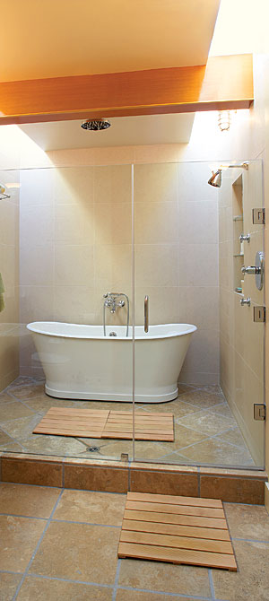
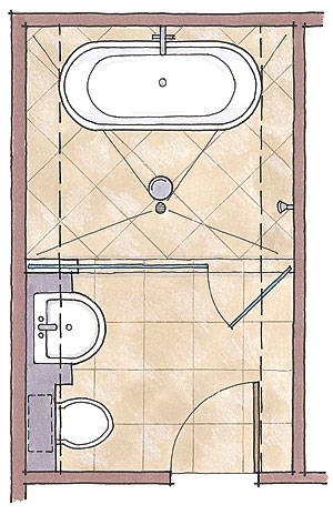
As if redesigning any part of a landmark house doesn’t present enough of a challenge, architect Gary Parsons faced additional dilemmas in his redesign of this master bathroom at renowned architect Bernard Maybeck’s Wallen II house in Berkeley, Calif. Primary among them was how to make the new bathroom light and airy without sacrificing privacy—a tall order, considering a public walking path passes just a few feet from the bathroom’s two exterior walls. Parsons found his solution in dual 15-in.-wide skylights that introduce sunlight and loftiness into the confining space, which he divided into wet and dry areas separated by a clear glass door. “It makes the room seem bigger and the shower less phone-booth like,” he says. Further framing the bathing area is an existing beam that Parsons clad in vertical-grain Douglas fir, reflecting the wood tones of the vanity cabinet that supports a semi-encastre basin. The pairing of the bathtub with caged light fixtures above perpetuates Maybeck’s habit of fitting industrial materials into traditional forms. (The house itself is a prime example, built of concrete but featuring a Jacobean-style gable and a corrugated steel roof.) The finishes Parsons chose for the room—honed limestone on the shower walls and travertine tiles on the floor—appear as contemporary as they do classic.
Architect: Gary Parsons, Berkeley, Calif.
Builder: Zanderbuilt, Berkeley
Photo: Muffy Kibbey
Sources: Bathtub, Piedmont by Sunrise Specialty; Floor tile, Cobblestone Imperiale by Import Tile Co., Berkeley; light fixtures, REA series by Appleton Electric
Drawings by: Martha Garstang Hill
