Add a Screened Porch
When the weather's right, there's no better place than a porch to enjoy a meal, to watch the kids play, or to entertain friends. Done correctly, a screened porch has plenty of daylight, and offers pleasant views and good ventilation.
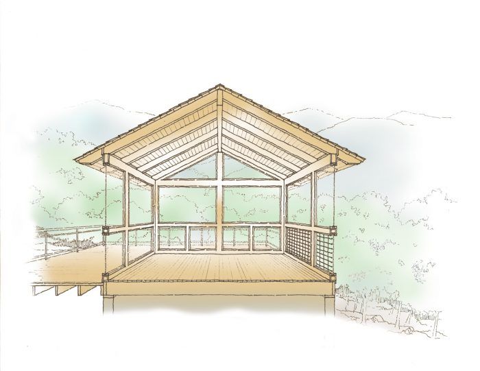
When the weather’s right, there’s no better place than a porch to enjoy a meal, to watch the kids play, or to entertain friends. But to keep mosquitoes and flies from ruining the fun, you need screened-in walls. Like a giant screened door, a screened porch opens your home to fresh air. Done right, a screened porch has plenty of daylight, pleasant views, and good ventilation.
Make it easy for people to gather
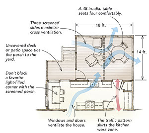
Social rooms—kitchens, family rooms, and dining areas, for example—facing the backyard are an ideal location for screened porches. Although a porch with two screened sides provides some cross ventilation, three screened sides work much better. Accordingly, try to avoid placing the porch at the inside corner of an L-shaped floor plan. Not only does an inside corner limit airflow, but it also can make hassles with a tricky roof merger.
Also, avoid overlapping the porch with a bathroom window, and don’t overlap a bedroom window or bedroom door unless the porch is relatively private with limited access.
You want to tie the porch to the landscape, inviting people to use both the porch and the backyard. You can create more-inviting stairs by breaking tall stair flights into shorter sections with terraces or landings and by dressing up these intermediate levels with barbecue grills, sunny seating, and potted plants.
The size should be just right
The porch should be sized in proportion both to the adjoining room(s) and to the overall scale of the house. A tiny porch off the grand family room of a large home looks and feels incongruous. Likewise, an oversize porch linked to a small bungalow kitchen seems out of character architecturally. Respect the scale of the house by using existing eave lines and roof shapes; this helps to keep the porch from overwhelming the house.
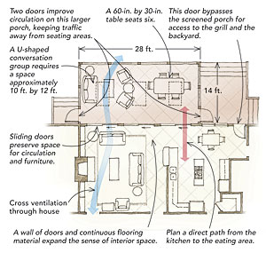
The furniture and activities you’re planning for the porch also are constrained by its size. Seating four comfortably for dinner requires a 48-in.-sq. or 48-in.-dia. round table, while lunch for six requires a 60-in.-dia. round table or a 60-in. by 30-in. rectangular table.
You can push back and get up from a table with as little as 24 in. between the table and a wall or other furniture, but 36 in. or more is easier on your back and keeps chairs from banging the walls. Add at least another 24 in. if the “scoot-back” zone is also a walking zone. (You can get by with less additional space if the walking zone is seldom used.) Plan for serving and storage, too. You might want to keep seat cushions, candles, and other items below a serving counter. Built in or not, storage and serving stations need floor space.
Add headroom for comfort
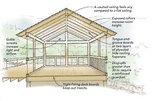
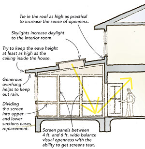
Screened porches reduce the amount of daylight entering adjacent rooms, so the brighter and loftier you can make the porch, the better. In general, the farther the porch extends away from the house, the higher the ceiling should be. While a flat 8-ft.-high ceiling for a porch only 8 ft. deep might be OK, that same ceiling for a 14-ft.-deep porch will seem low.
If the adjoining rooms have 9-ft. ceilings, then shoot for at least a flat 9-ft. ceiling for the porch, or vault the ceiling for extra airiness. As a rule, don’t increase the ceiling height by setting the porch floor below that of the interior rooms. A continuous floor plane beyond the threshold creates nice visual continuity. Also, interrupting that plane with a code-required landing and steps chews up valuable floor space, limits mobility, and invites accidents. If you can’t get a tall ceiling, you can use several strategies to boost daylight in the screened porch.
Block the bugs, and protect the view
When you choose screening, you need to balance your desire for transparency with your need for durability. Standard fiberglass screen is low cost, easy to install, and flexible enough to stay taut when stretched without denting or creasing. Aluminum screening costs a bit more but visually is more transparent. However, it is prone to oxidation and dents easily—pets and kids can make aluminum screening look bad in a hurry.
Traditionally, screen mounting is done by stretching and stapling rolled screening over openings framed in the wall and then hiding the staples with battens. However, getting screens tight can be challenging. I let a window-screen company make custom panels to fit framed wall openings. Sandwiching thin aluminum frames between a fixed stop on the outside and a removable one inside makes for a finished look that is easily replaceable if damaged.
Maximize Screened Area
Exposing the rafters and the underside of the roof deck lends a casual, sometimes rustic, feeling to the space. It also increases the height of the room. Splurge on tongue-and-groove wood decking, or use two layers of plywood thick enough to hide staples and nails. Put the attractive face downward. Elevated porches require a code-approved barrier for the bottom 3 ft. of wall. Design the barrier into the wall/screen assembly so that it doesn’t look like an afterthought. A reinforced guardrail also protects the screening, something you might want to include regardless of drop-off height if you have kids or pets.
Make it Bright and Airy
Screened porches create nice, sheltered outdoor space, but they reduce the amount of light in adjoining rooms. Low ceilings block more light than vaulted ceilings. In northern climates, you may notice lost solar gain in winter as well. Add skylights if you can’t vault the ceiling, and especially if it’s lower than the ceiling of the adjoining room. Skylights boost the amount of daylight to the screened porch and bounce more light into the house. Lighter paint colors, wood tones, and light-colored floors also help to reflect additional light indoors.
Design for Flow
Add windows and doors where you can to increase the glass area, visually expanding the interior space. They also allow for good airflow and, placed properly, provide convenient traffic flow.
Traffic patterns are critical when planning door locations and furniture layout. Create a direct route between the kitchen and the outdoor eating area so that people aren’t forced to walk through the cook’s work area. Also, avoid traffic patterns through a living-room conversation group or in front of the TV. On the porch, the house door and the screened door should isolate the traffic zone to one side or a corner, maximizing floor area for furniture and keeping the porch size in check.
The screened-porch door should open onto a comfortably sized landing area. You don’t want to be teetering on the top step as you open and close the door.
 |
 |
Illustrations by Paul DeGroot
RELATED STORIES
