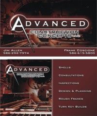
I mentioned earlier in the month that we were heading to a pro design shop to get some marketing materials made. Our goal was to exit the subcontract framing market and start marketing directly to homeowners. We have a show coming up and this is our proposed business card-front and back. The rest of the materials will follow. We still have a couple of days to make our decision.
I’m again asking for help. Please evaluate…all comments are welcome, both good and bad. I’ll post my comments after hearing yours, since I already have an opinion, but I like the collective wisdom of this mastermind group. I think a market survey of actual buyers would be better, but there’s no time for that.
I uploaded three sizes…it’s all the same pic.
TIA,
blue
Just because you can, doesn’t mean you should!
Warning! Be cautious when taking any framing advice from me. There are some in here who think I’m a hackmeister…they might be right! Of course, they might be wrong too!


Replies
What is that background?
Does not look like "normal construction".
Looks like aluminum "erector set" used for manufacturing jigs.
blue.. i like the logo...the presentation sucks..
you cannot see the logo against the dark background
View ImageMike Smith Rhode Island : Design / Build / Repair / Restore
Exactly what mike said, it needs to be Brighter. Maybe some yellows or sky blue-
Hey, wadda I know, I'm color blind.
Blue,
Slick logo, real sharp.
I'm not to sure of the background either, but I think I know where you're trying to go with it; as in "Advanced".
What is it, an overhead shot of some sort? I'll bet it was something you're real hot about too!
I don't like the more than one name, and the two numbers.
Can you each have your own cards? It's like, who ya gonna call?
I think I know what a 'shell' is, but does a potential client? I'd consider leaving it off, or at least moving it down the list.
Good luck.
EricI Love A Hand That Meets My Own,
With A Hold That Causes Some Sensation.
[email protected]
Eric, it is an overhead shot. It isn't something that were hot about though. It's just an overhead shot.
We decided to put both names on the cards because we often have to tell potential callers to call the other partner. Basically, we each take different type calls. For instance, if I make a contact with a builder and he asks to call us later when he gets a set of plans ready, I always tell him to call Frank, because Frank is in charge of that. So, instead of giving him both my card and Franks, I now can give him that card. I also tell everyone that by supplying them with both numbers, it gives them a much better chance at getting hold of us in an emergency and we want to make sure that all calls get through to us, since we don't run them through a switchboard. These are our personal cell phones.
That idea might be somewhat corny, but it works for us.
blueJust because you can, doesn't mean you should!
Warning! Be cautious when taking any framing advice from me. There are some in here who think I'm a hackmeister...they might be right! Of course, they might be wrong too!
Mike...since you cant see the logo, what do you see?
I'm being serious...what do you see first when you look at it?
blueJust because you can, doesn't mean you should!
Warning! Be cautious when taking any framing advice from me. There are some in here who think I'm a hackmeister...they might be right! Of course, they might be wrong too!
Answering for Mike....the "A".....after that its a blur.
Like the design, although it seems vaguely familiar......backround graphics gotta go.FREE SANCHO RON
Jay, I think you're eggajerating a bit. I opened the smallest one and I see more than just an "A"...and I've had cataract surgery!
blueJust because you can, doesn't mean you should!
Warning! Be cautious when taking any framing advice from me. There are some in here who think I'm a hackmeister...they might be right! Of course, they might be wrong too!
Exaggerating? Moi?
OK....but only somewhat.....it does take a second for the eye to focus and to discern what exactly is in the text.FREE SANCHO RON
Jay, when I look at the text, the word Advanced jumps out. I'm fine with that. For the most part, the "construction concepts is mumbo jumbo anyways. When we chose that name, we intentionall left the name vague. Some would say were missing our chance at educating the buying public, but we feel that the name adds intrigue, and when it's posted on a jobsite, the public understand what type of construction we are doing.
If you have to study the card a bit to read Construction Concepts, that's okay with me. Im just happy that one word...Advanced is highly visible. That was exactly what we requested.
blue
Just because you can, doesn't mean you should!
Warning! Be cautious when taking any framing advice from me. There are some in here who think I'm a hackmeister...they might be right! Of course, they might be wrong too!
blue...
View Image
i see an "A" with a leg on it.... everything else is just brown on brown
i'm gonna give you my logo speech.. so lissen up..
your logo should be repeated on everything your company does.. job signs, truck signs, Letterhead, invoices... all stationary.. newsprint ads
it should be consistent in shape and color..
you are trying to "brand" with your logo a dn it takes (according to research ) 7 hits on your potential customers radar screen before they remember you.. after that they think they know you.. even if they don't...
BTW.. they can know you good .. or tehy can know you bad.. like if you just cut tehm off on a freeway exit
so.. this card is muddled.. and a waste.. it doesn't help them get a picture on their radar screen.. the logo is lost against the background..
next...
the color.. is it brown... or maroon ?.. whatever it is ..that is what it has to be for all of your ads.. all of your signs.. everything you face the public with.. if you keep changing the color.. you will never reinforce the previous contacts you have made
so.. if this is the color you have chosen.. fine.. but make sure this is the one you want
(remember "Positioning " ? )Mike Smith Rhode Island : Design / Build / Repair / Restore
"what do you see first when you look at it?"
I see a key
I saw that same key Pierre.
blueJust because you can, doesn't mean you should!
Warning! Be cautious when taking any framing advice from me. There are some in here who think I'm a hackmeister...they might be right! Of course, they might be wrong too!
Bill, I don't know what the background is. It looked to me like I was hanging over the balcony overlooking an office building foyer from about 4 stories up.
blueJust because you can, doesn't mean you should!
Warning! Be cautious when taking any framing advice from me. There are some in here who think I'm a hackmeister...they might be right! Of course, they might be wrong too!
For the life of me I can't figure out what the background picture is supposed to be or how it could possibly be related to the building trade. What is it?
Maverick, the background is a mystery to me too.
blueJust because you can, doesn't mean you should!
Warning! Be cautious when taking any framing advice from me. There are some in here who think I'm a hackmeister...they might be right! Of course, they might be wrong too!
I do think that the card could be confusing.
I'm not a fan of the dark color, and the "techno background" makes me wonder.
"shells"...you know what it means, I know what it means...but I've mentioned "shell" to a few people and some think of it more as Cloud and his concrete dome shell than a wood-framed shell.
Couple that with the techno, semi-ambiguous background, and I see potential confusion.
The dark card would get lost at the bottom of the stack. Plus I sometimes write notes on business cards...couldn't read anything I wrote on yours.
A card like that, it's nice looking, graphically it's well executed, and it's slick...but it makes me think more of commercial construction than residential.
So...overall...I'd say it has a great beat, but it's not easy to dance to.
Mongo, I think the word shell at the top of the list is wrong too.
I'm thinking that I'll have them change the order to Rough frames, design and planning, consutations, inspections, Turn key building and shells in that order.
My thinking is this. We want to tap into the homeowner segment of the roughframe business. This will eliminate the builder/gc from the equation and we will absorb their markup and be able to add some profits in the form of helping out with the design and consultation. Our only inspection service will be to inspect rough frames on new construction. We are willing to do turn key builds, but those will be referred to another builder/partner that is geared toward handholding clients that want/need that type of service.
The shell business is what we ultimatly want and we intend to back into that sale by securing the rough frame first.
blueJust because you can, doesn't mean you should!
Warning! Be cautious when taking any framing advice from me. There are some in here who think I'm a hackmeister...they might be right! Of course, they might be wrong too!
Agreed....I was wondering if I had a surprise new builder source! Could use 'em.My first impression is that I didn't know what y'all build, Blue...commercial, residential, garages, manufacturing facilities...should be more targetted to the customer in terms they use and understand.
Dear Blue
I was in printing and graphic arts for 20 years. I've probable designed and printed 10,000 different sets of cards. I agree with the other poster, you each need your own cards. As a homeowner, I find the list of what you do confusing. I seems mostly contractor jargon. I would rather see "Additions" "Renovations" "New Home Construction" or something like it. Simple works. I did like the "Consulting" and "Design" parts. Do you have a website? Cell phone numbers? Put it on the card. If you are not going to change or alter the card after it is printed, get a good quanity 2500 each name it'll be cheaper per piece. Hand them out like water. A business card is the small business's best form of advertising.
Andy
Andy, I dont do additions or renovations. I would consider the words "new home construction" but that would simply replace the Turn key builds and Shells. Basically, we really want to stay clear of most turn key builds, but we are ready to do some big customs if needed using a third partner who specializes in that type of activity. Our main goal at this show is to meet potential homeowners who are gathering ideas and subcontractors so they can build their own.
blueJust because you can, doesn't mean you should!
Warning! Be cautious when taking any framing advice from me. There are some in here who think I'm a hackmeister...they might be right! Of course, they might be wrong too!
FWIW, I like the logo and the color scheme, not to dark in my opinion, Looks rich and chocolatey! I, too, puzzled over the background, but details speak to me and I'm naturally curious. I do like the overhead perspective, maybe substitute a more familiar scene, like a top down frame shot.
Also wondered if things like shell and turn-key builds were sort of ambiguous terms. Maybe Exterior Shells or Structure Shells. Turn-key buildings instead of builds. People are interested in product more than process. Perhaps order them differently. Progressively?
Inspections
Consultations
Planning and Design
Exterior Shells
Turn-Key Buildings
You want fries with that? PJ
Everything will be okay in the end. If it's not okay, it's not the end.
FWIW, I like the logo and the color scheme, not to dark in my opinion, Looks rich and chocolatey! I, too, puzzled over the background, but details speak to me and I'm naturally curious. I do like the overhead perspective, maybe substitute a more familiar scene, like a top down frame shot.
Peter, that was exactly how I "felt" when I looked at it for the first time...rich and chocolately! Lol!
I actually liked the puzzling background, but Frank and I are exploring exactly what you suggest, a more familar scene...something that we've done.
blueJust because you can, doesn't mean you should!
Warning! Be cautious when taking any framing advice from me. There are some in here who think I'm a hackmeister...they might be right! Of course, they might be wrong too!
I see the same thing in that list of things blue will attack. Seems like, "We're desparate enough to try anything" with no focus on a single thingDark colours to me speakk quality and the logo itself looks impressive, but the background display makes me dizzy and seems commercial. overall, I'm left wondering, "What do these guys do?"Blue, If keeping this overall card idea, I would only use the dark on front and be more minimalist on the back, changing wording to a faocused goal.
Welcome to the Taunton University of Knowledge FHB Campus at Breaktime. where ... Excellence is its own reward!
Many graphic designers/advertising folks suffer from an affliction that causes them to design with the primary focus of impressing other designers (they give each other awards). Obviously your designer is infected and needs a shot to the head.
IMHO, your card needs to speak retail, not wholesale. If you want your card to stick out, have them made 1/4" oversize.
gotta watch you evey second <grin>
The awful thing is that beauty is mysterious as well as terrible. God and the devil are fighting there, and the battlefield is the heart of man.
- Fyodor Dostoyevski
Lol Fn!
I'm going to hold my reply until a little more judgment is passed. I too have an opinion, but I'm trying to hold mine for a little while longer.
blueJust because you can, doesn't mean you should!
Warning! Be cautious when taking any framing advice from me. There are some in here who think I'm a hackmeister...they might be right! Of course, they might be wrong too!
I think that you need to set down and write out some detail exactly what you want to do and who the client is.Then keep working that over and boiling it down until you can get in to a phase and/or a few key words.Looking at that list you have I don't see any direction.Planning - of WHAT? If based on that card I would think sub-division devlopement or even large commerical properties.Inspectios - of WHAT? My first thought is that you are going after the resell homes, IE Home Inspector.Shells - Sound like you want to build commercial strip centers and leave the interior to the store owner.But you are talking about going after home owners as your clients.Are you trying to focus on owner builder clients?
Bill, I agree with your entire post!
The words were just bulletin points made in our meeting that discussed our marketing strategies. We're satisfied with the logo, color scheme, although Frank thought something lighter might be better probably in the same hues.
I told Frank that I liked the shot, but it conveyed the notion that we would build them a very nice commercial interior. I'm searching through my residential stuff now to send to the graphix guy.
We are also going to change the order and probably add some quick defiinitions/explanations.
I'm also going to try to get a look at the logo without the background. Frank was at the shop and when they pulled it up, he said it would be great when pasted on our stuff.
blueJust because you can, doesn't mean you should!
Warning! Be cautious when taking any framing advice from me. There are some in here who think I'm a hackmeister...they might be right! Of course, they might be wrong too!
Blue,
I'll go again.
Based on what someothers have said, you need to define your feild of work better.
Right or wrong as a whole, my logo says
Eric Paulson
Builder - Contractor
All Types of Residential Building and Contracting
It's clear that I do residential work.
As for that list; it needs work.
I'd put the 'Premium' services at the top. The ones you will make the most money at, the ones you wish to concentrate on.
I like the term 'Turn Key' and use it often.
The term often gets overused, but if you carry the term, and the emphasis on it's meaning, and the role it plays in your business, into your other publications, it may work well for you.
Eric
I Love A Hand That Meets My Own,
With A Hold That Causes Some Sensation.
[email protected]
The dark background has a lot of visual punch but it doesn't convey any information about your business at all. If you want to keep the look I would do something interesting with photos of one of your projects, or several of your projects.
For example, two shots, taken from the same spot at the beginning and end of a project and morphed together so one end is framed and the other end is finished is a good way to say "start to finish," though it's a bit over done.
Here is an example of a marketing rule breaker that might suit you. It is a collage I put together for my firm that gives an interesting snapshot into several of our projects. It's "way too busy" by marketing standards but it's amazing how many people took the time to study it for several minutes trying to pick out the transitions.
We've started using it as the case artwork for our marketing CD's and it gets a lot of positive feedback.
Golden, I like that collage that you've done, and I could see why it would be criticized, but yet quite interesting.
I'm going to explore that idea a bit.
blueJust because you can, doesn't mean you should!
Warning! Be cautious when taking any framing advice from me. There are some in here who think I'm a hackmeister...they might be right! Of course, they might be wrong too!
So...Blue...you're not Frank...
...Must be Jim...
All I can say after 30 yrs in the buss is i use my calling cards as note paper...they just call...go figure...
#1 KISS...Keep it simple, sir
#2 E-mail Luka
#3 Peace on Earth
I don't like the card at all.
It doesn't capture my attention because it's brown. If I saw that card laying on the ground, I wouldn't pick it up. I would think it's a leaf. The design of the card lends the impression that some beret wearin', four-eyed art student with no construction knowledge puked it up. The logo doesn't cover the scope of your work. "Advanced Construction Concepts" along with the layout of the card implies to me that you design multi million dollar skyscrapers.
The back side of the card isn't balanced. On the right, you have nothing but words on a solid color background while on the left, you have the logo buried in some picture that no one can identify.
Some things people DON'T see are an address, confirmation of insurance, nor a license number.
Are you certain the designer is a legitimate professional? Does he/she have any credentials? Have you seen any of their previous work? Does any of this matter to you?
I have to add I'm almost ashamed that I wasted 4 seconds of my life looking at that card.
I don't like the card at all.
Interestinly, I actually glad that the card provokes some emotion out of you. You're next post that claims that you are ashamed to say.....tells me that you are emotionally distrusght, or something about that card.
Now I know that it fits our stated intentions....we definitely wanted to separate from the crowd....
blueJust because you can, doesn't mean you should!
Warning! Be cautious when taking any framing advice from me. There are some in here who think I'm a hackmeister...they might be right! Of course, they might be wrong too!
Whoops!
Forgot the smilie face! :)
Blue, unless I already know, there is nothing about your card, that I can see, that tells me you're a framing contractor. The company name certainly implies much more than that. And when I was trying to figure out what the background was, since I already know you frame, I was looking for house framing. What I actually saw would not make me think your were a framing contactor. When I had my first business, I was always getting stuff in the mail with sample logos on them, and some were really slick and futuristic-looking like the one you have, but I never really liked them. That's just me. I think a card should tell someone at a glance what you do. If they have to take the time, like I did, to figure out what the card is about, I think you'll lose a lot of them.I admire your willingness to put your ideas out here for us to look at and critique. I'm not ashamed of having looked at it ;)
Allen in Santa Cruz
Moondance, you are right and we are on it. I'm actually looking for a glitzy biz card. We first wanted to get the logo done professionally. I'm satisfied with the logo. Now we'll work on the background and verbage.
In a way, I'm less inclined to attempt to say much about our business, on the card, and instead I am trying to create an emotion. I want them to look at the card and FEEL something! I would prefer a "wow", but would take a "huh?"...and I would prefer a "oh my, that is disgusting" to "ho-hum,zzzzzzzzzz"
One of the reasons that I want to create a buzz with the card is because 99% of the business cards I get from trades people are either boring, cheap looking, feel cheap, plain white, etc. Occasionally, someone hands me a card that impresses me and even though I might not use their services, I immediately draw a conclusion from the pizazz that the card gave me.
At this point I'm rethinking the front and back of the card. Actually, I'm thinking of making the back of the card the front, and leaving the back black. My name would go in the bottom of the left side of the card and the things we do will be listed the right. If I do that, the backdrop graphics will be either a framed skeleton of a house or a blueprint of a house.
I do like the idea of the morphed graphics background. If I go that route, I want to morph a set of plans into a rough frame into a finished house. If I do that, I'll probably use the back to list our services, but might consider squeezing them in a light font and leave plenty of room for notes. I too use the back of cards for notes, but that's not really a high priority for me.
One thing that everyone should keep in mind, I rarely give cards out except when I'm in the field doing my thing. This particular card will be handed out at a builders show and we will be presenting ourselves in a rough frame setting. Basically, they'll KNOW we are rough framers!
blueJust because you can, doesn't mean you should!
Warning! Be cautious when taking any framing advice from me. There are some in here who think I'm a hackmeister...they might be right! Of course, they might be wrong too!
In a way, I'm less inclined to attempt to say much about our business, on the card, and instead I am trying to create an emotion. I want them to look at the card and FEEL something! I would prefer a "wow", but would take a "huh?"...and I would prefer a "oh my, that is disgusting" to "ho-hum,zzzzzzzzzz"
Hey Blue, You reminded me of something else. I just got a business card from a new supplier yesterday. It was printed on the most substantial paper I've ever felt on a business card and it caught my attention. Real stiff and thick. I told the guy same. I'll think I'll cop the idea when it's time to print cards.
Actually, I've been talking to a graphic artist about a new logo...mind if I borrow from yours conceptually?PJ
Everything will be okay in the end. If it's not okay, it's not the end.
Pj, help yourself, I doubt that we'll be running into each other soon.
blueJust because you can, doesn't mean you should!
Warning! Be cautious when taking any framing advice from me. There are some in here who think I'm a hackmeister...they might be right! Of course, they might be wrong too!
blue, I can see where you're going with the card, and if it feels right to you, I think it will be right. One thing I realize as I'm planning a business name, logo, etc, is that I'm going to be selling myself first. Unless thay can look me in the eye, listen to what I have to say, and get a good feeling about me, all the fancy marketing campaigns and advertizing glitz in the world aren't going to be worth much.So my intent is that, as soon as possible, my work will be obtained through word-of-mouth references. The card will be something I hand them so they'll have my phone number closeby. They will have already heard about me, what kind of person I am, what kind of work I do. A sharp looking card will be nice, but I doubt many of us get jobs based on how cool our card is.As someone else mentioned on the "what's in a name" thread, we get hired based on who were are and what we do, not so much on our company name, business card, etc. I fully expect people to call me because they've heard that I'm the man to call. My company name and the appearance of my business card will be of little consequence most of the time.I like your idea about doing something different, something that stands out. When someone has met you face-to-face, and likes what he sees, your business card isn't going to change his mind about you. So use whatever appeals to you. If people like you and your framing, a card that is a little out of the ordinary will only say that you're a little different than the average framer out there, and that's a good thing.
Allen in Santa Cruz
When someone has met you face-to-face, and likes what he sees, your business card isn't going to change his mind about you.
Exactly Moondance! In most cases, the only reason someone will have a card is because they've requested one, or we've already exchanged enough verbal and visual information that the card is secondary to the relationship. Most everyone has suggested that my card be the reason or impetus that people will know what I'm doing and want to call me, but I already know that to be false. I'm not trying to establish a relationship when I hand the card, I'm trying to re-inforce it.
I have accepted a great many business cards over the years. Since I've become a student of business and marketing and money, I've substantially escalated my social nature and I probably ask 95% or more of people I converse with for their card. I scrutinize the entire process....how they react when I ask, where the card is, how they hand it to me, what it says, how it feels, how they react when I compliment them on their card, etc, etc, etc. Heres what I found out: most contractors don't readily have them available. When they finally get one, it is wrinkled, wrong numbered, often very cheap stock, occasionally have the wrong name. They almost always apologize in some way, shape or form. Basically, the conclusion that I always come to is that they are unorganized, sloppy and cheap. They always leave me with the feeling that I can't count on them
On the other hand, most succesful builders I have asked for cards present them in a much different fashion. They proudly and assuredly reach into their stash and present one with confidence. For the most part, the card is exquisite. Everything is done professionally. The card, combined with their demeanor exudes confidence, superiority, professionalism, quality, excellence.
Basically all of us collect cards and toss them into a pile. Eventually we all grab the pile and sort through them. I just did it while I was doing this post. I grabbed ten and flipped through them. Nine out of ten were ordinary. The tenth was a builder who lists :"Custom Estate Builders" as something he does. His card is the only glossy one. I can honestly say I remember him, his card and his card definitly makes statement, when clumped in with the ordinary one.
The point is this: you create an aura when you meet with your clients/trades. The aura creates expectations. The card re-inforces expectations. I'm not using the card to create the opportunity, I'm using the card to re-inforce the facts as already established.
blueJust because you can, doesn't mean you should!
Warning! Be cautious when taking any framing advice from me. There are some in here who think I'm a hackmeister...they might be right! Of course, they might be wrong too!
Right on, blue! While you're actually doing it, and I'm still in the process of formulating a plan, I think we're both on the same page. With my appearance, demeanor, knowledge, ethics, sense of humor, experience, etc., all of the things that make me who I am, I know I bring something to the table that nobody else has. I want my company name, logo, and business card to reflect who I really am, but I realize they are secondary. I think if you make the changes you've mentioned, but keep the visual impact you like, your card will be fine. If you like the way it looks and feels, that's the most important thing. I'm going to remember what you said about the presentation of the card.Last year I met Gary Ransone, author of the Contractor's Legal Aid kit, in the front yard of a house I was working on. I didn't know who he was, just that he was an attorney. I asked him for one of his cards, and he didn't have one on him. So he reached down and picked up a 2 x 4 block, asked for my pencil, and wrote his name and number down. I was more impressed by that than a glitzy card. The next day I saw his name in print on this site for the first time. Pretty cool, huh?
Allen in Santa Cruz
I'm going to remember what you said about the presentation of the card.
Moon, just for fun, start asking everybody that "should" carry a card for one after you have a little conversation with them. When they finally hand you one, make sure you look closely at it and find something to compliment about it (that is a tip I got from a Dale Carnegie type book). I think you'll find about the same results as me...often it's hard to say something nice about the actual card, so I quite often find myself saying something like "Oh wow Brian, I see you do both residential and commercial HVACS!" I'm not trying to be uppity, but the point is that finding the good in somebody helps me to implant the memory in my tiny brain and it allows the other party to tell a little bit more about their thm and their company, which is what I'm really interested in anyways.
You'll learn a lot of things that you SHOULDN'T DO OR SAY if you become a study of how others present their cards and companies!
Meeting a lawyer that is a good author is fun. It's kinda ironic that he had to scribble on a block of wood too. I've heard it said that you haven't arrived till you can present your card with only your name on it...no numbers, no ads, just you. I mean, think about it....would you expect Donald Trump to give you a card with his cell phone # on it?
blueJust because you can, doesn't mean you should!
Warning! Be cautious when taking any framing advice from me. There are some in here who think I'm a hackmeister...they might be right! Of course, they might be wrong too!
OK this whole discussion is getting way too etherical for me.
My card say's :
Mr T
Premium nail pounder.
You know where to find me
Mr T
I can't afford to be affordable anymore
Blue, Just a couple of comments from me;
I agree with your idea that the card doesn't need to be what people are looking at in order to determine exactly what it is you do. They should already know that by the time you hand it to them. I personally also agree with what you were saying about having a card that "stands out" from the others and looks sharp and professional, which your's does.
I think that you've already got enough criticism regarding your bullet points. ( I've never met a homeowner type who would have a clue what a "shell" is).
One thing I agree with is the poster who suggested leaving the front design alone but lightening up and simplifying the back. I personally tend to write on business cards, (just little reminders, like "does great tile work" etc. or "met at that swingers party." ) just to jog my memory of who it is. I couldn't do that with your card. Leaving some white background on the back would enable me to do that. Another thing I do is to write stuff on the back of my cards when I hand them out to people, Any time I ever have to give someone any type of note whether it be a shopping list, or directions to the tavern, it's on the back of one of my cards. Maybe doing the fold-over cards wouldn't be such a bad idea.
I also 100% disagree with the poster who said you need to have seperate cards. You are correct, having both numbers on the card, is like a bonus for the cardholder. And they don't have to juggle two cards now. One solution would be to have 2 different cards mocked up, one with your name in bold, and Frank's smaller and less prominent, and the other card with Frank's in bold. Or just leave well enough alone. I think it's fine.
Another poster suggested having the cards made 1/4" oversized. Bad idea! I keep a lot of cards in a plastic business card holder page in the back of my franklin planner, and oversised cards either get cut down with a scissors (always accompanied by some cursing, which puts the owner of the card in a negative place in my mind.) or thrown away.
I think I'm going to take your advice about asking for peoples' cards and observing them in the process, Great idea!
The only thing I found to be really negative from a personal standpoint is that looking at the card just gave me the impression that I probably couldn't afford your services. On the other hand, this way, nobody will be getting sticker shock when you quote them your rates. was this your intention? Or just fortunate coincidence?
Thanks for the advice Mark.
I'm probably going to either eliminate the back, or go with a bifold card. I myself use the card to leave messages and take notes. The bifold seems to have no downfalls..only price which is not really a big factor. I spend more in diesel fuel each week than that could cost in a year!
You said "The only thing I found to be really negative from a personal standpoint is that looking at the card just gave me the impression that I probably couldn't afford your services. On the other hand, this way, nobody will be getting sticker shock when you quote them your rates. was this your intention? Or just fortunate coincidence?"
We definitely want to give the impression that we are more expensive, because we are! We want our entire first impression to sort out the bargain seekers. We will be selling on value. We've already went bust wallowing with the masses. This is our response to the business cycle that is hell bent on impoverishing the carpenters here in Michigan. We might not do a lot of business, but when we do, IT WILL BE PROFITABLE!
blueJust because you can, doesn't mean you should!
Warning! Be cautious when taking any framing advice from me. There are some in here who think I'm a hackmeister...they might be right! Of course, they might be wrong too!
I like your approach, blue. There are very few people with the nerve to ask for more money than most others are getting. But there are people out there who prefer Porches to Volkswagens, and have the money to pay for it. If those are the only people you want to appeal to, and I don't blame you if they are, then you have to approach them differently than you would Mom & Pop Walmart. Your company name and business card design make more sense in that context. As part of a plan to market yourself mainly toward high-end homeowners.
Allen in Santa Cruz
Actually Moondance, we're not focusing our marketing efforts to high end homeowners. We're aiming at all economic groups that understand and want quality.
Mike sent me a very good book called "Building With an Attitude". A lot of the stuff that is covered in there makes sense and we had arrived at a lot of the ideas on our own because of our experiences. One topic covers pricing and how to present your pricing in a more palatable light.
Lets look at a modest starter home. Lets say a young couple approaches us and tells us that they are building their own and want a price on the rough frame only. Instead of focusing on price, we will be focusing on value. Then, when our our price ends up being higher, it will be expected. If the price become an issue, then there are several ways to look at it. 1)price is relative to quality...if they don't drive a Geo, then why would they want Geo type rough frame pricing? 2)Price is relative to time....$3,000 over the lifetime of a typical home loan adds about $17 per month.
Do you think they can afford to spend $17 per month to get a significantly better rough frame, especially when they've already been schooled on the importance of that particular house component? If we've done our job and did a professional job of selling, then I don't think $17 will be a deterrant. That's less than the price of a bottle of water each day.
blueJust because you can, doesn't mean you should!
Warning! Be cautious when taking any framing advice from me. There are some in here who think I'm a hackmeister...they might be right! Of course, they might be wrong too!
As I told someone a few years ago when they quibbled about me matching a bid that was close to 20% less than mine:
"I could meet their price...but I'd have to meet their lack of quality as well."
I got the job at my price.
Blue,I doubt if I can help further than all the really great advice written here already; I've usually been disappointed with my own company names and logos and business cards in the past.That said, I also think that I'm the kind of person who does not give extra credit for a really kickass card--but I will take points away for a bad one, which means your card is effective if you use me as a barometer.I disagree with one thing mentioned, though in many cases the poster is probably right: I really liked Jeff Buck's card, showing a list on the back of what types of work he does. I think it provokes someone to ask themselves if they need that kind of work done, and immediately they have someone in mind who can potentially help them. I don't worry about cost for these items; it is cheap in our business--if you get one sale because of handing out a card, you've paid for 10x the cost of producing a quality run, maybe much more. And there is no doubt that a cheap, unprofessional card probably indicates a chump contracting outfit.I do want to show the colors to my wife so she can later convince me that it was her idea to paint the dining room the same!Good luck to you,Dog
Blue,It looks as though you want your card to sell for “youâ€. I always sell myself and then hand them a card with my contact information on it. The card is simply a means to document how to get in touch with me, nothing more.You have been doing what you do for a long time. . . The card isn’t going to chance that. How you are “received†by potential customs makes the difference.And that’s my buck fiftys worth.
Thanks Joe, Maddog and everyone else for all your input.
Heres a link to the logo that we settled on :http://proofyourdesign.com/advanced/
That link shows the logo stripped of it's graphics background. We we satisfied with the basic shape and the dark maroon color. We'll start building our new retail identity with maroon and beige clothes.
Sorry I can't show a better pic of the graphics, but I don't have one...we'll be talking to the graphix guy soon and we'll have him post them on that sit
blueJust because you can, doesn't mean you should!
Warning! Be cautious when taking any framing advice from me. There are some in here who think I'm a hackmeister...they might be right! Of course, they might be wrong too!
Mark, I forgot to mention...have a lot of fun getting those cards from other contractors. You'll be surprised at how it will benefit your overall business. It might seem silly, but most contractors/people really want you to be interested in them and there's no easier way to compliment them than to ask them for their card. It's not really a compliment, but they automatically take it as one.
Give us some reports of your findings.
blueJust because you can, doesn't mean you should!
Warning! Be cautious when taking any framing advice from me. There are some in here who think I'm a hackmeister...they might be right! Of course, they might be wrong too!
>They should already know that by the time you hand it to them.I often get a bunch of cards in a short time, such as a trade show or similar. I have a bunch of cards right now that I can't remember the context of where I got them or why I have them. In general, gotta decide is the card is a way to give someone who already knows you your phone number (it's why I get cards from current contractors) or if it's a way to stay in the heads of people you just met whom you hope could become a client. If the former, then a name and number is sufficient. If the latter, then they aren't gonna remember the details of a conversation a few weeks/months later, and the card, like an advertisement, should make clear exactly how you can help them. I don't see the point of any form of marketing and advertising that doesn't clearly position you. If real estate is location, location, location, then marketing is positioning, positioning, positioning.
When they finally hand you one, make sure you look closely at it and find something to compliment about it
I love these little pearls of wisdom people here give out. It may seem obvious to some, but I'm definately guilty of grabbing a card and stashing it in my pocket. Nice tip.
Oh, and your card, I like the richness of the color, if not the exact color itself. The background is confusing but it is obviously some sort of construction. Together with your business name it seems like you might be in heavy construction, or maybe panelized construction. Hey, with your table framing you are in panelized construction, so there you go. I don't see anything wrong with the list of what you do; if you're in the trades, you know you do. And another vote for thinking it's fine to have two names. Needing one name is a bit of an ego thing. Your card has ALL the relevant information, and looks professional.
Mike
Nowhere does it mention Boogerin'!!
You getting away from what your best at?
:)
Mr T
I can't afford to be affordable anymore
I wish Boogerin was a politically correct term...it would be front and center on my marketing materials!
blueJust because you can, doesn't mean you should!
Warning! Be cautious when taking any framing advice from me. There are some in here who think I'm a hackmeister...they might be right! Of course, they might be wrong too!
I seem to be the only one, but I like it.
Phat
Never underestimate your ability to overestimate your ability
Hey Blue, I'm not in your biz but since graphic design, advertising and production are my bag I hope you don't mind if I chime in.
The logo is fine, but like everyone else has commented the background has got to go. It serves absolutely no purpose that I can see.
I would also suggest you skip printing front and back on your business card. People rarely look on the back so the extra cost in printing is wasted. If anything you should think about printing up and a folder over card with logo and main message on front, detailed info inside.
If you are dead set on a two sided card, drop the logo on the inside. You are wasting precious space with an unnecessary repeated message.
Back to the logo for a minute. The true test of effective logo design is to view it in black and white. Unless you have a big budget, there will be numerous occasions when your logo will need to be reproduced in B&W. When I design an identity package, the initial presentation of concepts is always
B&W. If you can't hook 'em with that, all the color in the world isn't going to help.
Just my two cents.
BTW - you mind of ask how much you paid for this design?
EDIT - Might I suggest you head down to your local Barnes and Noble and thumb through some of the logo and biz card design books in the graphic art section. yuo don't need to buy the books, just look through and see what works for you I think it will inspire you to something more effective. PRINT Magazine has an entire series that night be in your local reference library.
Edited 3/4/2005 9:30 pm ET by pino
Pino, I cant' tell you about the price, since I don't know anything about it. I'll let you know when I know.
I really don't want to do the "thumb through the books thing". All that ever happens is that I get confused, and then I do nothing. I'd rather do something badly, than nothing.
I need to be led in this department. Someone is now "handling" it...I'll let them know if i like it or not. The decision day is not far off...Moday I think.
blueJust because you can, doesn't mean you should!
Warning! Be cautious when taking any framing advice from me. There are some in here who think I'm a hackmeister...they might be right! Of course, they might be wrong too!
good luck.
Blue ..
bad news ...
I like it.
as for all the "I don't know what U do" questions ... who just goes around randomly handing out biz cards and running away? Here's an idea for ya .... hand then the card ... after U tell them what ya do?
also ... the graphics "pros" .. they pretty much try to impress other graphics pros ...
and ... I also like the 2 name deal. It's one company ... I know there are 2 guys ... now ... I have their names written down for me! What a concept! Hey look ... there's a number to reach them both too ... bonus!
really ... do ya think anyone we deal with on a daily basis would be confused by such information overload ... and if they are ... do ya want them calling U?
And what's with this ... "If I picked it up in a parking lot" .....
what the hell is that? Yeah ... I get some of my best customers by throwing my cards across a freaking parking lot ..... I'd be glad U couldn't tell what it said ... U garbage picking idgit. That line of thinking is just plain stupid.
anyways ... I liked it.
Jeff
Buck Construction
Artistry in Carpentry
Pgh, PA
I agree somewhat with Jeff. I don't think people often look at a business card for information of what someone does, just do you do what I need. So telling them what you do is where its at.
That said I do think its too dark. And if I were going to do the picture thing I would make it relevent to what I do and I don't think that picture is. Just my opinion. I could be wrong. DanT
Blue,
I tend to agree with Andy, Piff and whomever else...
Lose the irrelevant background.
Simplify your list of "specialties"
Maybe sumptin like "residential design/construction to fit your needs"
gotta let potential customers know that you want to serve THEM, so they will make the call.
If they can't figger out what you do, or whether or not you can do what they want, they will just keep looking.
I do like the graphics and color scheme..
Different!
"Let us booger up a new home for youse"
"I'm not a marketing exspurt, but I play one on the Internet"
Mr T
I can't afford to be affordable anymore