Alright ladies and gents….. we’ve toned down the skull and cross-bones logo that had many of yer panties tied up in knots…. we’ll save that for the tattoo artist!
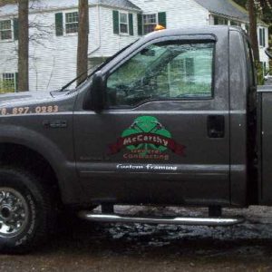
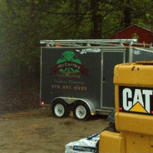
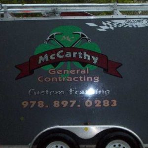
Yesterday I had the truck and trailer lettered up and I’m quite happy with the finished product. She’s coming back on Monday to letter up the boom on the forklift and hopefully the sweatshirts, t-shirts, tank tops, and business cards will be ready at the same time. I gotta give props to the Sue and the girls from www.graffitiworks.com for doing such great work with the logo design and lettering. She is a class act, does great work and offers the total package. She did it all…. designed the logo then layed out the lettering for the vehicles, went over the apparel choices and layout out for me, same with business cards. I’d use her for website design as well if I had the need. I was very impressed with her work and felt her prices were quite reasonable. Sue rocks!
The pictures aren’t great cuz it was pouring rain and very overcast when I took them this morning. I’ll take some better shots on a nice day when all three vehicles are finished. It’s hard to see in the dreary pics, but a bunch of lettering is ‘diamond plate’ and catches the sun really cool.
I think the truck lettering is perfect for my biz. Not too overstated. I’m a framing subcontractor so I’m not really looking to catch much attention on the roads with the general population. I’ve gotten in good with several high end builders in a fantastic market and they’re keeping me very busy. I just wanted to establish a unified logo for all the equipment and ‘uniforms’ so everything looks as professional as possible. The guys shouldn’t be able to complain about having to wear company shirts everyday as I ordered the top of the line Champion heavy weight hooded sweatshirts, heavy weight Champion T’s, and heavy weight Champion tanks. All in a grey color cuz it’s not too hot in the summer and hides dirt better than white, besides, the logo looked nice on grey. I’ll post pics of those when they come in.
Alright fellas…. cut it to pieces 😉
Edited 5/7/2005 11:30 am ET by dieselpig











Replies
Bummer.... the pictures don't do the job much justice.... I'll take some on a nicer day like I said. Here's the layout for the boom on the forklift....
Brian,
I like those logos a lot. I'll tell you what I think in all honesty. Looking at your truck, trailer, forklift, the clean jobsites, your crew (who don't look like bum at all) and what I know of your personality and workethic from this forum, you are what every contractor around here is looking for. A young guy who works hard, does a good job and is head and shoulders above the competition.
If I was a builder, I'd hire you and your crew in a heartbeat. You have my respect. Those logos are just right, not too flashy, but they'll stand out enough to get noticed.
I appreciate all that Tim and I'm glad you like the logo, but 'head and shoulders above the competition' just wouldn't work as a company catch phrase..... I'm 5'8"! LOL.
And if for you some strange reason you ever end up in Red Sox Nation..... you know where to look for work. ;)
Nice logo and good proportion of size going from truck to trailer etc. I don't know about your area but in ours you would be one of the few framers with a pro looking deal. Nice job. DanT
Diesel - that's great! I checked out the website at graffitiworks.com, very impressive. I think you explained your goal (" I just wanted to establish a unified logo for all the equipment and 'uniforms' so everything looks as professional as possible.") in going with this package, and if it works for you, and you like it, more power to ya! That's pretty much what I'm aiming for in my logo/uniforms/signage, and I think its a good business decision. Definitely elevates you above the 'gotta truck and some framin' buddies' type contractors. I tend to favor a more concise, graphic, design solution, but that's largely because my proposed usage and target market will be different from yours.
Nice design. I still liked the skull but I guess older people would'nt like a trailer with a skull sitting on there property. Looking forward to more pics of your work. It loooks more like wooden art.
Headstong, I'll take on anyone!
I still liked the skull but I guess older people would'nt like a trailer with a skull sitting on there property.
No, prolly not! :) I'd love to spin the company into a "Monster Framing" type image but I'm afraid it just wouldn't work in the market I'm finally breaking into. I'm very lucky where I'm positioned right now. Most of my work is coming from a small handful of GC's who have really taken me under their wings so to speak and are showing an honest interest in helping me succeed and make money while I help them turn a profit at the same time. I finally feel like I'm getting let into this "inner circle" of a group of established GC's, subs, and architects that have all been working together for about 10-12 yrs. I've earned a bit of their respect and would hate to lose it by rolling up like cowboy on one of their sites! That'd be just like me. LOL. Oh well... it's fun to dream right?
Edited 5/7/2005 12:20 pm ET by dieselpig
Nice logo.
Paint it on the cab and trailer roofs too, to promote sales with the gyrocopter crowd. Lull could be painted to company colours.
;)
New logo looks great, lettering on the truck and trailor also look great.
That a transfer tank I saw in the back of your rig?
Yup, that's a transfer tank for the forklift. Just a lil one.... it's only 24" wide, but holds 49 gallons.... more than a tank full for the telehandler and doesn't make me want to slit my wrists at the pump. Also leaves me 1/2 of the bed at 8' deep which comes in handy.
Glad you like the logo. Thanks.
Very nice. Crisp and profesional. So he shirt you sent me last year is a collectors item now?
I would have made some skull and crossbones ones for weekend wear.
Who Dares Wins!
I'm sure I will..... and you're an XL, right? :)
Thanks G.... I took some pics of the house just about finished up but they came out horrible.... I'll take some more when the weather lifts and post 'em.
Still an XL. Need some more screw cannisters?
Who Dares Wins!
Heck yeah... those things are great for misc. stuff. I can't promise anything about when the skull shirts will be made up... but I'll keep you posted.
Cool.
Who Dares Wins!
why the f did you get a shirt?
It's called bartering my good man. :)You should be nice to people then maybe you could have nice things too.
Who Dares Wins!
What's that, did you say he's going to start sending us all tshirts with the new logo? :)
I like the logo and the truck.
jt8
It's better to light a candle than to curse the darkness. --Chinese proverb
kudos diesel
a fine showing of pride, responsibility and carea very minor note let us know the finish / wax you come up with to keep those black babies glimmerin
keep the shirt.. send the truck...
Life is not a journey to the grave with the intention of arriving safely in a pretty and well preserved body, but rather to skid in broadside, thoroughly used up, totally worn out, and loudly proclaiming
WOW!!! What a Ride!
Forget the primal scream, just ROAR!!!
you want another ford super duty diesel?
spare parts
Life is not a journey to the grave with the intention of arriving safely in a pretty and well preserved body, but rather to skid in broadside, thoroughly used up, totally worn out, and loudly proclaiming
WOW!!! What a Ride!
Forget the primal scream, just ROAR!!!
I'll just add my voice to the chorus here to say I also think it is terrific -- elegant, distinctive, and beautifully rendered. Conveys a whole different (and better) image than the skull/hammers -- which always reminded me of the SS insignia."I would never die for my beliefs because I might be wrong."
-- Bertrand Russell
I like it ALOT! Especially the hammers! Green is my favorite color and I like the good luck clover, all laid out on a pallet pleasing to the eye.
Good job Brian!
"Rather be a hammer than a nail"
Bob
Thanks Bob, glad you like it!
brian... i think your logo is great..
now ..look at this...
View Image
notice how it stands out ?
the kelly green on the yellow background.. ok?
now.. look at your trailer...
View Image
lost against the dark background
have your sign guy do a white border with a black outline.. same thing for your lettering.. it won't cost much and it will pop..
either that or change your truch and trailer colors ( hah... fat chance ! )
anyways... it IS a great logo and it will register in people's minds.. but make sure it has a contrasting light background or they just won't see it
Mike Smith Rhode Island : Design / Build / Repair / Restore
Edited 5/7/2005 5:48 pm ET by Mike Smith
Thanks Mike.... I was thinking of you this week.... got your package. Muchos gracious. Someday those saws will find their way out of my basement and make it to a proper home as promised. I'm an airhead.
Reason I was thinking of you was that Sue made the graphics for the forklift too big! That's why it wasn't done at the same time on Friday as the other vehicles. So she gave 'em to me. You remember that trash barrel of yours that I'm so fond of? Well I'm gonna have one just like it! LOL. All I could think of was that barrel of yours when she forked over the 'goof ups'.
Let me take some pictures of the truck and trailer in better light under better conditions.... the pictures really don't do the work any justice what-so-ever. They were taken just after dawn in a down pour this morning. Even still, you may be right about it needing to 'pop' more.
tanks again.
Well I agree that the yellow background makes the lettering stand out, diesel, but I like the black background better - more subdued, classier. I always figured that stuff was just to give people the chance to find out who you are if they want to, not hit them over the head with the info.
I like it far better than many of the logos I see every day. Along with your rigs it really projects a professional image, like you are making a commitment to the future of your company and our profession.
And like Tim Huler, I'm not at all surprised you are making inroads with a group of solid pros, you seem like one on the way up yourself.
(edited because I REALLY have to start proof reading before hitting the "post" button)
Edited 5/7/2005 7:55 pm ET by jim blodgett
I agree about the colors. subtle looks classier. More executive if you will.
Who Dares Wins!
they'll look great on the 40 gal . Brute...
i think i'll ask my sign guy to make me up some for my tool boxes and some more trash barrels...
you're right... trash logos.. gotta have 'emMike Smith Rhode Island : Design / Build / Repair / Restore
Mike,
Sue came back to the site earlier this week and lettered up the forklift... I think it looks killer. She also brought the t-shirts and sweatshirts along with my new business cards. I'm pretty happy with the whole package. The business cards came out really nice too, same logo as everything else, but with a little more information.
I also throw in a shot of the trailer in a better light, what do you think? Still need the white?
Looks good, by the way, that "yankee's chocked" sticker kinda tells me the BoSox weren't really the best team, just got lucky ;)
no I'm not a Yankee fan either, just an observation.
Best bumper sticker I've seen in a while, our Silestone installer had it on his trailor.
"You, Out of the Gene Pool NOW!"
One out away from going to the World Series. Up three games to none. Then drop four straight games. What would you call it?
I guess you hadda be there. ;)
I love that CAT telehandler!! I build in northwest PA and none of the residential guys have them. Some of the commercial guys use them and all the masons.
It must be the price scaring everyone around here but a couple more good years like last year and I'm gettin' one!
Do you use it to set trusses with? Have you always used one on the job?
Sorry, dont' mean to change the subject or anything. I really like the new logo too looks classy.
Edited 5/21/2005 3:30 pm ET by EJCinc
EJ,
I'd say somewhere between 1/2 and 1/3 of the framers around here have telehandlers. The majority of the houses in the market I frame in are better than 3000 sqft and 99% of them are two story so the forklifts make sense.
It was kind of a no-brainer for me once I was confident that work was going to keep coming for awhile like it has been. I was able to eliminate the weak link on my crew with the purchase. The 'weak link' I'm referring to was that number four slot... I was trying to find a guy for this slot that was mainly la aborer, but had a good work ethic, didn't need a baby sitter to stay busy, and had the potential to learn in the process. I went through about 7 guys this past year trying to fill that role.... at $15/hr. Go figure.
The telehandler costs me $10.80 an hour, never calls in sick, never runs out of money on Wednesday, never gets lazy and doesn't mind working in the rain. Done deal for me. And.... it will actually have resale value when I 'm done paying for it in four years. Maintenance and fuel aside.... it works for free after those four years are up. Incidently, that $10.80/hr number is based on a 2000 hr year..... fifty 40hr weeks..... like that'll ever happen. Anyway, point I'm trying to make is.... the more hours we work, the lower that $10.80 number will fall. The more we work, the less I 'pay' it! Again, maintenance and fuel aside.
Problem is.... machines cost pretty much the same no matter where you live. But the cost of labor and the $$$$ we get for framing are variables. I get a pretty good price for my frames and labor rates are sky high around here so it's a good deal for me. If you live in an area where labor is cheap and you're not getting top dollar for your framing, it may not look like such a good deal. Also, sporadic work would make me nervous with that payment coming every month.
I've worked more without a forklift onsite than I have with one onsite, but I've probably had one at my disposal for three years or so... off and on. The guy I used to work for had one for the last two years I was with him and it was split between his crew and mine. Since I went out on my own, I rented one for a couple bigger jobs. And then I bought the Cat in January.
I don't own a truss boom, but also haven't worked with trusses in over three years. Hate 'em and thankfully they're not very popular around here. I love stick framing roofs. Coincidently, I'm framing a garage at the end of next week as a filler job and it does have attic trusses. But the site is tight and the job will be a quicky, so I probably won't move it to this particular job.
Sorry for being so long winded, but I wanted to answer all your questions!
great !.. i still can't see the "custom framing " part.. must be my eyes
View ImageMike Smith Rhode Island : Design / Build / Repair / Restore
i still can't see the "custom framing " part
Than how do Ya know it's there???
Jeff
braile...Mike Smith Rhode Island : Design / Build / Repair / Restore
ohhhh...
Hey ... stop "talking" to my wife!
Jeff
Great artwork, looks classy.
Awesome truck.
you probably look like your Dad
I look like heck
Looks very professional Brian.
Think it looks fine on the dark trailer and truck too. I don't think I would change a thing - well, maybe dashes rather than periods seperating sets of numbers for the phone number.
Nice German name. I'd get rid of the h though.