I will give this “ANOTHER” shot, geez!
I’m so confident this time I will include a photo. 😉
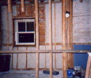
This is a remod I did ages ago, gut to the studs, re-plumb/wire/etc. House is about one hundred years old and between the previous re-dos, and a redesign, there wasn’t much to save.


Replies
Ha, nothing to it. ;-)
Ok, If you follow these next photos in order you will go around the room. Pic #1 & 2, the swinging door connects to the formal dining area. Pic #3, couldn't do a thing about that frig sticking out as it was up against an outside wall, but I did cheat a few inches for it. The window is the only exterior change, (that is the same opening you see in the gut photo, but it matches a window on an addition to the left, and the outside facade works, (and the Mrs. wanted BIG, yet couldn't go with a casement because there is a picnic table right outside of it. Pic #4, same area, but squeezed a 1/2 bath in there. The kitchen nook and bath is on a bump out about 8x16 ft, or so. Before the kit nook was a pantry, accessed by a small door on the right. We ripped out the wall and I think we might have even supported the second floor with something. Pic #5, That fuggly dark walnut stained door was about the only save here. That connects to a airlock entry where we installed a closet and re-used an existing fixed stained glass window. Pic #6, the reason the door on the left is higher is it opens to the stair landing, and the first stair starts at the door, (it goes a few steps to a landing and back down into the parlor. The little tv nook is a stolen space from the cellar way, accessed from the door on the right. Mr.'s only request was a space for the tv, and Mrs. let him have that little space over the cabinet.
Ps. I hope the pics aren't too horrible, I tried to keep them around 20 k or so.
I'm not too fond of the pics display - they are small and hard to see, plus you have to hit the back key on the browser to get back to the discussion. The Webx was better because it put them in another window.
Mary
At least in Internet Explorer, if you hold the shift key and click the picture, it will open in a separate window.
Dave
With Netscape right click and N opens a new window for the link.
The quality and size is probably my fault, I scanned at low pixies and optimized the photos. Next time I will scan at a higher res and keep the size a little bigger.
To make it easier to follow, open this in another window. I crunched the k's down a bit further, but the quality doesn't seem to suffer for it, (the quality prob seems to be the res I scanned at).
Qtrmeg:
Nice work. I like how all those pictures are in one post. How do I override my 1 meg limit without deleting?
Edited 3/22/2002 11:26:30 PM ET by Stan Foster
Thanks Stan, nice work but horrible photos. I was just trying out the new digs to see how things worked, if they up the pic limit I may even buy a camera. I pasted the photos together because even if you open the photos in a new window, you open a new window for each photo. Before they all opened in a designated window that you could backup and forward in. (note to self, add that to my list of things I don't like about the new site).
As for the pic limit, I think Mark said he was looking into upping it, and seeing what the options are for setting the limit to daily, or something. It is one of the known problems, #2, right under you can't follow a damn thing now.
Hey, I'll e-mail you the list I have so far, maybe you can add to it. ha.
Nice job , Qtrmeg. I realy like the look of those uppers.