Wainscoting – stile spacing around toilet and sink
Hello!
I am hoping to add wainscoting in my powder room… I was thinking of rail and stiles with quarter-round or base cap inside the “panel” and using the drywall as the back “panel.”
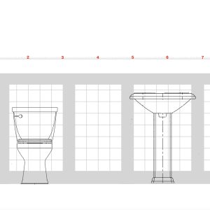
The stickler is that the toilet and pedestal sink share one of the long walls (99.5″). The toilet is about 18.5″ in from the left corner, the sink is about 18″ in from the right. (Toilet is 19″ wide, sink is 24″.) Clearly, the layout doesn’t lend itself to even spacing. Should I just “eyeball” it around the obstacles and frame them (as in the illustration below)?
I think the parallel wall will have 5 sections with the stiles roughly 15″ apart. Will it matter if they don’t align with the plumbing wall? Or, once wallpaper is added above does the eye make its own adjustments?
Then again. maybe this kind of molding just isn’t right for weirdo layouts. (I’ve also considered beadboard, but really like the look of the rail and stile if I can make it work.)
THANKS for any suggestions!
PLEASE NOTE: You have to click on the image to see the whole shebang. Otherwise the thumbnail only shows part of it.





Replies
If your drawing and the distances are correct and its feet shown on the top……..
Would you think of only the same three panel sizes on the opposite wall? So they’re the same mirror image.
Or
Maybe 4 instead of 5?
Someone sitting down might have the best guess.
The easiest guess would be 2 equal sections, both walls. Don’t use the items as the decider.
Make sure your top pc doesn’t interfere with the faucets or spout.
Edit. Your link picture above in the post shows 3 panels, while the link itself shows 5….. now I’m cornfused……
Hi, Calvin...
Thanks for taking a crack at my conundrum! Sorry about the photo; the website resized it. You definitely have to click the image to see the whole smash, so I edited my original post to note that accordingly.
I appreciate the suggestion on the faucet area...most of the photos I've looked at show the rail well above the faucet...and actually, quite a few made it a solid piece above the sinkline and continued the stiles below...which was interesting.
I edited the mock up to try the two large panels... (again, you would have to click on it to see the whole image).
And then, tried another one where I finessed the sink area and, per your suggestion, ignored the toilet....that one is kind of working for me.
Thanks for the suggestions!
50 yrs of being faced with a whole lot of “design” problems as a dumb carpenter and I’ve come to realize there are a few instances where I’ve come across some real horrible taste.
Do the best you can and realize it’s a bathroom. Most often used and left without much “looking”.
Be sure to show us the finished product!
oof, wait! If you think I'm demonstrating bad taste I am TOTALLY open to other options! I am grateful for your suggestions!!!
The wallpaper is super cool...and will be where most people are looking. But I do want to get the bottom as "right" as possible....
I thought that Beadboard might be a little pricy, but maybe that would be the better option.
No sir, not by any means do I think that your plan sucks!
I’d tell you if it did, politely.
In all the years of building and a bunch more looking…..
I’ve seen some really bogus designs and finishes.
Yours is not in that ballpark.
Your advanced drawings are a good way to “see it” before you do it.
Hi, Calvin...
Just following up. I ended up making everything the same on both sides of the room. We decided to go with a new vanity cabinet, so nearly half of the fixture wall wainscot will be covered anyway.
I normally prefer odd numbers, but given the size of the end walls, I went with four "boxes."
Thanks so much for taking the time to make suggestions! It's not perfect, but I'm really happy with how it turned out!
Beautiful Job!
And thank you for returning with result!
Bigger question, what’s next on the list?
Make sure you include us with the projects! Not so much with the planning, but surely the results.
Nice work! Do you mind sharing the profiles for the top rail and base? Were these custom made?
1. Customizing Around Fixtures
Eyeballing the Layout: Since the fixtures are positioned asymmetrically, it’s practical to adjust the wainscoting layout around them. Use the toilet and sink as reference points and frame the wainscoting to work around these obstacles. Make sure the stiles and rails align neatly around the fixtures, even if it means slightly deviating from perfect symmetry.
Visual Balance: The key is to ensure that the wainscoting looks balanced and intentional. If the layout is not symmetrical, focusing on a clean, consistent design approach will help. Using a level and measuring tape to make precise cuts and alignments will contribute to a more polished appearance.
2. Alignment of Panels
Parallel Wall Sections: Aligning the wainscoting on the parallel wall with the stiles 15″ apart is a solid plan. It’s acceptable if the stiles on the plumbing wall don’t align perfectly with those on the opposite wall. The overall design of the wainscoting will be more visually harmonious when it’s well-aligned on the longer wall, even if it means slight misalignment with the shorter, obstacle wall.
Optical Adjustment: Wallpaper or paint above the wainscoting can create a visual buffer that helps the eye adjust to any inconsistencies. Patterns or colors above the wainscoting can help blend any minor discrepancies and draw attention away from less-than-perfect alignments.
3. Rail and Stile vs. Beadboard
Choosing the Right Molding: Rail and stile wainscoting offers a classic and elegant look, which can work well even in challenging layouts, provided it’s done carefully. Beadboard is another great option, especially for powder rooms, and can sometimes be easier to install in irregular spaces.
Visual Impact: Beadboard tends to be more forgiving in irregular layouts and can add a charming, cottage-like feel. However, if you prefer the look of rail and stile, you can certainly make it work with thoughtful planning and adjustments around fixtures.
4. Additional Considerations
Professional Advice: If you’re uncertain about the installation, consider consulting with a professional carpenter or interior designer who can provide guidance specific to your space.
Mock-up: Creating a mock-up or using painter’s tape to simulate the wainscoting on your walls can help visualize how the final product will look and make adjustments easier.
Image Reference: Ensure to review the full image and illustration as mentioned, as it will provide a clearer understanding of how the design elements will fit together.
Final Thoughts
Ultimately, the success of your wainscoting project will depend on careful planning and attention to detail. Adjusting the layout to accommodate fixtures and maintaining a consistent design approach will help achieve a beautiful and functional result.
For wainscoting around the toilet and sink, you're right—eyeballing it and framing around the obstacles is a solid plan. It’s totally fine if the stiles don’t align perfectly with the parallel wall; the wallpaper above can help balance things out visually. Your idea of using rail and stile is great, especially if you love the look. Just make sure to measure carefully around those fixtures to get the best fit. Beadboard is also a nice option if the layout gets too tricky, but it sounds like you’re leaning towards the rail and stile for the style. Good luck with your project!
Magic touch etc.
Did you even read above?
He’s done!
Hope you become done also.
Paid by the word?
Are you intelligent artificially?