Big Ideas for Small Houses
Multiuse rooms, built-in furniture, and carefully orchestrated sightlines are just a few of the tools that can help you to get the most out of the space you have
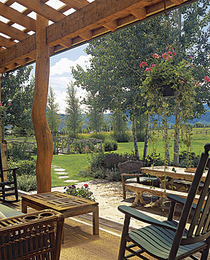
The green-house effect is everywhere these days. You just can’t escape the news about how important it is to save energy with efficient appliances and ample insulation—and that’s a good thing. But the simplest, most effective way to reduce a home’s energy usage in the long run is to reduce its size from the outset. A shrinking energy bill is just for starters: The need for fewer building materials, less land, and less maintenance is a significant by-product of building smaller houses.
More and more of my clients ask whether a small house can work for them. They’re concerned that it won’t have enough room for family and friends on holiday visits or that it just will seem cramped. The reality is that a small house doesn’t have to appear or feel small. With thoughtful design techniques, a small house can be made to seem larger and more gracious than its actual dimensions.
On these pages are ten guidelines that can be used to expand the perceived size of a small house. They comprise an overall approach that will yield a house that is both practical and excellent. To be successful, a small house also should be straightforward, composed of simple architectural forms and construction techniques, quality materials, and careful detailing. Quality feels better than quantity, while spirit and personality bring a house to life.
1. Include an outdoor room.
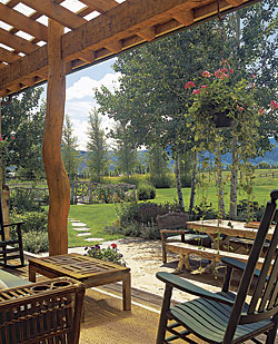
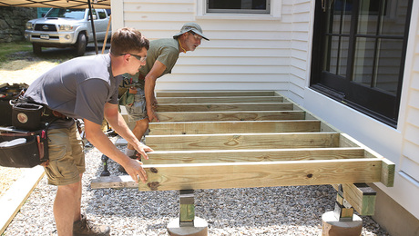
What you build outside the house can have a major impact on the way your home feels inside, especially if you make a roomlike space and connect it properly to the house. This outdoor space should have a definite boundary such as a stone wall, a fence, shrubs, a deck railing, or adjacent structures. It needs to be easily accessible from inside the house and to be linked to the interior by consistent materials, floor patterns, overhangs, plantings, and large doors and/or windows. An element such as an outdoor fireplace or an arrangement of table and chairs also can give this space an interior connection.
The outdoor room should be a bit bigger than the largest room in the house. I typically like to use spaces that are about 11⁄4 to 11⁄2 times as big as the largest room. Ideally, the outdoor room should have an area that is hidden from view, creating a bit of mystery and tempting a visitor to explore, leaving guests with a sense that there is something to discover.
2. invest space in transitions
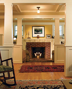
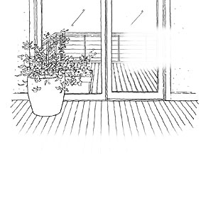
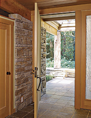
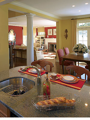
By using transitions, you can emphasize distinct realms within a house. Transitions range from portions of the floor plan such as stairs, hallways, and balconies to details such as thick thresholds, substantial columns, overhead beams, and lowered ceilings. You can use these architectural elements to create a sense of mystery and a process of controlled discovery, heightening the impression that there is more to the house than immediately meets the eye.
Although it might be tempting to remove square footage from entry and circulation spaces, it is more important to be generous with these areas. Doing so will create the sense that you are living in a bigger house.
3. Use contrasts in light and color
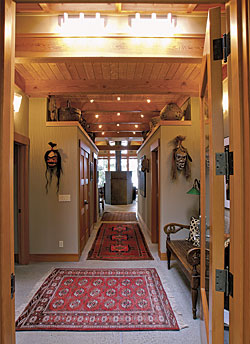
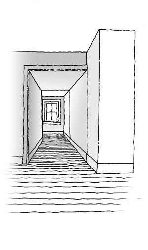
Light and color can be used to expand the perceived size of a house. Bright light in the foreground with slightly darker areas in the background creates a perspective that increases the perceived depth of a space. Light brought into the ends of a room draws the viewer’s eye, increasing the perceived distance; so too does a window at the end of a hall or a skylight at the top of a staircase.
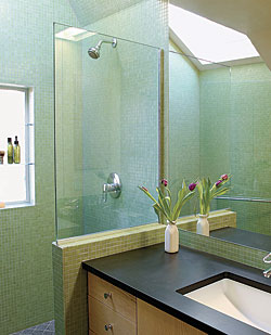
Natural light is a wonderful way to warm up and subjectively enlarge a space. Bring light into the house by using large windows, skylights, and clerestories. Interior spaces that are isolated from the exterior can use elements such as roof monitors and light tunnels, or can borrow light from other areas via transoms and interior windows.
Artificial lighting also can be used to brighten a room and to illuminate features and tasks. Wellplaced lighting provides contrast and shadow, gives definition and clarity to elements and edges, and creates a sense that the space is larger than it actually is.
Although a color scheme should be kept simple, contrasting colors can help to expand a space. Light colors on ceilings and walls dissolve boundaries, making a room seem larger; darker colors enclose the volume of a room, making it feel smaller and more intimate. Warm colors seem to advance toward us, while cool colors tend to recede. Using color in creative ways really can open up small spaces.
4. Create contrast with scale
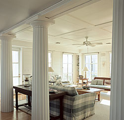
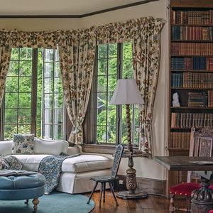
Avoid downsizing everything in a small house; doing so just makes it seem even smaller. Instead, vary the scale of objects and elements from larger than normal to smaller than normal to evoke a sense of grandeur. For example, a tiny window placed next to a big piece of furniture makes the area seem larger.
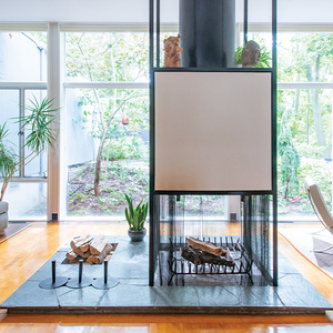
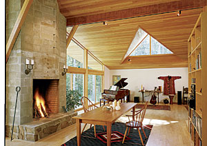
Using elements that are monumental can achieve the same effect. A huge fireplace, a grand chimney, an oversize window, a massive door, giant columns, an overstuffed chair, and a formal garden all appear as if they belong to a “greater” house. Combining large pieces of comfortable furniture with large area rugs is another good idea; you just need to use fewer pieces. Raising the ceiling height from the standard 8 ft. to 9 ft. in the main living areas also can make a big impact.
5. Organize the house into distinct zones
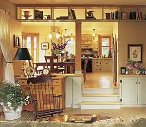
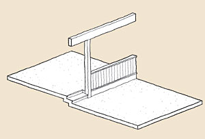
If you clearly distinguish different areas within a small house, you can make it seem larger by creating the impression that it contains multiple rooms and spatial domains. Establish at least two realms; avoid making a one-room house, unless that is your intention. Creating public and private zones, separating competing functions, and making distinctions between quiet and noisy areas all are good ways to enlarge the perceived size of a small house. Use well-articulated transitions such as floor-level changes and varied ceiling heights (see guideline No. 2) to define and separate different areas.
Contrast spaces by making some of them intimate and snug, and others open and airy. A sheltered inglenook off an open living area is a good example of this tactic.
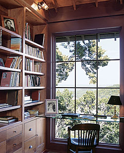
A “getaway” space somewhere in the house also is important. A small house feels larger and more balanced if you know that it contains a secluded place for quiet and inward-focused activities.
6. Develop multiple orientations
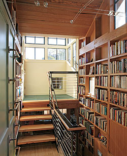
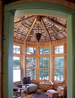
Use windows to vary the focus from nearby features to distant horizons. Try also to give each space natural light from at least two sides.
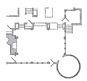
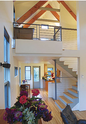
In the house pictured below, for example, high and low windows frame both garden and hilltop views, open-riser stairs allow glimpses from one room to another, and a frosted-glass stair landing adds a surprising layer of light in the center of the house.
Avoid using large areas of glass in small rooms and large windows on only one wall. Doing so can create an uneasy imbalance that sucks the sense of enclosure from the room.
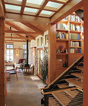
7. Accentuate the dimensions
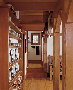
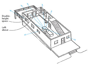
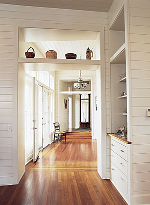
Start by using sightlines to their full potential. Long hallways strategically placed, one-and-a-half- or two-story spaces, and diagonal views all are ways to gain a sense of spaciousness. Instead of a solid wall that limits a potential long view, use interior windows, transoms, and clerestories to maximize sightlines and to extend space beyond its perceived boundaries.
Keeping sightlines clear is important. Limit the number of furniture pieces and eliminate clutter to allow the eye to travel farther, extending perceived spatial dimensions.
8. Put Illusion to work
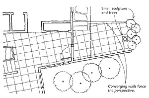
You can combine tapered walls and ceilings, and manipulate the scale of objects such as fireplaces, sculptures, and landscaping to create the illusion of expanded space. For example, an outdoor room with walls that taper toward one another creates a forced perspective that funnels the eye toward a focal point that seems more distant. Placed at that focal point, an object such as a small sculpture helps to enhance this perception of expanded space.
Another technique is to create a seductive curve by designing a space that beckons visitors into an area partly hidden from view. A curved or angled wall, a loft, or stairs going up or down can help to create a sense of mystery.
Large mirrors set on closet or bathroom doors and in small rooms can enlarge perceived space. Be careful to avoid placing mirrors facing each other, however. This arrangement can create a disorienting fun-house effect of endlessly duplicated images. When deciding how big a mirror should be and where it should go, think of it like a window, a piece of artwork, or a framed picture. Paintings and photographs also can create the illusion of more space when they’re placed strategically in a room or at the end of a hallway or staircase.
9. Use thick edges and built-ins
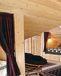
Thick countertops, deep window jambs, and wide door thresholds all are examples of thick edges. They give the impression of strength and longevity, and express a sense of grandeur.
Extending a window beyond the exterior plane of a wall creates thickness around the interior of the window. Inside, the wide jambs reflect light, brightening the room. Outside, shadows cast by the window bay add interest to the facade of the house. Likewise, recessing an entry door also creates the illusion of a thick wall.
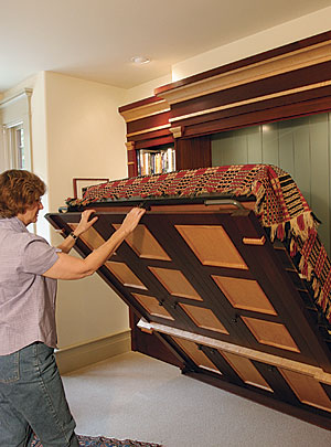
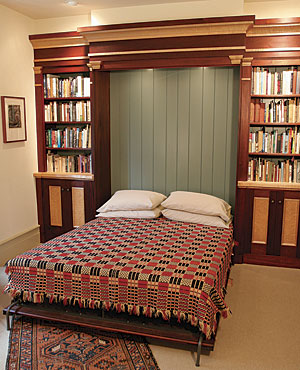
By incorporating thick edges and built-in furniture around the perimeter of a room, the center of the space becomes liberated for living. Built-in furniture such as window seats, wall beds, Pullman bunks, booth seating, and fold-up tables can be used to keep spaces clear.
Nothing creates a sense of claustrophobia in a small house faster than clutter. Use bookshelves, cupboards, cabinets, drawers, and storage chests to keep clutter out of sight. Often, nooks and crannies present themselves during remodeling or construction. Think like a boat designer and look for these opportunities to provide places for stowing away items.
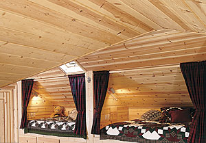
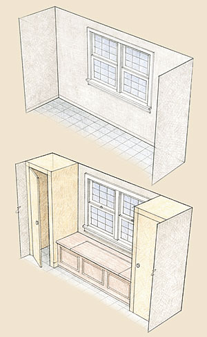
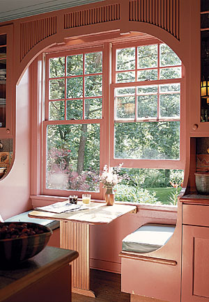
10. Include multipurpose rooms
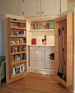
Houses integrate numerous functions, but each one doesn’t need its own space all the time. If you can combine different activities that occur at different times in the same space, you can eliminate the need for more rooms. But don’t force it. Work through the functional requirements of different activities before combining them. Here are some typical combinations:
- Hall with laundry and storage
- Bathroom/laundry room
- Entry with bench, storage, and powder room
- Mudroom with workbench, sink, and clothes-drying racks
- Bedroom with a comfortable area for reading or meditation
- Stair landing expanded to include a desk
- Dining area that serves both formal and informal dining
Russell Hamlet is an architect on Bainbridge Island, Wash. Drawings by the author, except where noted.
