Getting the Most from a Kitchen Island
Masterfully tailored to their spaces, these kitchen workstations show how to combine utility with panache.

Synopsis: Internationally acclaimed kitchen designer Johnny Grey is known for his inspired approaches to configuring timeless kitchens that defy stylistic labels. But they’re not just pretty to look at. Every one of them combines the practical layout of an efficient workshop with materials that are suited to their tasks. And the centerpiece in just about every one of these kitchens is an island. This article describes the functional underpinnings of a Johnny Grey island, along with three case histories that present islands of different sizes and functions. A sidebar on where islands go wrong offers another kind of sage advice.
If you ask me, getting the island right is the defining moment of kitchen design. The island is the link that connects every piece of furniture and all the diverse activity that takes place in a kitchen. The island is the ingredient that helps to make meal preparation a pleasurable punctuation to the daily continuum of life.
That’s what a kitchen island should be. In reality, however, there are as many ways to get islands wrong as there are varieties of kitchens. The size of the room, the placement of the windows, and the relationship of the kitchen to adjacent spaces are just a few of the variables to think about. Those considerations don’t even take into account the various functions that an island can include.
This article is about picking a path through those variables to get you to the best island for your kitchen. Some common-sense rules loosely govern the sizes and the materials that you should consider.
First, decide how big the island should be
I think of a kitchen island as a collection of parts that can be assembled in different combinations and sizes to suit the dimensions of the room and the functions desired by the cooks who use it. The average front-to-back depth of an island is between 4 ft. and 5 ft. This depth allows multiple worksurfaces of more than one height. (If the island is less than 40 in. deep, a single-height surface is better.)
At the most, an island should take up about 25% of a kitchen’s available floor space. That figure might be reduced to 15% in a more confined room, depending on the sizes of other furniture pieces and cabinets. In a kitchen narrower than 14 ft., a full-fledged island will be difficult to fit. Instead, consider a peninsula or a worktable whose continuous, single-height surface is narrower than an island.
Where the regular use of adjacent countertops is likely, leave at least a 4-ft. passage between the island and the counters. Near a doorway, a table, or an oven, expand the passage by at least another 1 ft. Allow 2 ft. in width for each person working at a counter.
Soft geometry is friendly geometry
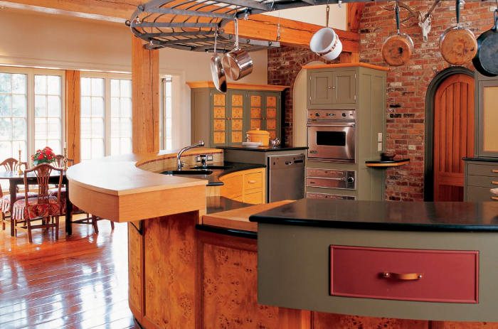
Islands can take a number of shapes to suit rooms of different sizes. An island’s presence can be likened to a piece of sculpture in which weight, mass, texture, light, and shape interplay. The added complication is that we don’t just look at an island. We stand next to it. We walk around it. We use it.
I use the principles of what I call soft geometry to help shape the kitchen islands that I design. Soft geometry recognizes that we don’t move in straight lines through spaces, and that we respond in subliminal ways to rounded corners versus sharp ones. Think of the kitchen in geological terms: A river has cut through it over time and ground away the hard edges, creating a path that flows easily.
For more photos and information on how to pick the right kitchen island, click the View PDF button below.


