Personalizing an Everyday Ranch
Open up the space, add smart lighting and sharp design, then, watch a humdrum house become a real humdinger.
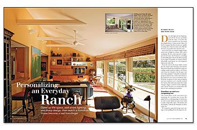
Synopsis: California lighting specialists Nancy McCoy and Peter Judge needed a bigger house with space for a home office. After some searching, they found a ranch-style house, but it required some work. Without spending a lot on the exterior, Nancy and Peter poured their energy into renovating the interior of the house, relocating walls, reshaping rooms, and calling on their lighting knowledge to make their house more than an everyday ranch.
Magazine extra: View additional before- and after-photos of the McCoy/Judge house.
Drive through any development, and all the houses probably look the same, even after the latest remodel craze has swept the neighborhood. Unless you live there, it’s hard to imagine that those houses are capable of rising above their ho-hum roots. But the interiors can go places the exteriors can’t.
A few years ago, we wanted a bigger house with room enough for a home office and a workshop. We live at the epicenter of high-priced real estate, San Francisco, so finding an affordable place that fit the bill was going to be tough. Eventually, we found a barely affordable ranch house in a development built in the early ’60s.
From the exterior, the house didn’t exactly get our creative juices flowing. The interior had period details that included low popcorn ceilings, small windows, hollow-core doors, and a faux-lava fireplace, but the space was more than adequate. A big plus was that the property backed onto conservation land, so the backyard view was an enormous asset. With the exception of a new entry treatment and new windows, we’ve hardly touched the exterior. But with some major floor-plan changes, bigger windows, better lighting, and a great kitchen, we transformed the interior into anything but mundane.
Demolition can work as a reorganizing tool
The initial phase of the renovation was satisfying, in a crowbar sort of way. We pulled down a wall separating two bedrooms as well as some bathroom and closet walls to make a large office space. The kitchen and the fireplace wall hit the Dumpster in short order, too.
We wanted to open the living-room ceiling, so after pulling down the popcorn ceiling, our contractor ripped out the ceiling joists and extended the middle wall up to the ridge, creating a bearing wall. To support the roof, he sistered 2x12s to each of the 2×6 rafters on the living-room side. On the opposite side of the new bearing wall, we planned the new kitchen.
Peter needed shop space to make the trim and cabinets for the house, so we split the garage: the outboard side for the shop, the inboard half for a den and laundry room.
At the other end of the house, we straightened out a confusion of doors masquerading as a hallway. We also reorganized back-to-back bathrooms by enlarging the bath closest to the master bedroom. The remaining bath was downsized to guest status.
The strength of the horizontal line drives the interior
Like most other ranches, this house had a strong horizontal element in its design: one story, low-pitched roof, and groups of small windows on each wall. Seen from the inside, however, the house seemed like a series of boxes. To increase the sense of space, we emphasized the horizontal wherever we could; it’s a design device that makes the eye move along that plane, extending the scale. For instance, a continuous band of trim runs 12 in. Below the ceiling throughout the bedroom wing. The band of wall above the trim is painted the same lighter color of the ceiling, a technique that makes even small rooms seem bigger. Other elements such as deep windowsills in the living room, horizontally divided lites, and three-panel doors (instead of flat slabs) furthered the concept.
For more photos, drawings, and details, click the View PDF button below:
