From Cardboard and Cutter to Click and Drag: Studio/Workshop Design in the Digital Age

Cardboard vs SketchUp
While recently browsing through the Editor’s Notebook blog, I came across a post by Patrick McCombe about designing a studio/workshop. His process was one I used many a time for similar tasks: layout and cut out cardboard to create a scale model. With a personal revalation some time ago of the features of SketchUp that improve the design process in nearly every way, I was compelled to offer some insight into developing a model in the digital age using click and drag instead of literal cut and paste.
Collaboration
Figuring that readers may be working on project design/planning during the winter months anticipating breaking ground in the spring, it made sense to showcase Pat’s project here on The Digital Jobsite. With a program as versatile as SketchUp there are numerous ways to go about creating a digital model. What I’ll show here are methods that work for me, but are by no means intended to imply they are the best, slickest or quickest ways to get the job done. Heck, I doubt if I’d even use the exact same process a second time! Hopefully this collaboration will give some insight into the usefulness of the SketchUp program and possibly prevent some nasty knife cuts.
Creating a Gable Profile
After going over the general purpose for the studio/workshop and some basic size, shape, construction type and roof pitch parameters, its time to put initial shape to the structure. This video shows how the information is transformed into an outline for the building.
Expand and Embelish the Gable Profile
Working from the gable profile, this video shows ways to embelish the model with some features to give a better idea how the building would look with the given parameters.
Square One
A great thing about digital drafting is that tweaking a design is a relatively simple process. You can download a copy of the model here:
SketchUp model of Patrick’s barn
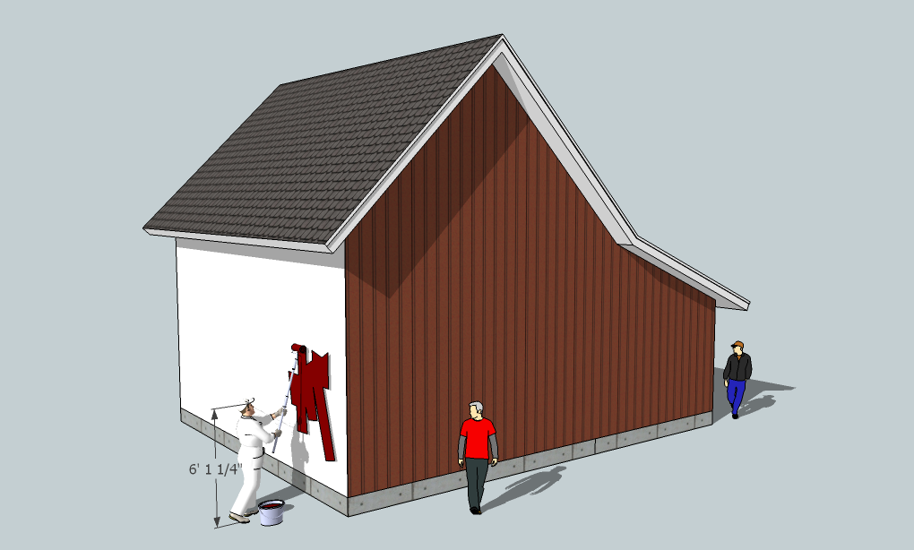
and practice re-working any of its attributes to suit your style. One of the primary design issues at this stage is the pitch of the lean-to roof, and how it intersects with the main gable. If this roof pitch and these proportions are what Pat is looking for, we’ll move on to square two and add simple window and door openings. Otherwise, its back to square one to re-work the basic shape.
Fine Homebuilding Recommended Products
Fine Homebuilding receives a commission for items purchased through links on this site, including Amazon Associates and other affiliate advertising programs.

All New Kitchen Ideas that Work
Not So Big House

Homebody: A Guide to Creating Spaces You Never Want to Leave
Looks like the painter is working overtime to finish up...







View Comments
"Insert SU model file here"
I think you forgot to insert the .skp file
Dreamcatcher,
Matt was just too fast for me! He published the article before I could upload the SketchUp model to the website. It's in there now. Have fun.
Regarding the design...The junction of the shed roof and the gable is awkward looking. Before you commit to this design, you should think about how you are going to run the rake boards on the overhang at this junction. Will you bisect the angle where the rakes intersect, or run one past the other?
I understand the value of the overhang in keeping water off the sidewalls, but you might want to consider getting rid of the overhang all together.
Take a look at some of the barns in the area deal with trim and overhangs.
Can I post photos here?
Greengiant,
Thanks for the input. That transition has been the most difficult part of the design. Here are the two problems I've identified. And Yes, I'm a firm believer in roof overhangs so I don't think I'm willing to eliminate them altogther, but I'd love to see some options.
Here are another couple reasons for the design.
1. The shed roof needs to have enough pitch for a conventional asphalt shingle roof. Although you can go lower than 4/12 if you hand seal the shingles, I don't really want to. I think 4/12 is the pitch shown.
2. I thought about dropping the shed roof (Matt even drew it in SketchUp)so it's below the main gable which would have eliminated that awkward transition altogether. Admittedly, this looks the best , but it means I'd have 24 ft.of additional overhang to build (and pay for) and it would be very hard to paint the soffit in the future.
If you send me the photos I'll be glad to post them on the Editor's Notebook Blog so others can weigh in.
Thanks again for the feedback! Keep it coming, please.