A Bathroom Zoned for Flow
This modern suite bathroom is cleverly organized around 4 principal functions.
Synopsis: Architect Kate Snider Tabony’s clients, two physicians, wanted their bathroom to have a more efficient layout and a vibe more conducive to relaxing after a hard day’s (or night’s) work. Tabony’s solution was to divide the space into four distinct zones: vanity, private toilet, wet room (with both a tub and a shower), and storage wall. The demarcation of these zones is enhanced by permanent barriers such as doors and glass walls, and subtle changes in materials.
Although their bathroom included all of the standard amenities, our clients felt that it suffered from an inefficient layout and overall lack of tranquility. The pair of doctors asked our firm not only to create the kind of vibe that would invite them to unwind after a long day of work, but also to design a space that would allow them to function on their varying schedules, whether that meant a day shift or a 3 a.m. surgery or delivery.
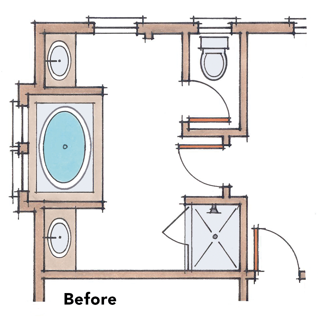
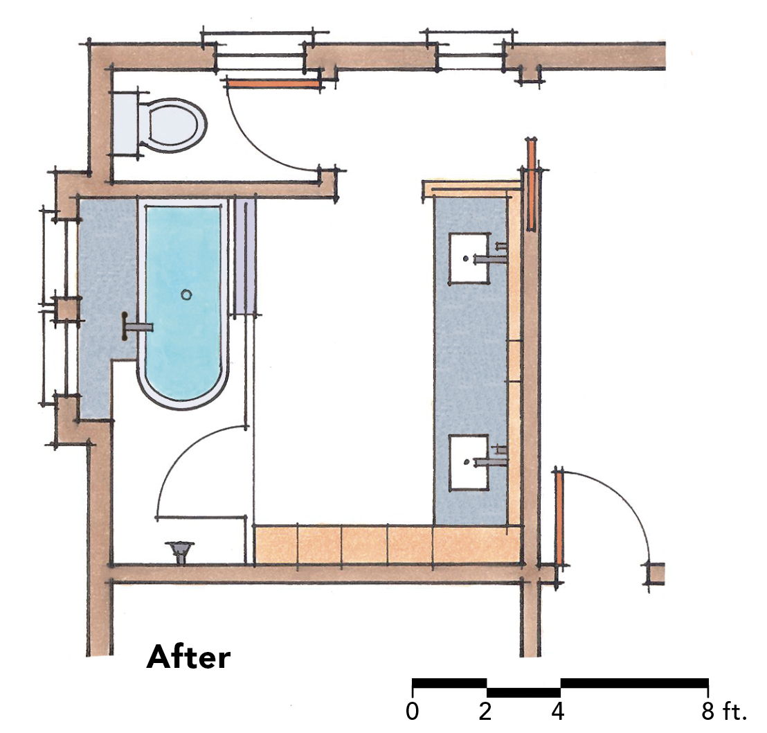
Our solution was to rework the layout of the room by dividing it into four zones — vanity, private toilet, wet room, and storage wall — while choosing materials, fixtures, and a lighting scheme that work together to create a calm and relaxing environment.
Details
Toilet Kohler Persuade, kohler.comSinks Kohler
Sink faucets Hansgrohe, hansgrohe-usa.com
Tub Victoria & Albert, vandabaths.comTub faucet Kohler Stillness
Shower faucets KohlerCabinetry Ikea (white), ikea.com; custom (walnut)
 |
 |
Separate spaces, unified whole
Permanent barriers such as doors and glass walls, and subtle changes in materials — for example, from tile to wood — divide this bathroom into four distinct zones.
1. Vanity
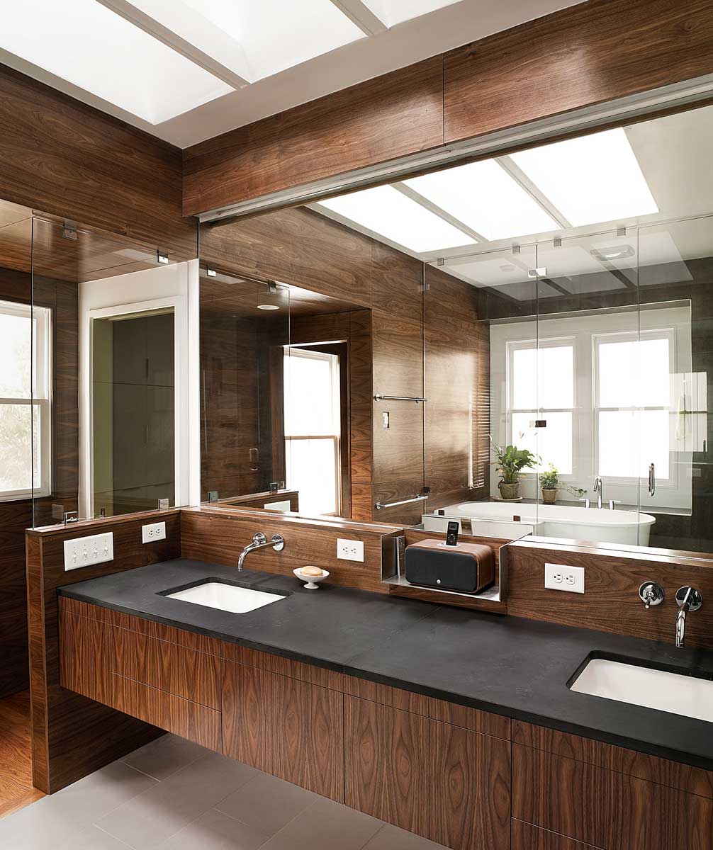
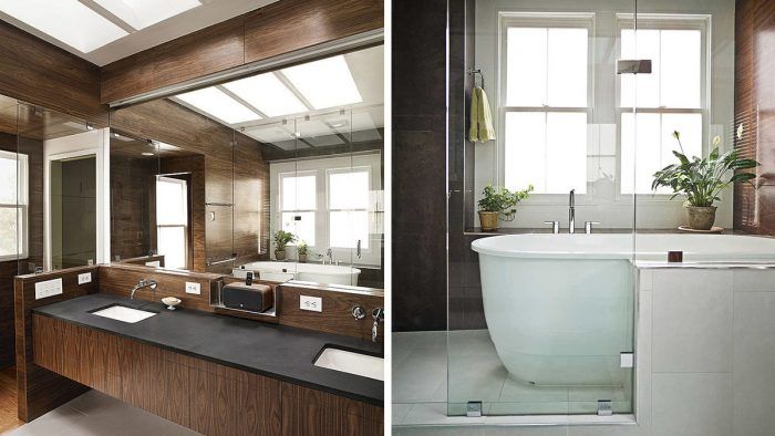
Mounting the contemporary walnut-paneled vanity to the wall created a space below that helps to visually widen the rectangular room. Two skylights on the house’s north-facing side allow natural light to wash through the white-walled skylight wells and down onto the countertop area, where it illuminates the full-wall mirror. At night, a light channel above the mirror provides concealed fluorescent lighting.
2. Private toilet
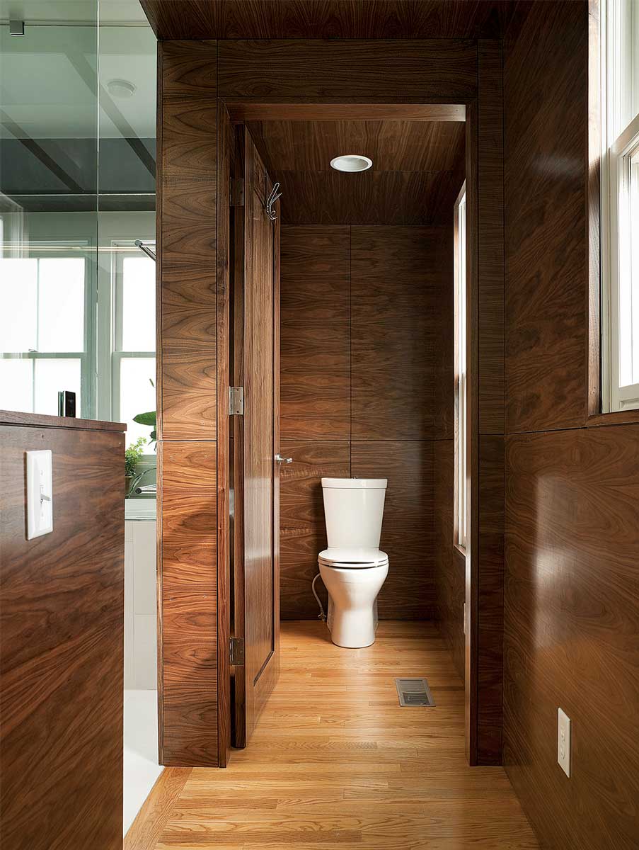
Located in a daylit nook off its own hallway, the toilet is accessible from the suite bedroom without entering the rest of the bathroom.
3. Wet room
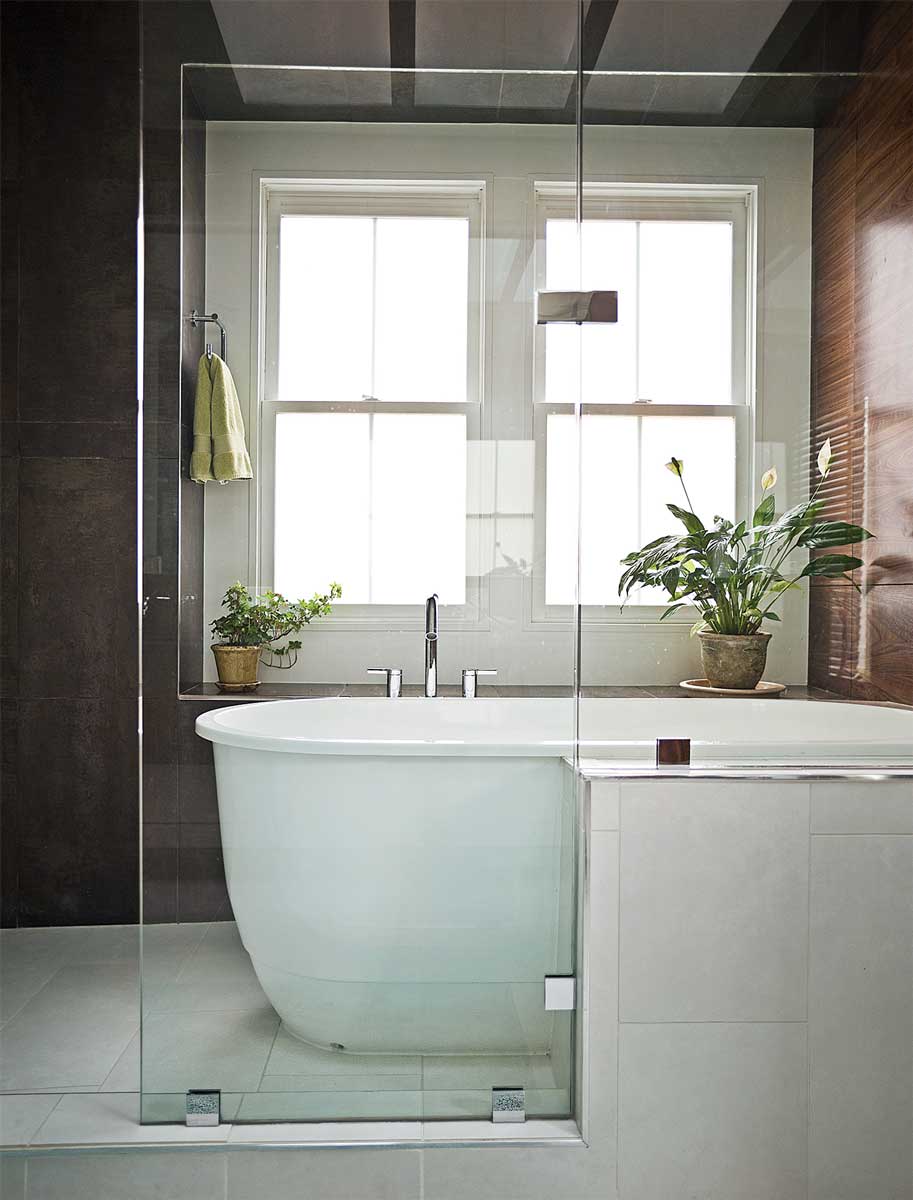
There was no space for a stand-alone tub in the center of the room, so the tub was anchored with a partial surround of tile. Separated from the rest of the bathroom by a wall of glass panels, the shower and the tub share a compact footprint, a space that would have been too small to accommodate both as separate units. The exterior wall in this wet area required a departure from the walnut paneling used elsewhere, so tile was chosen to provide a visual and tactile change.
4. Storage wall
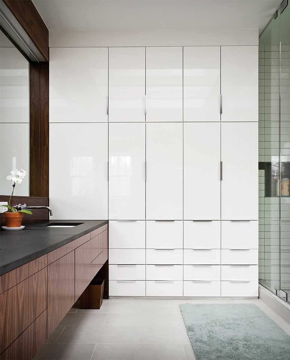
Smooth-faced Ikea cabinets were ganged together in ascending sizes to create a massive built-in storage unit that makes the room feel taller. Providing more than enough easy-access storage for the occupants, the glossy white unit also helps balance out the bathroom’s dark surfaces.
Kate Snider Tabony is an architect at Alloy Workshop in Charlottesville, Va. Photos by Andy Franck. Floor-plan drawings: Martha Garstang Hill
From Fine Homebuilding #255
