Bath on a Bluff
The bathroom in this bedroom suite offers lessons in layout and designing for comfort and quality.
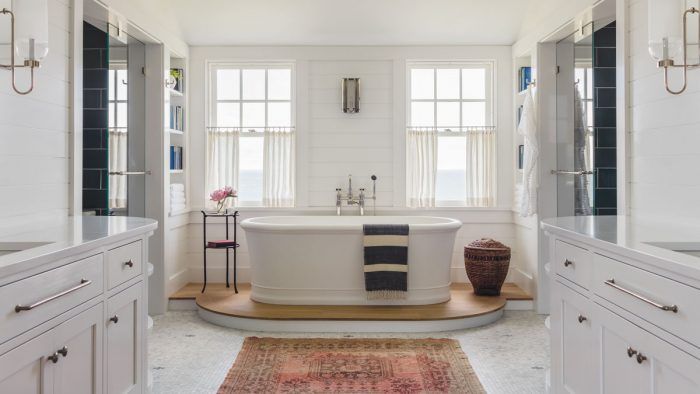
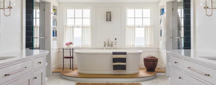
Synopsis: This main-suite bathroom has a number of defined spaces, including a raised bathtub, a water closet, and a shower stall. The designers utilized the natural symmetry of the space with mirroring vanities, and unified the design through the use of complementary materials.
This bathroom is part of the primary bedroom suite of a home known locally as Big Bluff, a shingle-style residence overlooking Vineyard Sound on Martha’s Vineyard. Though it is newly built, the design of the house has its roots in the earlier architecture of the island. Hutker Architects worked diligently to create a home that both honors the former residence, which was built in the early 20th century, and meets the more contemporary requests of the homeowners. We aspired to create a design that evokes the qualities of traditional architecture; is calm, clean, and comfortable; and has a timeless character. Our approach can be seen in the layout and details of the home’s main-suite bathroom.
The size of this bathroom is generous, but it isn’t beyond what many clients seek when considering a new primary bathroom. One of the challenges posed by bathrooms with a large footprint is their layout. When ill-conceived, a large bath can easily allow the homeowners to wander in a space that lacks warmth, logic, and focus. Ultimately, this turbulence makes the space uncomfortable.
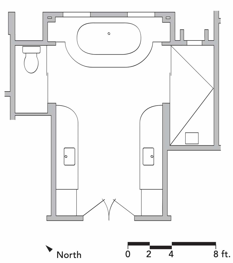
We start by ensuring that the utility of the space is clear and everything is in a sensible location. We then break down the layout of large bathrooms into distinct spaces, or zones, and knit them together with our material and detail choices. In this bath, for instance, the tub area serves as an important focal point. We made it feel distinct from the rest of the bath by setting it on an oak-topped plinth and flanking it with built-ins. Elevating the tub also breaks up the floor of honed Carrara white marble hexagon tile, which might otherwise feel monotonous, and it positions the bather higher in relation to the windows to improve the view of the ocean. The oak flooring adds warmth and richness to the space, while the curves of the plinth and the nearby Caesarstone vanity tops match the radius of those on the tub’s ends, adding an element of cohesiveness to the design.
Because the homeowners enter this room on its centerline, there is a natural symmetry to the space. Just beyond the opposing, matching vanities is a water closet to the left and a shower to the right. Both have been detailed with the same deep blue Pratt & Larson 6-in. by 18-in. ceramic tiles that mimic the colors found in a late-afternoon ocean. These smaller spaces are set behind frameless glass doors in order to borrow light and views from the main space and its windows. The darker tile color in these areas contrasts with the bright neutral tones of the main space and draws out the dark blue accents in the mosaic tile floor, helping distinguish them further. Each space is distinct, but very much a part of the same design.
There are few places as tactile as a bathroom, and this goes for fixtures and materials as well—only a kitchen rivals a bathroom when it comes to the physical closeness we have to the things we use in these spaces. For that reason, and to create a visceral sense of quality, we take care in selecting the products we incorporate into these rooms and work with highly skilled and collaborative carpenters and craftspeople to ensure the work is executed to a very high standard.
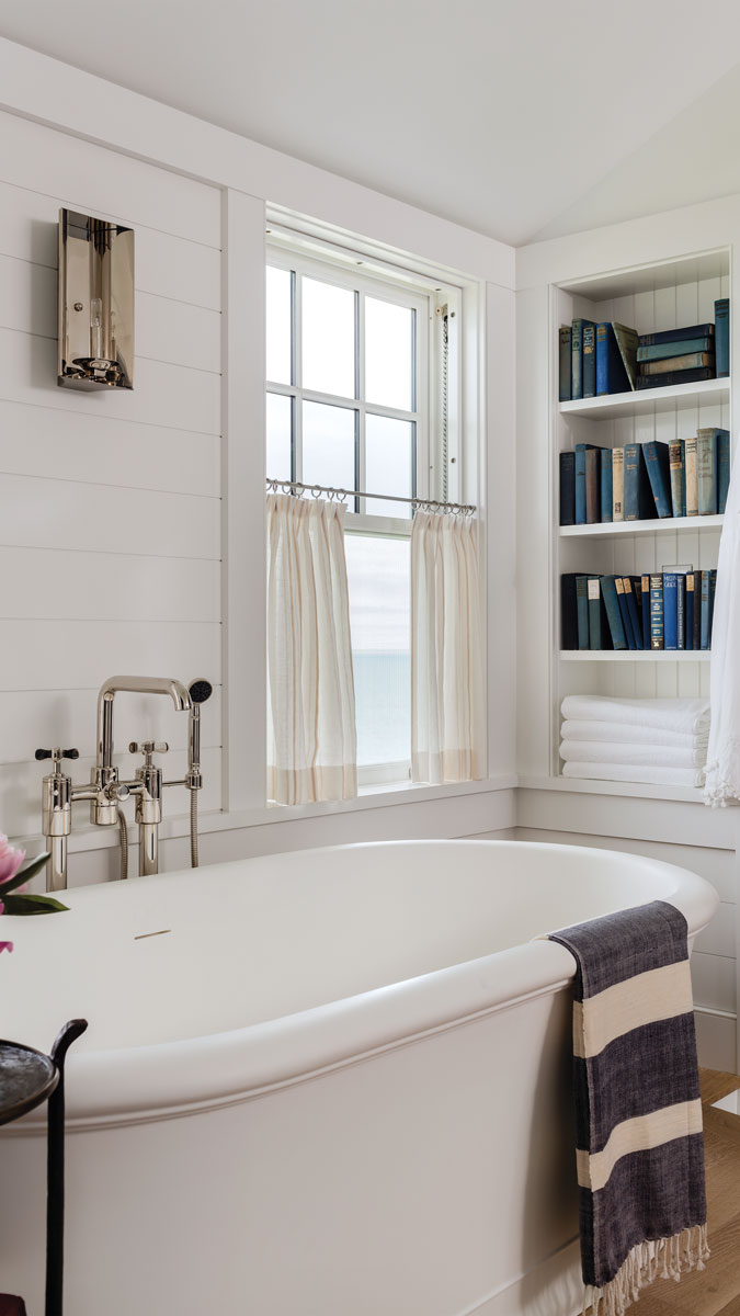
When considering fixtures and hardware for a bathroom, value how they function and feel. For instance, here we’ve used shower fixtures, faucets, and a tub filler from the Waterworks Ludlow collection. Their polished nickel cross-handle valves help give the bath a traditional feel and offer a heft and precision that is undeniable. Similarly, the solid Devon&Devon tub, Rocky Mountain Hardware pulls on the vanities, and lighting from The Urban Electric Co. help lend a sense of permanence to this space. When you experience this bath, you know its design will endure.
Traditional details tie it all together
While the arrangement of this bath’s plan is structured around defined spaces, it feels completely unified. Here are the details that help make that happen, while giving the space a distinctly traditional vibe.
1. Nickle-gap cladding on the walls harkens back to the interior paneling found in the former home. It also provides texture to the space and visually connects the areas surrounding the vanities and
the tub.
2. Running head trim that wraps the room and integrates seamlessly with the window and door casing acts as an anchor for the various openings and materials and lends a calm feeling to the space while providing a consistent visual and physical connective element.
3. Frame-and-panel cabinet doors on the vanities and built-in bookshelves with V-groove paneled backs help establish the style; they also tie the plan together as they mirror each other in the space.
Matthew Cramer, AIA, is a senior associate at Hutker Architects. Photos by Michael J. Lee.
Floor-plan drawing: Patrick Welsh
From Fine Homebuilding #295
Fine Homebuilding Recommended Products
Fine Homebuilding receives a commission for items purchased through links on this site, including Amazon Associates and other affiliate advertising programs.
Original Speed Square

100-ft. Tape Measure

Anchor Bolt Marker
