Designing a Bathroom on the Diagonal
In a small bathroom, a reorganized space yields maximum use along with unexpected opportunities.
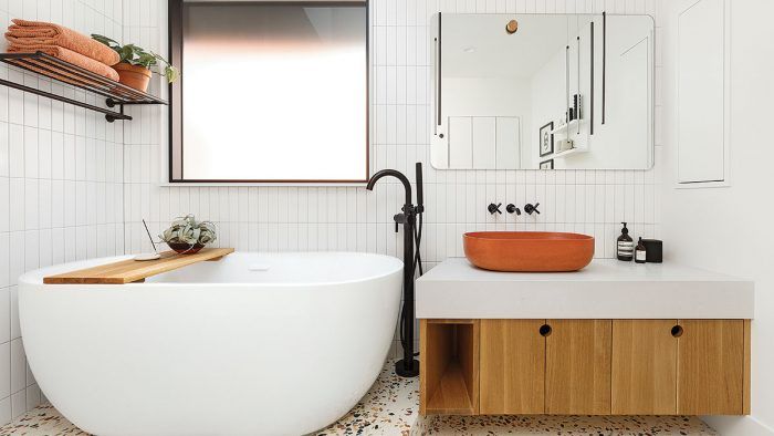
A neighborhood in Portland, Ore., with a small-town feel, Kenton appeals to young professional couples who are attracted to the remodeling potential of outmoded fixer-uppers. Such was the case for the owners of this modest midcentury ranch. The 1960s-era home had a basic, three-piece full bathroom that served a pair of bedrooms on the main level, and a three-quarter bath and one bedroom in the finished basement. The clients sought an inspiring, functional remodel of the full bath that would endow the mere 90-sq.-ft. space with the feeling of a dynamic suite. Aesthetically, they were after a modern look whose details would coordinate with the sink of their dreams: an elegantly curved Kast concrete countertop basin they were intent on purchasing.
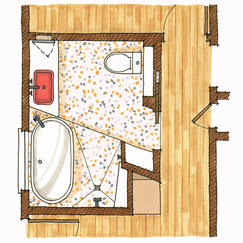
Designer Stephanie Dyer of Dyer Studio presented the homeowners with three schemes for the bath remodel, ranging from a traditional squared-off layout to the one the clients selected, which pulled modern inspiration from the home’s central, angled fireplace. Encouraged by her clients opting for this fresh design, Dyer offered an innovative space plan that would devote square footage where it was needed (at the tub) and hold back where it was less critical (at the shower). Contractor Daniel Durham of Durham Construction, who specializes in modern and design-driven home building and remodeling, was brought in to collaborate.
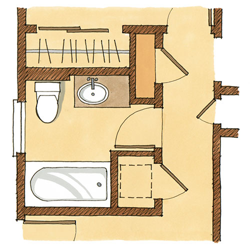
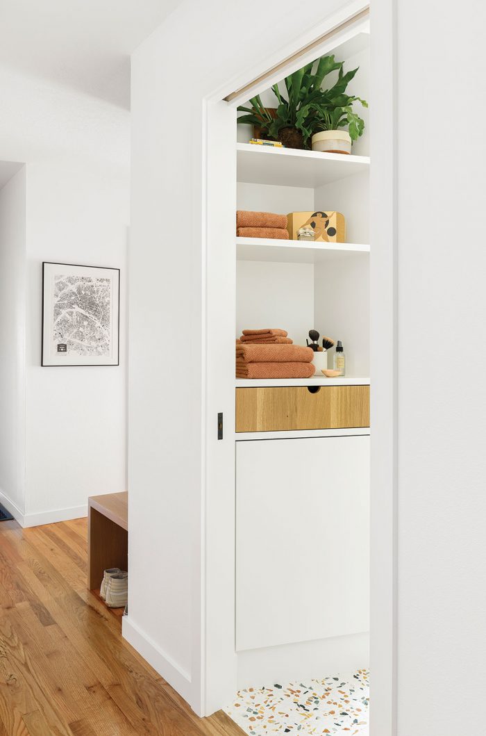
Dyer and her team regarded this project as an exercise in liberating themselves from the confines of square walls and right angles. Set on a diagonal, the tub and separate shower take up roughly the same amount of space as the tub/shower combo they replaced. Additional square footage was gained by absorbing the space previously devoted to two underutilized closets adjacent to the bathroom—one hall closet and one in a bedroom. The repurposed space allowed for the creation of linen storage in the form of shelves above a drawer and a base cabinet. Eliminating a hall coat closet enabled Dyer and Durham to incorporate a mud space at the foyer. Opening up this corner by removing the closet yielded a much more spacious and welcoming entryway with a built-in bench, coat hooks, and a few small corner shelves.
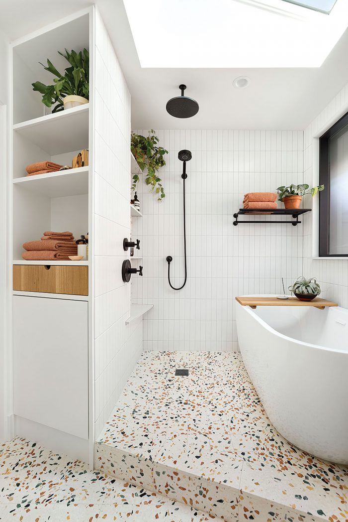
The tub and shower sit on a 6-in. platform. An attractive design element, the height was imagined out of necessity to create a slope for the shower pan. Instead of the 3-in. minimum requirement, the floor was raised twice that height to make the step up feel intentional. This way, the wet areas are distinct from the rest of the bath. The openness of the wet area in the bathroom makes it seem bigger than it is. The absence of both a visible shower tray and a divider to contain shower water allows the white wall tile to continue seamlessly throughout the room, and these unbroken surfaces also help to make the bathroom look roomier. Custom recessed cabinets provide storage above the sink and behind the toilet. The vanity’s open cubby resolves the angle of that piece, while the closed doors that meet underneath the sink help define its visual centerline. The addition of a decorative oak dowel makes the mirror look as though it’s hanging, plus the 2-in. dowel is the inverse of the same-size circle cutouts in the vanity.
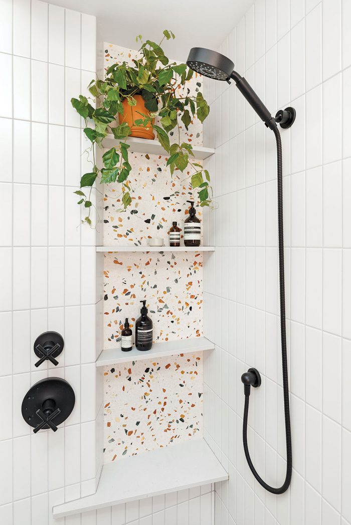
The original plan called for wrapping the area where the wall meets the window in tile. During the course of the project, however, the decision was made to use the same white Caesarstone as the countertop for the window sill and the jambs, giving the area a monolithic look as opposed to showing more grout joints had they tiled it. The palette emerged from the Kast Rho basin color, a burnt orange shade called “Ember,” which marries perfectly with the orange-flecked “Autumn” Aggregato Terrazzo Forte from Design & Direct Source. The natural element of white oak brings a warm presence to the otherwise crisp, hard surfaces. Situated behind the tub, the window from Marvin’s Modern line is black to tie in with the fixtures and frosted for privacy. The creativity and collaboration when it came to the layout of the room and the materials featured in it brought this bathroom out of its box.
 |
 |
Learn how this team transformed a closet in this same house in “A Custom Closet Remodel.”
Janice Rohlf is a contributing editor. Photos by Meagan Larsen. See more from the designer and builder on Instagram @dyerstudioinc and @durhamconstructionpdx.
From Fine Homebuilding #308
RELATED STORIES:


View Comments
Design needs to balance with function. Yes, the vessel-style tub looks nice, but who the heck is going to be able to clean between it and the wall (Plasticman?), or even it and the water supply/faucet? I fear it will be a repository of nasty hairs and linty dust blobs. This could literally appear on the FB page, "Things designed by people who don't have to clean them", a rogue's gallery of such follies.
I can't agree more. Although this bathroom is very attractive, I would not want to clean it. I always felt that you can't get worse than a vessel sink until I saw the vessel tub... Also, putting a step in a bathroom is a dangerous mistake...